सार्वजनिक जानकारी से बना चयन मार्गदर्शन। केवल संदर्भ हेतु।
Parent Child Checkbox एक Flutter पैकेज है जो विषयवार चेकबॉक्स संरचना की अनुमति देता है, जिससे उपयोगकर्ता नेस्टेड चेकलिस्ट बना सकते हैं जहां मुख्य चेकबॉक्स अपने बच्चे चेकबॉक्स के राज्य को नियंत्रित करते हैं। यह स्तरों के माध्यम से आसान चयन और अनचयन का समर्थन करता है, जिससे यह फॉर्म, कार्य सूचियों या समूहित विकल्प वाले सेटिंग्स के लिए आदर्श है। पैकेज हल्का है, आसानी से एकीकृत किया जा सकता है और सभी प्रमुख प्लेटफॉर्म जैसे Android, iOS, Web, macOS, Windows और Linux पर काम करता है।
उपयोग
कार्य प्रबंधन प्रणाली
समूहित विकल्प वाले फॉर्म इनपुट
नेस्टेड श्रेणियों वाले सेटिंग्स
हायरार्किकल डेटा चयन
उपयोगकर्ता प्राथमिकता कॉन्फ़िगरेशन
मुख्य विशेषताएँ
नेस्टेड चेकबॉक्स हायरार्की
स्वचालित बच्चा अवस्था प्रसारण
क्रॉस-प्लेटफॉर्म संगतता
सरल API एकीकरण
आंशिक चयन अवस्था का समर्थन करता है
इनके लिए उपयुक्त
जटिल फॉर्म बना रहे विकासकर्ता
संरचित चेकलिस्ट की आवश्यकता वाले UI डिजाइनर
समूहित चयन की आवश्यकता वाले ऐप
कई प्लेटफॉर्म के लिए लक्षित प्रोजेक्ट
हिरार्किकल चेक के लिए न्यूनतम सेटअप चाहने वाले उपयोगकर्ता
विचार योग्य बातें
उन्नत UI आवश्यकताओं के लिए कस्टम स्टाइलिंग की आवश्यकता हो सकती है
सीमित आंतरिक सत्यापन
अप्रासंगिक अप्रासंगिक चेकबॉक्स उपयोग केस के लिए
बड़े ट्री में राज्य प्रबंधन को बाहरी हैंडलिंग की आवश्यकता हो सकती है
किनारे के मामलों के लिए दस्तावेज़ का विस्तार किया जा सकता है
मूल README
संबंधित सोर्स रिपॉज़िटरी के मूल README का स्नैपशॉट। नवीनतम सामग्री के लिए रिपॉज़िटरी देखें।
parent_child_checkbox
Parent Child Checkbox is a type of checkbox where we can establish hierarchy in Checkboxes.
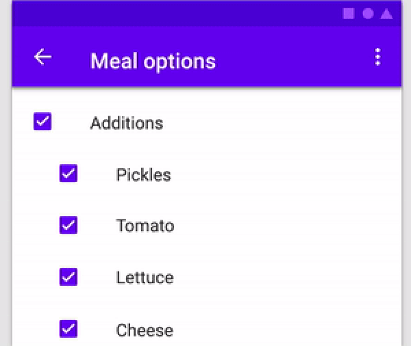
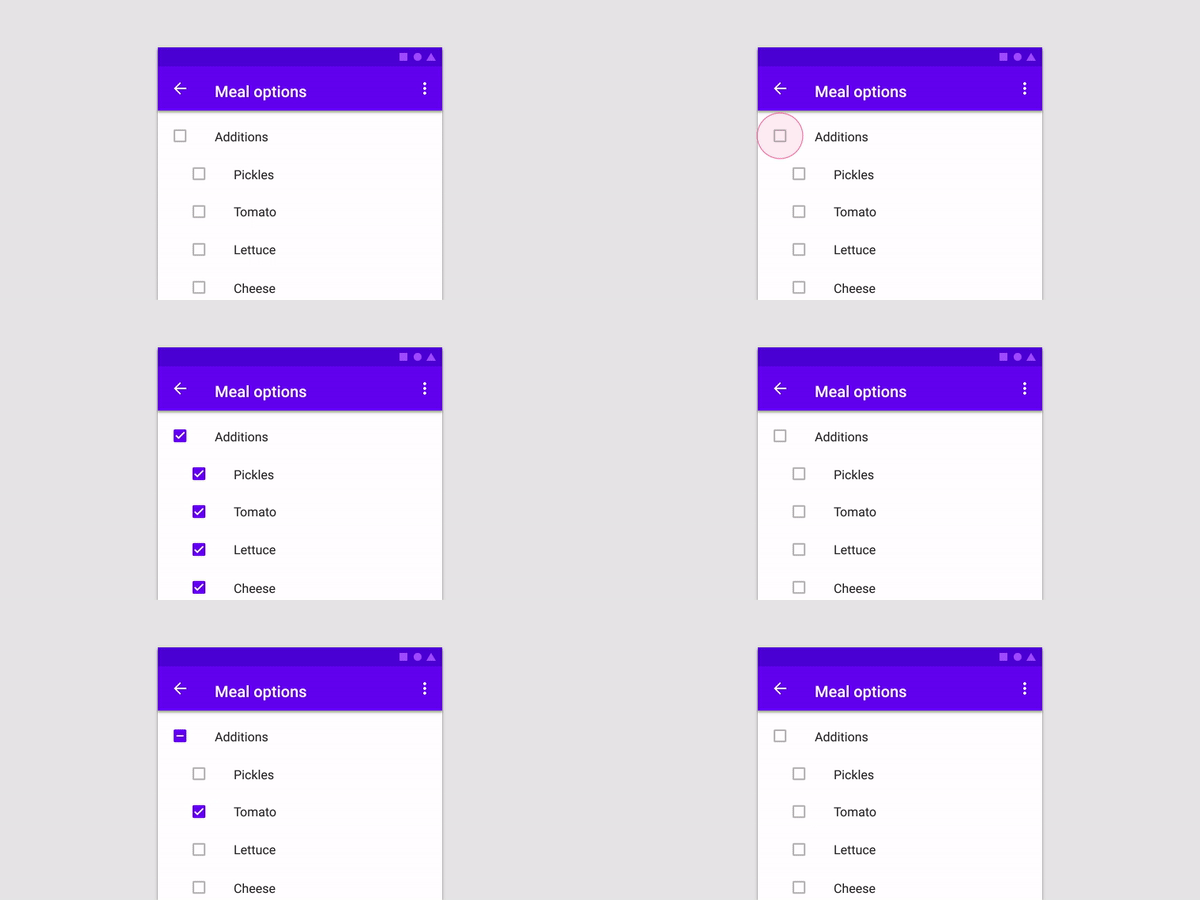
You can create a Parent Checkbox which has multiple checkboxes as their children! The value of parent checkbox depends on the value of children checkboxes and vice-versa.
If we clicked on Parent Checkbox, all children checkboxes will be selected too.
Properties available:
Parameter Name
Parameter Type
Description
parent
Text
Text Widget to specify the Parent checkbox
children
List<Text>
List<Text> Widgets to specify the Children checkboxes
parentCheckboxColor
Color
Color of Parent CheckBox Defaults to [ThemeData.toggleableActiveColor]
childrenCheckboxColor
Text Widget
Text Widget to specify the Parent checkbox
parentCheckboxScale
double
Scale of the Parent CheckBox. Defaults to [1.0]
childrenCheckboxScale
double
Scale of the Children CheckBox. Defaults to [1.0]
gap
double
Gap between the Parent and Children CheckBox. Defaults to [10.0]
onCheckedChild
void Function(int index)?
Function that will be executed if a child will be selected
onCheckedParent
void Function()?
Function that will be executed if the parent will be selected
isParentSelected
Getter
Getter to get whether particular parent is selected or not.
Example: {'Parent 1' : true, 'Parent 2' : false} where Parent 1 and Parent 2 will be 2 separate parents if you are using multiple ParentChildCheckbox in your code.
Default value will be false for all specified parents
selectedChildrens
Getter
Getter to get which childrens are selected for a particular parent.
Example: {'Parent 1' : ['Children 1.1','Children 1.2'], 'Parent 2' : []} where Parent 1 and Parent 2 will be 2 separate parents if you are using multiple ParentChildCheckbox in your code.
Default value is {'Parent 1' : [], 'Parent 2' : []}