सार्वजनिक जानकारी से बना चयन मार्गदर्शन। केवल संदर्भ हेतु।
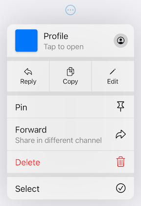
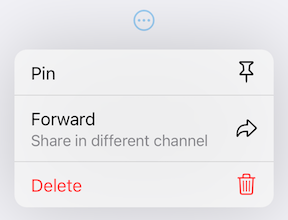
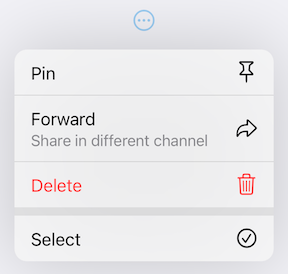
एक फ्लटर पैकेज जो iOS 14 के ड्रॉप-डाउन बटन UI कंपोनेंट की प्रतिलिपि बनाता है, ऐप इंटरफेस के लिए कस्टमाइज़ करने योग्य ड्रॉपडाउन शैली के बटन प्रदान करता है। यह उपयोगकर्ताओं को बटन से नीचे खींचकर विकल्प या क्रियाएँ दिखाने की अनुमति देता है, जिससे iOS डिज़ाइन पैटर्न के साथ इंटरैक्शन सुविधा में सुधार होता है। इस पैकेज को कई प्लेटफॉर्मों के लिए समर्थन मिलता है और इसके लिए बहुत व्यापक कस्टमाइज़ेशन उपलब्ध है।
उपयोग
iOS-शैली के ड्रॉप-डाउन मेनू का कार्यान्वयन
Flutter ऐप्स में कस्टम ड्रॉपडाउन बनाना
हस्तगत नियंत्रण के साथ उपयोगकर्ता अंतरक्रिया में सुधार
क्रॉस-प्लेटफॉर्म ऐप्स में प्लेटफॉर्म-विशिष्ट UI तत्व जोड़ना
स्पष्ट क्रिया चयनकर्ता डिज़ाइन करना
मुख्य विशेषताएँ
iOS 14-प्रेरित ड्रॉप-डाउन एनीमेशन
बहुत कस्टमाइज़ेबल दिखावट और व्यवहार
सभी प्रमुख Flutter प्लेटफॉर्म के लिए समर्थन
गति-आधारित इंटरैक्शन
विस्तार्य विजेट संरचना
इनके लिए उपयुक्त
iOS डिज़ाइन सुसंगतता का लक्ष्य विकासकर्ता
हस्तगत ड्रॉपडाउन की आवश्यकता वाले ऐप्स
मूल जैसे घटकों की आवश्यकता वाले प्लेटफॉर्म-स्थिर एप्लिकेशन
आधुनिक Flutter विजेट्स की तलाश में UI डिजाइनर
विचार योग्य बातें
हस्त नियंत्रण के समझ की आवश्यकता है
गैर-iOS प्लेटफॉर्म के लिए अतिरिक्त स्टाइलिंग की आवश्यकता हो सकती है
सीमित ड्रॉप-डाउन इंटरैक्शन पैटर्न
जटिल मेनू पदानुक्रम के लिए उपयुक्त नहीं
स्थान सीमित वातावरणों में सबसे अच्छा उपयोग किया जाता है
मूल README
संबंधित सोर्स रिपॉज़िटरी के मूल README का स्नैपशॉट। नवीनतम सामग्री के लिए रिपॉज़िटरी देखें।
Pull-Down Button from iOS 14-18 for Flutter
[!CAUTION]
This package is discontinued and will no longer receive any updates. Replacement is available in Flutter since stable version 3.44 - CupertinoMenuAnchor
pull_down_button is an attempt to bring
Pop-Up and
Pull-Down
Buttons from iOS 14-18 to Flutter with some additional customisation options.
This package only tries to visually replicate the native counterpart, some parts might be somewhat different.
[!IMPORTANT]
This package is no longer actively maintained and will most likely be deprecated and unlisted some time after Flutter finally supports iOS menus out of the box to give some time for migration. You can follow the progress here - #60298.
One of the core features of this package is an extensive customizability, which, most likely, will not be present in Flutter's pull-down menus. If there won't be any plans to add customizability to Flutter's menus, but there will be a big interest in it, this package might migrate most of the code to use Flutter's more advanced implementation with customisation options present right now. You can post your feedback on this topic here.
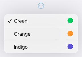
PullDownMenuItem.selectable uses all of PullDownMenuItem properties as well as a boolean value selected, to indicate whether the menu item is selected or not.
PullDownMenuActionsRow
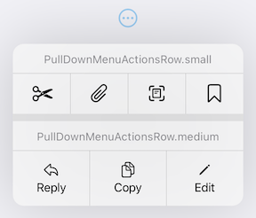
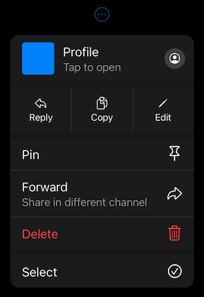
PullDownMenuActionsRow is a widget used to create cupertino-style pull-down menu row of actions
(small or medium size).
PullDownMenuItem is used to populate PullDownMenuActionsRow.items.
Depending on PullDownMenuActionsRows size, PullDownMenuItem might be either icon only or icon and title in a vertical array.
Properties
Description
items
List of PullDownMenuItem.
PullDownMenuDivider
PullDownMenuDivider.large is a widget used to create cupertino-style pull-down menu large divider.
There is no need in adding PullDownMenuDivider by hand, pull-down menu does it automatically!
PullDownMenuTitle
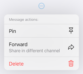
PullDownMenuTitle is a widget used to create cupertino-style pull-down menu title (usually at the top of menu).
An alternative way of displaying pull-down menu via a function call.
onPressed: () async {
/* get tap position and / or do something before opening menu */awaitshowPullDownMenu(
context: context,
items: [...],
position: position,
);
}
Properties table
Properties
Description
context
For looking up Navigator for the menu.
items
List of PullDownMenuEntry widgets.
position
The Rect is used to align the top of the menu with the top of the position rectangle.
itemsOrder
Whether the popup menu orders its items from itemBuilder in a downward or upwards way.
menuOffset
Additional offset for the pull-down menu if the menu's desired position.
scrollController
A custom menu scroll controller.
onCanceled
Called when the user dismisses the pull-down menu.
routeTheme
The theme of the pull-down menu box.
useRootNavigator
Whether to use the root navigator to show the pull-down menu.
routeSettings
Optional route settings for the pull-down menu.
PullDownMenu
Another alternative way of displaying the pull-down menu as a simple widget, with no animations or adding routes to the navigation stack.
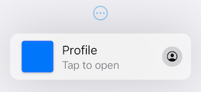
This package also provides additional customization. By default, the iOS 16 theme is used, but it is also possible to override defaults with widget properties (see above) or with PullDownButtonTheme theme extension.
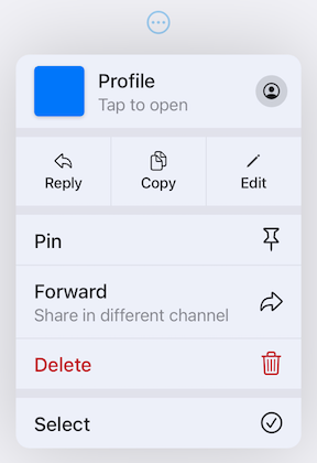
Light Theme
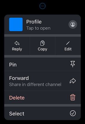
Dark Theme
PullDownButtonTheme
To use PullDownButtonTheme define it in your ThemeData as follows:
PullDownButtonTheme uses a set of sub-themes (for items, dividers, the menu itself, etc.) to define the needed theme. See below for every property each sub-theme provides.
backgroundColor usually has opacity in the range of 0.7-0.8 so that menu has a blur effect.
If backgroundColor is fully opaque (opacity set to 1), no blur effect will be applied.
PullDownMenuItemTheme
Properties
Description
destructiveColor
Color for destructive action.
checkmark
Checkmark icon.
textStyle
PullDownMenuItem text style.
subtitleStyle
PullDownMenuItem subtitle text style.
iconActionTextStyle
PullDownMenuItem text style inside of PullDownMenuActionsRow.
onHoverBackgroundColor
On hover color of PullDownMenuItem.
onPressedBackgroundColor
On pressed color of PullDownMenuItem.
onHoverTextColor
On hover color of text of PullDownMenuItem.
PullDownMenuDividerTheme
Properties
Description
dividerColor
Small divider color.
largeDividerColor
Large divider color.
largeDividerColor is usually lighter than dividerColor.
PullDownMenuTitleTheme
Properties
Description
style
PullDownMenuTitle text style.
PullDownButtonInheritedTheme
If defining PullDownButtonTheme in ThemeData is not possible, for example, if you are using CupertinoApp, you can use PullDownButtonInheritedTheme:
Here is an example of using PullDownButtonTheme with Material 3 color scheme colors
(generated from CupertinoColors.systemBlue with ColorScheme.fromSeed) from Material 3 Menu specs.
Custom Material 3 light theme
Custom Material 3 dark theme
Contributions
Feel free to contribute to this project.
Please file feature requests and bugs at the issue tracker.
If you fixed a bug or implemented a feature by yourself, feel free to send a pull request.