सार्वजनिक जानकारी से बना चयन मार्गदर्शन। केवल संदर्भ हेतु।
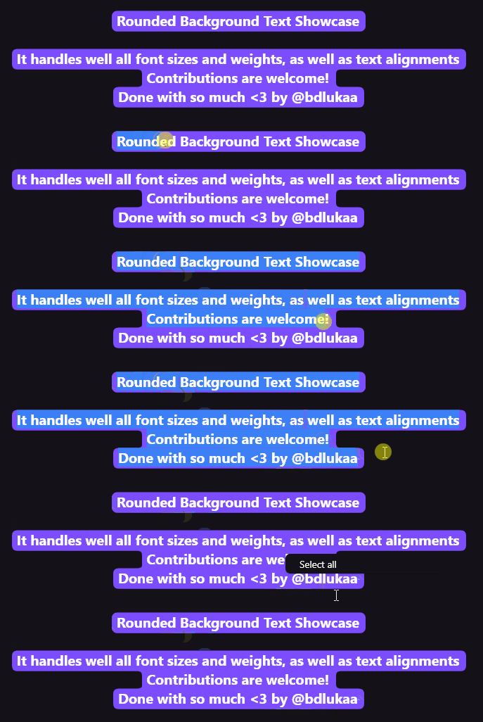
एक फ्लटर पैकेज जो टेक्स्ट तत्वों, जिनमें टेक्स्ट, टेक्स्टफील्ड और टेक्स्टस्पैन शामिल हैं, के लिए राउंड कोन बैकग्राउंड जोड़ता है। यह कस्टमाइज़ेबल रंग, बॉर्डर रेडियस और पैडिंग के साथ दृश्य रूप से आकर्षक टेक्स्ट हाइलाइटिंग की अनुमति देता है। टेक्स्ट पठनीयता और डिज़ाइन चमक के लिए ज़ोर देने वाले आधुनिक UI बनाने के लिए आदर्श है। पैकेज सभी मुख्य प्लेटफॉर्म—एंड्रॉइड, आईओएस, वेब, मैकओएस, विंडोज़ और लिनक्स—का समर्थन करता है, जिससे उपकरणों के बीच स्थिर स्टाइलिंग सुनिश्चित होती है। एकल pub add कमांड के माध्यम से सरल एकीकरण विकासकर्ताओं के लिए उपलब्ध है जो जटिल कस्टम पेंटिंग के बिना शानदार टेक्स्ट प्रभाव चाहते हैं।
उपयोग
एप्प में महत्वपूर्ण पाठ को हाइलाइट करना
स्टाइल्ड इनपुट फ़ील्ड्स बनाना
लेबल्स को विजुअल जोर देना
आधुनिक UI घटकों का डिज़ाइन करना
विरोधाभास के माध्यम से पहुँच को बढ़ाना
इंटरैक्टिव पाठ तत्वों का निर्माण
मुख्य विशेषताएँ
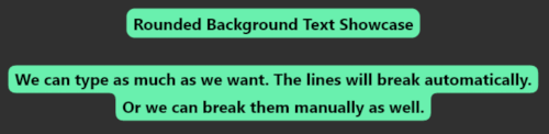
टेक्स्ट के लिए गोल कोने वाला बैकग्राउंड
गोल किनारे वाले पृष्ठभूमि के साथ TextField का समर्थन
कस्टमाइज़ किए गए सीमा त्रिज्या और पैडिंग
TextSpan के साथ अनुकूलित
क्रॉस-प्लेटफ़ॉर्म समर्थन
pub.dev के माध्यम से आसान एकीकरण
इनके लिए उपयुक्त
दृश्य सुंदरता की तलाश में UI डिजाइनर
आधुनिक Flutter ऐप बनाने वाले विकासकर्ता
उच्च रेखांकित पाठ तत्वों की आवश्यकता वाले ऐप
प्राप्ति और पठनीयता पर केंद्रित परियोजनाएँ
त्वरित प्रभाव के अनुकूलन की आवश्यकता वाली टीमें
विचार योग्य बातें
बहुत सारे उदाहरणों के साथ प्रदर्शन प्रभावित हो सकता है
प्राप्ति के लिए रंग के विपरीतता का ध्यान देना आवश्यक है
पाठ सजावट के उपयोग मामलों तक सीमित
जटिल लेआउट के लिए उपयुक्त नहीं
प्लेटफॉर्म रेंडरिंग सुसंगतता पर निर्भर करता है
दृश्य अव्यवस्था से बचने के लिए इसका सीमित उपयोग करें
मूल README
संबंधित सोर्स रिपॉज़िटरी के मूल README का स्नैपशॉट। नवीनतम सामग्री के लिए रिपॉज़िटरी देखें।
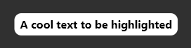
RoundedBackgroundText(
'A cool text to be highlighted',
style: constTextStyle(fontWeight: FontWeight.bold),
backgroundColor: Colors.white,
),
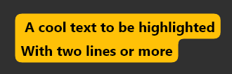
Multiline text is also supported
RoundedBackgroundText(
'A cool text to be highlighted\nWith two lines or more',
style: constTextStyle(fontWeight: FontWeight.bold),
backgroundColor: Colors.amber,
),
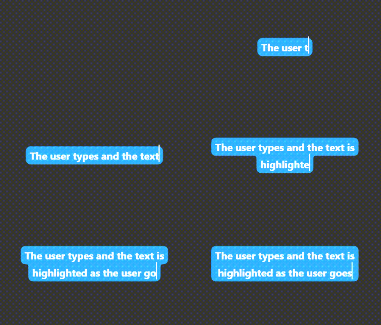
The text highlight will follow the text field scroll position.
Highlight a text span:
Highlight a small part of a text
RichText(
text: TextSpan(
text: 'Start your text and ',
children: [
RoundedBackgroundTextSpan(
text: 'highlight something',
backgroundColor: Colors.blue,
),
constTextSpan(text: ' when necessary'),
],
),
),
Select a highlighted text:
Use RoundedBackgroundText.selectable to make the text selectable:
RoundedBackgroundText.selectable(
'A cool highlighted text to be selected',
style: constTextStyle(fontWeight: FontWeight.bold),
backgroundColor: Colors.white,
),
You may like to know:
Change the corner radius
You can change the radius of the corners by setting innerRadius and outerRadius:
RoundedBackgroundText(
'A cool text to be highlighted',
style: constTextStyle(fontWeight: FontWeight.bold),
backgroundColor: Colors.white,
innerRadius: 15.0,
outerRadius: 10.0,
),
The max allowed value is 20.0. The min is 0.0
Deep dive
This section explains, with details, how the background painting works.
RoundedBackgroundText doesn't use a Text widget under the hood. Instead, it uses a custom text painter to paint the text above the background. As soon as the RoundedBackgroundText widget is initialized, the line metrics for the text is calculated (See computeLineMetrics), and is recalculated when the text changes or when the parent width changes. This is done at built time, resulting in a smooth experience for the user.
To paint the background, the line metrics generated before is used. Each line has 4 properties:
x - where the line starts horizontally within the size
y - where the line starts vertically within the size
width - the horizontal size of the line
height - the vertical size of the line
With these values, we can generate the background for each line. The background is generated around the whole text: from top-left to bottom-left to bottom-right to top-right to top-left. This makes it easy to calculate when there is a corner, either outer or inner.
The inner and outer radius are dynamically calculated based on the line height, provided by the line metrics, and the given innerRadius and outerRadius, respectively. By default, innerRadius is 10.0 and outerRadius is 10.0. For safety, in order to keep the roundnesses correct, these values must be in the bounds of 0.0 (min) and 20.0 max, otherwise the painting would be out the line.