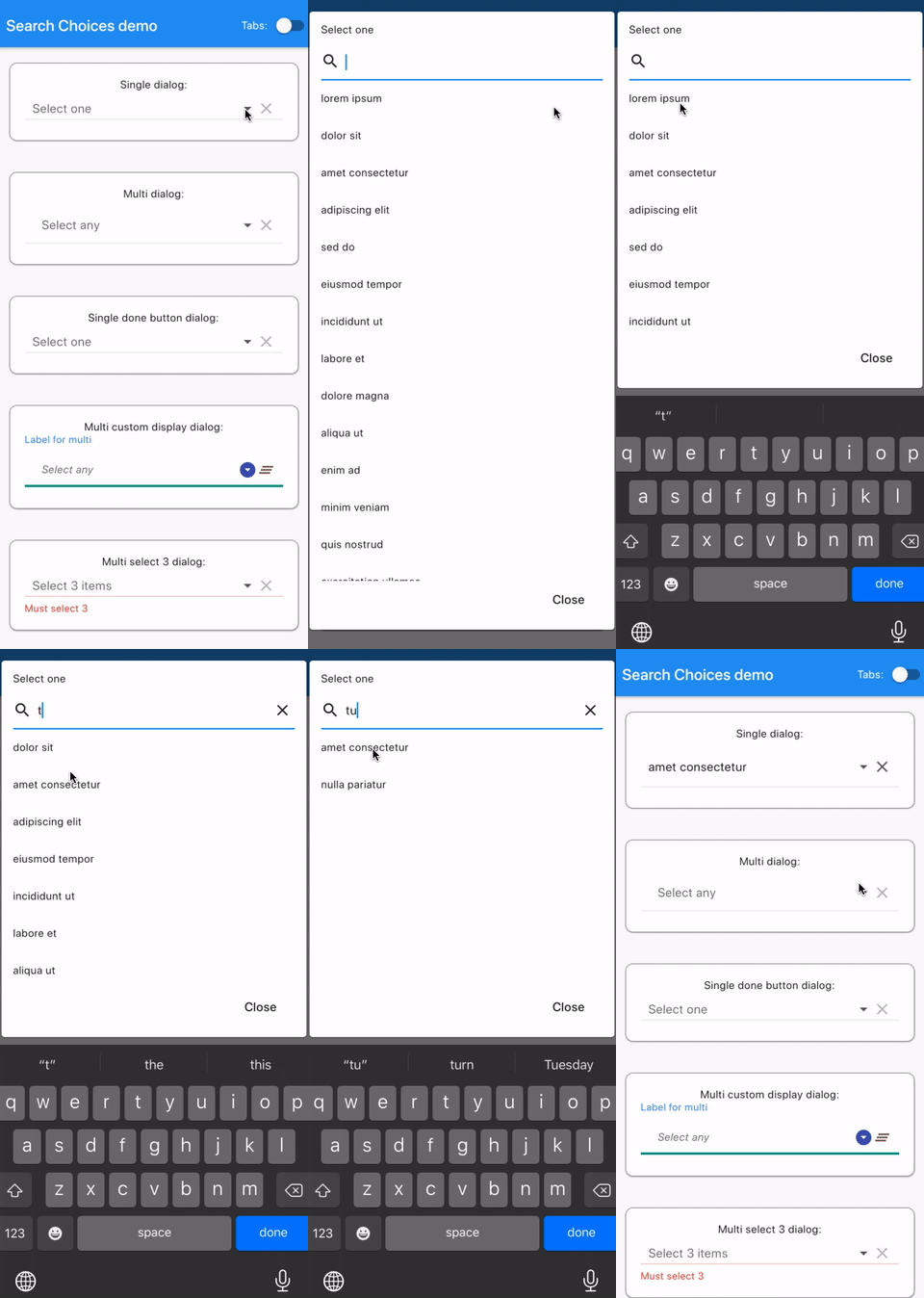
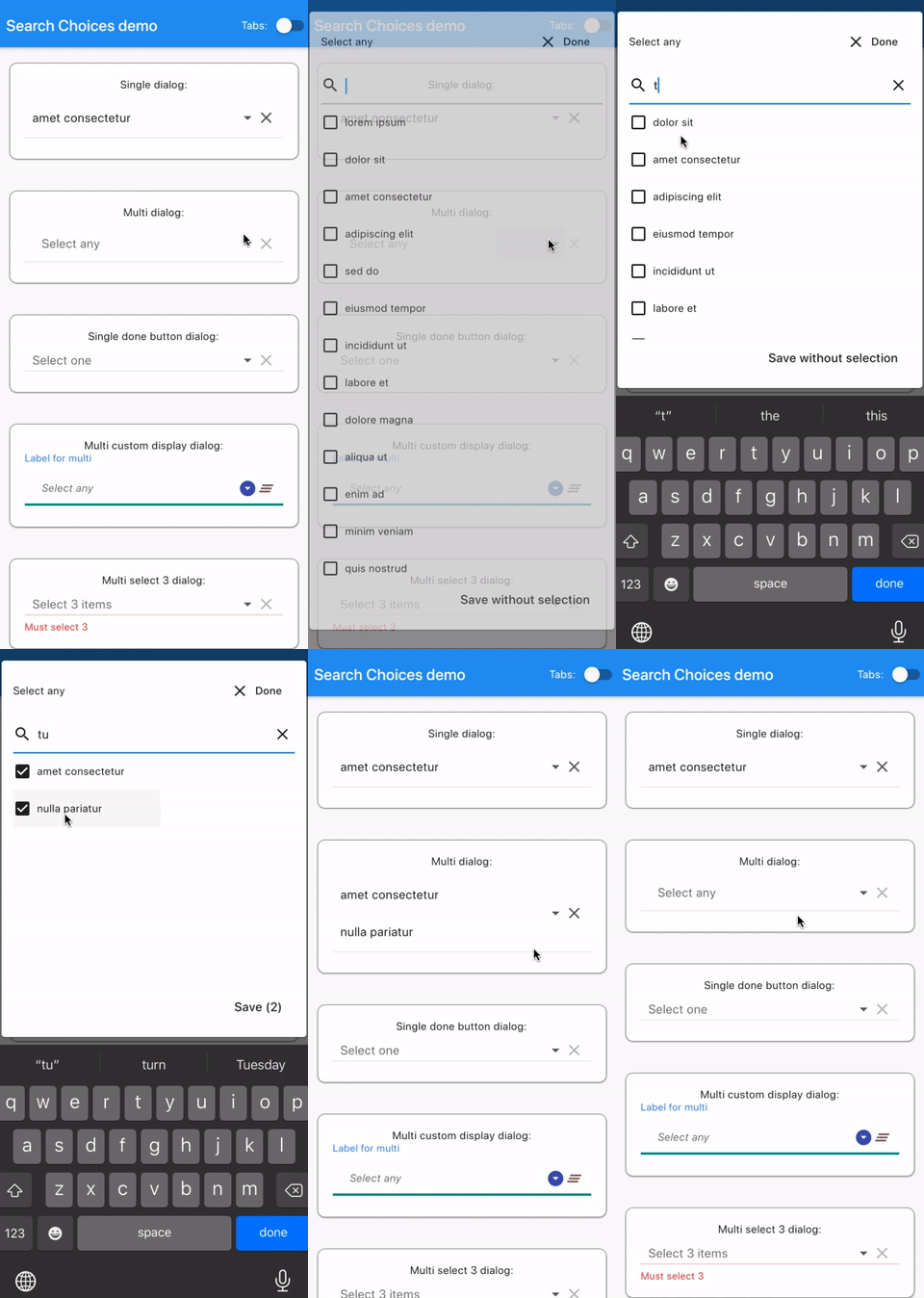
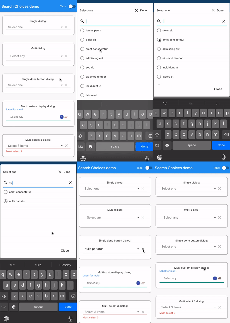
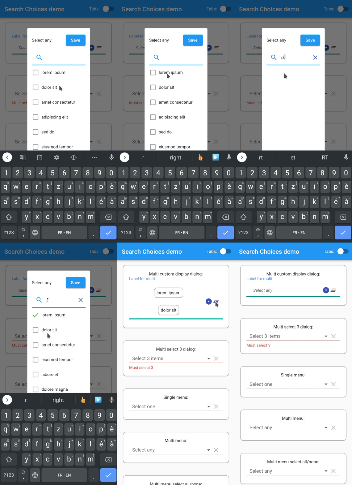
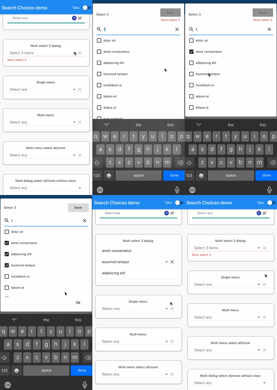
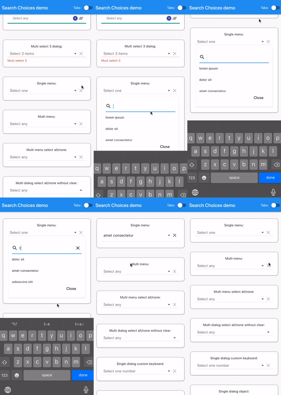
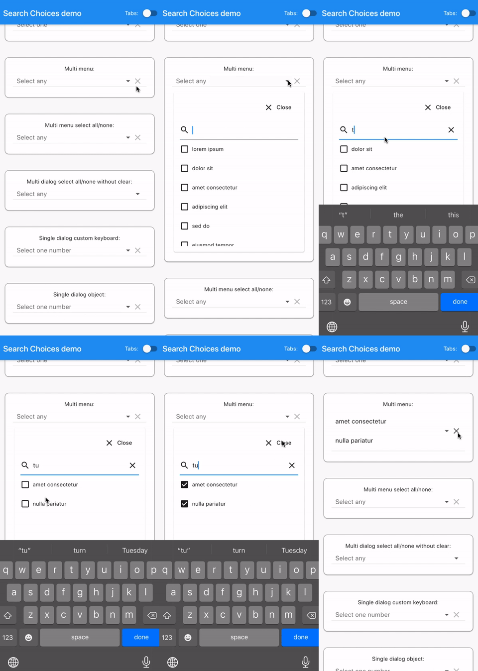
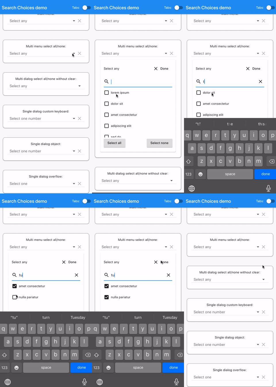
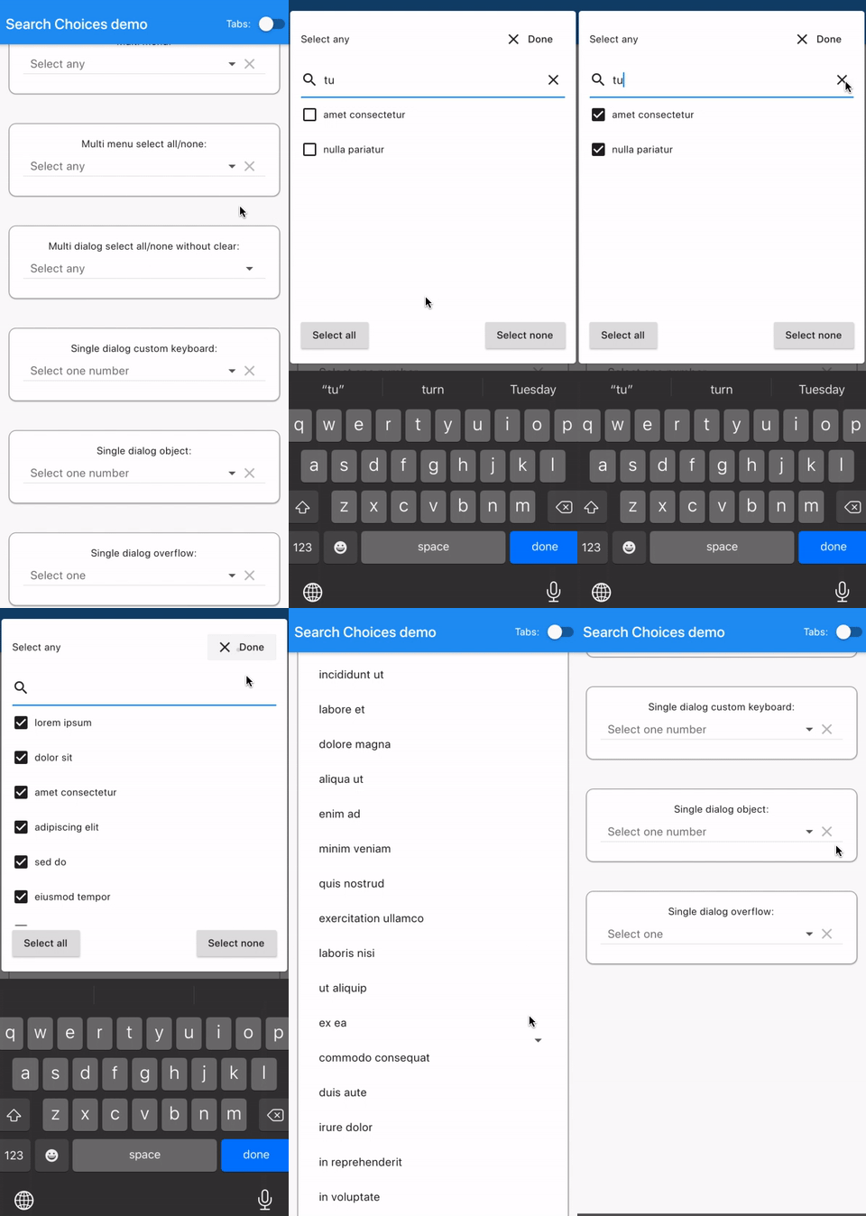
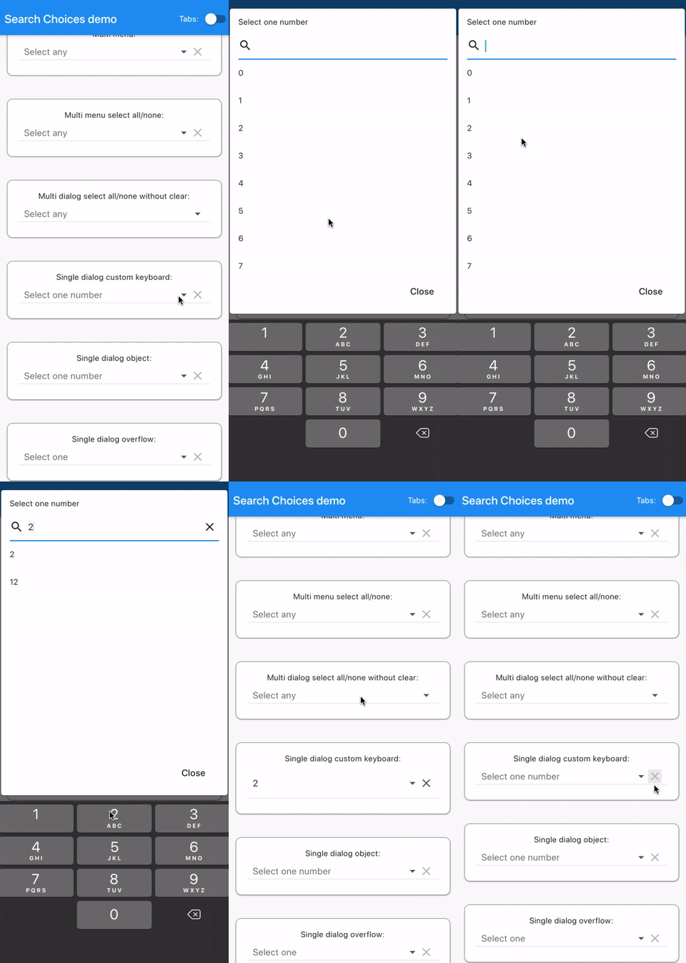
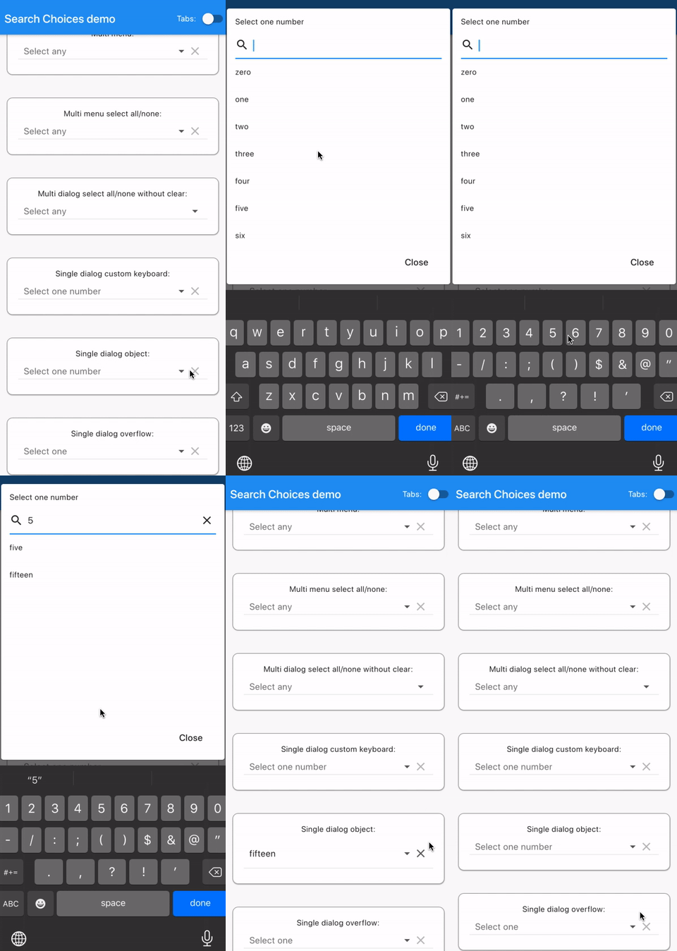
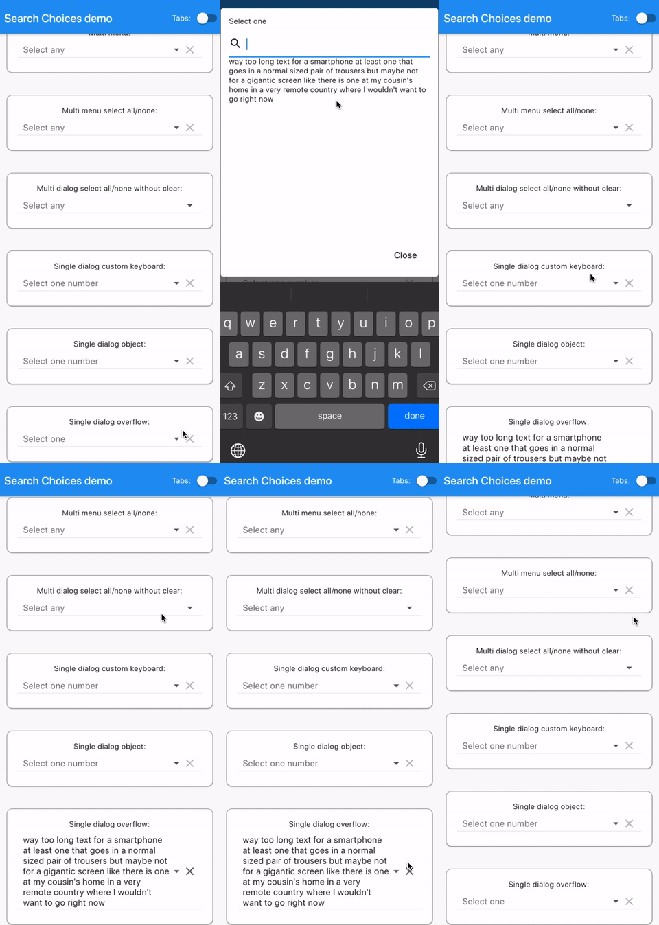
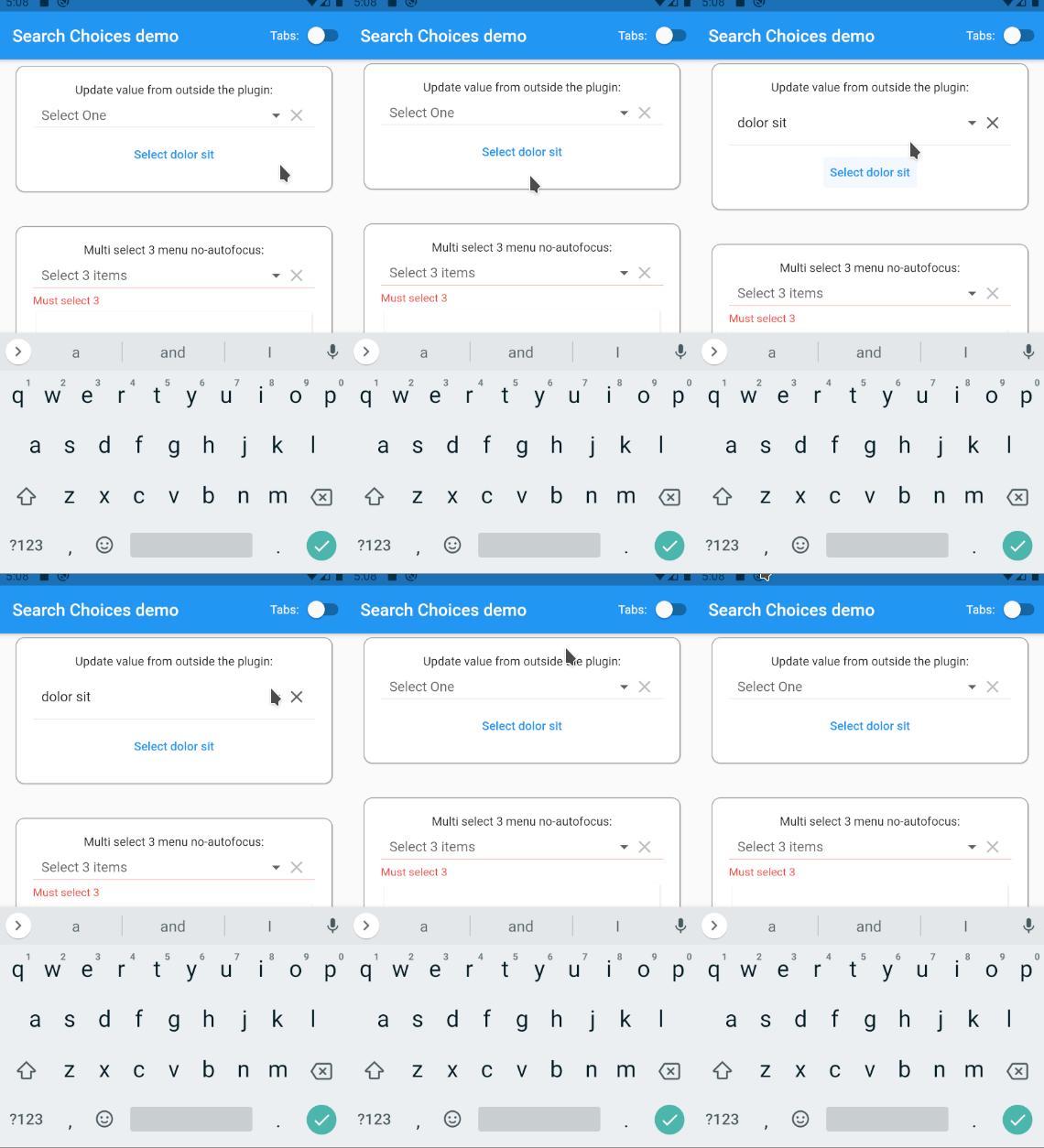
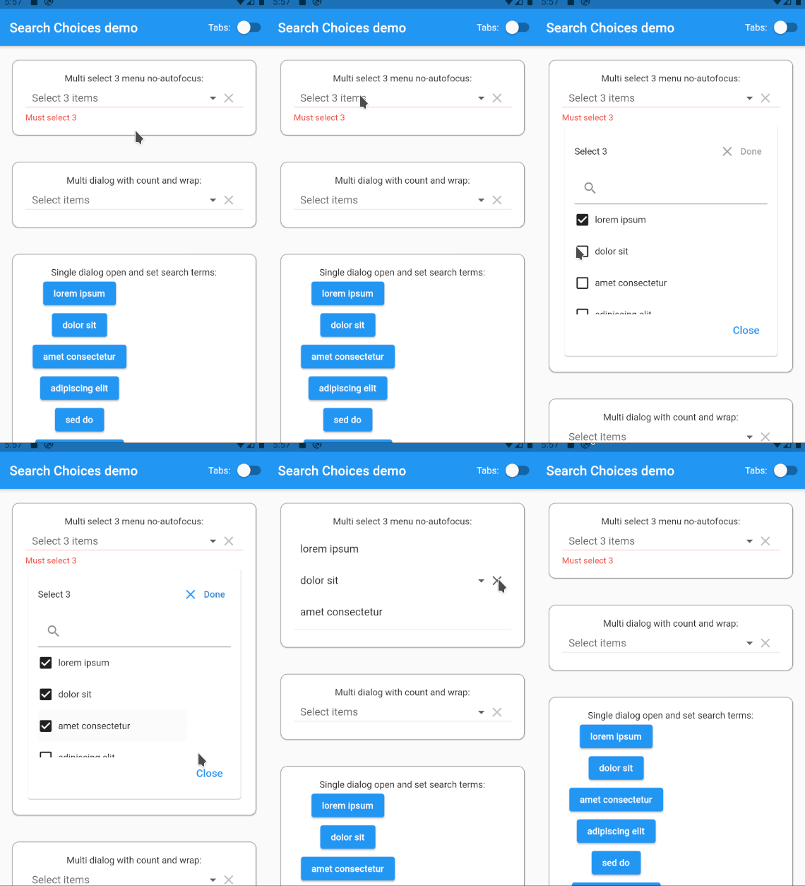
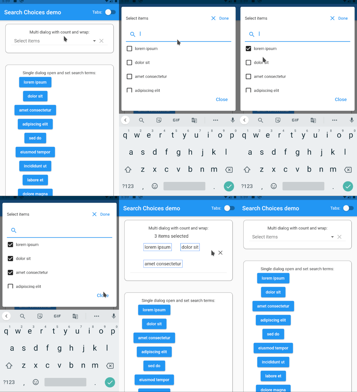
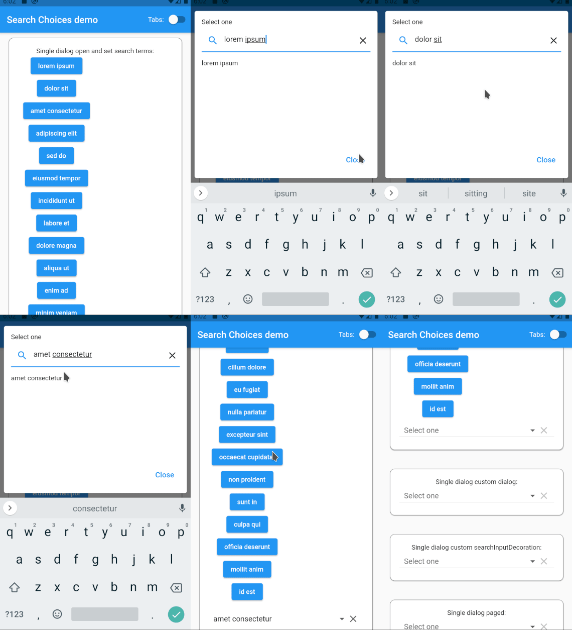
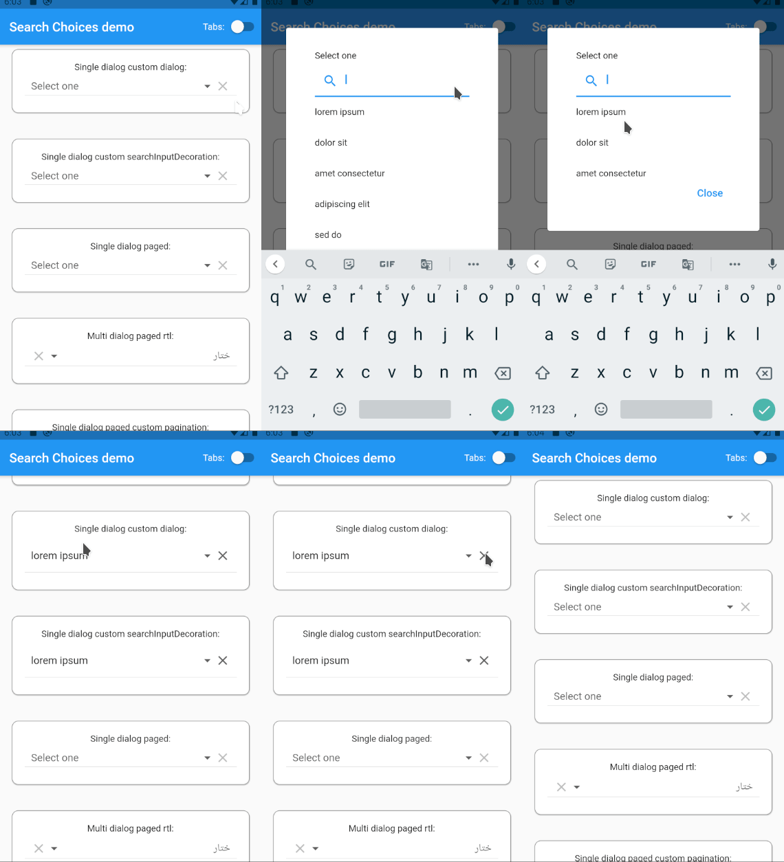
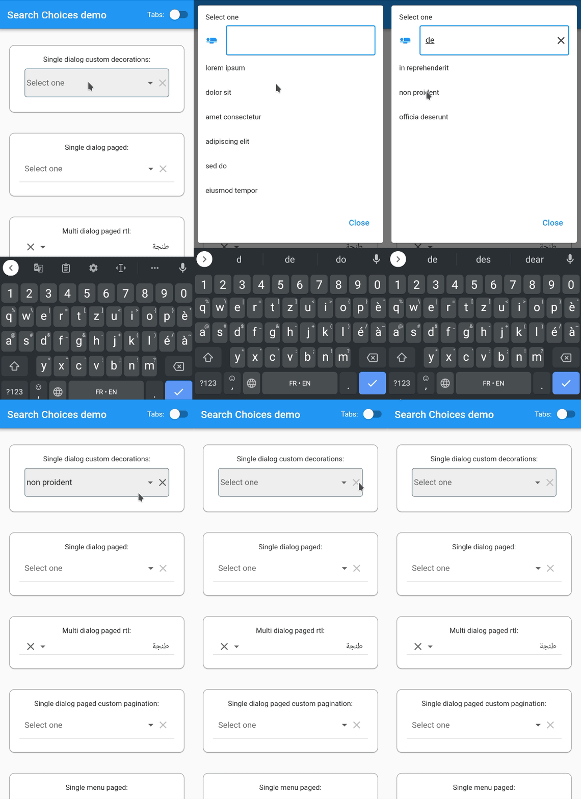
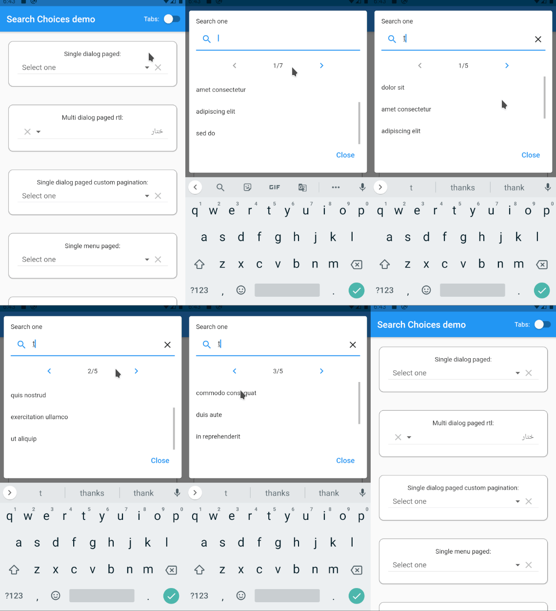
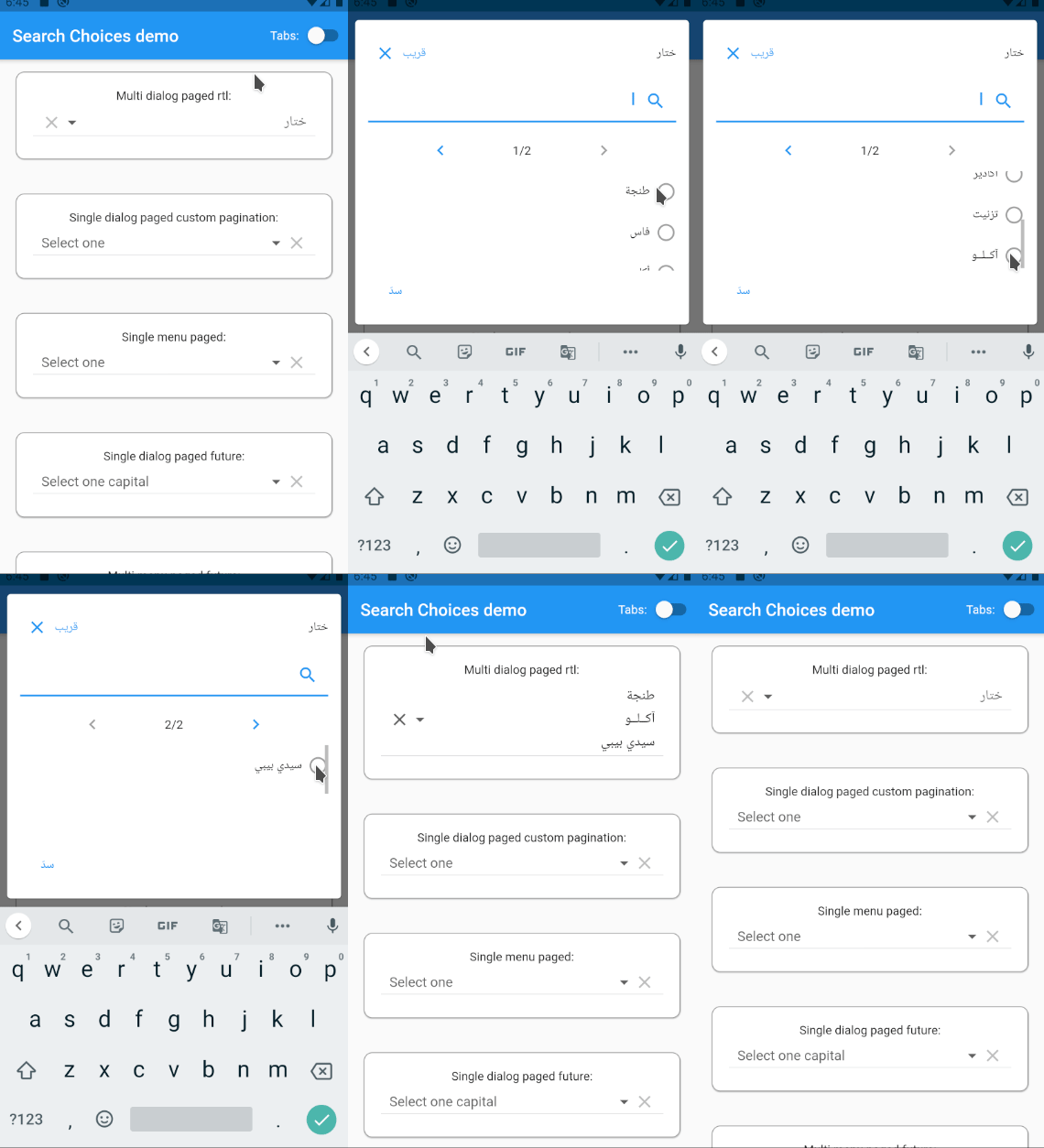
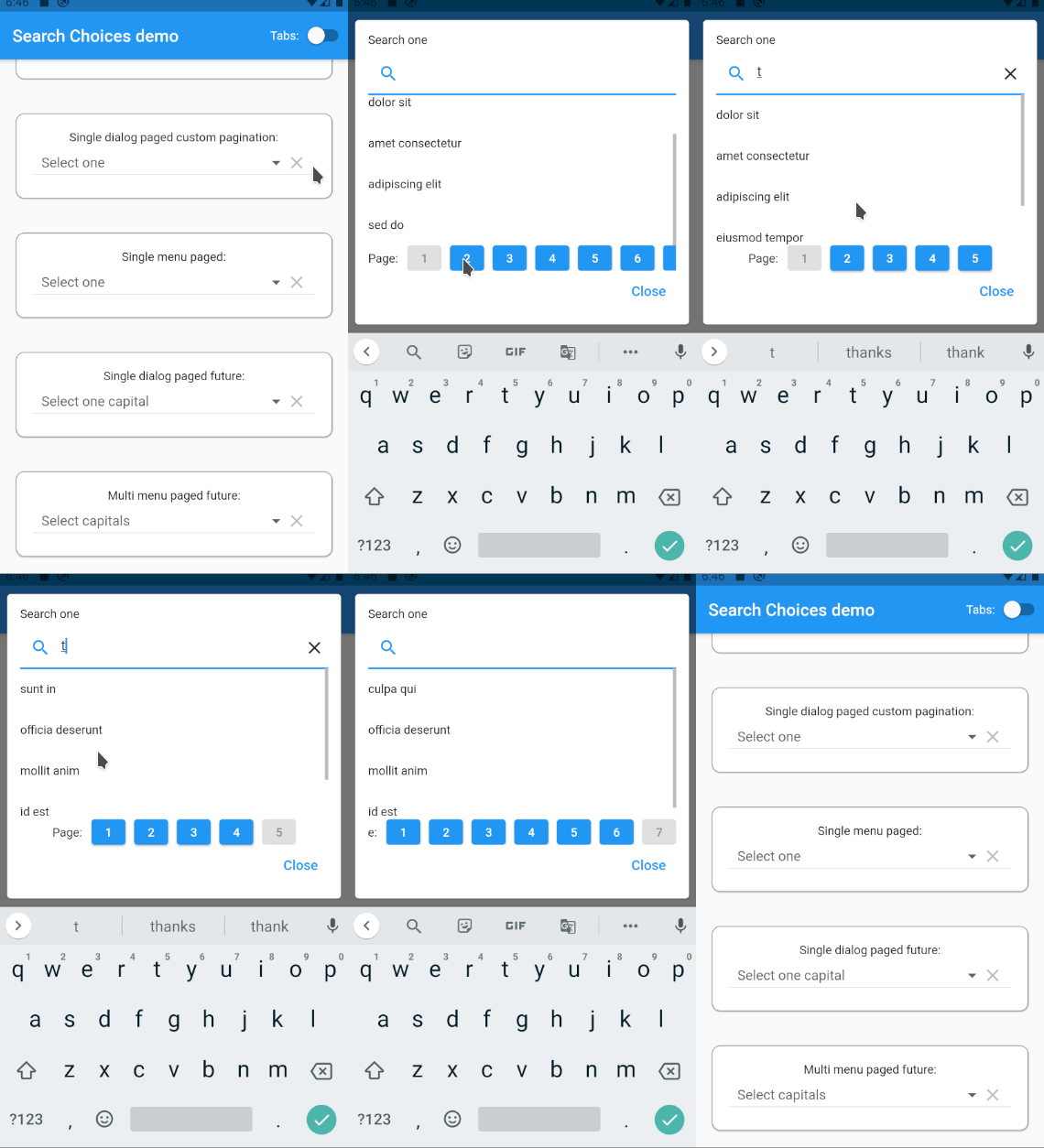
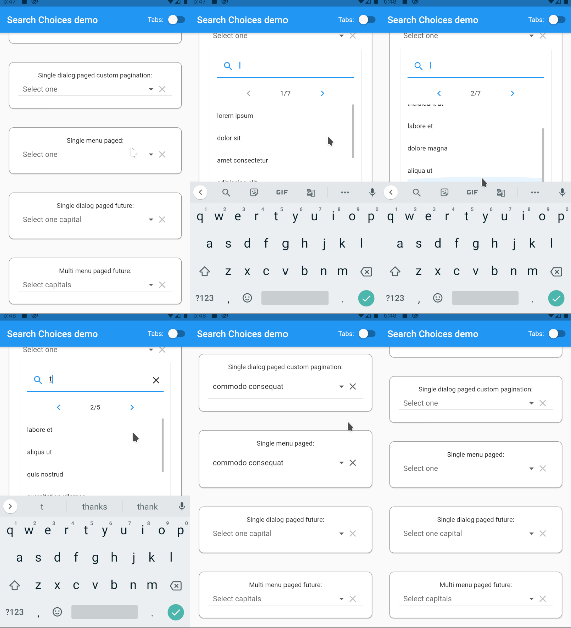
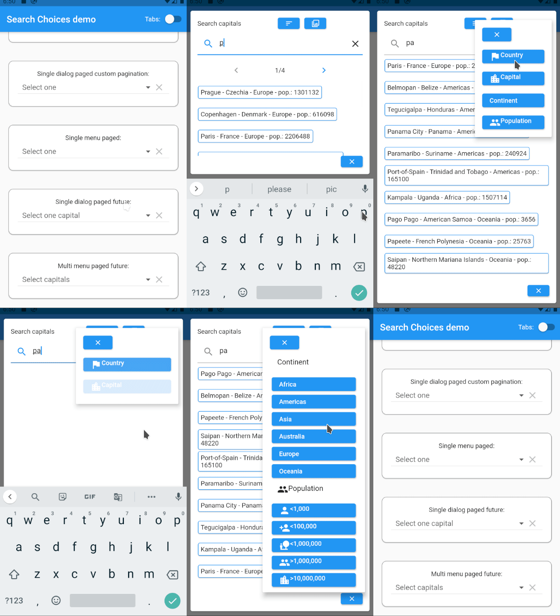
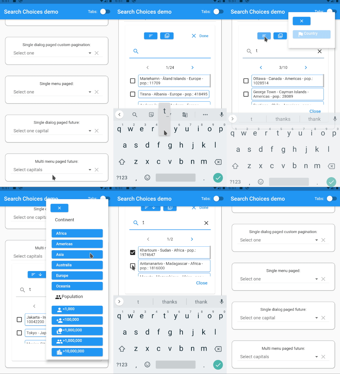
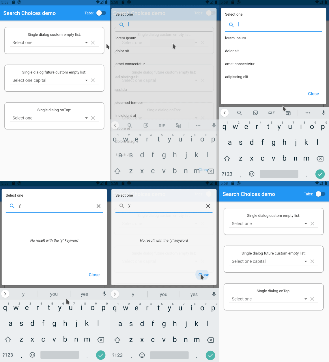
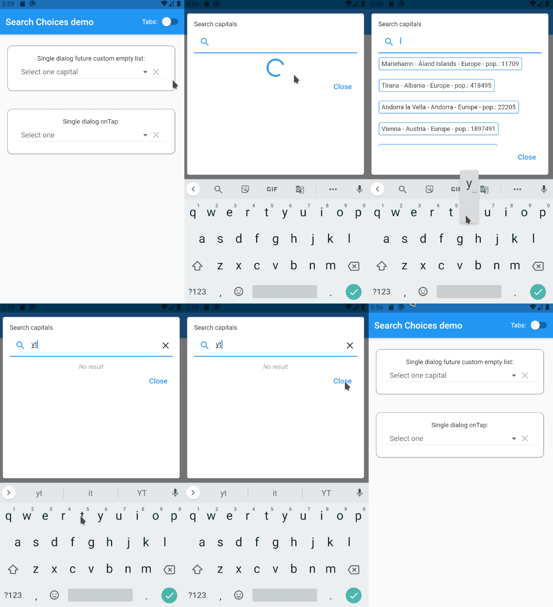
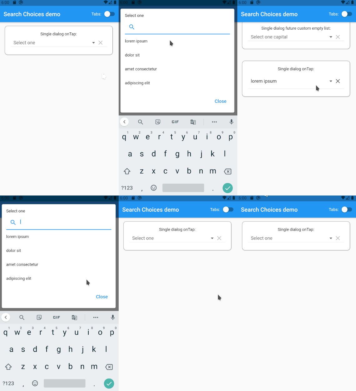
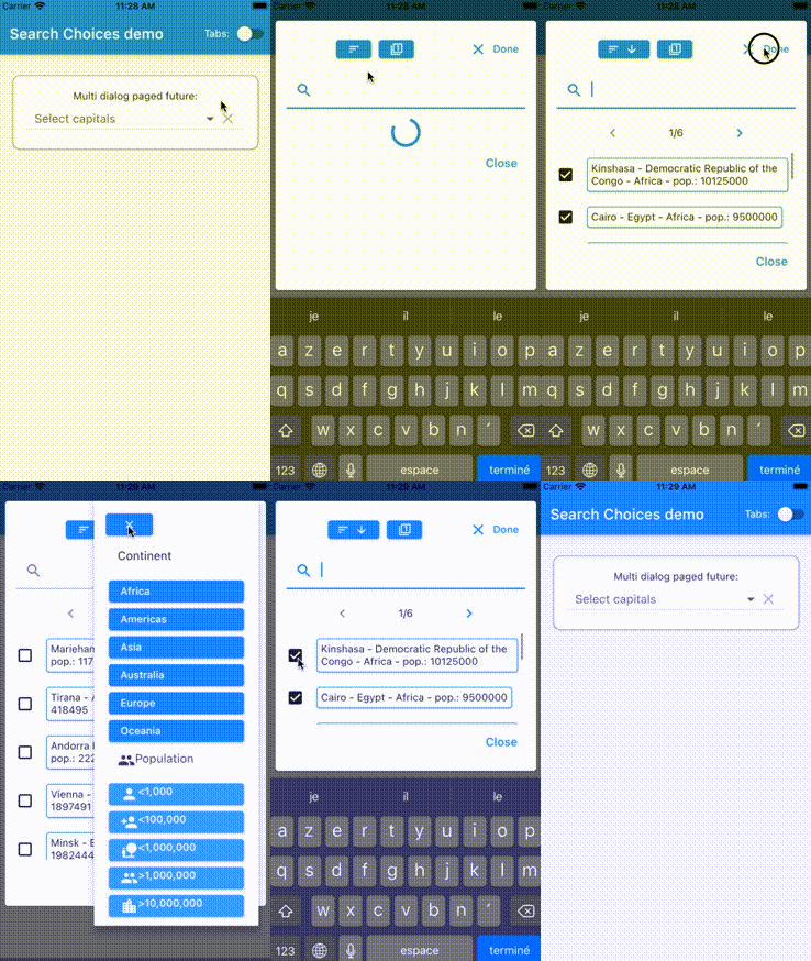
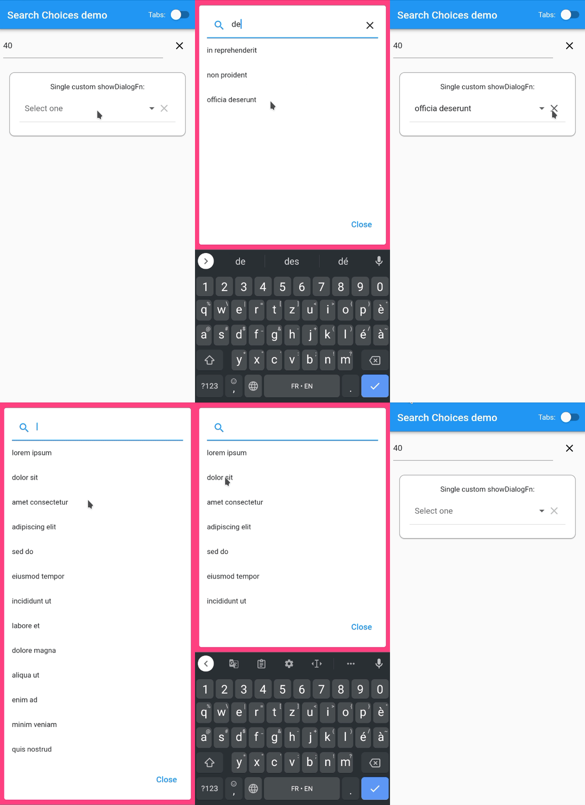
एक डायलॉग बॉक्स या मेनू में एक या अधिक विकल्पों की सूची के माध्यम से खोजने के लिए उच्चतर रूप से कस्टमाइज़ किया गया विजेट। पेजिंग, भविष्य/एपीआई/वेबसर्विस खोज और वर्णक्रम और फ़िल्टर का समर्थन करता है।
सार्वजनिक जानकारी से बना चयन मार्गदर्शन। केवल संदर्भ हेतु।
एक उच्चतर अनुकूलनीय Flutter विजेट जो डायलॉग बॉक्स या मेनू में सिंगल या मल्टीपल चॉइस सूचियों के माध्यम से खोज को सक्षम बनाने के लिए डिज़ाइन किया गया है। यह futures, APIs या वेब सेवाओं के माध्यम से डायनामिक डेटा लोडिंग का समर्थन करता है, स्वचालित पेजिंग, सॉर्टिंग और फ़िल्टरिंग क्षमता के साथ। बड़े डेटासेट से प्रभावी और उपयोगकर्ता-अनुकूल चयन की आवश्यकता वाले एप्लिकेशन के लिए आदर्श है। यह विजेट सभी प्रमुख प्लेटफॉर्म जैसे Android, iOS, Web, macOS, Windows और Linux में संगत है, जिससे सभी जगह समान व्यवहार सुनिश्चित होता है। इसका लचीला डिज़ाइन विकासकर्ताओं को ऐप-विशिष्ट आवश्यकताओं के अनुसार UI और इंटरैक्शन पैटर्न को ढालने की अनुमति देता है।
उपयोग
फॉर्म में बड़े डेटासेट को खोजना
API एकीकरण के साथ डायनामिक ड्रॉपडाउन का कार्यान्वयन
खोजयोग्य बहु-चयन मेनू बनाएं
छाने गए डेटा दृश्य के साथ प्रशासन पैनल बनाना
मोबाइल और वेब ऐप्स में रियल-टाइम सर्च जोड़ना
मुख्य विशेषताएँ
एकल और बहुचयन समर्थित है
निर्मित पृष्ठांकन और अनंत स्क्रॉल
futures और APIs के माध्यम से डायनामिक डेटा लोडिंग
सॉर्टिंग और फ़िल्टरिंग विकल्प
कस्टमाइज़ किए गए UI और थीम
क्रॉस-प्लेटफॉर्म संगतता
इनके लिए उपयुक्त
जटिल फॉर्म बना रहे विकासकर्ता
सर्च करने योग्य ड्रॉपडाउन वाले ऐप्स
बड़े डेटा सेट वाले प्रोजेक्ट्स
क्रॉस-प्लेटफ़ॉर्म फ्लटर एप्लिकेशन्स
यूआई-भारी प्रशासन डैशबोर्ड
विचार योग्य बातें
असिंक्रोनस डेटा स्रोत के साथ सावधानीपूर्वक निपटना आवश्यक है
जटिल लेआउट के लिए कस्टम स्टाइलिंग की आवश्यकता हो सकती है
प्रदर्शन डेटा के आकार और नेटवर्क की गति पर निर्भर करता है
प्रारंभिक सेटअप में एसिंक पैटर्न की समझ की आवश्यकता हो सकती है
पृष्ठांतरण के बिना अत्यधिक बड़े डेटासेट के लिए अनअनुकूलित
मूल README
संबंधित सोर्स रिपॉज़िटरी के मूल README का स्नैपशॉट। नवीनतम सामग्री के लिए रिपॉज़िटरी देखें।
search_choices
Highly customizable Widget to search through a single or multiple choices list in a dialog box or a menu. Supports pagination and future/network/API/webservice searches with sort and filter. Each release is thoroughly tested through automated integrated testing with Flutster.
Platforms
This widget has been successfully tested on iOS, Android, Linux and Chrome. It is expected to work fine on MacOS and Windows.
items with child: Widget displayed ; value: any object with .toString() used to match search keyword.
onChanged Function with parameter: value not returning executed after the selection is done.
value value to be preselected.
style used for the hint if it is given is String.
searchHint String|Widget|Function with no parameter returning String|Widget displayed at the top of the search dialog box.
hint String|Widget|Function with no parameter returning String|Widget displayed before any value is selected or after the selection is cleared.
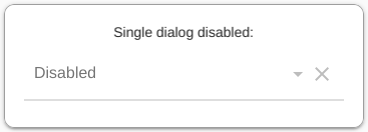
disabledHint String|Widget|Function with no parameter returning String|Widget displayed instead of hint when the widget is displayed.
icon String|Widget|Function with parameter: value returning String|Widget displayed next to the selected item or the hint if none.
underline String|Widget|Function with parameter: value returning String|Widget displayed below the selected item or the hint if none.
doneButton String|Widget|Function with parameter: value returning String|Widget displayed at the top of the search dialog box.
label String|Widget|Function with parameter: value returning String|Widget displayed above the selected item or the hint if none.
closeButton String|Widget|Function with parameter: value returning String|Widget displayed at the bottom of the search dialog box.
displayClearIcon whether or not to display an icon to clear the selected value.
clearIcon Icon to be used for clearing the selected value.
iconEnabledColor Color to be used for enabled icons.
iconDisabledColor Color to be used for disabled icons.
iconSize for the icons next to the selected value (icon and clearIcon).
isExpanded can be necessary to avoid pixel overflows (zebra symptom).
isCaseSensitiveSearch only used when searchFn is not specified.
searchFn Function with parameters: keyword, items returning List as the list of indexes for the items to be displayed.
onClear Function with no parameter not returning executed when the clear icon is tapped.
selectedValueWidgetFn Function with parameter: item returning Widget to be used to display the selected value.
keyboardType used for the search.
validator Function with parameter: value returning String displayed below selected value when not valid and null when valid.
displayItem Function with parameters: item, selected returning Widget to be displayed in the search list.
dialogBox whether the search should be displayed as a dialog box or as a menu below the selected value if any.
menuConstraints BoxConstraints used to define the zone where to display the search menu. Example: BoxConstraints.tight(Size.fromHeight(250)) . Not to be used for dialogBox = true.
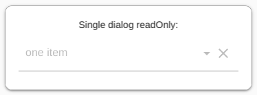
readOnly bool whether to let the user choose the value to select or just present the selected value if any.
menuBackgroundColor Color background color of the menu whether in dialog box or menu mode.
rightToLeft bool mirrors the widgets display for right to left languages defaulted to app.
autofocus bool automatically focuses on the search field bringing up the keyboard defaulted to true.
selectedAggregateWidgetFn Function with parameter: list of widgets presenting selected values, returning Widget to be displayed to present the selected items.
padding double or EdgeInsets sets the padding around the DropdownButton, defaulted to 10.0.
setOpenDialog Function sets the function to call to set the function to call in order to open the dialog with the search terms string as a parameter, defaulted to null.
buildDropDownDialog Function controls the layout of the dropdown dialog.
dropDownDialogPadding EdgeInsets sets the padding between the screen and the dialog.
searchInputDecoration InputDecoration sets the search bar decoration.
itemsPerPage int if set, organizes the search list per page with the given number of items displayed per page.
currentPage PointerThisPlease of an int if itemsPerPage is set, holds the page number for the search items to be displayed.
customPaginationDisplay Widget Function(Widget listWidget, int totalFilteredItemsNb, Function updateSearchPage) if itemsPerPage is set, customizes the display and the handling of the pagination on the search list.
futureSearchFn Function used to search items from the network. Must return items (up to itemsPerPage if set). Must return an int with the total number of results (allows the handling of pagination).
futureSearchOrderOptions Map when futureSearchFn is set, can be used to display search order options specified in the form {"order1Name":{"icon":order1IconWidget,"asc":true},}. Please refer to the documentation example: https://github.com/lcuis/search_choices/blob/master/example/lib/main.dart.
futureSearchFilterOptions Map when futureSearchFn is set, can be used to display search filters specified in the form {"filter1Name":{"icon":filter1IconWidget,"values":["value1",{"value2":filter1Value2Widget}}}. Please refer to the documentation example: https://github.com/lcuis/search_choices/blob/master/example/lib/main.dart.
emptyListWidget String|Widget|Function with parameter: keyword returning String|Widget displayed instead of the list of items in case it is empty.
onTap Function called when the user clicks on the Widget before it opens the dialog or the menu. Note that this is not called in case the Widget is disabled.
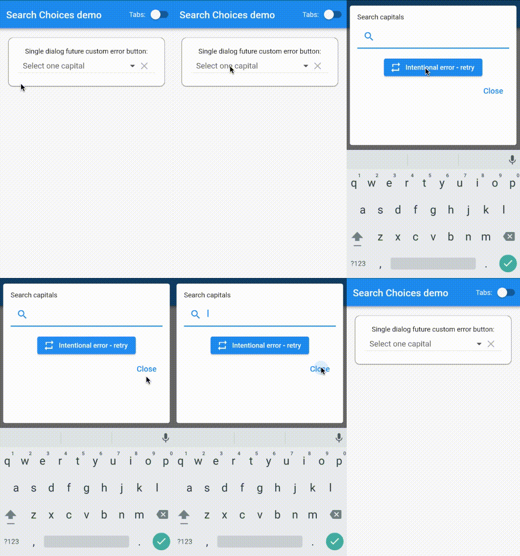
futureSearchRetryButton Function called to customize the Error - retry button displayed when there is an issue with the future search.
searchDelay int in milliseconds applied before the search is initiated. This applies to future and non-future searches.
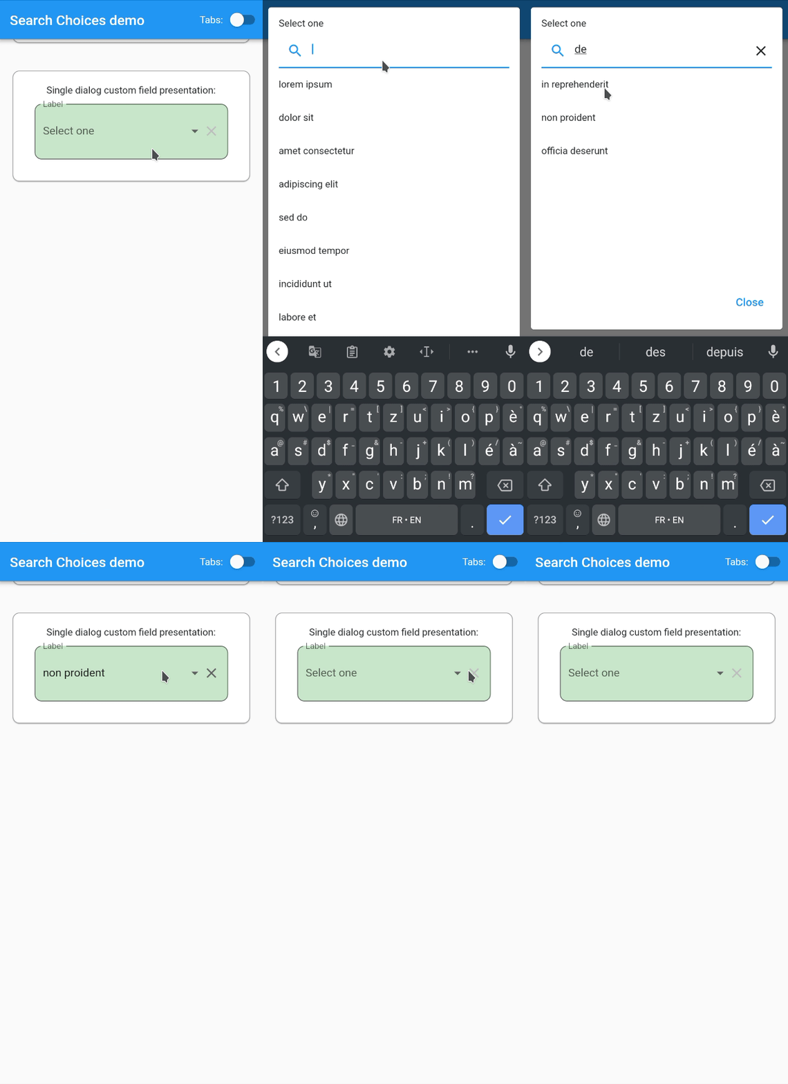
fieldPresentationFn Function returning a Widget to customize the display of the field.
fieldDecoration Decoration is the decoration of the SearchChoices Widget while displaying the hints or the selected values. Should differ when selection is not valid.
clearSearchIcon Widget sets the icon to be used to clear the search.
showDialogFn Function allows the control of the dialog display.
onSaved as in FormField.
autovalidateMode as in FormField.
restorationId as in FormField.
giveMeThePop Function to pass the pop function so that the menu or dialog can be closed from outside the widget.
buildFutureFilterOrOrderButton Function to customize the order and filter button in case of future search. Where:
** filter is true if building filter button and false while building order button.
** nbFilters is set to the number of filters applied if any.
** orderAsc true when the applied order is ascending.
** orderBy is the string by which the search is sorted.
searchResultDisplayFn to customize the display of the search result items within the dialog or menu.
Multiple choice constructor
Search choices Widget with a multiple choice that opens a dialog or a menu to let the user do the selection conveniently with a search.
items with child: Widget displayed ; value: any object with .toString() used to match search keyword.
onChanged Function with parameter: selectedItems not returning executed after the selection is done.
selectedItems indexes of items to be preselected.
style used for the hint if it is given is String.
searchHint String|Widget|Function with no parameter returning String|Widget displayed at the top of the search dialog box.
hint String|Widget|Function with no parameter returning String|Widget displayed before any value is selected or after the selection is cleared.
disabledHint String|Widget|Function with no parameter returning String|Widget displayed instead of hint when the widget is displayed.
icon String|Widget|Function with parameter: selectedItems returning String|Widget displayed next to the selected items or the hint if none.
underline String|Widget|Function with parameter: selectedItems returning String|Widget displayed below the selected items or the hint if none.
doneButton String|Widget|Function with parameter: selectedItems returning String|Widget displayed at the top of the search dialog box. Cannot be null in multiple selection mode.
label String|Widget|Function with parameter: selectedItems returning String|Widget displayed above the selected items or the hint if none.
closeButton String|Widget|Function with parameter: selectedItems returning String|Widget displayed at the bottom of the search dialog box.
displayClearIcon whether or not to display an icon to clear the selected values.
clearIcon Icon to be used for clearing the selected values.
iconEnabledColor Color to be used for enabled icons.
iconDisabledColor Color to be used for disabled icons.
iconSize for the icons next to the selected values (icon and clearIcon).
isExpanded can be necessary to avoid pixel overflows (zebra symptom).
isCaseSensitiveSearch only used when searchFn is not specified.
searchFn Function with parameters: keyword, items returning List as the list of indexes for the items to be displayed.
onClear Function with no parameter not returning executed when the clear icon is tapped.
selectedValueWidgetFn Function with parameter: item returning Widget to be used to display the selected values.
keyboardType used for the search.
validator Function with parameter: selectedItems returning String displayed below selected values when not valid and null when valid.
displayItem Function with parameters: item, selected returning Widget to be displayed in the search list.
dialogBox whether the search should be displayed as a dialog box or as a menu below the selected values if any.
menuConstraints BoxConstraints used to define the zone where to display the search menu. Example: BoxConstraints.tight(Size.fromHeight(250)) . Not to be used for dialogBox = true.
readOnly bool whether to let the user choose the value to select or just present the selected value if any.
menuBackgroundColor Color background color of the menu whether in dialog box or menu mode.
rightToLeft bool mirrors the widgets display for right to left languages defaulted to app.
autofocus bool automatically focuses on the search field bringing up the keyboard defaulted to true.
selectedAggregateWidgetFn Function with parameter: list of widgets presenting selected values, returning Widget to be displayed to present the selected items.
padding double or EdgeInsets sets the padding around the DropdownButton, defaulted to 10.0.
setOpenDialog Function sets the function to call to set the function to call in order to open the dialog with the search terms string as a parameter, defaulted to null.
buildDropDownDialog Function controls the layout of the dropdown dialog.
dropDownDialogPadding EdgeInsets sets the padding between the screen and the dialog.
searchInputDecoration InputDecoration sets the search bar decoration.
itemsPerPage int if set, organizes the search list per page with the given number of items displayed per page.
currentPage PointerThisPlease if itemsPerPage is set, holds the page number for the search items to be displayed.
customPaginationDisplay Widget Function(Widget listWidget, int totalFilteredItemsNb, Function updateSearchPage) if itemsPerPage is set, customizes the display and the handling of the pagination on the search list.
futureSearchFn Future Function(String keyword, List itemsListToClearAndFill, int pageNb) used to search items from the network. Must return items (up to itemsPerPage if set). Must return an int with the total number of results (allows the handling of pagination).
futureSearchOrderOptions Map<String, Map<String,dynamic>> when futureSearchFn is set, can be used to display search order options specified in the form {"order1Name":{"icon":order1IconWidget,"asc":true},}. Please refer to the documentation example: https://github.com/lcuis/search_choices/blob/master/example/lib/main.dart.
futureSearchFilterOptions Map<String, Map<String, Object>> when futureSearchFn is set, can be used to display search filters specified in the form {"filter1Name":{"icon":filter1IconWidget,"values":["value1",{"value2":filter1Value2Widget}}}. Please refer to the documentation example: https://github.com/lcuis/search_choices/blob/master/example/lib/main.dart.
futureSelectedValues List contains the list of selected values in case of future search in multiple selection mode.
emptyListWidget String|Widget|Function with parameter: keyword returning String|Widget displayed instead of the list of items in case it is empty.
onTap Function called when the user clicks on the Widget before it opens the dialog or the menu. Note that this is not called in case the Widget is disabled.
futureSearchRetryButton Function called to customize the Error - retry button displayed when there is an issue with the future search.
searchDelay int in milliseconds applied before the search is initiated. This applies to future and non-future searches.
fieldPresentationFn Function returning a Widget to customize the display of the field.
fieldDecoration Decoration is the decoration of the SearchChoices Widget while displaying the hints or the selected values. Should differ when selection is not valid.
clearSearchIcon Widget sets the icon to be used to clear the search.
showDialogFn Function allows the control of the dialog display.
onSaved as in FormField.
listValidator Function with parameter: List returning String displayed below selected value when not valid and null when valid.
autovalidateMode as in FormField.
restorationId as in FormField.
giveMeThePop Function to pass the pop function so that the menu or dialog can be closed from outside the widget.
buildFutureFilterOrOrderButton Function to customize the order and filter button in case of future search. Where:
** filter is true if building filter button and false while building order button.
** nbFilters is set to the number of filters applied if any.
** orderAsc true when the applied order is ascending.
** orderBy is the string by which the search is sorted.
searchResultDisplayFn to customize the display of the search result items within the dialog or menu.
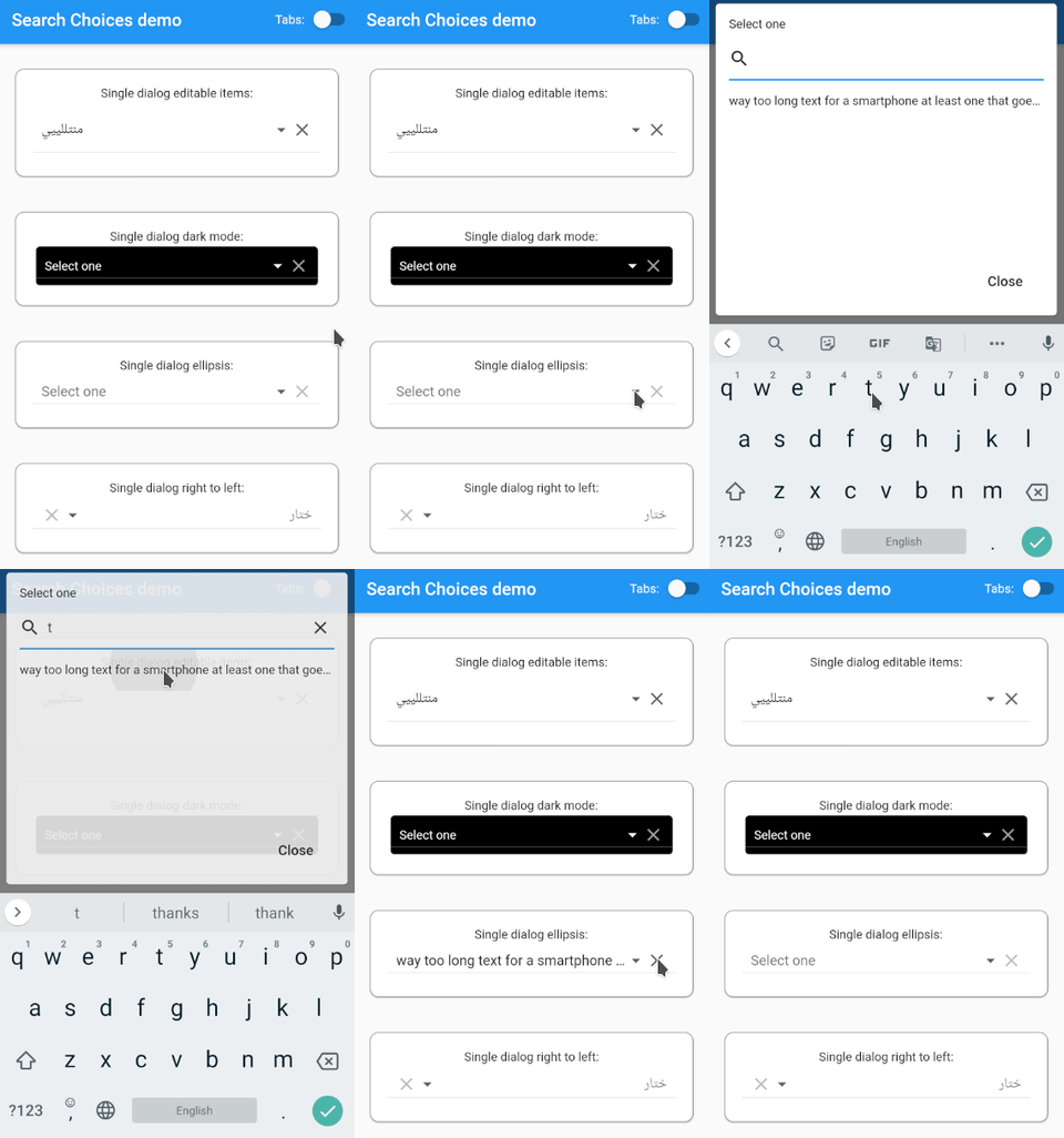
SearchChoices.single(
        items: [
          DropdownMenuItem(
            child: Text(
                "way too long text for a smartphone at least one that goes in a normal sized pair of trousers but maybe not for a gigantic screen like there is one at my cousin's home in a very remote country where I wouldn't want to go right now"),
            value:
                "way too long text for a smartphone at least one that goes in a normal sized pair of trousers but maybe not for a gigantic screen like there is one at my cousin's home in a very remote country where I wouldn't want to go right now",
          )
        ],
        value: selectedValueSingleDialogOverflow,
        hint: "Select one",
        searchHint: "Select one",
        onChanged: (value) {
          setState(() {
            selectedValueSingleDialogOverflow = value;
          });
        },
        dialogBox: true,
        isExpanded: true,
      )
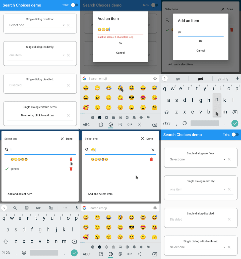
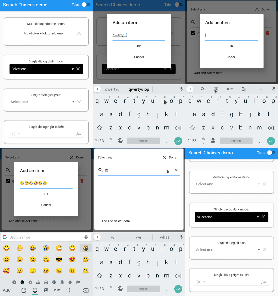
This example lets the user add and remove items to and from the list of choices within a dialog. One can limit the number of items that can be added (100 here).
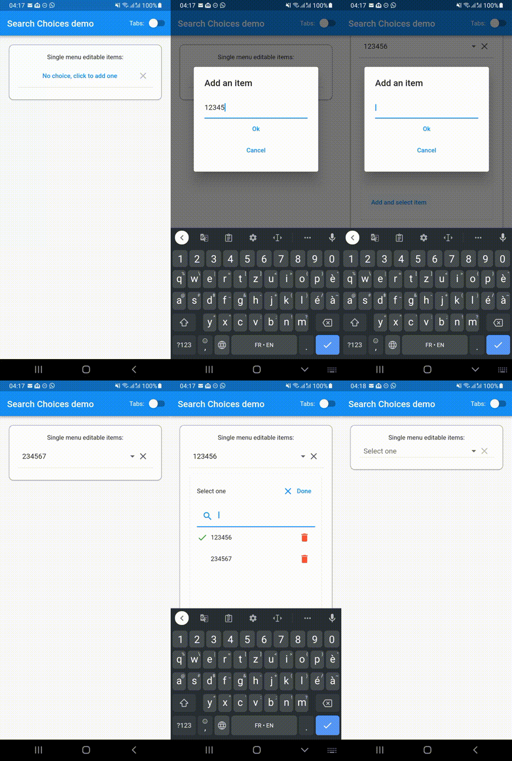
This example lets the user add and remove items to and from the list of choices within a menu. One can limit the number of items that can be added (100 here).
SearchChoices.single(
items: [
DropdownMenuItem(
child: Text(
"way too long text for a smartphone at least one that goes in a normal sized pair of trousers but maybe not for a gigantic screen like there is one at my cousin's home in a very remote country where I wouldn't want to go right now",
overflow: TextOverflow.ellipsis,
),
value:
"way too long text for a smartphone at least one that goes in a normal sized pair of trousers but maybe not for a gigantic screen like there is one at my cousin's home in a very remote country where I wouldn't want to go right now",
)
],
value: selectedValueSingleDialogEllipsis,
hint: "Select one",
searchHint: "Select one",
onChanged: (value) {
setState(() {
selectedValueSingleDialogEllipsis = value;
});
},
selectedValueWidgetFn: (item) {
returnDropdownMenuItem(
child: (Text(
item,
overflow: TextOverflow.ellipsis,
)),
);
},
dialogBox: true,
isExpanded: true,
)
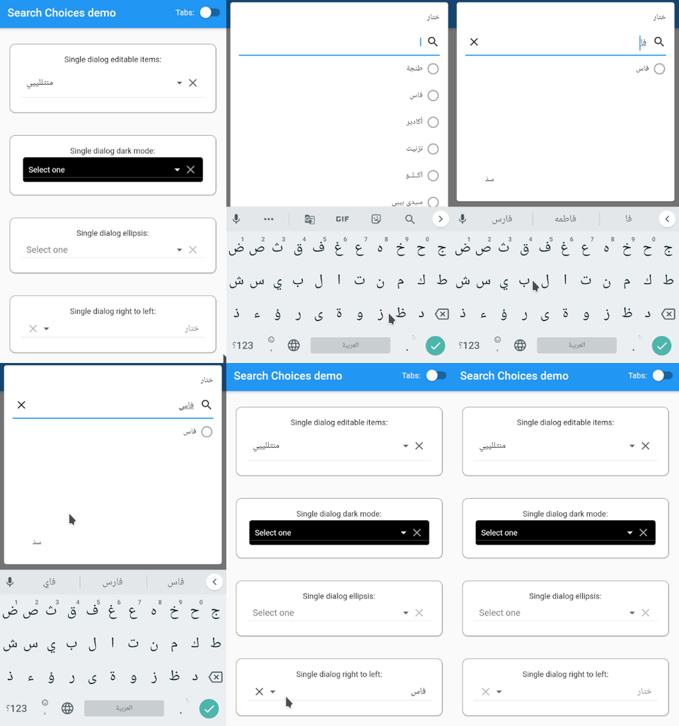
Single dialog right to left
In support for Arabic, Hebrew and other RTL languages.
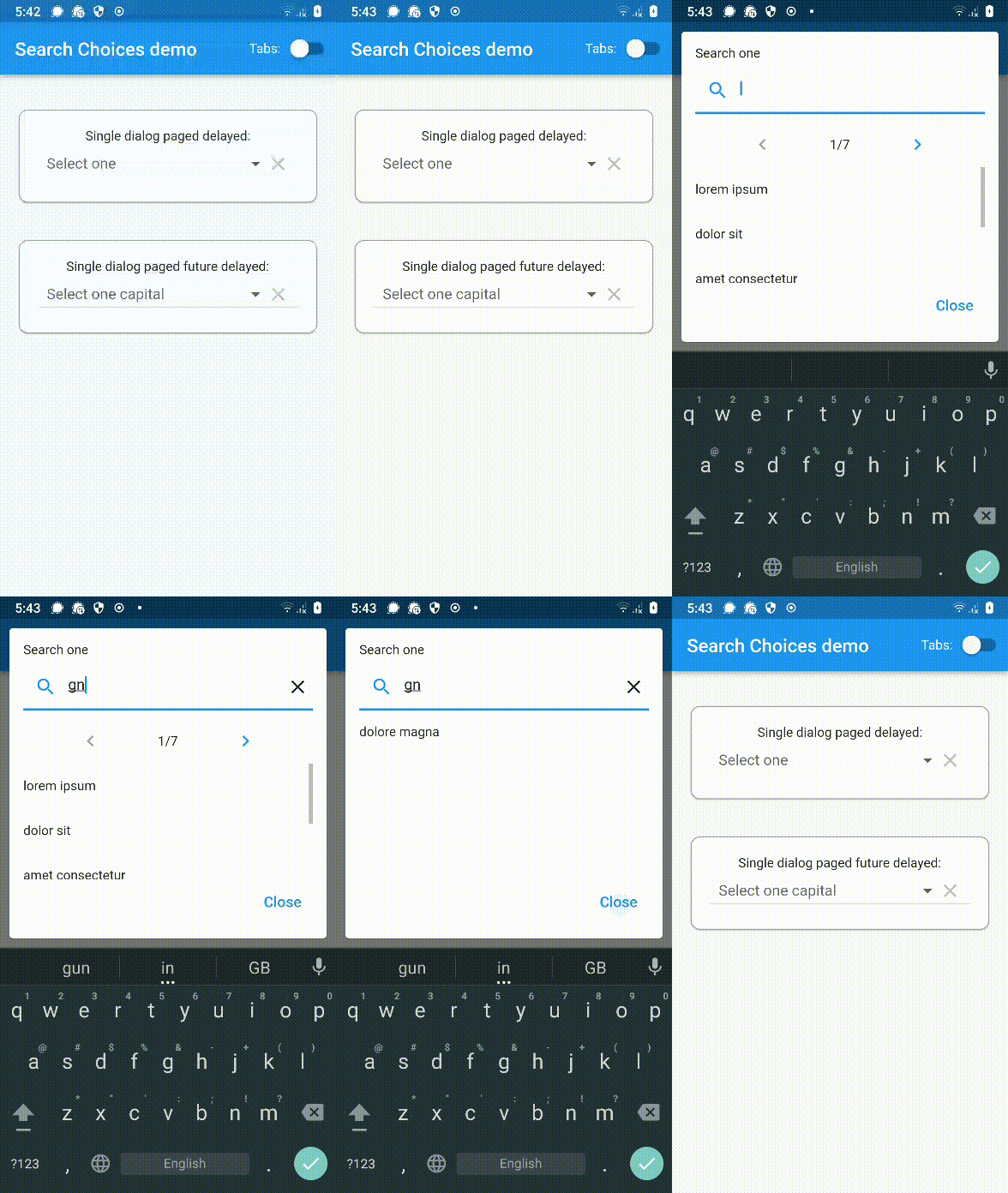
Custom pagination can let the user choose which page to display instead of having next and previous buttons. Useful when displaying a huge amount of items.
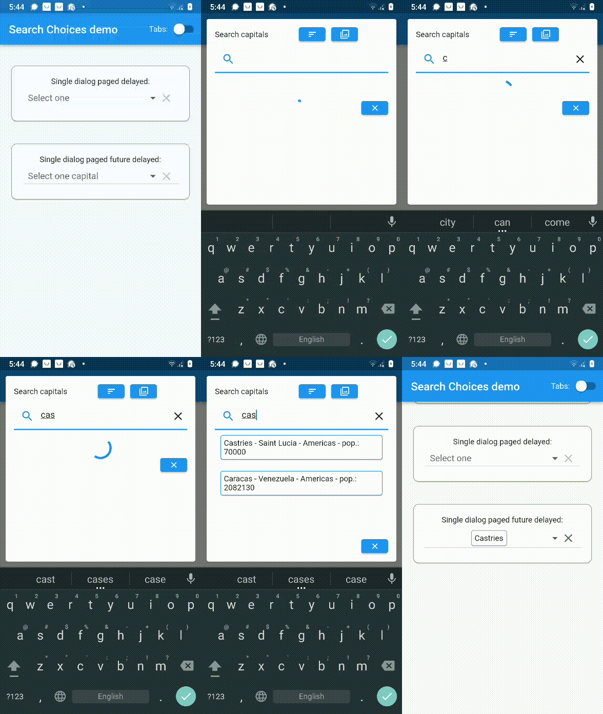
Future/network/internet/web/API/webservice call displayed paged in a dialog. This example doesn't work on web because of the get function call, though, the plugin features should work on web. This example shows that this would work with PHP-CRUD-API.
Future/network/internet/web/API/webservice call displayed paged in a menu. This example doesn't work on web because of the get function call, though, the plugin features should work on web. This example shows that this would work with PHP-CRUD-API.
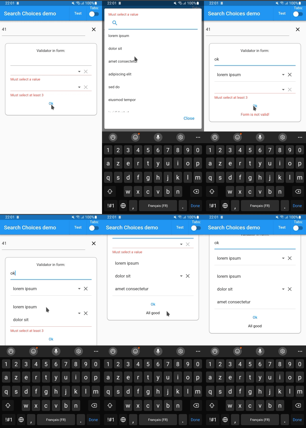
The form field validator is called by the parent form validator.
Form(
key: _formKeyForValidator,
child: Column(
mainAxisSize: MainAxisSize.min,
children: <Widget>[
TextFormField(
validator: (String? value) {
if (value == "ok") {
return (null);
}
return ("Not the expected value");
},
),
SearchChoices.single(
items: items,
value: selectedValueSingleDialog,
onChanged: (value) {
setState(() {
selectedValueSingleDialog = value;
});
},
isExpanded: true,
validator: (dynamic value) {
if (value == null) {
return ("Must select a value");
}
if (!(value isString)) {
return ("Selected value must be a String");
}
if (value.startsWith("l")) {
return (null);
}
return ("Must start with 'l'");
},
),
SearchChoices.multiple(
items: items,
selectedItems: selectedItemsMultiDialog,
onChanged: (value) {
setState(() {
selectedItemsMultiDialog = value;
});
},
isExpanded: true,
validator: (dynamic value) {
if (value == null) {
return ("Must select some values");
}
if (!(value isList<int>)) {
return ("Selection is of unexpected type");
}
if (value.length < 3) {
return ("Must select at least 3");
}
return (null);
},
),
TextButton(
onPressed: () {
if (_formKeyForValidator.currentState?.validate() ?? false) {
setState(() {
formResult = "All good";
});
} else {
setState(() {
formResult = "Form is not valid!";
});
}
},
child: constText("Ok"),
),
formResult == null
? SizedBox.shrink()
: Text(formResult ?? "",
style: TextStyle(
color:
formResult == "All good" ? Colors.black : Colors.red,
)),
],
),
)
Feature requests/comments/questions/bugs
Feel free to log your feature requests/comments/questions/bugs here:
https://github.com/lcuis/search_choices/issues
Contributions
This solution is based on improvements done on a pull request that was probably already changing too many things to the great original repository:
https://github.com/icemanbsi/searchable_dropdown/pull/11
I would be happy to merge pull request proposals provided that:
they don't break the compilation
they pass the automated testing
they provide the relevant adaptations to documentation and automated testing
they bring value
they don't completely transform the code
they are readable (though, I enjoy https://www.ioccc.org/ as a contest full of curiosities)
Contributions and forks are very welcome!
In your pull request, feel free to add your line in the contributors section below: