श्रेणियाँ, पैकेज और रिपॉज़िटरी खोजें

sliver_sticky_collapsable_panel कवर
पैकेज विवरणv5.0.1

sliver_sticky_collapsable_panel

एक स्लिवर वास्तुकला चिपकने वाले संकलन पैनल के साथ, एक बॉक्स हेडर और स्लिवर बच्चा के रूप में पैनल की सामग्री के साथ।

AndroidiOSWebmacOSWindowsLinux
30-दिन डाउनलोड
2.5 हज़ार
लाइक
121
Pub अंक
160

पैकेज इंस्टॉल करें

flutter pub add sliver_sticky_collapsable_panel

पैकेज अवलोकन

सार्वजनिक जानकारी से बना चयन मार्गदर्शन। केवल संदर्भ हेतु।

एक स्लिवर-आधारित विजेट जो स्क्रॉल स्थिति के आधार पर डायनामिक हेडर पुनर्निर्माण के साथ एक स्टिकी, कॉलैप्सिबल पैनल को लागू करता है। इसमें पैनल विस्तार या संकुचित होने पर अपडेट होने वाला कस्टमाइज़ किया गया बॉक्स हेडर होता है, और पैनल कंटेंट के लिए एक स्लिवर बच्चा स्वीकार करता है। जटिल सूचियों में कुशल स्क्रॉलिंग के लिए डिज़ाइन किया गया, यह एक कई प्लेटफॉर्मों में कस्टम स्क्रॉलव्यू लेआउट में बिना किसी दिक्कत के एकीकृत होता है।

उपयोग

  • इंटरैक्टिव हेडर वाली स्क्रॉलिंग सूचियाँ
  • स्क्रॉल के दौरान डायनामिक हेडर स्टेट्स
  • स्टिकी पैनल की आवश्यकता वाले जटिल UI
  • स्थान जो विस्तार/संक्षिप्त करते हैं
  • कस्टमाइज़ किए गए स्क्रॉल-ड्रिवन इंटरैक्शन

मुख्य विशेषताएँ

  • स्टिकी पैनल व्यवहार
  • स्क्रॉल पर हेडर का पुनर्निर्माण
  • Sliver समर्थित लेआउट
  • संक्षिप्त सामग्री खंड
  • प्लेटफ़ॉर्म-अनुकूल वास्तविकीकरण

इनके लिए उपयुक्त

  • स्क्रॉल करने योग्य इंटरफेस बनाने वाले डेवलपर्स
  • प्रतिक्रियाशील शीर्षक की आवश्यकता वाले ऐप्स
  • CustomScrollView एकीकरण
  • क्रॉस-प्लेटफॉर्म मोबाइल और वेब एप्लिकेशन
  • परतदार स्क्रॉल करने योग्य सामग्री वाले UI

विचार योग्य बातें

  • CustomScrollView के भीतर एकीकरण की आवश्यकता है
  • सिल्वर-आधारित लेआउट पर सीमित
  • हेडर लॉजिक को कस्टम ट्यूनिंग की आवश्यकता हो सकती है
  • प्रदर्शन बच्चे की जटिलता पर निर्भर करता है
  • गैर-स्क्रॉलिंग संदर्भ के लिए उपयुक्त नहीं

मूल README

संबंधित सोर्स रिपॉज़िटरी के मूल README का स्नैपशॉट। नवीनतम सामग्री के लिए रिपॉज़िटरी देखें।

sliver_sticky_collapsable_panel

pub license build status flutter compatibility dart compatibility

A Sliver implementation of sticky collapsable panel, with a box header rebuild on status and a sliver child as panel content.

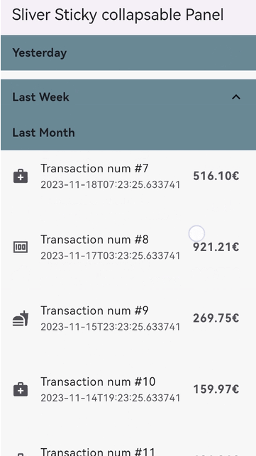
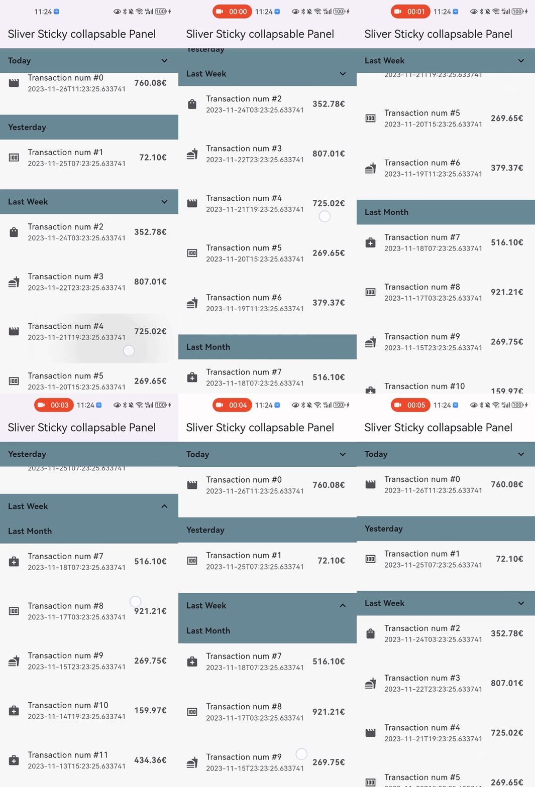
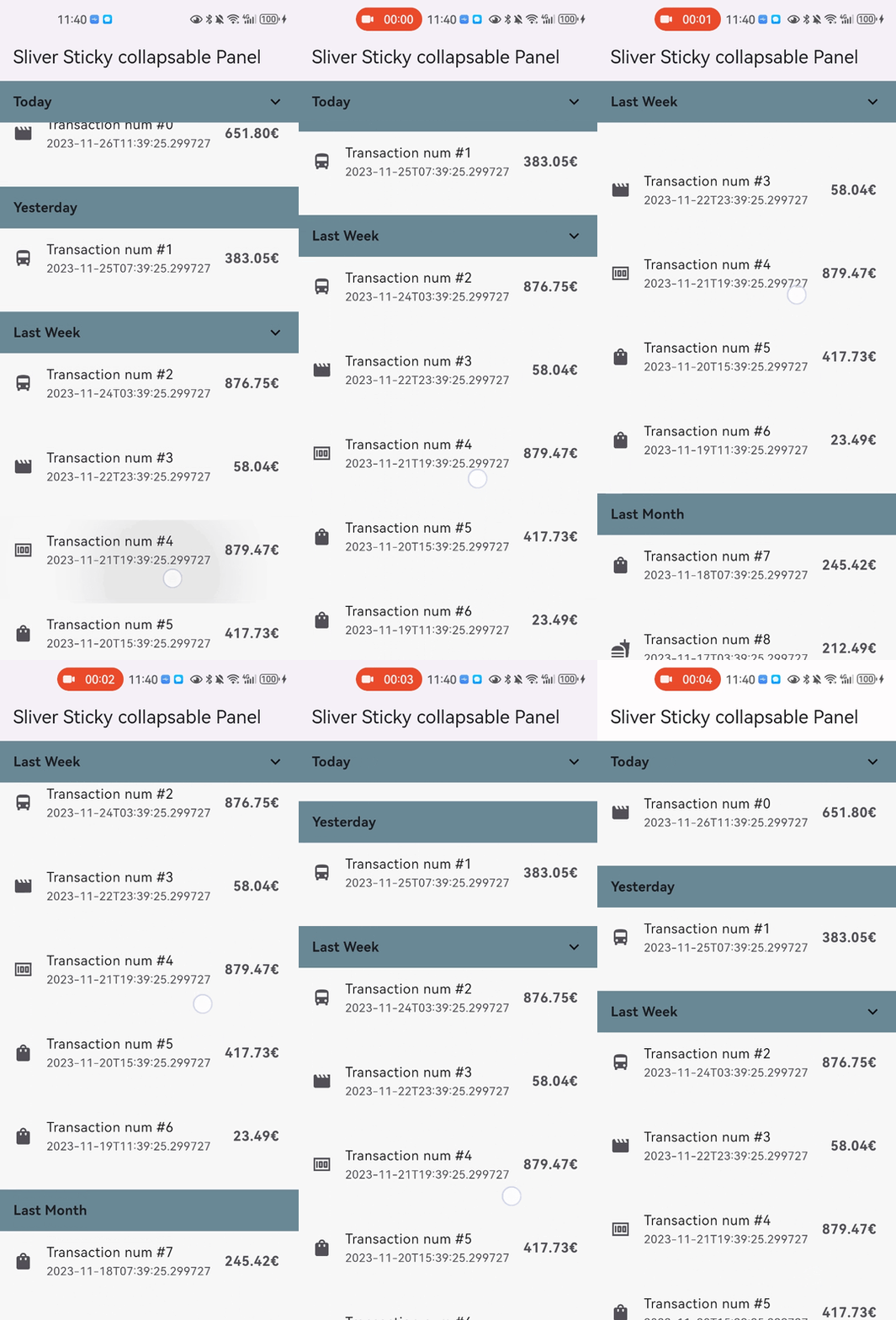
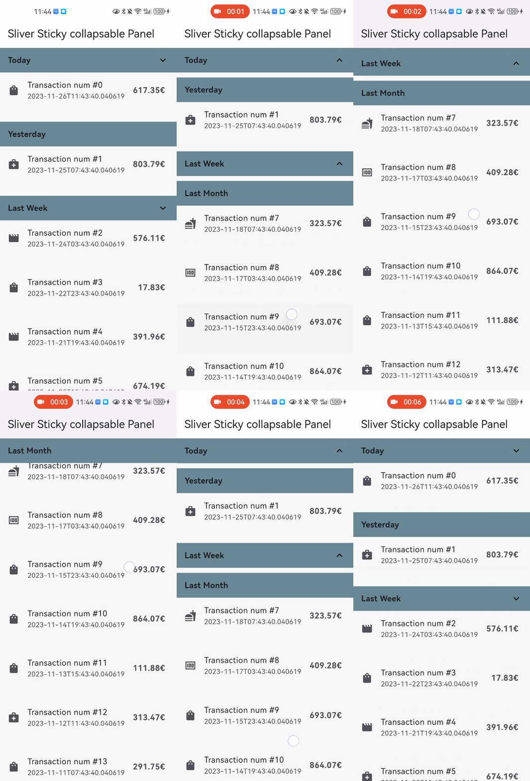
Snap Shot

simple Shot

Features

  • Relying solely on the Flutter framework itself, no any other dependencies.
  • Pure Dart implementation, running on any platform who supports Flutter.
  • Command style support for expand/collpase the panel.(it's still compatible with declarative style)
  • Accept one box child as header and one sliver child as panel content.
  • Header can overlap panel content (useful for sticky side header for example).
  • Notify and rebuild the header when status changed (scroll outside the viewport for example).
  • Support not sticky headers (with sticky: false parameter).
  • Support a controller which notifies the scroll offset of the current sticky header.
  • Support click the header to collapse the panel, or disable collapse (with disableCollapsable = true parameter in panelController).
  • Support iOS style sticky header, just like iOS's system contact app (with iOSStyleSticky = true parameter).
  • Support add padding for sliver child (with paddingBeforeCollapse parameter).
  • Support add padding after the header even the panel collapsed (with paddingAfterCollapse parameter).

Getting started

  • In the pubspec.yaml of your flutter project, add the following dependency:

    dependencies:
      sliver_sticky_collapsable_panel: ^5.0.1
    
  • In your library add the following import:

    import 'package:sliver_sticky_collapsable_panel/sliver_sticky_collapsable_panel.dart';
    
  • In your code, use the sliver like this:

    CustomScrollView(
      controller: _scrollController,
      slivers: [
        SliverStickyCollapsablePanel(
          scrollController: _scrollController,
          panelController: StickyCollapsablePanelController(key:'key_1'),
          headerBuilder: (context, status) => SizedBox.fromSize(size: Size.fromHeight(48)),
          sliverPanel: SliverList.list(children: [...]),
        ),
        SliverStickyCollapsablePanel(
          scrollController: _scrollController,
          panelController: StickyCollapsablePanelController(key:'key_2'),
          headerBuilder: (context, status) => SizedBox.fromSize(size: Size.fromHeight(48)),
          sliverPanel: SliverList.list(children: [...]),
        ),
        ...,
      ],
    );
    
  • For simple right side header arrow hint ^, you can build with widget in flutter framework like AnimatedRotation:

    SliverStickyCollapsablePanel(
      scrollController: _scrollController,
      panelController: StickyCollapsablePanelController(key:'key_1'),
      headerBuilder: (context, status) => Container(
        width: double.infinity,
        height: 48,
        child: Stack(
          children: [
            Text("your title, or any other box widget you like"),
            Align(
              alignment: Alignment.centerRight,
              child: AnimatedRotation(
                duration: const Duration(milliseconds: 0),
                turns: status.isExpanded ? 0 : 0.5,
                child: const Icon(Icons.expand_more),
              ),
            ), 
          ],
        ),
      ),
      sliverPanel: SliverList.list(children: [...]),
    ),
    

More Advanced Feature:

  • You can disable collapse for any sliver you wanted, just add disableCollapsable = true.
    CustomScrollView(
      controller: _scrollController,
      slivers: [
        SliverStickyCollapsablePanel(
          scrollController: _scrollController,
          panelController: StickyCollapsablePanelController(key:'key_1',disableCollapsable: true),
          headerBuilder: (context, status) => SizedBox.fromSize(size: Size.fromHeight(48)),
          sliverPanel: SliverList.list(children: [...]),
        ),
        ...,
      ],
    );
    

  • You can enable iOS style sticky header, just like the system's contact app with just one parameter iOSStyleSticky = true.
    CustomScrollView(
      controller: _scrollController,
      slivers: [
        SliverStickyCollapsablePanel(
          scrollController: _scrollController,
          panelController: StickyCollapsablePanelController(key:'key_1'),
          iOSStyleSticky: true,
          headerBuilder: (context, status) => SizedBox.fromSize(size: Size.fromHeight(48)),
          sliverPanel: SliverList.list(children: [...]),
        ),
        ...,
      ],
    );
    
    simple Shot

  • You can add padding for sliver child (with paddingBeforeCollapse), even if the panel is collapsed, the padding still work between headers with paddingAfterCollapse.

    CustomScrollView(
      controller: _scrollController,
      slivers: [
        SliverStickyCollapsablePanel(
          scrollController: _scrollController,
          panelController: StickyCollapsablePanelController(key:'key_1'),
          paddingBeforeCollapse: const EdgeInsets.all(16),
          paddingAfterCollapse: const EdgeInsets.only(bottom: 10),
          headerBuilder: (context, status) => SizedBox.fromSize(size: Size.fromHeight(48)),
          sliverPanel: SliverList.list(children: [...]),
        ),
        ...,
      ],
    );
    
    simple Shot

  • You can animate collapse/expand with only one parameter: panelAnimationDuration
    CustomScrollView(
      controller: _scrollController,
      slivers: [
        SliverStickyCollapsablePanel(
          scrollController: _scrollController,
          panelController: StickyCollapsablePanelController(key:'key_1'),
          panelAnimationDuration: Duration(milliseconds: 300),
          paddingBeforeCollapse: const EdgeInsets.all(16),
          paddingAfterCollapse: const EdgeInsets.only(bottom: 10),
          headerBuilder: (context, status) => SizedBox.fromSize(size: Size.fromHeight(48)),
          sliverPanel: SliverList.list(children: [...]),
        ),
        ...,
      ],
    );
    

Performance configuration

  • You can use optional parameter headerSize to speed up the layout process when the size not change
    • if your header size maybe change, just keep this parameter null (which is the default)
      CustomScrollView(
        controller: _scrollController,
        slivers: [
          SliverStickyCollapsablePanel(
            scrollController: _scrollController,
            panelController: StickyCollapsablePanelController(key:'key_1'),
            iOSStyleSticky: true,
            headerBuilder: (context, status) => SizedBox.fromSize(size: Size.fromHeight(48)),
            headerSize: Size(MediaQuery.of(context).size.width, 48),
            sliverPanel: SliverList.list(children: [...]),
          ),
          ...,
        ],
      );
      

Thanks

श्रेणियाँ

सोर्स रिपॉज़िटरी

इस पैकेज का उपयोग करने वाले प्रोजेक्ट

अभी कोई डेटा उपलब्ध नहीं है।