पैकेज, रिपॉज़िटरी और ऐप श्रेणियाँ खोजें

smooth_corner कवर
पैकेज विवरणv1.1.1

smooth_corner

Figma से प्रेरित एक आयताकार सीमा जिसमें चलने की वैशिष्ट्य है।

AndroidiOSWebmacOSWindowsLinux
30-दिन डाउनलोड
24.3 हज़ार
लाइक
64
Pub अंक
160

पैकेज इंस्टॉल करें

flutter pub add smooth_corner

पैकेज अवलोकन

सार्वजनिक जानकारी से बना चयन मार्गदर्शन। केवल संदर्भ हेतु।

Smooth Corner एक Flutter पैकेज है जो विकासकर्ताओं को समायोज्य स्मूथनेस के साथ आयताकार सीमा बनाने की अनुमति देता है, जो Figma में पाए जाने वाले डिज़ाइन अस्तरों के निकटता से मिलता है। यह कस्टम क्लिपर तर्क का उपयोग करके विजेट्स पर गोल या स्मूथ वक्र किनारे लगाने का लचीला और प्रदर्शन-प्रभावी तरीका प्रदान करता है। आधुनिक, चिकने दिखने वाले उपयोगकर्ता इंटरफेस तत्वों के लिए आदर्श, जिन्हें जटिल छवि संसाधनों पर निर्भर नहीं करना पड़ता है। पैकेज सभी प्रमुख प्लेटफॉर्मों का समर्थन करता है, जिससे उपकरणों के बीच समान रूप से रेंडरिंग सुनिश्चित होता है।

उपयोग

  • मॉडर्न UI घटकों को नरम किनारों के साथ बनाना
  • चर रेडियस के साथ बटन और कार्ड डिज़ाइन करना
  • Figma-आधारित बॉर्डर स्टाइल्स का लागू करना
  • एप्लिकेशन इंटरफेस में दृश्य सजावट को बढ़ावा देना
  • पुनर्उपयोगी सजावटी डिब्बे बनाना
  • डिज़ाइन सिस्टम की आवश्यकताओं के अनुरूप

मुख्य विशेषताएँ

  • कोनों के लिए चर स्मूथनेस नियंत्रण
  • Figma-शैली के सीमा अनुमान
  • क्रॉस-प्लेटफॉर्म संगतता
  • हल्का और कारगर क्लिपर कार्यान्वयन
  • pub add के माध्यम से आसान एकीकरण
  • सभी फ्लटर प्लेटफॉर्म को समर्थन करता है

इनके लिए उपयुक्त

  • Figma डिज़ाइन को लागू करने वाले UI डिज़ाइनर
  • साफ और आधुनिक सीमाओं की तलाश में विकासकर्ता
  • उच्च दृश्य सटीकता की आवश्यकता वाले ऐप्स
  • सुसंगतता के लिए डिज़ाइन टोकन का उपयोग करने वाले प्रोजेक्ट
  • पिक्सेल-परफेक्ट UI पुनरस्थापना के साथ काम कर रही टीमें

विचार योग्य बातें

  • जटिल आकृतियों के साथ प्रदर्शन प्रभाव बढ़ सकता है
  • सीमित आयताकार सीमा के साथ चिकने कोने
  • सभी लक्षित प्लेटफॉर्मों पर परीक्षण की आवश्यकता हो सकती है
  • बहुत अनियमित या मुक्त आकार के लिए उपयुक्त नहीं
  • पथ-आधारित क्लिपिंग के सटीक रेंडरिंग पर निर्भर करता है

मूल README

संबंधित सोर्स रिपॉज़िटरी के मूल README का स्नैपशॉट। नवीनतम सामग्री के लिए रिपॉज़िटरी देखें।

Language: English | 中文简体

smooth_corner

Pub

Implement smooth iOS-style rounded corners in Flutter, mimicking Figma's "corner smoothing" feature. The algorithm is also inspired by Figma's blog post "Desperately seeking squircles".

The principle involves combining two Bezier curves and an arc to create smooth corners. Similar to Figma, the smoothness is adjustable. When the smoothness parameter is 0, it represents a normal rounded rectangle, and when the parameter is 1, the rounded corners are composed of only two Bezier curves, approaching a superellipse.

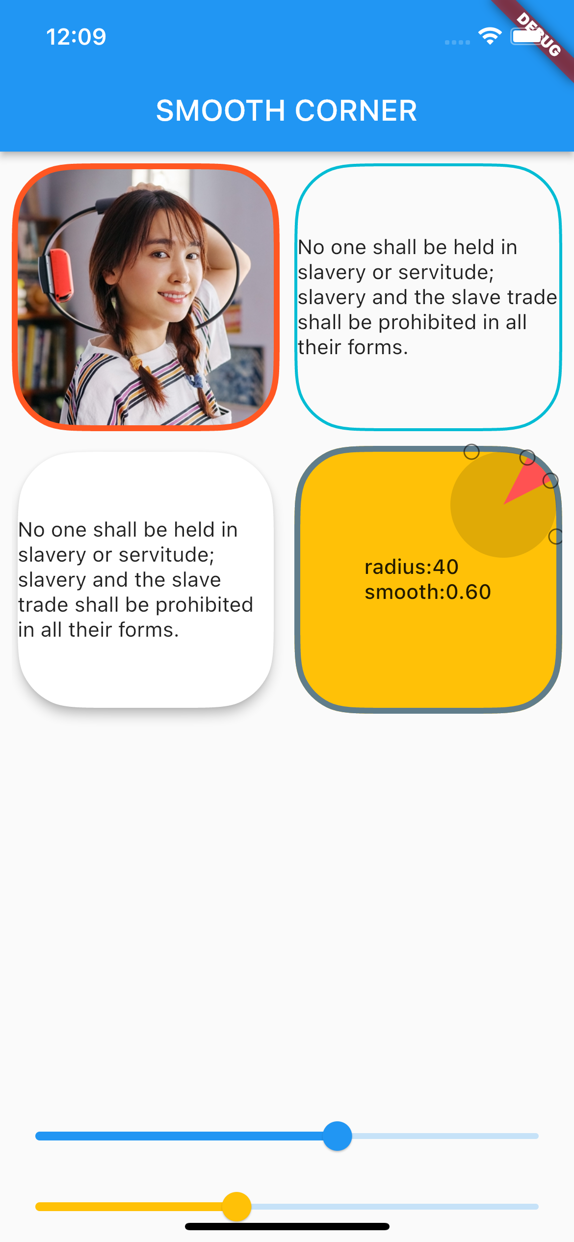
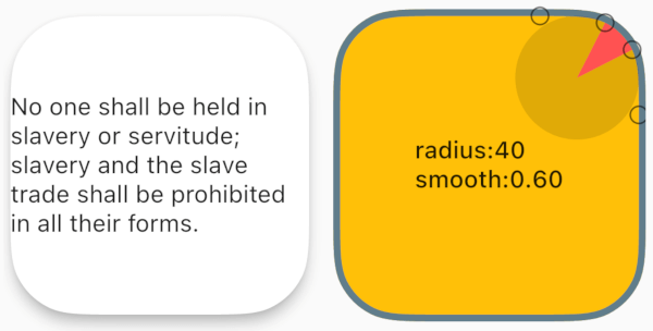
You can view the debug rounded corner components and image examples I wrote in the example project, adjusting their smoothness and corner size to observe the changes in the corner curves.

Example screen shot

Usage

Add dependency
dependencies:
  smooth_corner: ^1.1.1
Built-in Widgets

This library provides several commonly used widgets that allow you to adjust smooth rounded corners.

All widgets provide three parameters: smoothness, side, and borderRadius, to control smooth corners and borders.

  • smoothness: Represents the smoothness, ranging from [0, 1.0]. According to Figma's standards, 0.6 is the closest to iOS's rounded corner curve.

  • side: Type is BorderSide, used to set borders.

  • borderRadius: Used to set the corner radius. Note that if the x and y values of the radius are not equal, the smaller one will be chosen.

SmoothContainer

SmoothContainer includes all the parameters of Container.

SmoothContainer(
  width: 200,
  height: 200,
  smoothness: 0.6,
  side: BorderSide(color: Colors.cyan, width: 2),
  borderRadius: BorderRadius.circular(40),
  child: child,
  alignment: Alignment.center,
),
SmoothClipRRect

To enable images to have borders, SmoothClipRRect is provided.

SmoothClipRRect(
  smoothness: 0.6,
  side: BorderSide(color: Colors.deepOrange, width: 4),
  borderRadius: BorderRadius.circular(40),
  child: Image.network(
    url,
    fit: BoxFit.cover,
  ),
SmoothCard

SmoothCard includes all parameters of Card.

SmoothCard(
  smoothness: 0.6,
  borderRadius: BorderRadius.circular(40),
  elevation: 6,
  child: child,
),
Custom widget

The smooth corner capabilities of the above widgets are implemented by SmoothRectangleBorder. You can use this ShapeBorder to freely customize your smooth corner components.

ShapeDecoration
Container(
  width: 200,
  height: 200,
  alignment: Alignment.center,
  decoration: ShapeDecoration(
    shape: SmoothRectangleBorder(
      borderRadius: BorderRadius.circular(40),
      smoothness: 0.6,
    ),
    color: Colors.amber,
  ),
  child: Text(''),
),
ShapeBorderClipper
Container(
  width: 200,
  height: 200,
  child: ClipPath(
    clipper: ShapeBorderClipper(
      shape: SmoothRectangleBorder(
        smoothness: 0.6,
        borderRadius:
            BorderRadius.circular(40),
      ),
    ),
    child: Image.network(url),
  ),
),

श्रेणियाँ

सोर्स रिपॉज़िटरी

इस पैकेज का उपयोग करने वाले प्रोजेक्ट

अभी कोई डेटा उपलब्ध नहीं है।