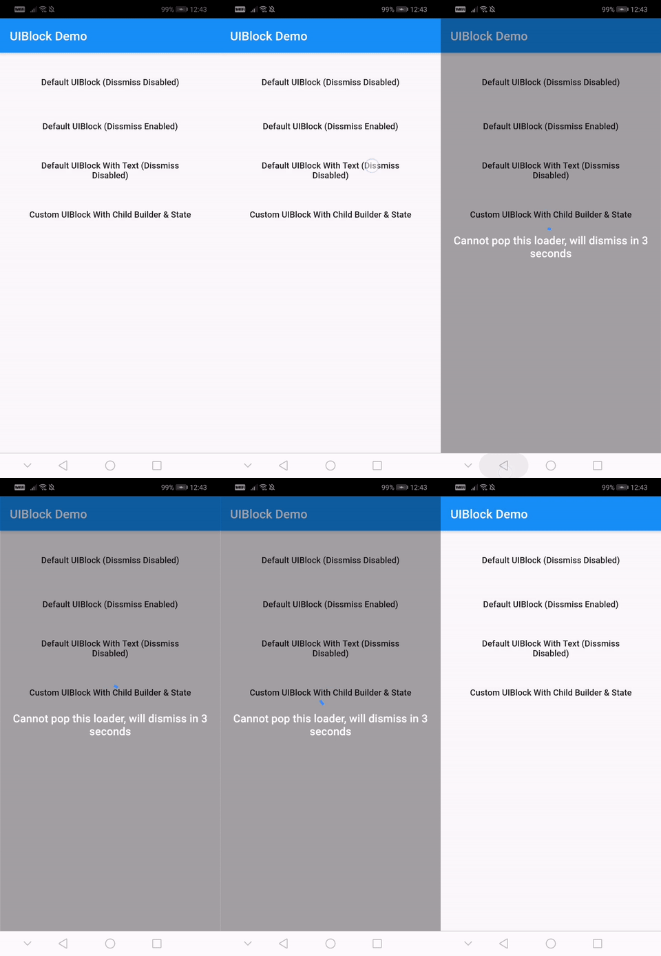
सार्वजनिक जानकारी से बना चयन मार्गदर्शन। केवल संदर्भ हेतु।
एक पूरी तरह से कस्टमाइज़ेबल और आसान उपयोग करने वाला Flutter पैकेज जो ऐप में UI ब्लॉकिंग तत्वों को लागू करने के लिए है। यह लोडिंग इंडिकेटर, प्रोग्रेस बार या कस्टम विजेट के साथ सामग्री को ओवरले करने का एक सरल तरीका प्रदान करता है, जिससे असिंक्रोनस ऑपरेशन के दौरान उपयोगकर्ताओं को सूचित किया जा सकता है। डेटा लोडिंग या प्रोसेसिंग के दौरान इंटरैक्शन को रोकने के लिए आदर्श, यह सभी प्रमुख प्लेटफॉर्म के लिए समर्थन करता है, जिसमें Android, iOS, Web, macOS, Windows और Linux शामिल हैं। पैकेज हल्का है और मौजूदा Flutter प्रोजेक्ट में बिना किसी दिक्कत के एकीकृत किया जा सकता है।
उपयोग
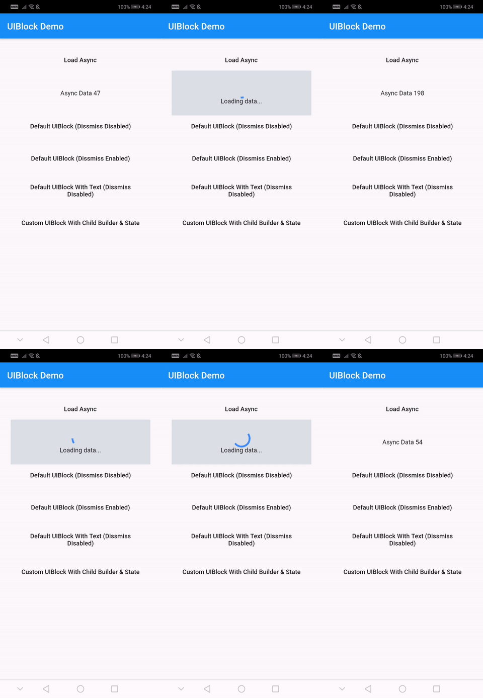
डेटा लोडिंग के दौरान UI को ब्लॉक करना
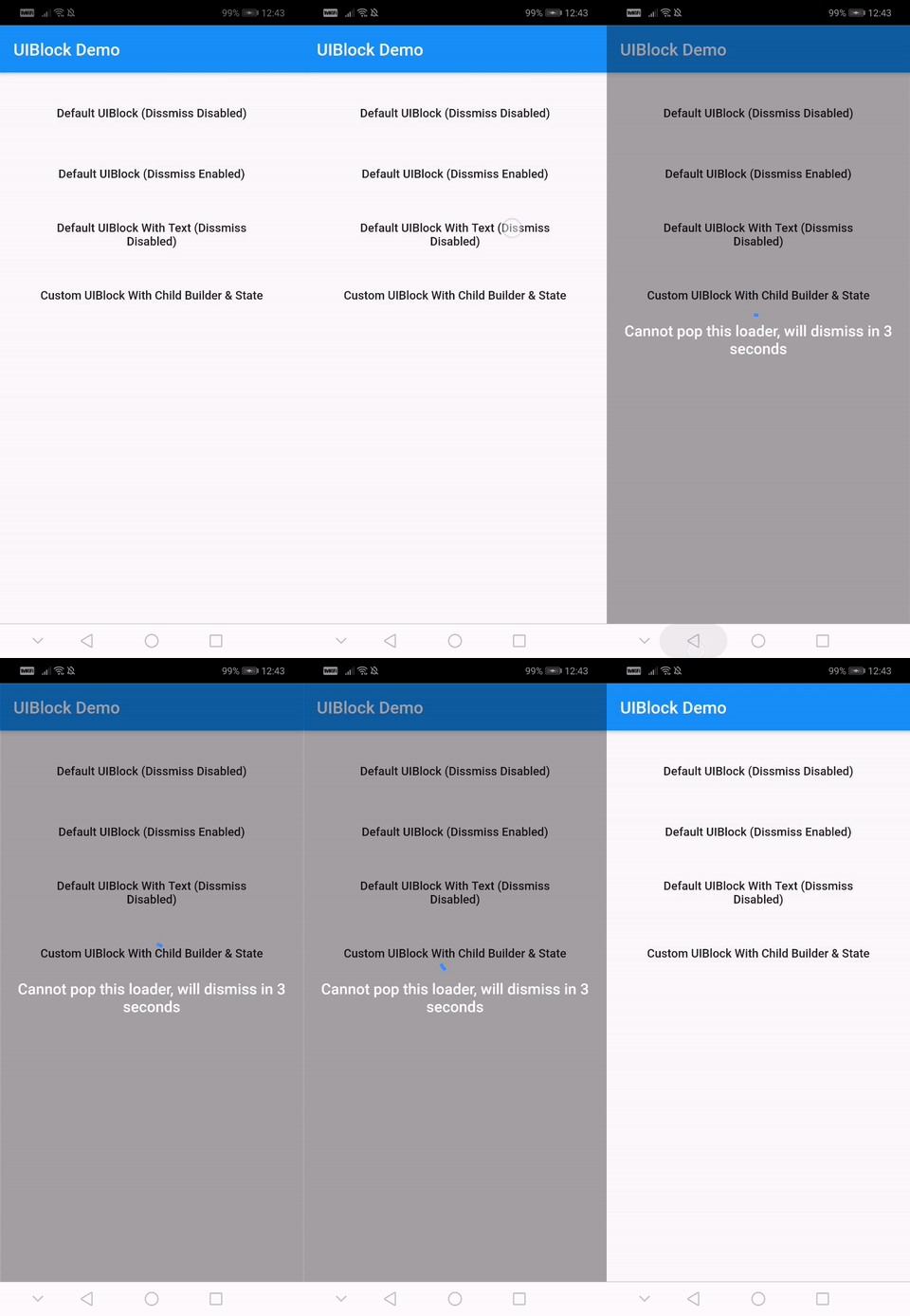
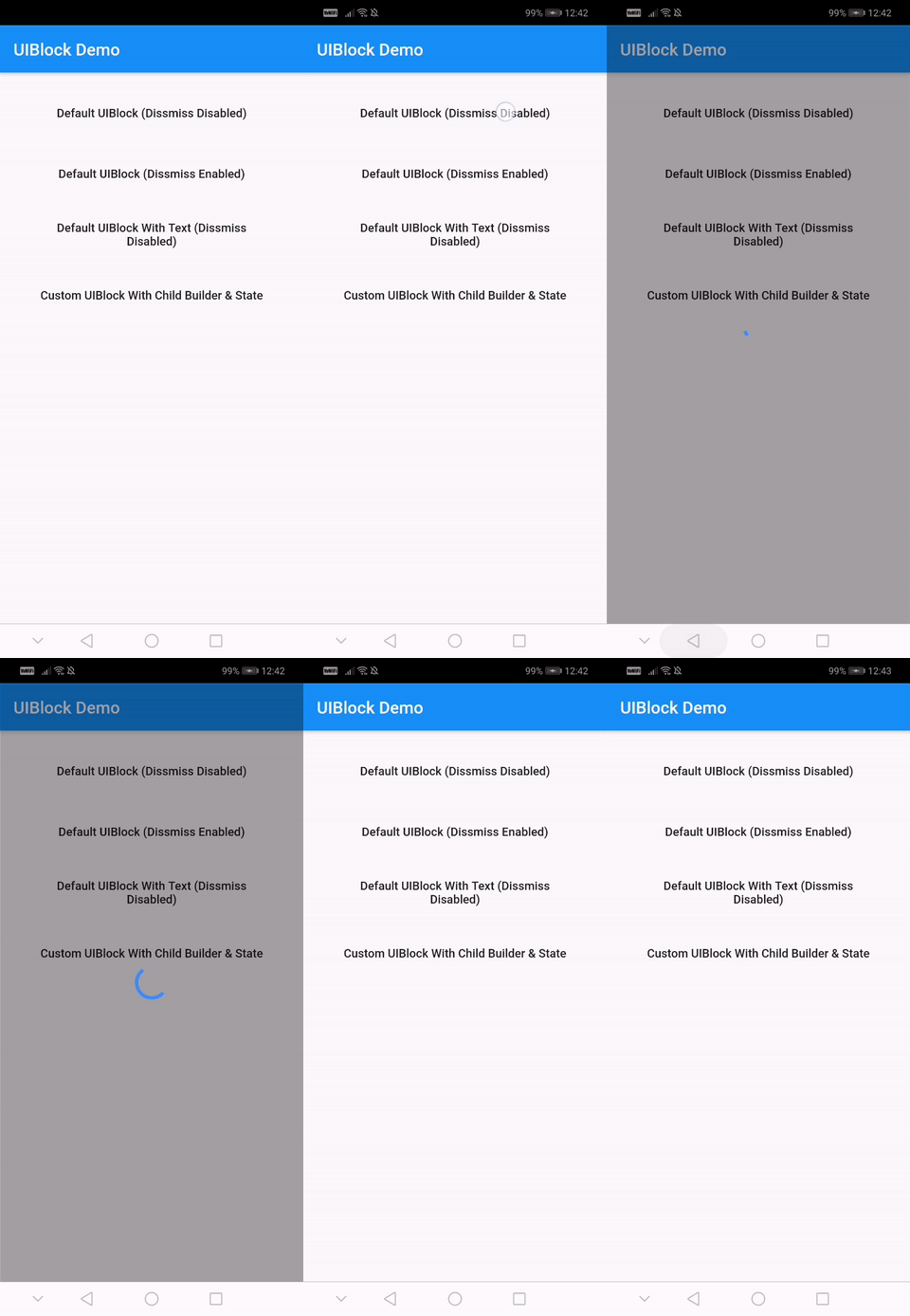
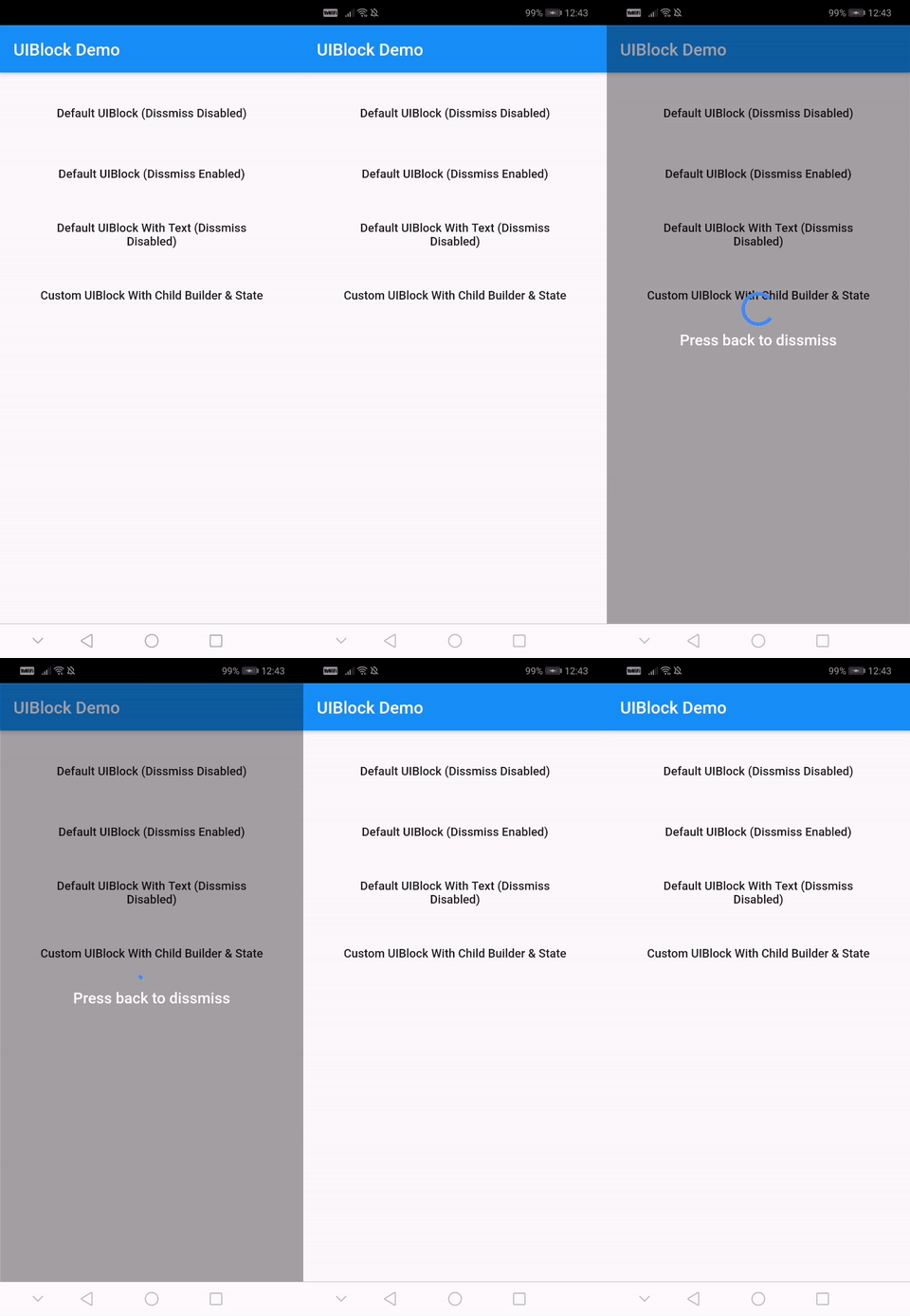
कस्टम लोडिंग ओवरले दिखाएं
एसिंक टास्क के दौरान उपयोगकर्ता इंटरैक्शन को रोकना
दृश्य प्रतिक्रिया के साथ उपयोगकर्ता अनुभव में सुधार
रिफ्रेश सूचक का अनुप्रयोग
मॉडल लोडिंग स्क्रीन बनाना
मुख्य विशेषताएँ
पूरी तरह से कस्टमाइज़ किया गया दिखावट
त्वरित एकीकरण के लिए सरल API
सभी फ्लटर प्लेटफॉर्म का समर्थन करता है
कस्टम ओवरले के लिए विस्तारित
हल्का और कार्यक्षम
निर्मित लोडिंग और प्रगति सूचक
इनके लिए उपयुक्त
त्वरित UI ब्लॉकिंग समाधान खोज रहे डेवलपर्स
स्थिर लोडिंग स्थिति की आवश्यकता वाले ऐप्स
उपयोगकर्ता अनुभव सुधार पर केंद्रित टीमें
क्रॉस-प्लेटफ़ॉर्म आवश्यकताओं वाले प्रोजेक्ट्स
Flutter का उपयोग करने वाले फ्रंटएंड विकासकर्ता
अक्सर एसिंक ऑपरेशन करने वाले अनुप्रयोग
विचार योग्य बातें
जटिल डिज़ाइन के लिए अतिरिक्त स्टाइलिंग की आवश्यकता हो सकती है
कस्टम ओवरले आवश्यक है मैनुअल इम्प्लीमेंटेशन
सीमित आंतरिक थीम
उच्च आवृत्ति अपडेट के लिए अनअनुकूलित
सही विजेट ट्री संरचना पर निर्भर करता है
उचित राज्य प्रबंधन के साथ सबसे अच्छा उपयोग किया जाता है
मूल README
संबंधित सोर्स रिपॉज़िटरी के मूल README का स्नैपशॉट। नवीनतम सामग्री के लिए रिपॉज़िटरी देखें।
uiblock
Easiest and simplest method to block/unblock ui for your flutter apps.
One line of code to block/unblock ui and stop user from navigating during loading or processing in your flutter apps. You could use it as a widget or directly as a global service/util.
Fully customizable
Android and IOS
Easy and Simple
No other dependencies
Well documented
Production ready
Installation
With null-safety
      dependencies:
        uiblock: ^2.0.1
Without null-safety
      dependencies:
        uiblock: 1.2.0
Getting Started
Add the dependency to your project and start using uiblock everywhere:
Import the package.
import'package:uiblock/uiblock.dart';
To block ui
// defaultUIBlock.block(context);
//OR// if using globalKeyUIBlock.block(_scaffoldGlobalKey.currentContext);
To unblock ui
// call unblock after blockui to dissmissUIBlock.unblock(context);
//OR// if using globalKeyUIBlock.unblock(_scaffoldGlobalKey.currentContext);
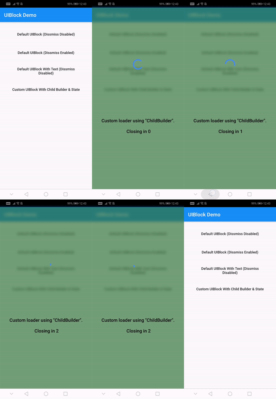
// easily create custom block ui bodyUIBlock.block(
_scaffoldGlobalKey.currentContext,
backgroundColor: Colors.green.withOpacity(0.5),
imageFilter: ImageFilter.blur(sigmaX: 5.0, sigmaY: 5.0),
childBuilder: (BuildContext context) {
// return your widget here
},
);
// Don't forget to call unblock after block :)
Creating custom block modal transitions (only applicable on static UIBlock.block)
// NOTE : only for on UIBlock.block as this uses Modal Barrier// widget block is inline widget replacement with loader widgetUIBlock.block(
//...// more code
customBuildBlockModalTransitions:
(context, animation, secondaryAnimation, child) {
returnRotationTransition(
turns: animation,
child: child,
);
},
// ...
);
Using with data return
// NOTE : canDissmissOnBack is alaways truevar result = awaitUIBlock.blockWithData(
_scaffoldGlobalKey.currentContext,
loadingTextWidget: Padding(
padding: constEdgeInsets.all(8.0),
child: FlatButton(
onPressed: () {
// unblock and return dataUIBlock.unblockWithData(context, "hello world");
},
child: Text(
'Press here to dissmiss with data. Back for null',
textAlign: TextAlign.center,
style: TextStyle(
color: Colors.white,
fontSize: 18.0,
fontWeight: FontWeight.w600,
),
),
),
),
);
print(result);
For more details have a look at the other examples.
Properties
Property
Type
Default
Note
context (required)
BuildContext
-
childBuilder
Function
-
customLoaderChild
Widget
-
loadingTextWidget
Widget
-
imageFilter
ImageFilter
-
backgroundColor
Color
Transparent
canDissmissOnBack
bool
false
safeAreaLeft
bool
true
Set as 'false' to disable 'Left' Safe Area
safeAreaTop
bool
true
Set as 'false' to disable 'Top' (usually status bar) Safe Area
safeAreaRight
bool
true
Set as 'false' to disable 'Right' Safe Area
safeAreaBottom
bool
true
Set as 'false' to disable 'Bottom' Safe Area
safeAreaMinimumPadding
EdgeInsets
EdgeInsets.zero
safeAreaMaintainBottomViewPadding
bool
false
isSlideTransitionDefault
bool
true
Toggle between slide or fade transition
buildBlockModalTransitions
Function
-
Use this to create custom transition other than fade/slide
Widget Properties
Property
Type
Default
builder
Function
you implement it
loadingStateFromFuture
Future Function()
your future function (APIs,etc)
loaderBuilder
Function
-
customLoaderChild
Widget
-
loadingTextWidget
Widget
-
offset
offset
-
barrierOpacity
double
0.4
barrierColor
Color
black45
canDismiss
bool
false
hideBuilderOnNullData
bool
false
Improve
Help me by reporting bugs, submit new ideas for features or anything else that you want to share.