सार्वजनिक जानकारी से बना चयन मार्गदर्शन। केवल संदर्भ हेतु।
एक विविध Flutter पैकेज जो सभी मुख्य प्लेटफॉर्मों पर फॉर्म, ओनबोर्डिंग फ्लो या बहु-चरण प्रक्रियाओं के लिए चरण-दर-चरण इंटरफ़ेस बनाने को सरल बनाता है। यह दोनों क्षैतिज और ऊर्ध्वाधर लेआउट का समर्थन करता है। इस विशेष उपकरण को कस्टमाइज़ किया जा सकता है और मौजूदा Flutter एप्लिकेशन में बिना किसी दिक्कत के एकीकृत किया जा सकता है। लचीलेपन और उपयोग में आसानी के लिए डिज़ाइन किया गया है, जिससे विकासकर्ता कम कोड के साथ स्थिर UI पैटर्न बनाए रख सकते हैं। इसकी क्रॉस-प्लेटफॉर्म संगतता एंड्रॉइड, iOS, वेब, macOS, Windows और Linux पर समान व्यवहार सुनिश्चित करती है।
उपयोग
ऑनबोर्डिंग विजार्ड्स
बहु-चरण फॉर्म नेविगेशन
चेकआउट प्रक्रिया डिज़ाइन
प्रगति ट्रैकिंग इंटरफेस
सेटअप विजार्ड
मुख्य विशेषताएँ
क्षैतिज और लंबवत दिशाओं का समर्थन करता है
क्रॉस-प्लेटफॉर्म संगतता
कस्टमाइज़ किए गए स्टाइल
सरल API एकीकरण
पुनर्उपयोगी चरण घटक
इनके लिए उपयुक्त
गाइडेड वर्कफ़्लो बनाने वाले विकासकर्ता
स्थिर स्टेपर यूआई की आवश्यकता वाली टीमें
बहु-चरण उपयोगकर्ता इनपुट की आवश्यकता वाले ऐप्स
पुनर्उपयोगी घटकों के साथ डिज़ाइन प्रणालियाँ बनाएँ
क्रॉस-प्लेटफॉर्म एप्लिकेशन
विचार योग्य बातें
जटिल थीम के लिए अतिरिक्त स्टाइलिंग की आवश्यकता हो सकती है
सीमित निर्मित एनीमेशन विकल्प
रैखिक चरण क्रम के लिए सबसे उपयुक्त
अत्यधिक गतिशील चरण तर्क के लिए उपयुक्त नहीं
चरण नियंत्रण के लिए सही अवस्था प्रबंधन पर निर्भर करता है
मूल README
संबंधित सोर्स रिपॉज़िटरी के मूल README का स्नैपशॉट। नवीनतम सामग्री के लिए रिपॉज़िटरी देखें।
A simple package to build steppers with custom elements. You can set up your own body content, badges, and paths using indexed builders.
Vertical Stepper
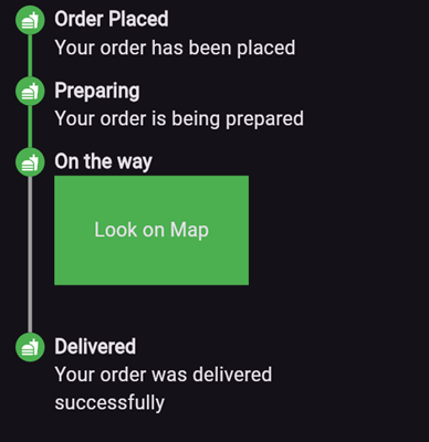
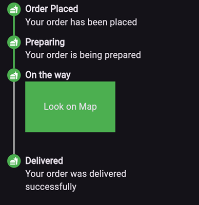
To create a vertical stepper, set stepperDirection to Axis.vertical.
Here’s an example of what the result might look like:
Parameters
elementBuilder: A builder for the content of the stepper.
badgeBuilder: A builder for the badge.
badgePosition: Determines the alignment of the badge. Options include StepperBadgePosition.start, StepperBadgePosition.center, or StepperBadgePosition.end.
pathBuilder: A builder for the main path (e.g., a line, dotted line, etc.). This is the most commonly used path.
subPathBuilder: A builder for the secondary path, used when badgePosition is set to StepperBadgePosition.center. This path is displayed under the badge and allows you to control its visibility based on the active step.
elementCount: The number of elements in the stepper.
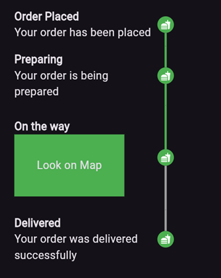
inverted: A flag to invert the position of the path and badge relative to the element. By default, this is false, and for vertical steppers, the path appears on the left. When set to true, the path appears on the right. For horizontal steppers, the path appears on the top and when set to true, the path appears on the bottom.
For example, if you set inverted to true and badgePosition to StepperBadgePosition.center, the result will look like this:
Horizontal Stepper
To create a horizontal stepper, set stepperDirection to Axis.horizontal.