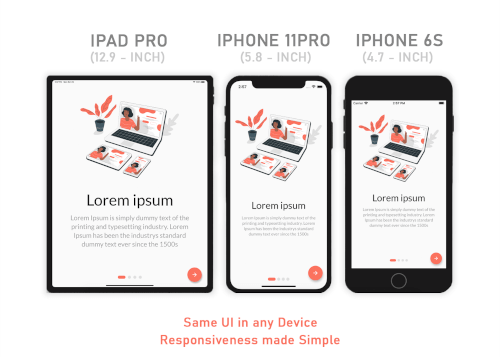
If you want the same layout to look different in tablet and mobile, use the Device.screenType method:
Device.screenType == ScreenType.tablet
  ? Container(   // Widget for Tablet
      width: 100.w,
      height: 20.5.h,
   )
  : Container(   // Widget for Mobile
      width: 100.w,
      height: 12.5.h,
   )
*Device.ScreenTypecan not be Desktop unless maxTabletWidth is set
Parameters
ResponsiveSizer
maxMobileWidth - Maximum width of a mobile device
(If the device's width is larger than this, it will be categorized as a tablet) - Default value: 599
maxTabletWidth - Maximum width of a tablet device
(If the device's width is larger than this, it will be categorized as a desktop) - Optional: enables DesktopScreenType if enabled
Extensions
Adaptive.h() or .h - Calculated percentage of the device's height (40.h -> 40% of device's height)
Adaptive.w() or .w - Calculated percentage of the device's width (40.w -> 40% of device's width)
Adaptive.sp() or .sp - Calculated sp based on the device's pixel density and aspect ratio (See FAQ)
Adaptive.dp() or .dp - Calculated dp based on the device's pixel density (See FAQ)
*Note: Only use .sh and .sw if you want height and width to depend on the device's available height and width after applying SafeArea. Use .h and .w by default.
Adaptive.sh() or .sh - Calculated percentage of the remaining device's height after applying SafeArea
Adaptive.sw() or .sw - Calculated percentage of the remaining device's width after applying SafeArea
Device.boxConstraints - BoxConstraints of the device
Device.orientation - Screen Orientation of the device (portrait or landscape)
Device.screenType - Screen type of the device (mobile or tablet)
Device.aspectRatio - Aspect ratio of the device
Device.pixelRatio - Pixel density ratio of the device
Adaptive.cm() or .cm - The respective value in value in centimeters
Adaptive.mm() or .mm - The respective value in value in millimeters
Adaptive.Q() or .Q - The respective value in quarter-millimeters
Adaptive.inches() or .inches - The respective value in inches
Adaptive.pc() or .pc - The respective value in picas (1/6th of 1 inch)
Adaptive.pt() or .pt - The respective value in points (1/72th of 1 inch)
Adaptive.px() or .px - The respective value in pixels
Take Note
You need to import responsive_sizer package in order to access number.h, number.w, number.dp, and number.sp
Auto import in VSCode and Android Studio doesn't work for dart extension methods. Typing 10.h would not bring up auto import suggestion for this package
One workaround is to type Device so that the auto import suggestion would show up:
Why is dp not calculated using the device's screen density?
Since there is no way to obtain a device's physical width in inches, we could not calculate for screen density. Material Design's screen density calculation involves a device's physical width in inches. As an alternative, dp is calculated using the device's pixel ratio.
Community Support
If you have any suggestions or issues, feel free to open an issue
If you would like to contribute, feel free to create a PR