패키지, 저장소 및 앱 카테고리 검색

animated_theme_switcher 표지
패키지 상세v2.0.10

animated_theme_switcher

Flutter 애니메이션 테마 스위처로 테마 전환 시 아름다운 트랜잭션을 만들 수 있습니다.

AndroidiOSWebmacOSWindowsLinux
30일 다운로드
2.7천
좋아요
533
Pub 점수
140

패키지 설치

flutter pub add animated_theme_switcher

패키지 개요

공개 정보를 바탕으로 생성한 선택 가이드입니다.

라이트 테마와 다크 테마를 전환할 때 부드럽고 애니메이션 효과가 있는 전환을 가능하게 하는 플러터 패키지입니다. 급격한 시각적 전환이 없이 시각적으로 매력적인 테마 변경을 제공하여 사용자 경험을 향상시킵니다. 최소한의 코드로 우아한 테마 전환을 구현하고자 하는 개발자를 위한 것입니다. 안드로이드, iOS, 웹, 맥OS, 윈도우, 리눅스 등 주요 모든 플랫폼을 지원합니다. 플러터의 테마 시스템과 원활하게 통합되며, 애니메이션 지속 시간, 곡선, 전환 효과 등을 사용자 정의할 수 있습니다.

사용 사례

  • 모바일 앱에서의 부드러운 테마 전환
  • 애니메이션 테마 변경을 통한 UI/UX 개선
  • 시각적인 매력이 있는 다크 모드 구현
  • 동적 테마를 사용한 반응형 디자인 만들기
  • 점진적인 테마 이동을 통한 접근성 지원

주요 기능

  • 애니메이션 테마 전환
  • 사용자 정의 가능한 애니메이션 지속 시간 및 곡선
  • 크로스 플랫폼 호환성
  • ThemeData와의 간편한 통합
  • 라이트 모드와 다크 모드 모두 지원
  • 필요한 최소한의 보일러플레이트

적합한 대상

  • 정교한 UI 전환을 찾는 앱 개발자
  • 디자인 중심의 플러터 프로젝트
  • 주기적으로 테마를 전환하는 앱
  • 사용자 경험을 우선시하는 개발자
  • 플랫폼 전반적인 테마 일관성이 필요한 프로젝트

고려 사항

  • 저사양 기기에서 성능에 영향을 줄 수 있습니다
  • 애니메이션 매개변수를 신중하게 조정해야 합니다
  • 테마 관련 애니메이션만 가능
  • 테마가 아닌 상태 변경에 적합하지 않습니다
  • 완전한 기능을 위해 플러터의 테마 시스템에 의존합니다

원본 README

연결된 소스 저장소의 README 원문 스냅샷입니다. 최신 내용은 저장소에서 확인하세요.

animated_theme_switcher

Pub

Animated theme switcher.

This library starts from Peyman's stackoverflow question how-to-add-animation-for-theme-switching-in-flutter

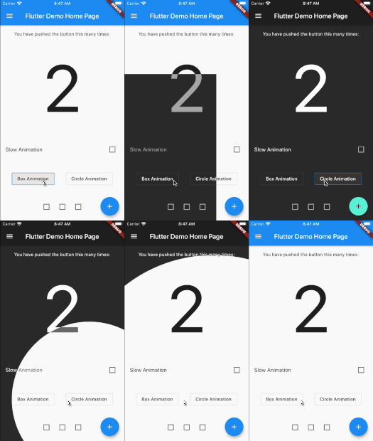
demo

Getting started

Add animated_theme_switcher: "^2.0.8" in your pubspec.yaml dependencies.

dependencies:
 animated_theme_switcher: "^2.0.8"
How To Use

Import the following package in your dart file

import 'package:animated_theme_switcher/animated_theme_switcher.dart';

Wrap MaterialApp with ThemeProvider widget, as it has shown in the following example:

  ThemeProvider(
      initTheme: initTheme,
      builder: (context, myTheme) {
        return MaterialApp(
          title: 'Flutter Demo',
          theme: myTheme,
          home: MyHomePage(),
        );
      }),
    ),

But if all you want is to provide a theme, use as follows:

  ThemeProvider(
      initTheme: initTheme,
      child: SomeCoolPage(),
    ),

Wrap the screen where you whant to make them switch with ThemeSwitchingArea widget, as it has shown in the following example:

    ThemeSwitchingArea(
      child: Builder(builder: (context) {
        return ...,
      },
    );

Wrap every switcher with ThemeSwitcher builder, and use ThemeSwitcher.of(context).changeTheme function to switch themes;


    ThemeData newTheme = ThemeData(
      primaryColor: Colors.amber
    );
    ...
    ThemeSwitcher(
      builder: (context) {
        ...
        onTap: () => ThemeSwitcher.of(context).changeTheme(
          theme: newTheme,
          isReversed: false // default: false 
        );
        ...
      },
    );

Alternatively you could use ThemeSwitcher.switcher() or ThemeSwitcher.withTheme().
Builders of this constructors already provide you ThemeSwitcher.
ThemeSwitcher.withTheme() also provides current theme:

    ThemeSwitcher.switcher(
      builder: (context, switcher) {
        ...
        onTap: () => switcher.changeTheme(
          theme: newTheme,
        );
        ...
      },
    );
    
    ThemeSwitcher.withTheme(
      builder: (context, switcher, theme) {
        ...
        onTap: () => switcher.changeTheme(
          theme: theme.brightness == Brightness.light
              ? darkTheme
              : lightTheme,
        );
        ...
      },
    );

Use optional named parameter clipper to pass the custom clippers.

    ...
    ThemeSwitcher(
      clipper: ThemeSwitcherBoxClipper(),
      builder: (context) {
        ...
      },
    );

Notes:

  1. This package is not intended to persist selected theme on the local device. But we added special example to show how to do it using shared_preferences package.

  2. Use the CanvasKit rendering engine to use it on web, more about it..

카테고리

소스 저장소

이 패키지를 사용하는 프로젝트