패키지, 저장소 및 앱 카테고리 검색

flutter_animated_reaction 표지
패키지 상세v0.0.2

flutter_animated_reaction

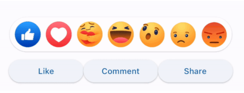
Flutter Animated Reaction은 애니메이션된 반응 오버레이(예: 페이스북, 링크드인)이며, 사용자 고유의 반응 아이콘(이미지/GIF)을 사용하여 맞춤 설정할 수 있습니다.

AndroidiOSWebmacOSWindowsLinux
30일 다운로드
36
좋아요
34
Pub 점수
130

패키지 설치

flutter pub add flutter_animated_reaction

패키지 개요

공개 정보를 바탕으로 생성한 선택 가이드입니다.

Flutter Animated Reaction은 Facebook이나 LinkedIn과 유사한 소셜 미디어 스타일의 반응을 위한 사용자 정의 가능한 애니메이션 오버레이입니다. 사용자가 콘텐츠와 상호작용할 때 이미지나 GIF 등의 애니메이션 반응 아이콘을 표시할 수 있습니다. 이 패키지는 Android, iOS, Web, macOS, Windows, Linux 등 여러 플랫폼을 지원하여 크로스플랫폼 앱에 적합합니다. pub add를 통해 간단하게 통합할 수 있으며, 동적 시각 피드백을 통해 사용자 참여도를 높입니다.

사용 사례

  • 소셜 미디어 앱 상호작용
  • 사용자 반응 애니메이션
  • 인터랙티브 게시물 피드
  • 참여도 기반 UI 요소
  • 메시징 앱에서의 실시간 피드백

주요 기능

  • 사용자 지정 반응 아이콘
  • 이미지 및 GIF 지원
  • 크로스 플랫폼 호환성
  • Flutter와의 간단한 통합
  • 애니메이션 오버레이 효과

적합한 대상

  • 소셜 네트워킹 앱을 개발하는 개발자
  • 상호작용 피드백을 원하는 UI 디자이너
  • 실시간 사용자 반응이 필요한 앱
  • 다중 플랫폼 대상 프로젝트
  • 경량 애니메이션 솔루션을 원하는 팀

고려 사항

  • 아이콘에 대한 적절한 자산 관리가 필요합니다
  • 복잡한 GIF에 따라 성능이 달라질 수 있습니다
  • 아이콘 및 애니메이션 스타일 외에는 사용자 정의가 제한적입니다
  • 중규모 애니메이션에 가장 적합
  • 복잡한 워크플로우를 위해 추가 상태 관리가 필요할 수 있습니다

원본 README

연결된 소스 저장소의 README 원문 스냅샷입니다. 최신 내용은 저장소에서 확인하세요.

Flutter Animated Reaction

Flutter Animated Reaction is an animated reaction overlay(Example: Facebook, LinkedIn) which can be customized using your own reaction icons(images/gifs). Wherever your reaction button is on the screen, this package helps you to pop up an animated reaction overlay at the right location on the screen with your preferred reactions icon.

Demo

animated

Features

  • Customized reaction icon i.e. images, gifs can be added in the list
  • Cool animation to display the reaction overlay
  • Dragging any reaction icon generates nice animation
  • In built facebook reaction icons
  • Reaction sound feature

Getting started

import 'package:flutter_animated_reaction/flutter_animated_reaction.dart';

Usage

For better understanding, you can see example application.

AnimatedFlutterReaction().showOverlay(context: context,
                                      key: key,
                                      onReaction: (val){
                                         print(val);
                                      });
Parameters
Parameter Description
Key Global Key used in the reaction button . It is used to find the renderBox and measure it's position.
reactions List of all reaction icons which you want to show in the overlay.(Image/Gifs path)
onReaction(int) It is triggered when any of the reaction is tapped
backgroundColor It describes overlay background color
overlaySize It specifies overlay width
iconSize It can set the size of reaction icons. Default size is (45,45)

How to Contribute

  1. Fork it
  2. Create your feature branch (git checkout -b new-feature)
  3. Commit your changes (git commit -m 'Add some feature')
  4. Push to the branch (git push origin new-feature)
  5. Create new Pull Request

카테고리

의존성

의존성 목록 1 개

소스 저장소

이 패키지를 사용하는 프로젝트

아직 데이터가 없습니다.