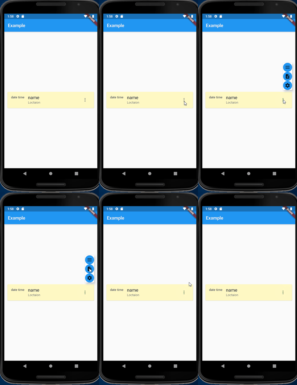
Flutter Portal은 기존의 Overlay와 OverlayEntry를 선언적이고 컨텍스트 인식적인 접근 방식으로 대체하는 현대적인 오버레이 솔루션입니다. 위젯 트리 위에 UI 요소를 위치하고 정렬하는 것을 간단하게 만들어 주며, 명령형 조작 없이 직관적인 배치를 가능하게 합니다. 모든 Flutter 플랫폼에서 원활한 통합을 위해 설계되었으며, 반복 코드를 줄이고 유지보수성을 향상시켜 개발자 경험을 향상시킵니다. 복잡한 레이아웃 내에서 정밀하고 동적으로 위치가 필요한 모달, 툴팁, 포퍼스, 플로팅 컴포넌트에 적합합니다.
사용 사례
특정 위젯 위에 툴팁 표시
컨텍스트 인식형 팝오버 생성
사용자 지정 모달 대화 상자 만들기
복잡한 레이아웃 위에 UI 요소 겹쳐 표시하기
계층화된 UI 컴포넌트 관리
주요 기능
선언적 오버레이 구문
자동 컨텍스트 인식
직관적인 정렬 컨트롤
크로스 플랫폼 호환성
최소한의 보일러플레이트
동적 위치 지정
적합한 대상
풍부한 UI 오버레이를 구축하는 개발자
유지보수 가능한 코드를 우선시하는 팀
정확한 요소 위치 지정이 필요한 프로젝트
계층적 컴포넌트를 갖춘 UI 중심 애플리케이션
다중 플랫폼을 대상으로 하는 앱
고려 사항
초보자에게는 학습 곡선이 필요할 수 있습니다
오버레이 전용 사용 사례에 국한됨
전체 화면 탐색에 적합하지 않음
과도한 오버레이로 인한 성능 영향
정확한 위젯 트리 구조에 의존합니다
원본 README
연결된 소스 저장소의 README 원문 스냅샷입니다. 최신 내용은 저장소에서 확인하세요.
flutter_portal: Evolved Overlay/OverlayEntry - declarative not imperative, intuitive-context, and easy-alignment
Want to show floating overlays - tooltips, contextual menus, dialogs, bubbles, etc? This library is an enhancement and replacement to Flutter's built-in Overlay/OverlayEntry.
Declarative, not imperative: Like everything else in the Flutter world, overlays (portals) are declarative now. Simply put your floating UI in the normal widget tree. Compare: The OverlayEntry is not a widget, and is manipulated imperatively using .insert() etc.
Alignment, done easily: Built-in support for aligning an overlay next to a UI component. Compare: A custom contextual menu from scratch in a few lines of code; while Overlay makes it nontrivial to align the tooltip/menu next to a widget.
Customizable alignment logic: For example, ensure the portal target never renders outside the screen (shiftToWithinBound), align it to portal instead of parent widget (alignToPortal), and you can even create your own align algorithm (extend EnhancedCompositedTransformAnchor). Compare: Overlay does not seem to have this.
The intuitive Context: The overlay entry is build with its intuitive parent as its context. Compare The Overlay approach uses the far-away overlay as its context. Update: OverlayPortal, which is inspired by this package, improved and did this well.
As a consequence, also have the following pros:
Easy restorable property: Since showing an overlay as simple as doing a setState, RestorableProperty works nicely. Compare: When using the Overlay approach, the state of our modals are not restored when our application is killed by the OS.
Correct Theme/provider: Since the overlay entry has the intuitive context, it has access to the same Theme and the different providers as the widget that shows the overlay. Compare: The Overlay approach will yield confusing Themes and providers. Update: OverlayPortal, which is inspired by this package, improved and did this well.
👀 Show me the code
PortalTarget(
// 1. Declarative: Just provide `portalFollower` as a normal widget// 2. Intuitive BuildContext inside
portalFollower: MyAwesomeOverlayWidget(),
// 3. Align the "follower" relative to the "child" anywhere you like
anchor: Aligned.center,
child: MyChildWidget(),
)
To migrate from 0.x to 1.x, see the last section of the readme.
🪜 Examples
Check-out the examples folder for examples on how to use flutter_portal:
Before doing anything, you must insert the Portal widget in your widget tree. The follower widgets will behave as if they are inserted as children of this widget.
You can place this Portal above MaterialApp or near the root of a route:
Portal(
  child: MaterialApp(...)
)
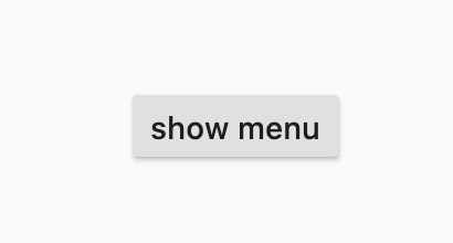
The button
First, we need to create a StatefulWidget that renders our RaisedButton:
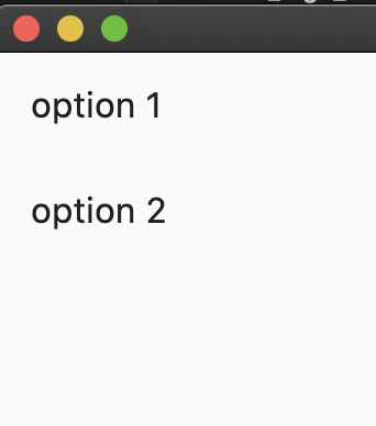
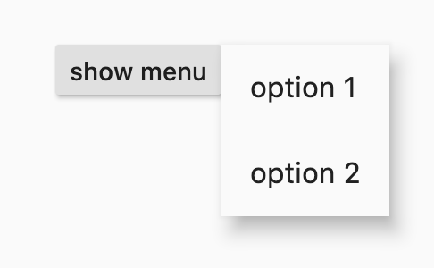
What this code means is, this will align the top-left of our menu with the
top-right or the `RaisedButton`. With this, our menu is no-longer full-screen and is now located to the right of our button.
Show the menu
Finally, we can update our code such that the menu show only when clicking
on the button.
To do that, we need to declare a new boolean inside our StatefulWidget,
that says whether the menu is open or not:
There are a few concepts that are useful to fully understand when using
flutter_portal. That is especially true if you want to support custom use
cases, which is easily possible with the abstract API provided.
In the following, each of the abstract concepts you need to understand are
explained on a high level. You will find them both in class names (e.g. the
Portal widget or the PortalTarget widget as well as in parameter names).
Portal
A portal (or the portal if you only have one) is the space used for doing all
of the portal work. On a low level, this means that you have one widget that
allows its subtree to place targets and followers that are connected.
The portal also defines the area (rectangle bounds) that are available to any
followers to be rendered onto the screen.
In detail, you might wrap your whole MaterialApp in a single Portal widget,
which would mean that you can use the whole area of your app to render followers
attached to targets that are children of the Portal widget.
Target
A target is any place within a portal that can be followed by a follower. This
allows you to attach whatever you want to overlay to a specific place in your
UI, no matter where it moves dynamically.
On a low level, this means that you wrap the part of your UI that you want to
follow in a PortalTarget widget and configure it.
Example
Imagine you want to display tooltips when an avatar is hovered in your app. In
that case, the avatar would be the portal target and could be used to anchor
the tooltip that is overlayed.
Another example would be a dropdown menu. The widget that shows the current
selection is the target and when tapping on it, the dropdown options would be
overlayed through the portal as the follower.
Follower
A follower can only be used in combination with a target. You can use it for
anything that you want to overlay on top of your UI, attached to a target.
Specifically, this means that you can pass one follower to every
PortalTarget, which will be displayed above your UI within the portal when
you specify so.
Example
If you wanted to display an autocomplete text field using flutter_portal,
you would want to follow the text field to overlay your autocomplete
suggestions. The widget for the autocomplete suggestions would be the portal
follower in that case.
Anchor
Anchors define the layout connection between targets and followers. In general,
anchors are implemented as an abstract API that provides all the information
necessary to support any positioning you want. That means that anchors can be
defined based on the attributes of the associated portal, target, and follower.
There are a few anchors that are implemented by default, e.g. Aligned or
Filled.
⛵ Migration from 0.x
There are some breaking changes (mostly introduced by #44) from 0.x to 1.0, but it can be easily migrated. The following:
If you originally use PortalEntry without portalAnchor/childAnchor (i.e. make it fullscreen), then you can write as:
PortalTarget(
anchor: constFilled(),
...
)
✨ Acknowledgement
Owners
@rrousselGit: The former owner of this package. Create this package in December 2019, and majorly maintain until early 2022. Contributions include: Implementation of the package, including code, documentations, examples, etc. Change algorithms of rendering. Remove PortalEntry's generic. Allow delaying the disappearance of PortalEntry, useful for leave animations.
@fzyzcjy: The current owner of this package. See CHANGELOG.md for contributions.
Contributors
@creativecreatorormaybenot: New anchoring logic for advanced use cases, making anchors more flexible, improving code quality, and enhancing non-fragility without additional layout/paint calls.