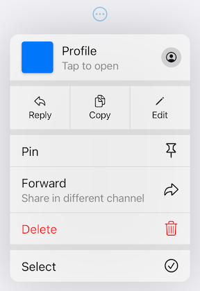
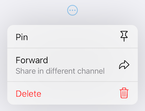
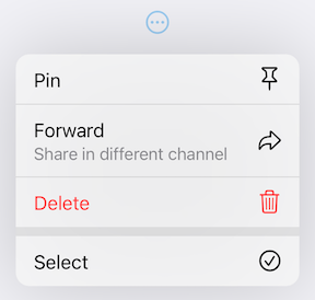
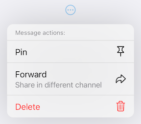
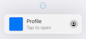
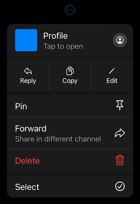
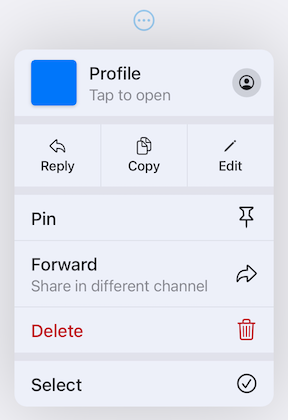
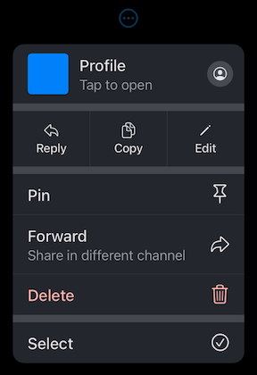
iOS 14의 풀다운 버튼 UI 컴포넌트를 복제하는 플러터 패키지로, 앱 인터페이스용 사용자 정의 가능한 드롭다운 스타일의 버튼을 제공합니다. 사용자가 버튼에서 아래로 당겨서 옵션이나 작업을 표시할 수 있게 하여 iOS 디자인 패턴과의 상호작용 일관성을 높입니다. 이 패키지는 여러 플랫폼을 지원하며 외형 및 동작에 대한 광범위한 커스터마이징 기능을 제공합니다.
사용 사례
iOS 스타일의 드롭다운 메뉴 구현
Flutter 앱에서 사용자 정의 드롭다운 만들기
제스처 기반 제어를 통한 사용자 상호작용 향상
크로스 플랫폼 앱에 플랫폼별 UI 요소 추가하기
직관적인 액션 선택기 설계
주요 기능
iOS 14를 영감으로 한 드래그 다운 애니메이션
매우 사용자 정의 가능한 외관 및 동작
모든 주요 플러터 플랫폼 지원
제스처 기반 상호작용
확장 가능한 위젯 구조
적합한 대상
iOS 디자인 일관성에 초점을 맞춘 개발자
제스처 기반 드롭다운이 필요한 앱
네이티브와 유사한 구성 요소가 필요한 크로스 플랫폼 앱
현대적인 Flutter 위젯을 찾는 UI 디자이너
고려 사항
제스처 처리 이해 필요
비-iOS 플랫폼용 추가 스타일링이 필요할 수 있습니다
하향 탐색 상호작용 패턴으로 제한
복잡한 메뉴 계층 구조에 적합하지 않습니다
공간이 제한된 맥락에서 가장 효과적으로 사용됨
원본 README
연결된 소스 저장소의 README 원문 스냅샷입니다. 최신 내용은 저장소에서 확인하세요.
Pull-Down Button from iOS 14-18 for Flutter
[!CAUTION]
This package is discontinued and will no longer receive any updates. Replacement is available in Flutter since stable version 3.44 - CupertinoMenuAnchor
pull_down_button is an attempt to bring
Pop-Up and
Pull-Down
Buttons from iOS 14-18 to Flutter with some additional customisation options.
This package only tries to visually replicate the native counterpart, some parts might be somewhat different.
[!IMPORTANT]
This package is no longer actively maintained and will most likely be deprecated and unlisted some time after Flutter finally supports iOS menus out of the box to give some time for migration. You can follow the progress here - #60298.
One of the core features of this package is an extensive customizability, which, most likely, will not be present in Flutter's pull-down menus. If there won't be any plans to add customizability to Flutter's menus, but there will be a big interest in it, this package might migrate most of the code to use Flutter's more advanced implementation with customisation options present right now. You can post your feedback on this topic here.
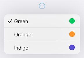
PullDownMenuItem.selectable uses all of PullDownMenuItem properties as well as a boolean value selected, to indicate whether the menu item is selected or not.
PullDownMenuActionsRow
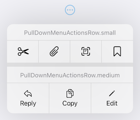
PullDownMenuActionsRow is a widget used to create cupertino-style pull-down menu row of actions
(small or medium size).
PullDownMenuItem is used to populate PullDownMenuActionsRow.items.
Depending on PullDownMenuActionsRows size, PullDownMenuItem might be either icon only or icon and title in a vertical array.
Properties
Description
items
List of PullDownMenuItem.
PullDownMenuDivider
PullDownMenuDivider.large is a widget used to create cupertino-style pull-down menu large divider.
There is no need in adding PullDownMenuDivider by hand, pull-down menu does it automatically!
PullDownMenuTitle
PullDownMenuTitle is a widget used to create cupertino-style pull-down menu title (usually at the top of menu).
An alternative way of displaying pull-down menu via a function call.
onPressed: () async {
/* get tap position and / or do something before opening menu */awaitshowPullDownMenu(
context: context,
items: [...],
position: position,
);
}
Properties table
Properties
Description
context
For looking up Navigator for the menu.
items
List of PullDownMenuEntry widgets.
position
The Rect is used to align the top of the menu with the top of the position rectangle.
itemsOrder
Whether the popup menu orders its items from itemBuilder in a downward or upwards way.
menuOffset
Additional offset for the pull-down menu if the menu's desired position.
scrollController
A custom menu scroll controller.
onCanceled
Called when the user dismisses the pull-down menu.
routeTheme
The theme of the pull-down menu box.
useRootNavigator
Whether to use the root navigator to show the pull-down menu.
routeSettings
Optional route settings for the pull-down menu.
PullDownMenu
Another alternative way of displaying the pull-down menu as a simple widget, with no animations or adding routes to the navigation stack.
This package also provides additional customization. By default, the iOS 16 theme is used, but it is also possible to override defaults with widget properties (see above) or with PullDownButtonTheme theme extension.
Light Theme
Dark Theme
PullDownButtonTheme
To use PullDownButtonTheme define it in your ThemeData as follows:
PullDownButtonTheme uses a set of sub-themes (for items, dividers, the menu itself, etc.) to define the needed theme. See below for every property each sub-theme provides.
backgroundColor usually has opacity in the range of 0.7-0.8 so that menu has a blur effect.
If backgroundColor is fully opaque (opacity set to 1), no blur effect will be applied.
PullDownMenuItemTheme
Properties
Description
destructiveColor
Color for destructive action.
checkmark
Checkmark icon.
textStyle
PullDownMenuItem text style.
subtitleStyle
PullDownMenuItem subtitle text style.
iconActionTextStyle
PullDownMenuItem text style inside of PullDownMenuActionsRow.
onHoverBackgroundColor
On hover color of PullDownMenuItem.
onPressedBackgroundColor
On pressed color of PullDownMenuItem.
onHoverTextColor
On hover color of text of PullDownMenuItem.
PullDownMenuDividerTheme
Properties
Description
dividerColor
Small divider color.
largeDividerColor
Large divider color.
largeDividerColor is usually lighter than dividerColor.
PullDownMenuTitleTheme
Properties
Description
style
PullDownMenuTitle text style.
PullDownButtonInheritedTheme
If defining PullDownButtonTheme in ThemeData is not possible, for example, if you are using CupertinoApp, you can use PullDownButtonInheritedTheme:
Here is an example of using PullDownButtonTheme with Material 3 color scheme colors
(generated from CupertinoColors.systemBlue with ColorScheme.fromSeed) from Material 3 Menu specs.
Custom Material 3 light theme
Custom Material 3 dark theme
Contributions
Feel free to contribute to this project.
Please file feature requests and bugs at the issue tracker.
If you fixed a bug or implemented a feature by yourself, feel free to send a pull request.