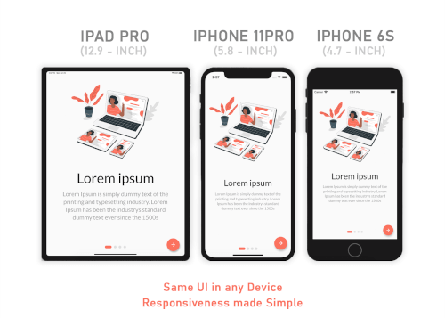
Responsive Sizer는 다양한 화면 크기와 방향에서 반응형 레이아웃을 쉽게 만들 수 있도록 도와주는 Flutter 패키지입니다. 디바이스의 화면 치수에 따라 글꼴, 크기 및 간격을 쉽게 조정할 수 있는 헬퍼 위젯과 확장 메서드를 제공합니다. `vs`(수직 크기)와 `hs`(수평 크기)와 같은 논리적 단위를 사용함으로써 다양한 기기에서 일관된 UI 표시를 보장할 수 있습니다. 이 패키지는 기존의 Flutter 프로젝트에 원활하게 통합되며 Android, iOS, Web, macOS, Windows, Linux 등 주요 플랫폼을 모두 지원합니다.
사용 사례
다양한 디바이스에 대응하는 반응형 UI 구축
텍스트 및 레이아웃 요소의 동적 확대
다양한 화면 크기에 맞는 적응형 디자인 만들기
장치 간 일관된 간격 보장
복잡한 계산 없이 반응형 디자인 간소화
주요 기능
사용하기 쉬운 확장 메서드
vs 및 hs 단위 지원
내장된 반응형 위젯
크로스 플랫폼 호환성
최소한의 보일러플레이트 코드
자동 화면 크기 감지
적합한 대상
다중 플랫폼 앱을 개발하는 개발자
반응형 디자인을 우선시하는 팀
동적 확장이 필요한 프로젝트
초보자가 반응형 Flutter 배우기
다양한 디바이스 화면을 대상으로 하는 앱
고려 사항
기존 레이아웃 값의 초기 조정이 필요할 수 있습니다
일관된 디자인 시스템과 함께 사용하는 것이 가장 좋습니다
높은 사용자 정의 또는 비균일 확대 필요에 적합하지 않음
성능에 미치는 영향은 무시할 수 있지만 저사양 기기에서 테스트해야 합니다
반응형 디자인 원칙을 이해해야 합니다
원본 README
연결된 소스 저장소의 README 원문 스냅샷입니다. 최신 내용은 저장소에서 확인하세요.
Responsive Sizer
Responsive Sizer helps implement a responsive layout by providing helper widgets and extensions.
If you want the same layout to look different in tablet and mobile, use the Device.screenType method:
Device.screenType == ScreenType.tablet
  ? Container(   // Widget for Tablet
      width: 100.w,
      height: 20.5.h,
   )
  : Container(   // Widget for Mobile
      width: 100.w,
      height: 12.5.h,
   )
*Device.ScreenTypecan not be Desktop unless maxTabletWidth is set
Parameters
ResponsiveSizer
maxMobileWidth - Maximum width of a mobile device
(If the device's width is larger than this, it will be categorized as a tablet) - Default value: 599
maxTabletWidth - Maximum width of a tablet device
(If the device's width is larger than this, it will be categorized as a desktop) - Optional: enables DesktopScreenType if enabled
Extensions
Adaptive.h() or .h - Calculated percentage of the device's height (40.h -> 40% of device's height)
Adaptive.w() or .w - Calculated percentage of the device's width (40.w -> 40% of device's width)
Adaptive.sp() or .sp - Calculated sp based on the device's pixel density and aspect ratio (See FAQ)
Adaptive.dp() or .dp - Calculated dp based on the device's pixel density (See FAQ)
*Note: Only use .sh and .sw if you want height and width to depend on the device's available height and width after applying SafeArea. Use .h and .w by default.
Adaptive.sh() or .sh - Calculated percentage of the remaining device's height after applying SafeArea
Adaptive.sw() or .sw - Calculated percentage of the remaining device's width after applying SafeArea
Device.boxConstraints - BoxConstraints of the device
Device.orientation - Screen Orientation of the device (portrait or landscape)
Device.screenType - Screen type of the device (mobile or tablet)
Device.aspectRatio - Aspect ratio of the device
Device.pixelRatio - Pixel density ratio of the device
Adaptive.cm() or .cm - The respective value in value in centimeters
Adaptive.mm() or .mm - The respective value in value in millimeters
Adaptive.Q() or .Q - The respective value in quarter-millimeters
Adaptive.inches() or .inches - The respective value in inches
Adaptive.pc() or .pc - The respective value in picas (1/6th of 1 inch)
Adaptive.pt() or .pt - The respective value in points (1/72th of 1 inch)
Adaptive.px() or .px - The respective value in pixels
Take Note
You need to import responsive_sizer package in order to access number.h, number.w, number.dp, and number.sp
Auto import in VSCode and Android Studio doesn't work for dart extension methods. Typing 10.h would not bring up auto import suggestion for this package
One workaround is to type Device so that the auto import suggestion would show up:
Why is dp not calculated using the device's screen density?
Since there is no way to obtain a device's physical width in inches, we could not calculate for screen density. Material Design's screen density calculation involves a device's physical width in inches. As an alternative, dp is calculated using the device's pixel ratio.
Community Support
If you have any suggestions or issues, feel free to open an issue
If you would like to contribute, feel free to create a PR