패키지, 저장소 및 앱 카테고리 검색

rounded_loading_button 표지
패키지 상세v2.1.0

rounded_loading_button

Flutter용 간단한 애니메이션 로딩 버튼 위젯 구현

30일 다운로드
876
좋아요
539
Pub 점수
60

패키지 설치

flutter pub add rounded_loading_button

패키지 개요

공개 정보를 바탕으로 생성한 선택 가이드입니다.

표준 버튼에서 원형 진행률 표시기와 함께 로딩 상태로 부드럽게 전환할 수 있는 애니메이션 로딩 버튼 위젯을 제공하는 플러터 패키지입니다. 간단하고 통합이 쉬우며 비동기 작업 중 사용자 피드백을 향상시킬 수 있도록 설계되었습니다. 색상, 크기, 애니메이션 지속 시간 등을 사용자 정의할 수 있어 양식, 로그인 화면 및 사용자 확인이 필요한 모든 작업에 적합합니다. 깔끔한 Dart 코드로 작성되어 현대적인 플러터 애플리케이션에 자연스럽게 통합됩니다.

사용 사례

  • 폼 제출
  • 로그인 또는 등록 흐름
  • API 호출 트리거
  • 사용자 작업 확인
  • 로딩 상태 피드백

주요 기능

  • 애니메이션 로딩 전환
  • 사용자 지정 가능한 색상 및 크기
  • 순환 진행 표시기
  • 간단한 API 통합
  • 부드러운 애니메이션

적합한 대상

  • 초보자 플러터 개발자
  • UI 중심 애플리케이션
  • 인터랙티브 폼
  • 모바일 앱 인터페이스
  • 빠른 프로토타이핑

고려 사항

  • 제한된 플랫폼별 사용자 지정
  • 내장된 오류 상태 없음
  • 비동기 로직을 수동으로 처리해야 합니다
  • 복잡한 버튼 동작에 적합하지 않음
  • 외부 애니메이션 시간에 의존

원본 README

연결된 소스 저장소의 README 원문 스냅샷입니다. 최신 내용은 저장소에서 확인하세요.

rounded_loading_button

pub package build codecov style: effective dart License: MIT Awesome Flutter

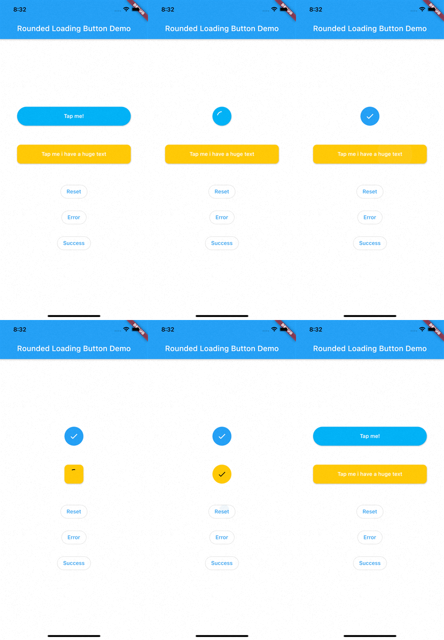
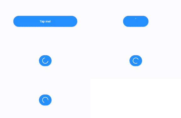
RoundedLoadingButton is a Flutter package with a simple implementation of an animated loading button, complete with success and error animations.

Installation

Add this to your pubspec.yaml:

dependencies:
    rounded_loading_button: ^2.0.8

Usage

Import
import 'package:rounded_loading_button/rounded_loading_button.dart';
Simple Implementation
final RoundedLoadingButtonController _btnController = RoundedLoadingButtonController();

void _doSomething() async {
    Timer(Duration(seconds: 3), () {
        _btnController.success();
    });
}

RoundedLoadingButton(
    child: Text('Tap me!', style: TextStyle(color: Colors.white)),
    controller: _btnController,
    onPressed: _doSomething,
)

The Rounded Loading Button has many configurable properties, including:

  • duration - The duration of the button animation
  • loaderSize - The size of the CircularProgressIndicator
  • animateOnTap - Whether to trigger the loading animation on the tap event
  • resetAfterDuration - Reset the animation after specified duration, defaults to 15 seconds
  • errorColor - The color of the button when it is in the error state
  • successColor - The color of the button when it is in the success state
  • successIcon - The icon for the success state
  • failedIcon - The icon for the failed state

Contributions

All contributions are welcome!

카테고리

의존성

의존성 목록 1 개

소스 저장소

이 패키지를 사용하는 프로젝트