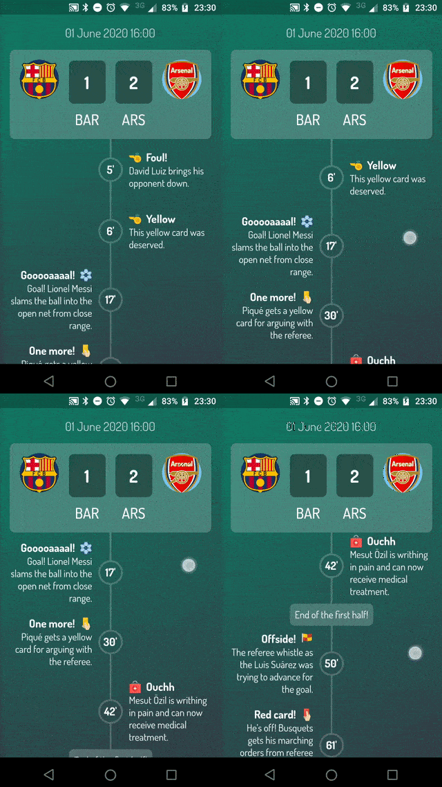
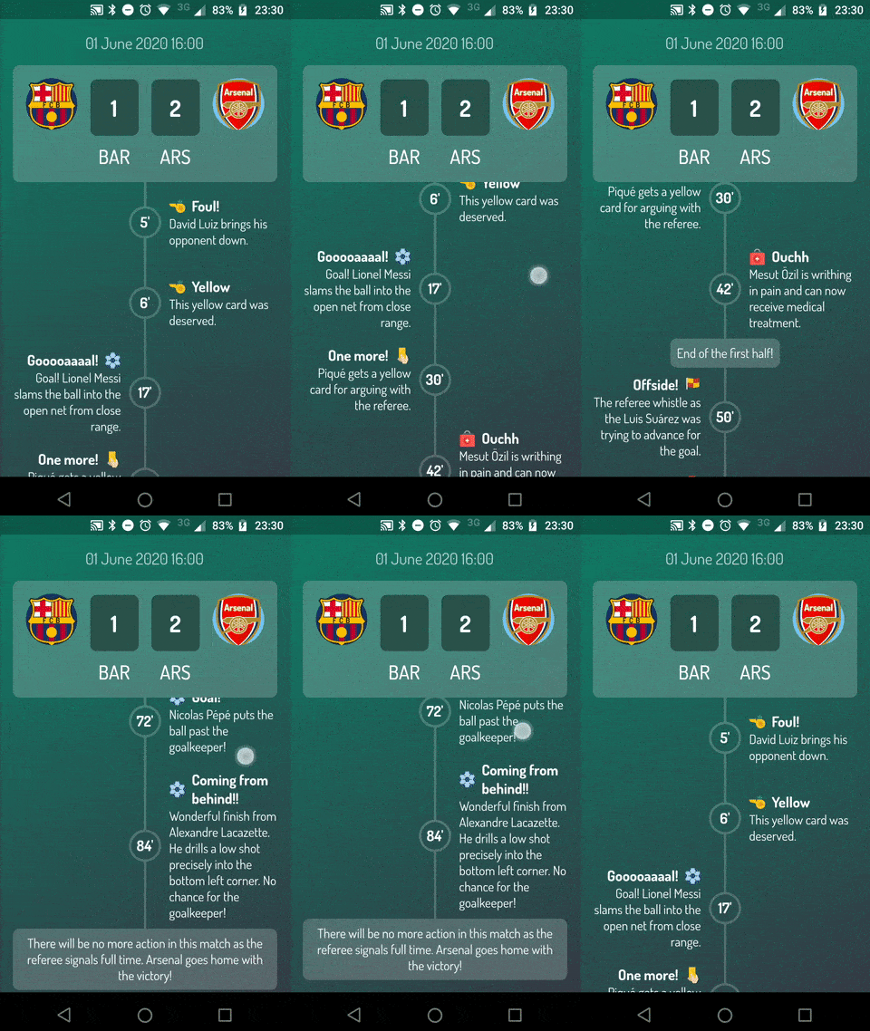
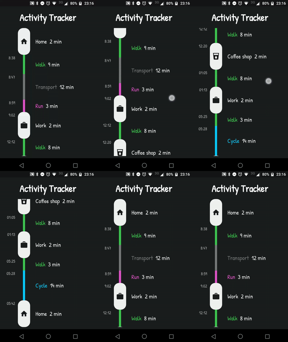
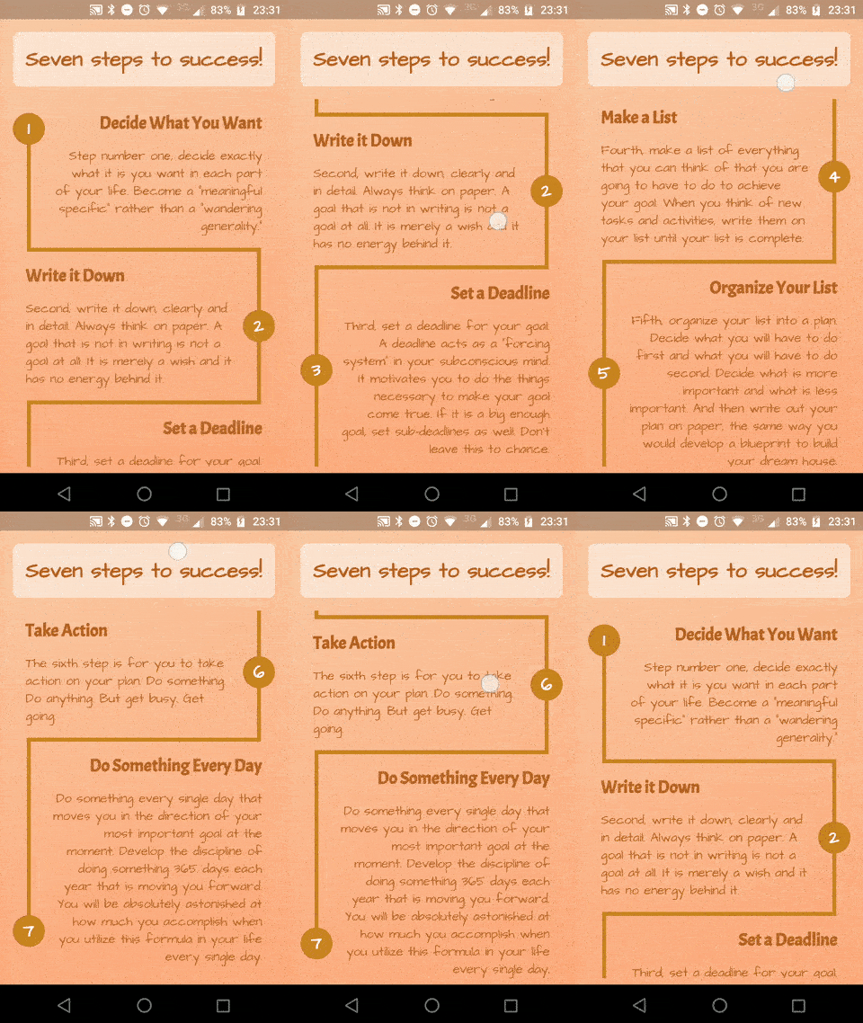
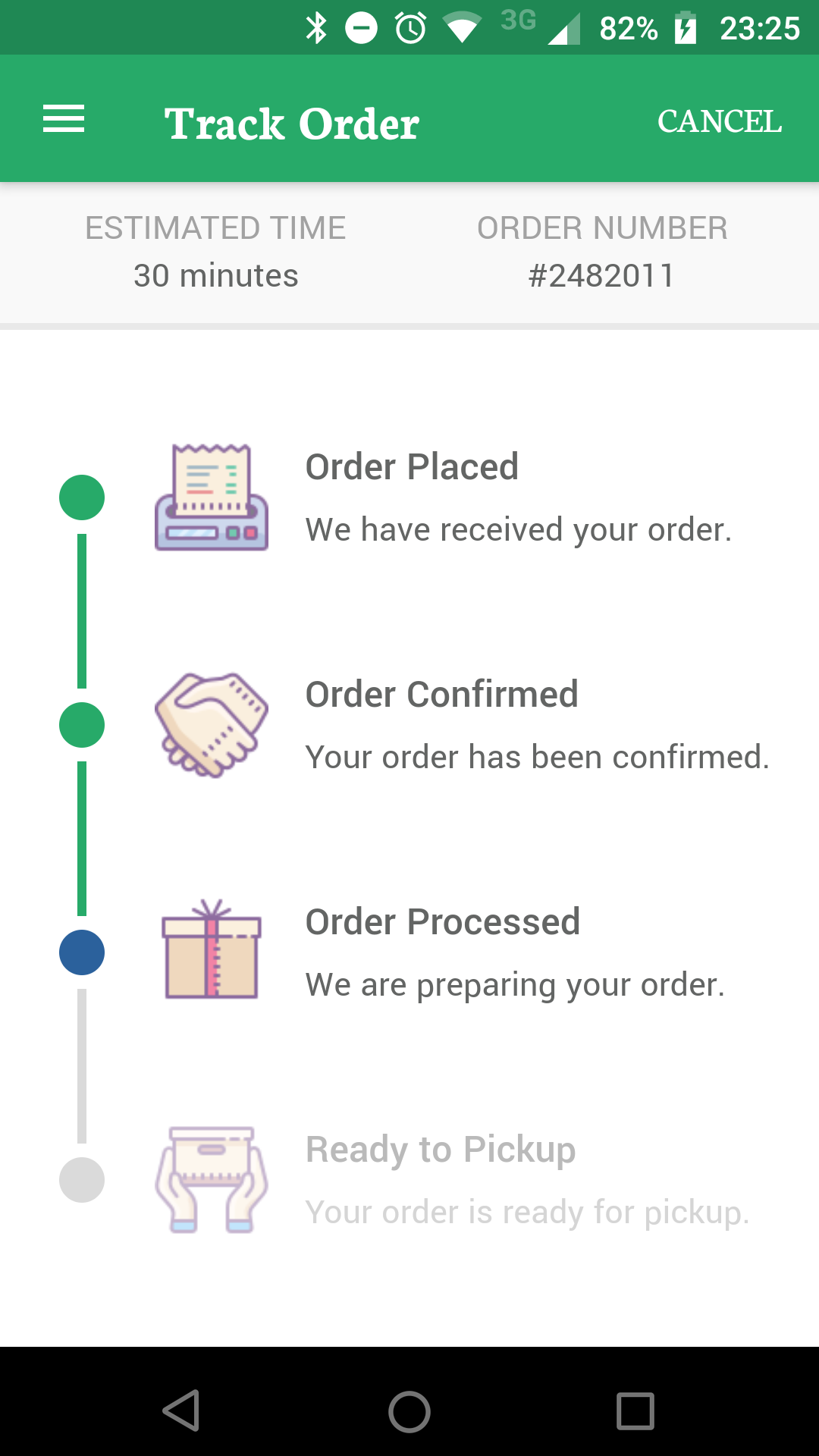
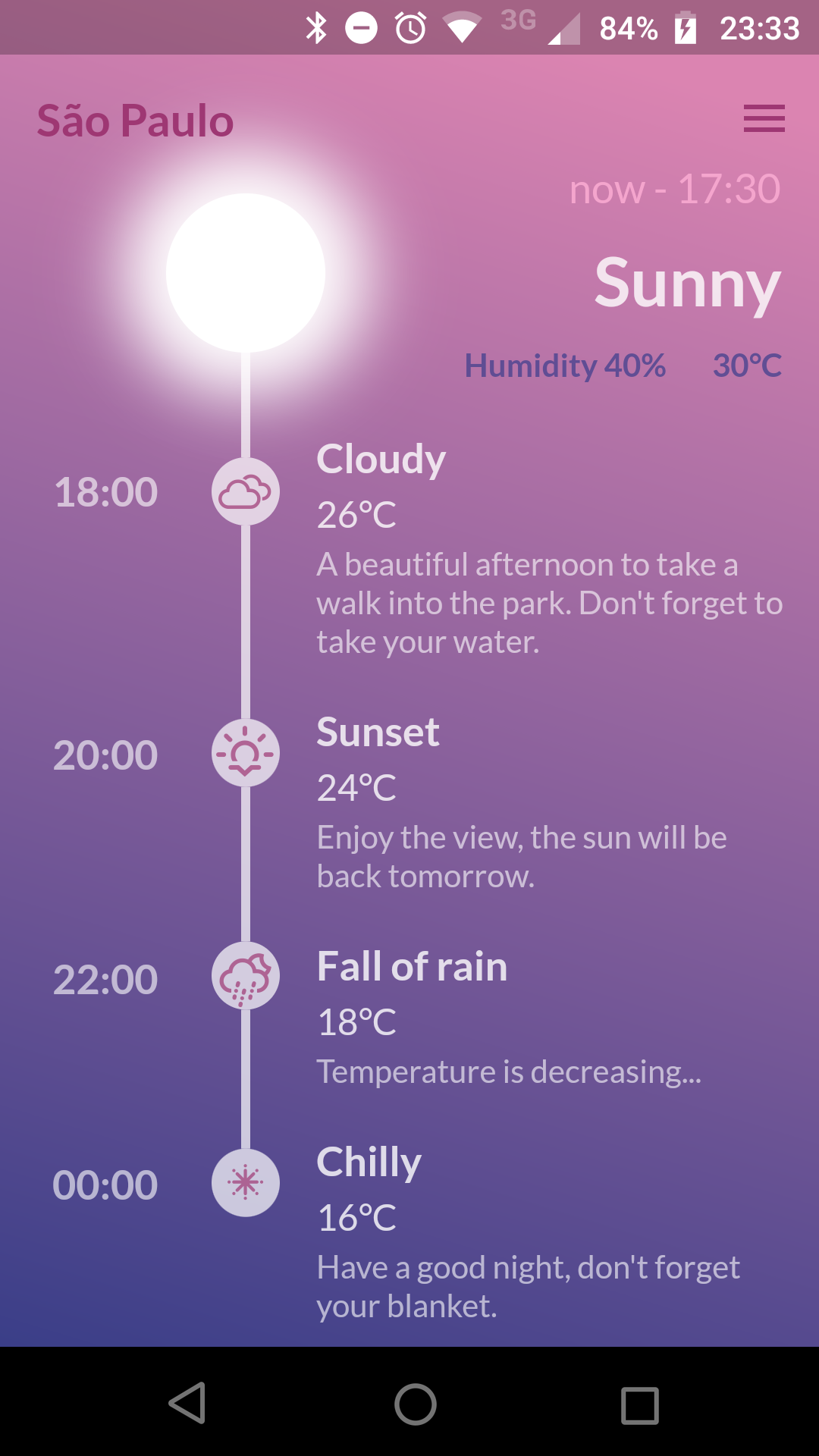
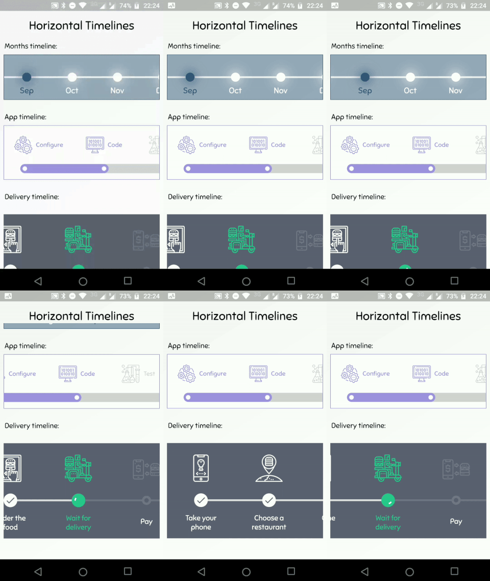
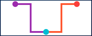
timeline_tile은 사용자가 쉽게 고도로 사용자 정의 가능한 타임라인을 만들 수 있도록 설계된 Flutter 패키지입니다. 수직 또는 수평 타임라인을 구축하기 위한 유연한 위젯을 제공하며, 다양한 스타일, 색상 및 콘텐츠 레이아웃을 지원합니다. 개발자는 타임라인 인디케이터, 커넥터 및 타일의 외관을 앱 디자인에 맞게 사용자 정의할 수 있습니다. 이 패키지는 가볍고 기존의 Flutter 프로젝트에 원활하게 통합되며, 이벤트 역사, 프로젝트 진행 상황 또는 시간 순서 데이터를 매력적으로 표시하는 데 이상적입니다.
사용 사례
이벤트 기록 표시
프로젝트 마일스톤 표시
단계별 프로세스 시각화
상호작용형 타임라인 만들기
역사적 데이터 표시
온보딩 흐름 개선
주요 기능
고도로 사용자 정의 가능한 타임라인 디자인
수직 및 수평 레이아웃 지원
사용자 정의 가능한 지시기 및 커넥터
유연한 타일 콘텐츠 배치
경량이며 간편한 통합
확장 가능한 위젯 구조
적합한 대상
시계열 UI를 구축하는 개발자
시각적 진행 추적을 필요로 하는 앱
교육용 또는 온보딩 인터페이스
프로젝트 관리 도구
콘텐츠가 풍부한 애플리케이션
고려 사항
복잡한 디자인의 경우 수동 레이아웃 구성이 필요합니다
제한된 내장 애니메이션
정적 또는 단순한 동적 타임라인에 가장 적합
반응형 동작을 위해 추가 스타일링이 필요할 수 있습니다
성능 조정 없이 매우 긴 타임라인에 최적화되지 않음
원본 README
연결된 소스 저장소의 README 원문 스냅샷입니다. 최신 내용은 저장소에서 확인하세요.
TimelineTile
A package to help build customisable timelines in Flutter.
Example
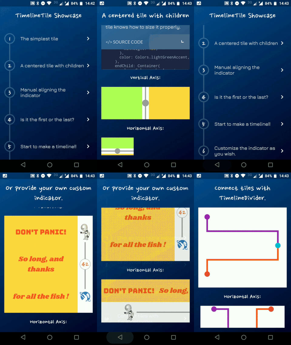
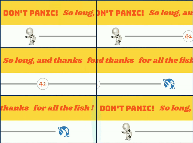
You can access the example project for a Timeline Showcase.
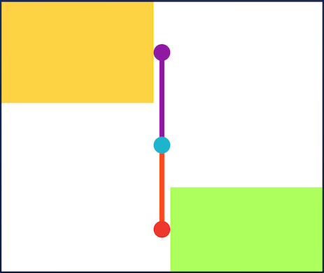
A Timeline consists in a group of TimelineTiles. To build a tile you can simply use:
TimelineTile()
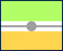
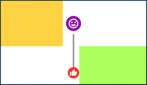
Which will build a default tile with a vertical axis, that aligns to the start, with a height of 100:
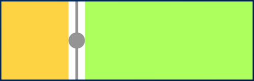
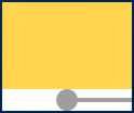
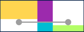
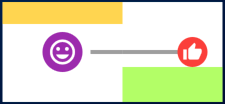
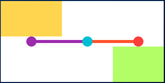
The axis can be switched to render an horizontal tile, aligned to the start, with a default width of 100:
TimelineTile(axis: TimelineAxis.horizontal)
There are 4 types of alignment.
TimelineAlign.start
TimelineAlign.end
TimelineAlign.center
TimelineAlign.manual
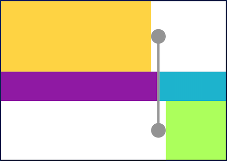
The start and end alignment allows a child in their opposite sides. On the other hand, both center and manual allows children on both sides. For example, one tile with alignment to the center:
When providing children to the vertical tile, the height will be as minimum as possible, so you can control it with a height constraint (at least minHeight). This way the tile knows how to size it properly.
If the axis is horizontal, the things are the opposite. The width will be as minimum as possible, so you can control it with a width constraint (at least minWidth). This way the tile knows how to size it properly.
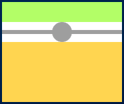
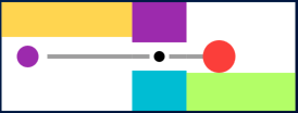
With TimelineAlign.manual you can provide the lineXY, which allows you to specify a value from 0.0 to 1.0, that represents a size percentage. For example, aligning at 30% of the width or height:
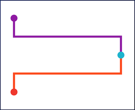
You can finally start to combine some tiles to make a Timeline. The flag hasIndicator can control whether an indicator should or shouldn't be rendered.
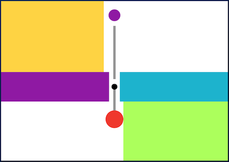
The default indicator is a circle, and you can customize it as you wish. With IndicatorStyle you can change the color, the X/Y position based on values from 0.0 to 1.0 or give it a padding. You must explicitly provide its width (vertical) or height (horizontal) though.
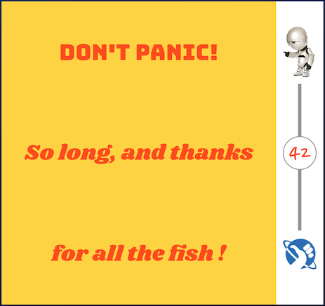
With the indicator parameter you can customize the tile with your own indicator. However, you must control its size through both width and height parameters.