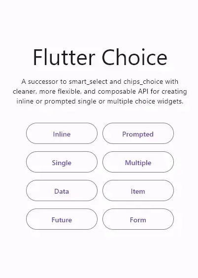
Originaler README-Schnappschuss aus dem verknüpften Quell-Repository. Aktuelle Inhalte finden Sie im Repository.




The successor to smart_select and chips_choice with cleaner, more flexible, and composable API for creating inline or prompted choice widgets with single or multiple selection.
Features
- Cleaner, flexible, and composable API
- Inline or prompted choice widget
- Single or multiple choice widget
- Searchable choice items with highlighted result
- Specifies whether the choice selection needs to be confirmed
- Use any type of choice data and load it easily, either synchronously or asynchronously
- Build your own choice item that fits your needs
- Groupable choice items that can be sorted
- Supports leading and trailing choice items, as well as divider choice items
- Use a predefined wrapped, scrollable, virtualized choice list, or build one that fits your needs
- Use a predefined popup dialog, bottom sheet, new page prompt, or build one that fits your needs
- Use a predefined modal header, footer, and separator, or build one that fits your needs
- Use a predefined group list, group item, and group header, or build one that fits your needs
- Use a predefined anchor widget or build one that fits your needs
- Use a predefined widget on loading, on error, and placeholder when empty, or build one that fits your needs
Usage
For a complete usage, please see the example.
To read more about classes and other references used by choice, see the API Reference.
Single Choice
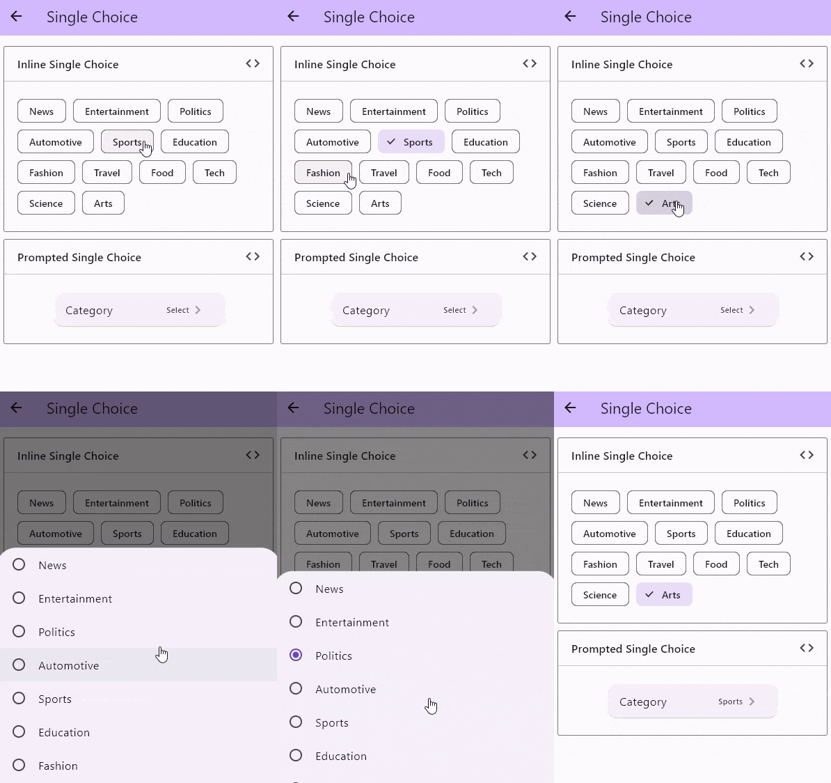
There are a few constructors to create a single selection choice widget:
By default, the choice controller maintains the selection state within a List. Any constructors other than those dedicated to single choice will have a List<T> for their value and onChanged prop. If we want to use a single value of T, we can use ChoiceSingle.value adapter to fill the value prop and ChoiceSingle.onChanged adapter to fill the onChanged prop.
Here is an example of how to use the ChoiceSingle.value and ChoiceSingle.onChanged adapters
import 'package:flutter/material.dart';
import 'package:choice/choice.dart';

class InlineScrollableX extends StatefulWidget {
  const InlineScrollableX({super.key});

  @override
  State<InlineScrollableX> createState() => _InlineScrollableXState();
}

class _InlineScrollableXState extends State<InlineScrollableX> {
  List<String> choices = [
    'News',
    'Entertainment',
    'Politics',
    'Automotive',
    'Sports',
    'Education',
    'Fashion',
    'Travel',
    'Food',
    'Tech',
    'Science',
    'Arts'
  ];

  String? selectedValue;

  void setSelectedValue(String? value) {
    setState(() => selectedValue = value);
  }

  @override
  Widget build(BuildContext context) {
    return Column(
      children: [
        Choice<String>.inline(
          clearable: true,
          value: ChoiceSingle.value(selectedValue),
          onChanged: ChoiceSingle.onChanged(setSelectedValue),
          itemCount: choices.length,
          itemBuilder: (state, i) {
            return ChoiceChip(
              selected: state.selected(choices[i]),
              onSelected: state.onSelected(choices[i]),
              label: Text(choices[i]),
            );
          },
          listBuilder: ChoiceList.createScrollable(
            spacing: 10,
            padding: const EdgeInsets.symmetric(
              horizontal: 20,
              vertical: 25,
            ),
          ),
        ),
        InlineChoice<String>.single(
          clearable: true,
          value: selectedValue,
          onChanged: setSelectedValue,
          itemCount: choices.length,
          itemBuilder: (state, i) {
            return ChoiceChip(
              selected: state.selected(choices[i]),
              onSelected: state.onSelected(choices[i]),
              label: Text(choices[i]),
            );
          },
          listBuilder: ChoiceList.createWrapped(
            spacing: 10,
            runSpacing: 10,
            padding: const EdgeInsets.symmetric(
              horizontal: 20,
              vertical: 25,
            ),
          ),
        ),
      ],
    );
  }
}
Multiple Choice
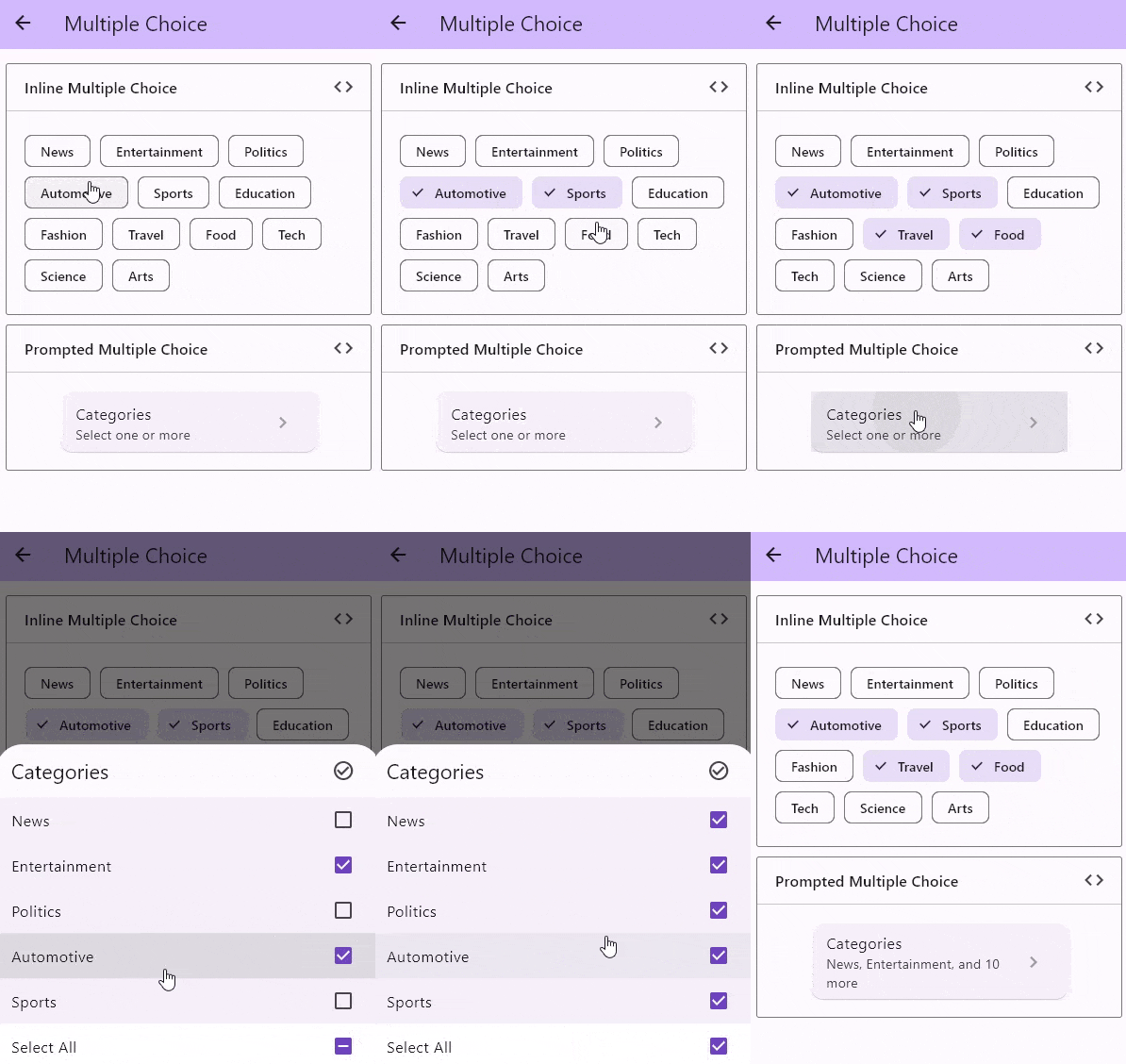
There are a few constructors to create an multiple selection choice widget:
Inline Choice
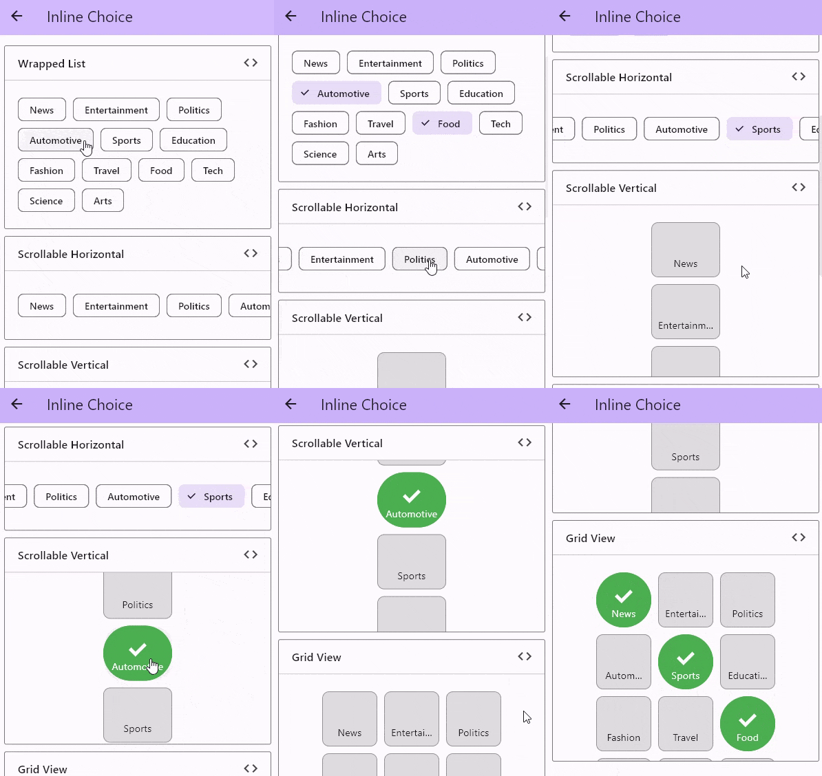
There are a few constructors to create an inline choice widget:
Prompted Choice
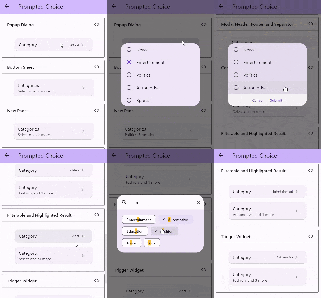
There are a few constructors to create a prompted choice widget:
Choice Data
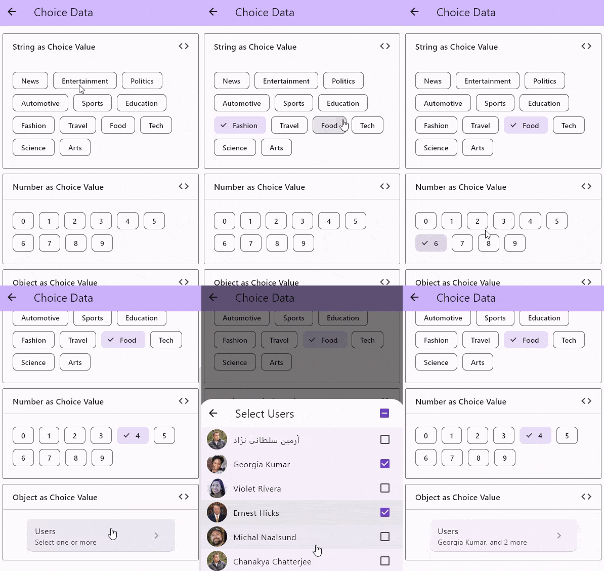
Choice Item
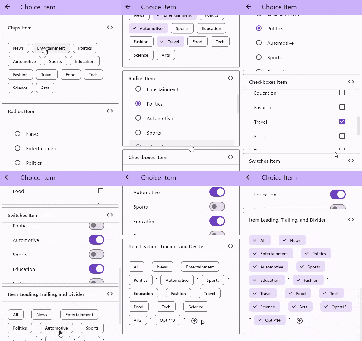
With Future Builder
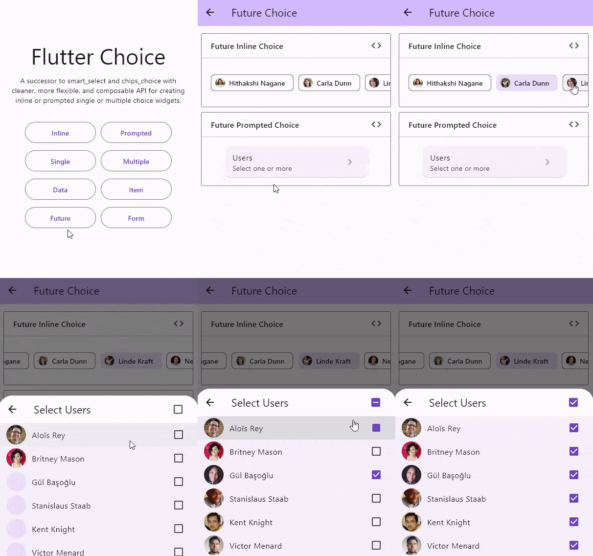
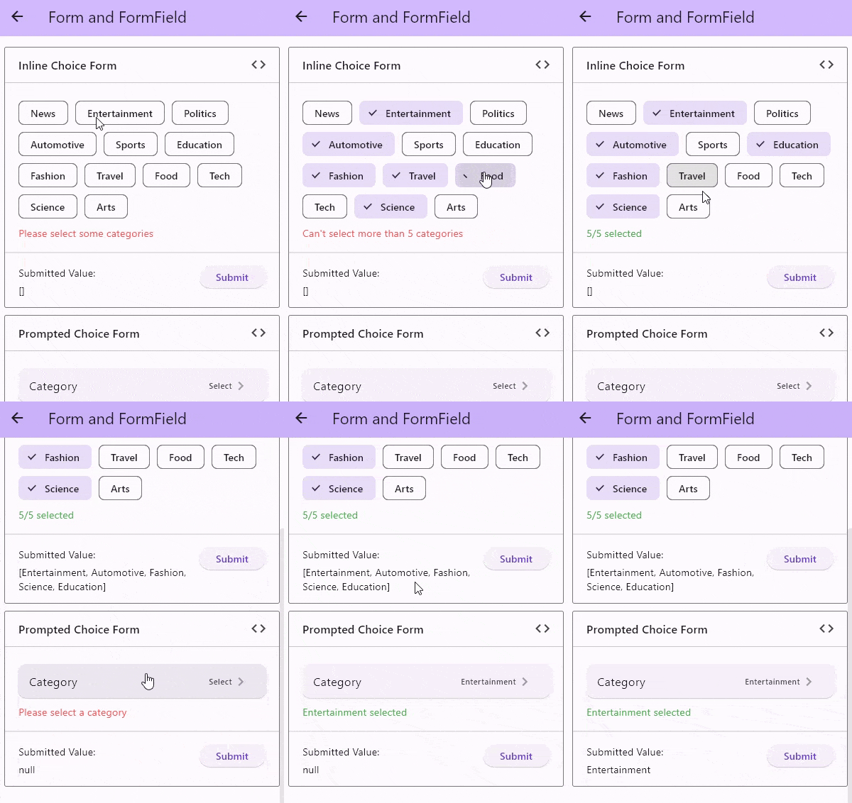
With Form and FormField
TODO
- :white_check_mark: Grouped choice items
- :x:
Sortable choice items better to do this outside
- :black_square_button: Add scroll wheel list
- :black_square_button: Add dropdown choice widget
- :black_square_button: Add chainable choice widget
Sponsoring


If this package or any other package I created is helping you, please consider to sponsor me so that I can take time to read the issues, fix bugs, merge pull requests and add features to these packages.