Pakete, Repositories und App-Kategorien suchen

Cover von crystal_navigation_bar
Paketdetailsv2.0.0

crystal_navigation_bar

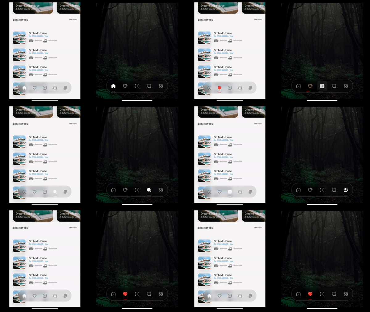
Schlanker, kristallklarer Blurred-Unter-Navigation-Balken mit dynamischem Indikator für nahtlose App-Navigation.

AndroidiOSWebmacOSWindowsLinux
30-Tage-Downloads
2520
Likes
137
Pub-Punkte
160

Paket installieren

flutter pub add crystal_navigation_bar

Paketübersicht

Aus öffentlichen Paketdaten erstellte Orientierung.

Crystal Navigation Bar ist eine visuell beeindruckende untere Navigationsleiste für Flutter-Apps mit einem schicken, kristallklaren Blurreffekt und einem dynamischen Indikator, der die Benutzererfahrung verbessert. Für nahtlose App-Navigation über mehrere Plattformen entwickelt, bietet sie flüssige Animationen und moderne Ästhetik. Das Paket unterstützt Android, iOS, Web, macOS, Windows und Linux und ist daher ideal für plattformübergreifende Entwicklung. Mit minimalem Setup über `flutter pub add` lässt es sich problemlos in bestehende Projekte integrieren. Sein Fokus auf visuelle Klarheit und fließende Übergänge macht es perfekt für Apps, die Design und Benutzerfreundlichkeit priorisieren.

Anwendungsfälle

  • Plattformübergreifende mobile und Web-Anwendungen
  • Moderne UI-Designs mit Blurreffekten
  • Apps, die eine intuitive Unternavigation erfordern
  • High-End-Benutzeroberflächen
  • Dynamische Indikator-basierte Navigation

Hauptmerkmale

  • klarer Blur-Effekt
  • Dynamische Anzeigeanimation
  • Plattformübergreifende Kompatibilität
  • Minimal setup with pub add
  • Glatte Übergangsanimationen
  • Anpassbare Erscheinung

Geeignet für

  • designorientierte Flutter-Entwickler
  • Apps mit anspruchsvollen UI/UX-Anforderungen
  • Entwickler, die mehrere Plattformen ansprechen
  • Projekte mit Fokus auf visuelle Aufbereitung
  • Benutzer, die moderne Navigationsmuster suchen

Hinweise

  • Kann die Leistung auf Low-End-Geräten beeinträchtigen
  • Der Blur-Effekt erfordert GPU-Beschleunigung
  • Eingeschränkte Anpassung über die Kernfunktionen hinaus
  • Am besten geeignet für hell gehaltene Oberflächen
  • Mögliche Darstellungsunterschiede auf älteren Betriebssystemversionen

Original-README

Originaler README-Schnappschuss aus dem verknüpften Quell-Repository. Aktuelle Inhalte finden Sie im Repository.

Crystal Bottom Navigation Bar


undefined undefined
undefined undefined undefined undefined undefined
undefined undefined

A highly flexible bottom navigation bar that allows you to tailor it to your specific needs without any constraints. Elevate your UI/UX with seamless animations, customizable appearance—including the option to incorporate blur effects—and the ability to fully personalize the interface.

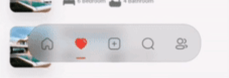
Styles

Screenshot 1

Simple BottomBar

With Border

Screenshot 2

Simple BottomBar

With Badge


CRYSTAL BOTTOM NAVIGATION BAR


  • Blur navigation bar
  • Frosted navigation bar
  • Floating navigation bar
  • Rounded navigation bar
  • Modern navigation bar

Getting Started

To install, add it to your pubspec.yaml file:

dependencies:
    crystal_navigation_bar:

import 'package:crystal_navigation_bar/crystal_navigation_bar.dart';

How to use it

Use CrystalNavigationBar constructor in Your app with in Scaffold's bottomNavigationBar:

Make sure extendBody in Scaffold should be true to use Floating behavior

      extendBody: true,

if you do not want to make round navigation bar with show body behind the navbar you have to make that

      extendBody: false,
Widget build(BuildContext context) {
  return Scaffold(
    body: Center(),
    extendBody: true,//<------like this 
    bottomNavigationBar:  CrystalNavigationBar(
          currentIndex: _SelectedTab.values.indexOf(_selectedTab),
          onTap: _handleIndexChanged,
          indicatorColor: Colors.white,
          // enableFloatingNavBar: false
          items: [
            
            
          ],
        ),
  );
}

basic implementation

Widget build(BuildContext context) {
    return Scaffold(
      extendBody: true,
      body: SizedBox(
        height: MediaQuery.of(context).size.height,
        child: Image.network(
          "https://images.pexels.com/photos/1671325/pexels-photo-1671325.jpeg?auto=compress&cs=tinysrgb&w=1260&h=750&dpr=2",
          fit: BoxFit.fitHeight,
        ),
      ),
      bottomNavigationBar: Padding(
        padding: const EdgeInsets.only(bottom: 10),
        child: CrystalNavigationBar(
          currentIndex: _SelectedTab.values.indexOf(_selectedTab),
          // indicatorColor: Colors.white,
          unselectedItemColor: Colors.white70,
          backgroundColor: Colors.black.withOpacity(0.1),
          // outlineBorderColor: Colors.black.withOpacity(0.1),
          borderWidth: 2,
          outlineBorderColor: Colors.white,
          onTap: _handleIndexChanged,
          items: [
            /// Home
            CrystalNavigationBarItem(
              icon: IconlyBold.home,
              unselectedIcon: IconlyLight.home,
              selectedColor: Colors.white,
              badge: Badge(
                label: Text(
                  "9+",
                  style: TextStyle(color: Colors.white),
                ),
              ),
            ),

            /// Favourite
            CrystalNavigationBarItem(
              icon: IconlyBold.heart,
              unselectedIcon: IconlyLight.heart,
              selectedColor: Colors.red,
            ),

            /// Add
            CrystalNavigationBarItem(
              icon: IconlyBold.plus,
              unselectedIcon: IconlyLight.plus,
              selectedColor: Colors.white,
            ),

            /// Search
            CrystalNavigationBarItem(
                icon: IconlyBold.search,
                unselectedIcon: IconlyLight.search,
                selectedColor: Colors.white),

            /// Profile
            CrystalNavigationBarItem(
              icon: IconlyBold.user_2,
              unselectedIcon: IconlyLight.user,
              selectedColor: Colors.white,
            ),
          ],
        ),
      ),
    );
  }

The constructor has 19 attributes related to the Widget:

  • items: A list of tabs to display, example Home, Profile,Search, etc
  • height: The height of CrystalNavigationBar, [Default] & [Minimum] height is 105,
  • currentIndex: The tab to display.
  • onTap:Returns the index of the tab that was tapped.
  • outlineBorderColor : Border Color of the Bottom bar.
  • borderWidth : Border Width of the Bottom bar.
  • badge : Badge to display. (to display notification count etc).
  • selectedItemColor:The color of the icon and text when the item is selected.
  • unselectedItemColor: The color of the icon and text when the item is not selected.
  • margin:A convenience field for the margin surrounding the entire widget.
  • itemPadding:The padding of each item.
  • duration: The transition duration.
  • curve: The transition curve.
  • indicatorColor:The color of the tab indicator.
  • marginR:margin for the bar to give some radius .
  • paddingR:padding for the bar to give some radius.
  • borderRadius:border radius for nav bar.
  • backgroundColor:background colors for the nav bar.
  • boxShadow: floating nav bar shadow ,it takes List of BoxShadow
  • enableFloatingNavBar: make Floating nav bar enabled.
  • enablePaddingAnimation: enable the animation on item during item change.
  • splashColor: Color of the item's Splash Color. To disable, use Colors.transparent.

iconly package is used for Icons in the demo/example

Adjust Colors of background, unselectedItemColor, selectedItemColor according to your UI for better Design.

Example Usage

See Example Code for more info.

Contributing

Every pull request is welcome.

Contributors

Imtiaz Ahmad

  • Twitter
  • GitHub
  • LinkedIn

Kategorien

Abhängigkeiten

Abhängigkeiten 1 Einträge

Quell-Repository

Projekte, die dieses Paket verwenden