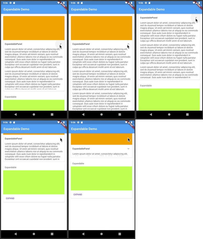
Aus öffentlichen Paketdaten erstellte Orientierung.
Das erweiterbare Paket bietet ein Flutter-Widget, das es ermöglicht, Inhalte zwischen erweitertem und zusammengeklapptem Zustand zu wechseln, typischerweise ausgelöst durch einen Kopfzeile oder ein Symbol. Es verbessert die Interaktivität der Benutzeroberfläche, indem Nutzer auf Anforderung detaillierte Informationen anzeigen oder verbergen können, was die Platzeffizienz und Navigation verbessert. Ideal für Listen, FAQs oder Einstellungsbereiche, unterstützt es reibungslose Animationen und anpassbare Kopfzeilen. Das Paket ist auf allen wichtigen Plattformen kompatibel, darunter Android, iOS, Web, macOS, Windows und Linux.
Anwendungsfälle
Häufig gestellte Fragen Abschnitte
Einklappbare Listen
Einstellungspanels
Dynamische Inhaltsverbergung
Benutzerprofil-Details
Interaktive Formulare
Hauptmerkmale
Glatte Expandieren-/Zusammenklappen-Animationen
Anpassbarer Kopfzeile und Symbol
Unterstützt mehrere Erweiterungszustände
Einfache Integration mit bestehenden Widgets
Plattformübergreifende Kompatibilität
Konfigurierbare Dauer und Kurve
Geeignet für
Entwickler, die interaktive Benutzeroberflächen erstellen
Apps mit dichten Inhaltslayouts
Mobile- und Webanwendungen, die zusammenfaltbare Abschnitte benötigen
UI-Designer, die wiederverwendbare Komponenten suchen
Projekte, die eine responsive Inhaltsgenerierung erfordern
Hinweise
Kann die Leistung bei großen Datensätzen beeinträchtigen
Erfordert sorgfältige Zustandsverwaltung
Die Animationszeit möglicherweise für UX abstimmen
Beschränkt auf einstufige Erweiterung ohne zusätzliche Logik
Nicht geeignet für komplexe verschachtelte Strukturen ohne Anpassung
Original-README
Originaler README-Schnappschuss aus dem verknüpften Quell-Repository. Aktuelle Inhalte finden Sie im Repository.
Expandable
A Flutter widget that can be expanded or collapsed by the user.
Introduction
This library helps implement expandable behavior as prescribed by Material Design:
Expandable should not be confused with
ExpansionPanel.
ExpansionPanel, which is a part of
Flutter material library, is designed to work only within ExpansionPanelList and cannot be used
for making other widgets, for example, expandable Card widgets.
Usage
The easiest way to make an expandable widget is to use ExpandablePanel:
ExpandablePanel has a number of properties to customize its behavior, but it's restricted by
having a title at the top and an expand icon shown as a down arrow (on the right or on the left).
If that's not enough, you can implement custom expandable widgets by using a combination of Expandable,
ExpandableNotifier, and ExpandableButton:
classEventPhotosextendsStatelessWidget{
@overrideWidgetbuild(BuildContext context) {
returnExpandableNotifier( // <-- Provides ExpandableController to its children
child: Column(
children: [
Expandable( // <-- Driven by ExpandableController from ExpandableNotifier
collapsed: ExpandableButton( // <-- Expands when tapped on the cover photo
child: buildCoverPhoto(),
),
expanded: Column(
children: [
buildAllPhotos(),
ExpandableButton( // <-- Collapses when tapped on
child: Text("Back"),
),
]
),
),
],
),
);
}
}
Automatic Scrolling
Expandable widgets are often used within a scroll view. When the user expands a widget, be it
an ExpandablePanel or an Expandable with a custom control, they expect the expanded
widget to fit within the viewable area (if possible). For example, if you show a list of
articles with a summary of each article, and the user expands an article to read it, they
expect the expanded article to occupy as much screen space as possible. The Expandable
package contains a widget to help implement this behavior, ScrollOnExpand.
Here's how to use it:
ExpandableNotifier( // <-- This is where your controller lives//...ScrollOnExpand( // <-- Wraps the widget to scroll//...ExpandablePanel( // <-- Your Expandable or ExpandablePanel//...
)
)
)
Why a separate widget, you might ask? Because generally you might want to show not just
the expanded widget but its container, for example a Card that contains it.
See the example app for more details on the usage of ScrollOnExpand.
Themes
Version 4.0 introduced themes to expandable widgets. Themes greatly simplify visual customization
and as well as future extensibility. Each expandable widget can get its theme data directly via
the constructor or from the nearest ExpandableTheme widget:
ExpandableTheme widgets can be nested, in which case inner definitions override outer definitions.
There is a default theme with fallback values defined in ExpandableThemeData.defaults.
Prior to version 4.0, theme parameters were passed to widget constructors directly. These parameters
are now deprecated and will be removed in the next release.
Icon Customization
There are several theme properties that help customize the expand/collapse icon:
hasIcon - should the icon be shown in the header of [ExpandablePanel];
iconSize - icon size;
iconColor - icon color;
iconPadding - icon padding;
iconPlacement - icon placement in the header;
iconRotationAngle - the angle to which to rotate the icon;
expandIcon - icon face to use in the collapsed state;
collapseIcon - icon face to use in the expanded state.
When specifying a custom icon, you have the option to use the same icon for expand/collapse or
to use two different icons. If using the same icon, specify the same value for expandIcon and collapseIcon, and
that icon will be shown as-is in the collapsed state and upside-down in the expanded state.
Migration
If you have migration issues from a previous version, read the Migration Guide.