Originaler README-Schnappschuss aus dem verknüpften Quell-Repository. Aktuelle Inhalte finden Sie im Repository.
Quds UI Kit
This library consists of:
- Animating widgets with simple controlling, events capturing.
- Page Transitions
- Toasts
- Bottom sheets
- Dialogs
- Pagination
- Simple Drawer
- Splash Screen View
- Another Viewers
To use this package see the following example.
Animation:
Icons:
- QudsAnimatedIcon
A wrap widget to control Flutter AnimatedIcon easily.
 QudsAnimatedIcon(
            iconData: AnimatedIcons.play_pause,
            showStartIcon: _isPlaying,
          )

What if desired to combine another two icons?
- QudsAnimatedCombinedIcons
Combines any two icons and make a transition!
 QudsAnimatedCombinedIcons(
        startIcon: Icons.accessible,
        endIcon: Icons.accessibility_new,
        showStartIcon: _onChair,
      ),

You can customize the sizes, colors, transition duration and curve, ..etc.

QudsAnimatedText(
          _isPlaying ? 'Playing' : 'Paused',
        )

QudsAnimatedCounter(
        counter,
        duration: Duration(milliseconds: 200),
        length: 4,
        style: TextStyle(fontSize: 30),
      )

Buttons
All animated icons in this library wrapped in buttons with capturing tap ability.
QudsAnimatedCombinedIconsButton(
tooltip: 'Toggle',
startIcon: Icons.arrow_forward,
onPressed: _toggle,
),
Other Buttons:
- QudsAnimatedIconButton
- QudsAnimatedCombinedIconsButton
- QudsCheckbox
- QudsCheckboxListTile
- QudsCheckboxWithText

Page Transitions
Wide collection of page route tranistion are now supported in Quds UI Kit
- Fade QudsFadePageRoute({duration, curve})
- Rotation QudsRotatePageRoute({duration, curve, alignment})
- Slide QudsSlidePageRoute({direction[
Up Down Left Right Start End], duration, curve})
- Zoom QudsZoomPageRoute({duration, curve, alignment})
- Combined QudsTransitionPageRoute({withFade, withRotate, withSlide, withScale, rotateAlignment, scaleAlignment, duration, curve})
Navigator.push(
context,
QudsSlidePageRoute(
builder: (c) => _SecondScreen(),
slideDirection: SlideDirection.Up,
))

Toasts
Customized toasts with easy control,
showQudsToast(context,
                  content: Text('Copied!'),
                  toastTime: QudsToastTime.VeryShort,
                  leadingActions: [
                    QudsAutoAnimatedCombinedIcons(
                      startIcon: Icons.copy,
                      endIcon: Icons.paste,
                      showStartIcon: false,
                    )
                  ])

Bottom Sheets
showQudsModalBottomSheet(
              context,
              (c) => Column(
                    children: [
                      for (int i = 0; i < 5; i++) ListTile(title: Text('Hi'))
                    ],
                  ),
              titleText: 'Test Bottom Sheet')

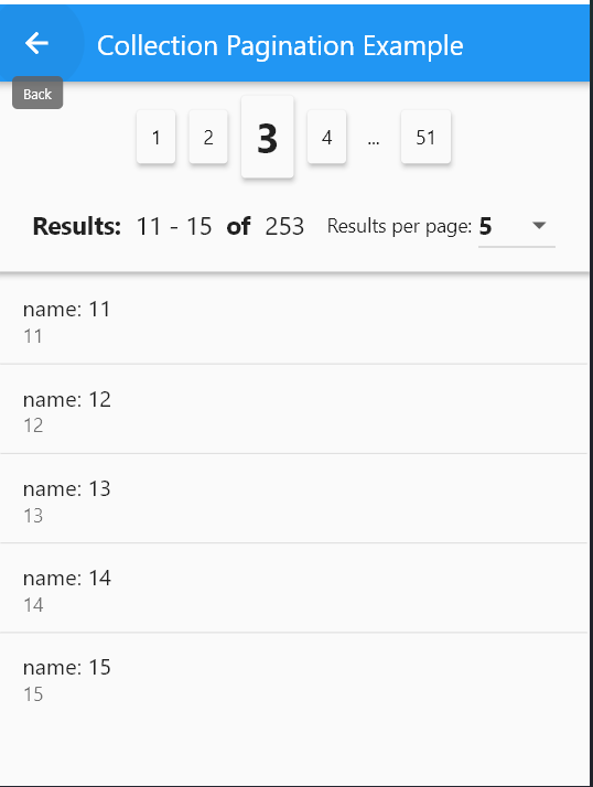
Pagination
QudsCollectionPagination<_ExampleModel>(
        resultsPerPage: itemsPerPage,
        itemsPadding: EdgeInsets.all(2),
        onResultsPerPageChanged: (p) {
          page = 1;
          itemsPerPage = p;
          _fillItems();
        },
        currentPageItems: currItems,
        onPageChanged: (p) {
          page = p;
          _fillItems();
        },
        selectedPage: page,
        total: provider.list.length,
        itemBuilder: (c, i, o) => ListTile(
          title: Text(o.name),
          subtitle: Text(o.id.toString()),
        ),
      )
Dialogs
- General Dialogs
In general, to show a dialog, user showQudsDialog, for example:
    showQudsDialog(context,
            title: Text('Save'),
            builder: (c) => Text(
                    'Would you like to save the document before existing?'));
- Pre-prepared dialogs:
This package provides some pre-customized dialogs:
 showQudsConfirmDeleteDialog(context,
              onDeletePressed: () => showQudsToast(context,
                  toastTime: QudsToastTime.VeryShort,
                  leadingActions: [
                    QudsAutoAnimatedCombinedIcons(
                        startIcon: Icons.delete, endIcon: Icons.done)
                  ],
                  content: Text('Deleted!'),
                  trailingActions: [
                    InkWell(
                        onTap: () {
                          showQudsToast(context,
                              toastTime: QudsToastTime.VeryShort,
                              content: Text('Undo pressed'));
                        },
                        child: Container(
                            padding: EdgeInsets.all(5),
                            child: QudsAutoAnimatedCombinedIcons(
                              startIcon: CupertinoIcons.delete,
                              endIcon: CupertinoIcons.arrow_turn_up_left,
                              showStartIcon: false,
                            )))
                  ]))

QudsLightDrawer
class MainDrawer extends StatelessWidget {
  @override
  Widget build(BuildContext context) {
    return QudsLightDrawer(
      bottomAboutButton: ...,
      bottomButton: ...,
      body: ...;
  }
}

QudsPopupMenu
QudsPopupButton(
tooltip: 'T',
items: getMenuItems(),
child: Icon(Icons.menu)),
List<QudsPopupMenuBase> getMenuItems() {
return [
QudsPopupMenuSection(
backgroundColor: Colors.yellow.shade200,
titleText: 'أبو أسعد الأمير',
subTitle: Text('See your profile'),
leading: Icon(
Icons.redeem,
size: 40,
),
subItems: [
QudsPopupMenuSection(
titleText: 'Settings',
leading: Icon(Icons.settings),
subItems: [
QudsPopupMenuItem(
leading: Icon(Icons.logout),
title: Text('Logout'),
onPressed: () {
showToast('Logout Pressed!');
})
]),
]),
QudsPopupMenuDivider(),
QudsPopupMenuItem(
leading: Icon(Icons.info_outline),
title: Text('Give Feedback'),
subTitle: Text('Help us improve our new app'),
onPressed: () {
showToast('Feedback Pressed!');
}),
QudsPopupMenuDivider(),
QudsPopupMenuSection(
leading: Icon(Icons.place),
titleText: 'Settings & Privacy',
subItems: [
QudsPopupMenuItem(
leading: Icon(Icons.settings),
title: Text('Settings'),
onPressed: () {
showToast('Settings Pressed!');
}),
QudsPopupMenuItem(
leading: Icon(Icons.lock),
title: Text('Privacy Checkup'),
onPressed: () {
showToast('Privacy Checkup Pressed!');
}),
QudsPopupMenuItem(
leading: Icon(Icons.lock_clock),
title: Text('Privacy Shortcuts'),
onPressed: () {
showToast('Privacy Shourtcuts Pressed!');
}),
QudsPopupMenuItem(
leading: Icon(Icons.list),
title: Text('Activity Log'),
onPressed: () {
showToast('Activity Log Pressed!');
}),
QudsPopupMenuItem(
leading: Icon(Icons.card_membership),
title: Text('News Feed Preferences'),
onPressed: () {
showToast('News Feed Preferences Pressed!');
}),
QudsPopupMenuItem(
leading: Icon(Icons.language),
title: Text('Language'),
onPressed: () {
showToast('Language Pressed!');
}),
]),
QudsPopupMenuDivider(),
QudsPopupMenuWidget(
builder: (c) => Container(
padding: EdgeInsets.all(10),
child: IntrinsicHeight(
child: Row(
mainAxisAlignment: MainAxisAlignment.center,
children: [
IconButton(
onPressed: () {
showToast('Favourite Pressed!');
},
icon: Icon(
Icons.favorite,
color: Colors.red,
)),
VerticalDivider(),
IconButton(
onPressed: () {},
icon: Icon(
Icons.music_note,
color: Colors.blue,
)),
VerticalDivider(),
IconButton(
onPressed: () {},
icon: Icon(
Icons.umbrella,
color: Colors.green,
))
],
),
)))
];
}

QudsSplashView
class SplashScreen extends StatelessWidget {
  @override
  Widget build(BuildContext context) {
    return Scaffold(
      body: QudsSplashView(
      progressIndicator: ...,
      futures: [...],
      onCompleted: ...,
      ),
    );
  }
}
Another Viewers
 QudsDigitalTimeViewer(
        hour: 10,
        minute: 59,
        second: 40,
        milliSecond: 10,
      ),
QudsDigitalClockViewer(
        showSeconds: true,
        showMilliSeconds: true,
      )


