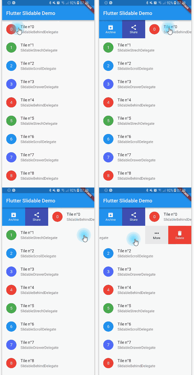
flutter_slidable는 사용자가 왼쪽 또는 오른쪽으로 스와이프하여 액션 버튼을 표시할 수 있는 상호작용 가능한 리스트 항목을 가능하게 하는 Flutter 패키지입니다. 방향성 슬라이드 및 삭제 제스처를 지원하여 리스트에서 삭제, 아카이브, 읽음 표시 등의 기능을 구현하는 데 이상적입니다. ListView 및 기타 스크롤 가능한 위젯과 원활하게 통합되며, 사용자 정의 가능한 애니메이션과 레이아웃을 제공합니다. Android, iOS, Web, macOS, Windows, Linux 등 주요 플랫폼 전반에서 작동합니다.
You can read this small guide to migrate from the 0.6 to the 1.0 version: https://github.com/letsar/flutter_slidable/wiki/Migration-from-version-0.6.0-to-version-1.0.0
Features
Accepts start (left/top) and end (right/bottom) action panes.
Can be dismissed.
4 built-in action panes.
2 built-in slide action widgets.
1 built-in dismiss animation.
You can easily create custom layouts and animations.
You can use a builder to create your slide actions if you want special effects during animation.
Closes when a slide action has been tapped (overridable).
Closes when the nearest Scrollable starts to scroll (overridable).
Option to disable the slide effect easily.
Install
In the pubspec.yaml of your flutter project, add the following dependency:
Slidable(
// Specify a key if the Slidable is dismissible.
key: constValueKey(0),
// The start action pane is the one at the left or the top side.
startActionPane: ActionPane(
// A motion is a widget used to control how the pane animates.
motion: constScrollMotion(),
// A pane can dismiss the Slidable.
dismissible: DismissiblePane(onDismissed: () {}),
// All actions are defined in the children parameter.
children: const [
// A SlidableAction can have an icon and/or a label.SlidableAction(
onPressed: doNothing,
backgroundColor: Color(0xFFFE4A49),
foregroundColor: Colors.white,
icon: Icons.delete,
label: 'Delete',
),
SlidableAction(
onPressed: doNothing,
backgroundColor: Color(0xFF21B7CA),
foregroundColor: Colors.white,
icon: Icons.share,
label: 'Share',
),
],
),
// The end action pane is the one at the right or the bottom side.
endActionPane: constActionPane(
motion: ScrollMotion(),
children: [
SlidableAction(
// An action can be bigger than the others.
flex: 2,
onPressed: doNothing,
backgroundColor: Color(0xFF7BC043),
foregroundColor: Colors.white,
icon: Icons.archive,
label: 'Archive',
),
SlidableAction(
onPressed: doNothing,
backgroundColor: Color(0xFF0392CF),
foregroundColor: Colors.white,
icon: Icons.save,
label: 'Save',
),
],
),
// The child of the Slidable is what the user sees when the// component is not dragged.
child: constListTile(title: Text('Slide me')),
),
Motions
Any ActionPane has a motion parameter which allow you to define how the pane animates when the user drag the Slidable.
Behind Motion
The actions appear as if they where behind the Slidable:
Drawer Motion
Animate the actions as if they were drawers, when the Slidable is moving:
Scroll Motion
The actions follow the Slidable while it's moving:
Stretch Motion
Animate the actions as if they were streched while the Slidable is moving:
Controller
You can use SlidableController to open or close the actions programmatically:
final controller = SlidableController();
// ...Slidable(
controller: controller,
// ...
);
// ...// Open the actionsvoid_handleOpen() {
controller.openEndActionPane();
// OR//controller.openStartActionPane();
}
void_handleOpen() {
controller.close();
}
FAQ
You can read the FAQ here: https://github.com/letsar/flutter_slidable/wiki/FAQ
Sponsoring
I'm working on my packages on my free-time, but I don't have as much time as I would. If this package or any other package I created is helping you, please consider to sponsor me so that I can take time to read the issues, fix bugs, merge pull requests and add features to these packages.
Contributions
Feel free to contribute to this project.
If you find a bug or want a feature, but don't know how to fix/implement it, please fill an issue.
If you fixed a bug or implemented a feature, please send a pull request.