연결된 소스 저장소의 README 원문 스냅샷입니다. 최신 내용은 저장소에서 확인하세요.


Introduction
What are skeleton loaders?
UI skeleton loading is a technique used to enhance user experience during web or app loading. It involves displaying a simplified, static version of the user interface while the actual content is being fetched. This placeholder UI gives the illusion of instant loading and prevents users from perceiving long loading times.
Motivation
Creating a skeleton-layout for your screens doesn't only feel like a duplicate work but things can
go out of sync real quick, when updating the actual layout we often forget to update the
corresponding skeleton-layout.
How does it work?
As the name suggests, skeletonizer will reduce your already existing layouts into mere skeletons and
apply painting effects on them, typically a shimmer effect. It automatically does the job for you,
in addition skeleton annotations can be used to change how specific widgets are skeletonized.
Basic usage
Simply wrap your layout with Skeletonizer widget or SliverSkeletonizer | Skeletonizer.sliver for sliver widgets.
Skeletonizer(
  enabled: _loading,
  child: ListView.builder(
    itemCount: 7,
    itemBuilder: (context, index) {
      return Card(
        child: ListTile(
          title: Text('Item number $index as title'),
          subtitle: const Text('Subtitle here'),
          trailing: const Icon(Icons.ac_unit),
        ),
      );
    },
  ),
)
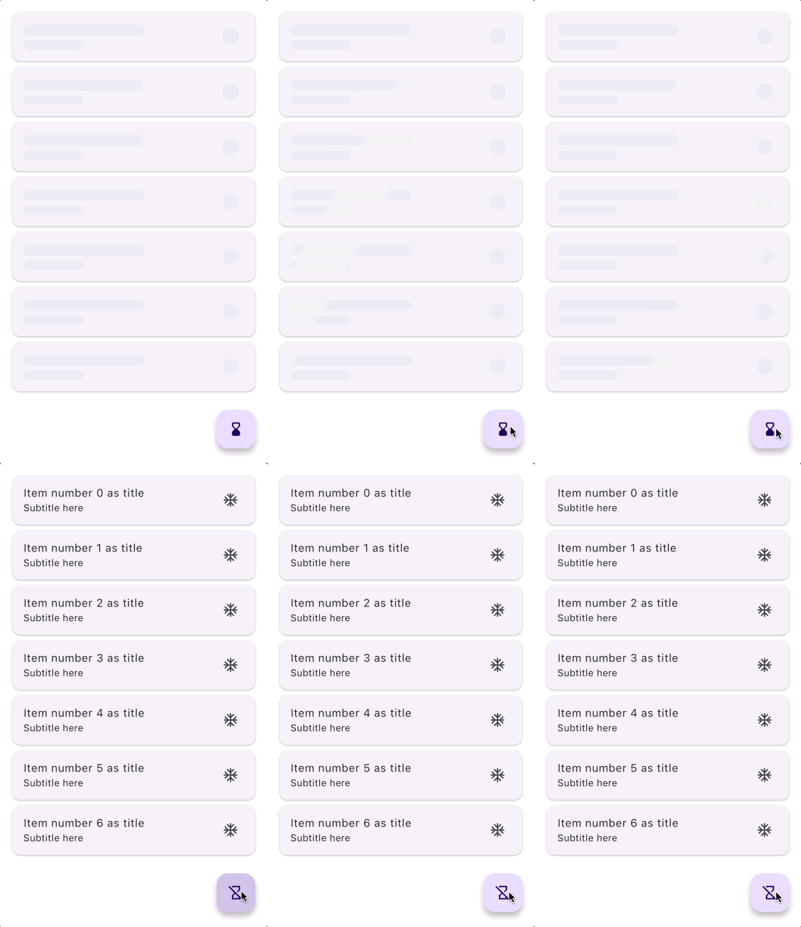
Skeletonizer with default config
Note: all the following shimmer effects are disturbed by the gif optimization
Click here for HD video demo
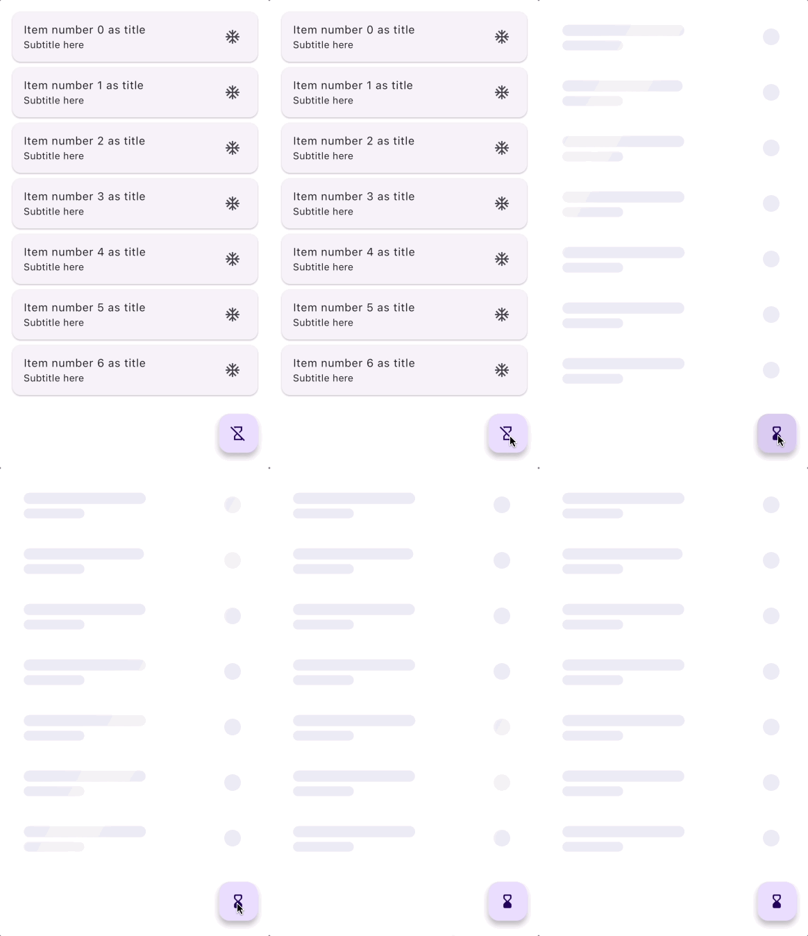
Skeletonizer with no containers
Skeletonizer(ignoreContainers: true)
The need for fake data
In order for skeletonizer to work it actually needs a layout, but in most cases the layout would
need data to shape, e.g the following ListView will not render anything unless users is populated, because if users is empty
we have no layout which means we have nothing to skeletonize.
Skeletonizer(
  enabled: _loading,
  child: ListView.builder(
    itemCount: users.length,
    itemBuilder: (context, index) {
      return Card(
        child: ListTile(
          title: Text(users[index].name),
          subtitle: Text(users[index].jobTitle),
          leading: CircleAvatar(
            radius: 24,
            backgroundImage: NetworkImage(users[index].avatar),
          ),
        ),
      );
    },
  ),
)
So the key here is to provide fake data for the layout to shape until the real data is fetched form
the server, and we would have such a setup in our build method:
  if (_loading) {
    final fakeUsers = List.filled(7, User(
        name: 'User name',
        jobTitle: 'Developer',
        avatar: ''
      ),
    );
    return Skeletonizer(
      child: UserList(users: fakeUsers),
    );
  } else {
    return UserList(users: realUsers);
  }
or by utilizing the enabled flag
  {
  final users = _loading ? List.filled(
      7, const User(
      name: 'User name',
      jobTitle: 'Developer',
      avatar: ''
  ) : realUsers;
  );
  return Skeletonizer(
    enabled: _loading,
    child: UserList(users: users),
  );
Note: you can use BoneMock to easily generate fake text for your mock data
    final fakeUsers = List.filled(7, User(
        name: BoneMock.name,
        jobTitle: BoneMock.words(2),
        email: BoneMock.email,
        createdAt: BoneMock.date,
      ),
    );
Now we have our layout but one issue remains, if you run the above example you'll get an error in
your console stating that an invalid url was passed to NetworkImage which is legit because our fake
avatar url is an empty string, in such cases we need to make sure NetworkImage is not in our widget
tree when skeletonizer is enabled and we do that by using a skeleton annotation
called Skeleton.replace ..read more about annotations below.
Skeletonizer(
enabled: _loading,
child: ListView.builder(
itemCount: users.length,
itemBuilder: (context, index) {
return Card(
child: ListTile(
title: Text(users[index].name),
subtitle: Text(users[index].jobTitle),
leading: Skeleton.replace(
width: 48,
height: 48,
child: CircleAvatar(
radius: 24,
backgroundImage: NetworkImage(users[index].avatar),
),
),
);
},
),
)
or you can do it directly like follows:
Skeletonizer(
  enabled: _loading,
  child: ListView.builder(
    itemCount: users.length,
    itemBuilder: (context, index) {
      return Card(
        child: ListTile(
          title: Text(users[index].name),
          subtitle: Text(users[index].jobTitle),
            leading: CircleAvatar(
            radius: 24,
            backgroundImage: _loading ? null : NetworkImage(users[index].avatar),
          ),
        ),
      ),);
    },
  ),
)
Note: you can also check wither a skeletonizer is enabled inside descendent widgets using:
Skeletonizer.of(context).enabled;
Annotations
We can use annotations to change how some widgets should be skeletonized, skeleton annotations have
no effect on the real layout as they only hold information for skeletonizer to use when it's
enabled.
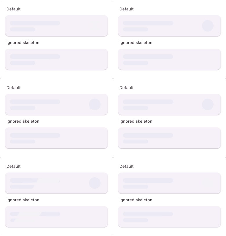
Skeleton.ignore
Widgets annotated with Skeleton.ignore will not be skeletonized
Card(
child: ListTile(
title: Text('The title goes here'),
subtitle: Text('Subtitle here'),
trailing: Skeleton.ignore(
child: Icon(Icons.ac_unit, size: 40),
),
),
)
Skeleton.leaf
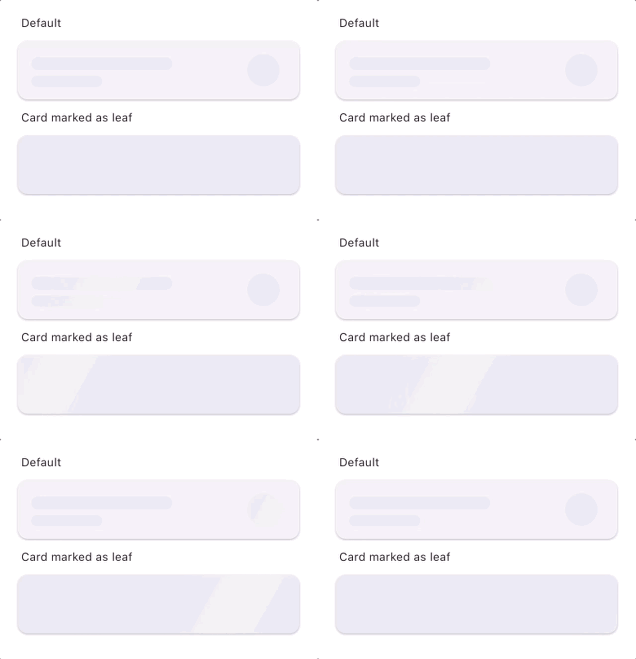
Widgets annotated with Skeleton.leaf marks containers as leafs, leafs are painted using the shader paint.
Skeleton.leaf(
   child : Card(
    child: ListTile(
        title: Text('The title goes here'),
        subtitle: Text('Subtitle here'),
        trailing: Icon(Icons.ac_unit, size: 40),
      ),
  )
)
Skeleton.keep
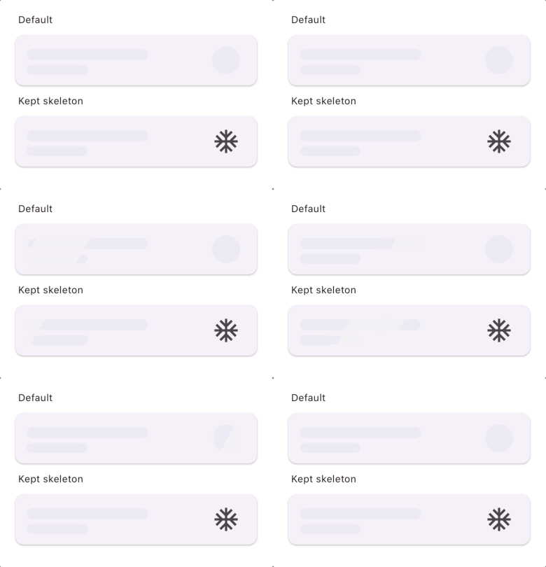
Widgets annotated with Skeleton.keep will not be skeletonized but will be painted as is
Card(
child: ListTile(
title: Text('The title goes here'),
subtitle: Text('Subtitle here'),
trailing: Skeleton.keep(
child: Icon(Icons.ac_unit, size: 40),
),
),
)
Skeleton.shade
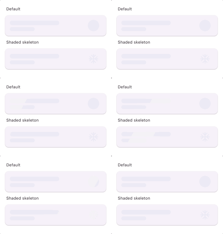
Widgets annotated with Skeleton.shade will not be skeletonized but will be shaded by a shader mask.
Note: CustomPainter widgets need to be explicitly annotated with Skeleton.shade to be shaded.
Card(
child: ListTile(
title: Text('The title goes here'),
subtitle: Text('Subtitle here'),
trailing: Skeleton.shade(
child: Icon(Icons.ac_unit, size: 40),
),
),
)
Skeleton.replace
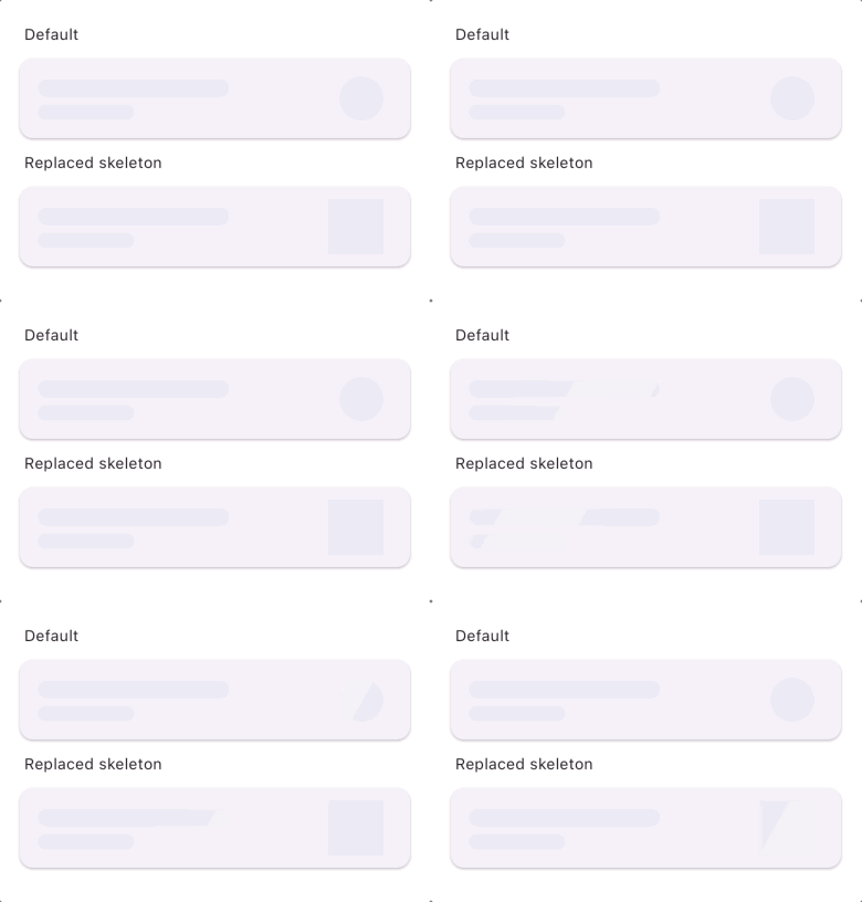
Widgets annotated with Skeleton.replace will be replaced when skeletonizer is enabled and the
replacement will be skeletonized, This is good for widgets that can not render with fake data
like Image.network()
Card(
child: ListTile(
title: Text('The title goes here'),
subtitle: Text('Subtitle here'),
trailing: Skeleton.replace(
width: 50,
height: 50,
replacement:
child: Icon(Icons.ac_unit, size: 40),
),
)
,)
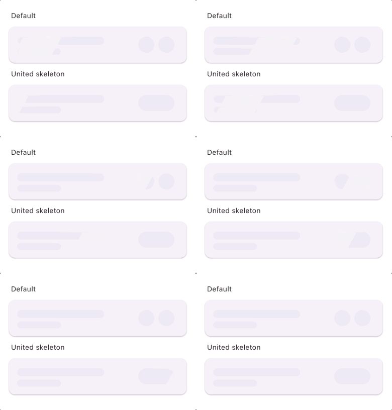
Skeleton.unite
Widgets annotated with Skeleton.unite will not be united and drawn as one big bone, this is good
for when you have multiple small bones close to each other and you want to present them as one bone.
Card(
  child: ListTile(
    title: Text('Item number 1 as title'),
    subtitle: Text('Subtitle here'),
    trailing: Skeleton.unite(
      child: Row(
        mainAxisSize: MainAxisSize.min,
        children: [
          Icon(Icons.ac_unit, size: 32),
          SizedBox(width: 8),
          Icon(Icons.access_alarm, size: 32),
        ],
      ),
    ),
  ),
)
,
Skeleton.ignorePointers
Widgets annotated with Skeleton.ignorePointers will ignore pointer events when skeletonizer is enabled.
Creating Skeletons manually
Originally, Skeletonizer worked its magic by creating skeletons from real widgets. But hey, we get it – sometimes you want to do your own thing, have a different layout, or just skip the whole fake data scene. Now, you can speed things up big time by crafting custom skeletons from scratch using Bone widgets. Now, you might wonder, "What sets this apart from other shimmer libraries?" Simple – Bone widgets are your time-saving superheroes. They mimic everyday UI components you'd typically want to shimmer, such as icons, texts, and buttons and use their actual theme data to design border radius and sizing information.
Skeletonizer.zone(
    child: Card(
      child: ListTile(
        leading: Bone.circle(size: 48),
        title: Bone.text(words: 2),
        subtitle: Bone.text(),
        trailing: Bone.icon(),
      ),
    ),
 );
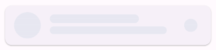
Obviously, you can create any bone shape using Bone(width, height) or use the helpers Bone.circle(size) and Bone.square(size). The cool part here is using mimic bone types like Bone.icon(), which, you guessed it, reads icon sizing information from the inherited theme. As such, Bone.text reads font size and line height from the inherited theme if not provided in the constructor. By default, it mimics 3 words (word = 5 letters), but you can easily change that. For multiline, use Bone.multiText(lines: 3).
Bone.button() and Bone.iconButton() use BoneResolver to determine their dimensions, shape,
and typography. They use generic defaults when no resolver is provided. Provide a resolver to match
your design system's button theme.
When opting for the manual approach, only Bone widgets get the shimmer treatment – they're the ones that'll be shaded. This means you can wrap other colorable widgets like cards, containers ..etc, without worrying about them getting shaded. which results to a seamless and perfect shimmer effect!
Customization
Loading effects
Skeletonizer has 3 different painting effects to choose from which can be customized to your
liking.
Note: Loading effects are disturbed by Gif optimization, these look much better on flutter
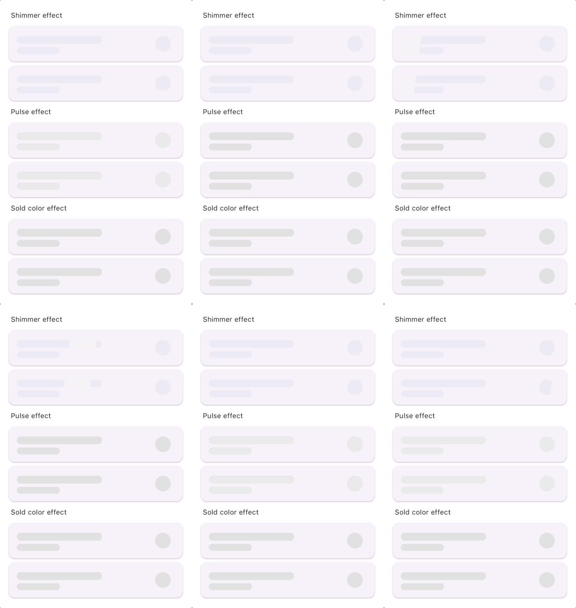
Effects are configurable, e.g you can change the base color, highlight color, direction, and duration of ShineEffect like so:
Skeletonizer(
  effect: const ShimmerEffect(
    baseColor: Colors.grey[300],
    highlightColor: Colors.grey[100],
    duration: Duration(seconds: 1),
  ),
  child: ...
)
Animating the transition between skeleton and content (Slivers are not supported)
you can animate the transition between skeleton and content by setting enableSwitchAnimation to true, animation can be customized by providing a SwitchAnimationConfig.
SwitchAnimationConfig({
    this.duration = const Duration(milliseconds: 300),
    this.switchInCurve = Curves.linear,
    this.switchOutCurve = Curves.linear,
    this.transitionBuilder = AnimatedSwitcher.defaultTransitionBuilder,
    this.layoutBuilder = AnimatedSwitcher.defaultLayoutBuilder,
    this.reverseDuration,
});
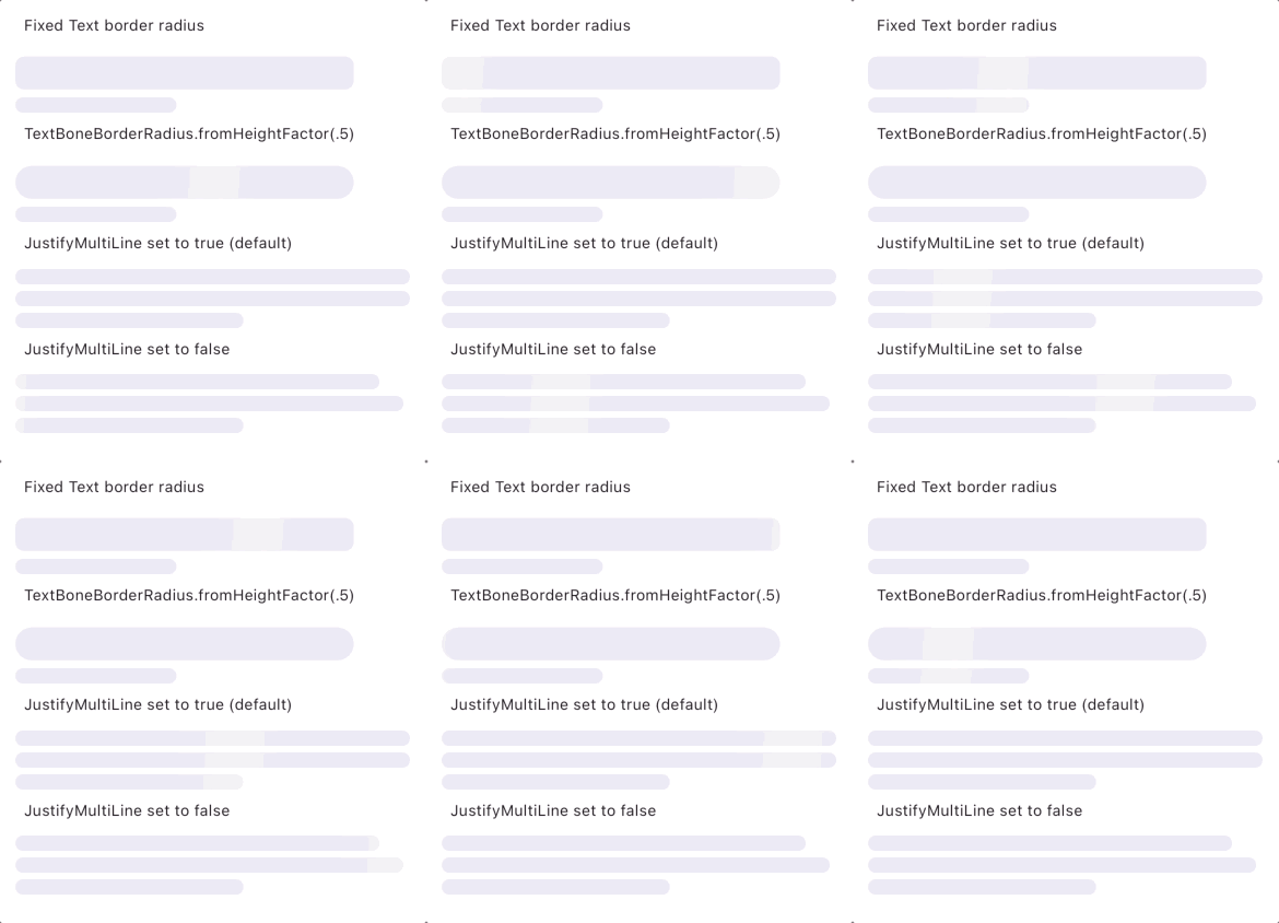
Text skeleton config
You can provide a global text config options to skeletonizer widgets like
Skeletonizer(
    justifyMultiLineText: false,
    textBoneBorderRadius: TextBoneBorderRadius.fromHeightFactor(.5),
    ...
)
ignoreContainers
if you want to ignore all containers and only skeletonize their children you can set
ignoreContainers to true
containersColor
if provided, all containers will be painted with this color otherwise the actual color will be
Using the inheritable Config data
Wrap a subtree with SkeletonizerConfig to provide default configuration values to all descendant
Skeletonizer widgets. By default, SkeletonizerConfigData resolves a light shimmer in light mode
and a dark shimmer in dark mode, using the platform brightness.
SkeletonizerConfig(
  data: const SkeletonizerConfigData(),
  child: MaterialApp(
    home: MyHomePage(),
  ),
)
Use effectResolver to supply effects for each brightness. SkeletonizerConfigData uses the
platform brightness by default. When your app uses a different theme mode, provide its brightness
explicitly. For example, in a Material app, use Theme.of(context).brightness from a context below
MaterialApp.
MaterialApp(
  home: Builder(
    builder: (context) => SkeletonizerConfig(
      data: SkeletonizerConfigData(
        effectResolver: (brightness) => switch (brightness) {
          Brightness.light => const ShimmerEffect(),
          Brightness.dark => const ShimmerEffect.dark(),
        },
        brightness: Theme.of(context).brightness,
        justifyMultiLineText: true,
        textBorderRadius: const TextBoneBorderRadius.fromHeightFactor(.5),
        ignoreContainers: false,
      ),
      child: MyHomePage(),
    ),
  ),
)
Button bone resolvers
For the default button-bone specifications, use a BoneResolver instance:
const BoneResolver()
For a custom design system, extend BoneResolver and implement resolveButton and
resolveIconButton, or construct a BoneResolver with callbacks. In a Material app, this callback
resolver reads the active button themes:
SkeletonizerConfig(
  data: SkeletonizerConfigData(
    boneResolver: BoneResolver(
      button: (context, type) {
        final theme = ButtonTheme.of(context);
        final style = switch (type) {
          BoneButtonType.prominent => ElevatedButtonTheme.of(context).style,
          BoneButtonType.plain => TextButtonTheme.of(context).style,
          BoneButtonType.outlined => OutlinedButtonTheme.of(context).style,
        };
        return BoneButtonSpec(
          height: theme.height,
          width: theme.minWidth,
          shape: style?.shape?.resolve({}) ?? const StadiumBorder(),
          textStyle: style?.textStyle?.resolve({}),
        );
      },
      iconButton: (context, type) => BoneIconButtonSpec(
        shape: IconButtonTheme.of(context).style?.shape?.resolve({}),
      ),
    ),
  ),
  child: MyHomePage(),
)
Resources
Support Skeletonizer
You can support skeletonizer by liking it on Pub and staring it on Github, sharing ideas on how we
can enhance a certain functionality or by reporting any problems you encounter and of course buying
a couple coffees will help speed up the development process.
