패키지, 저장소 및 앱 카테고리 검색

vs_story_designer 표지
패키지 상세v2.2.1

vs_story_designer

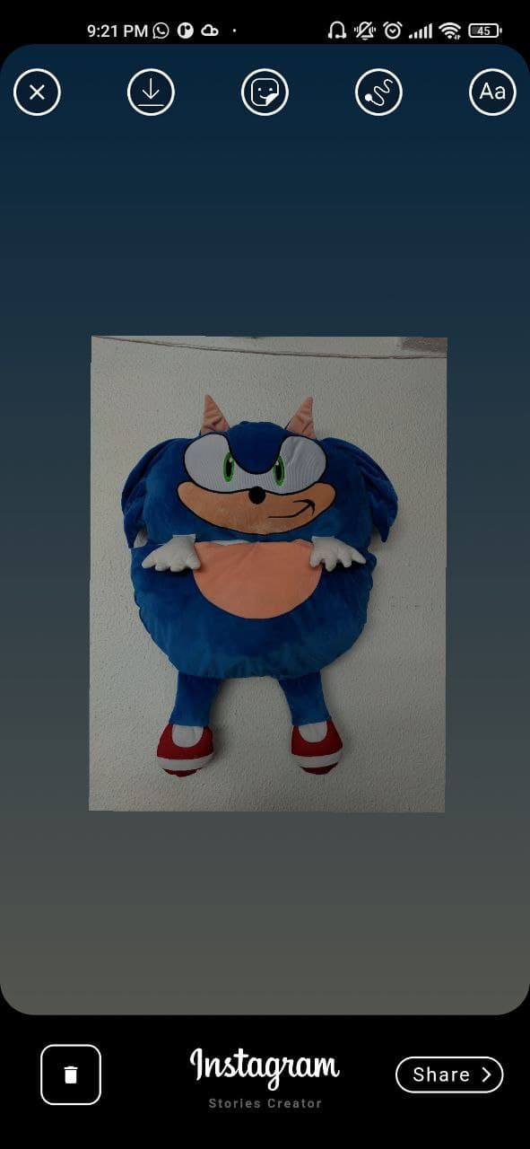
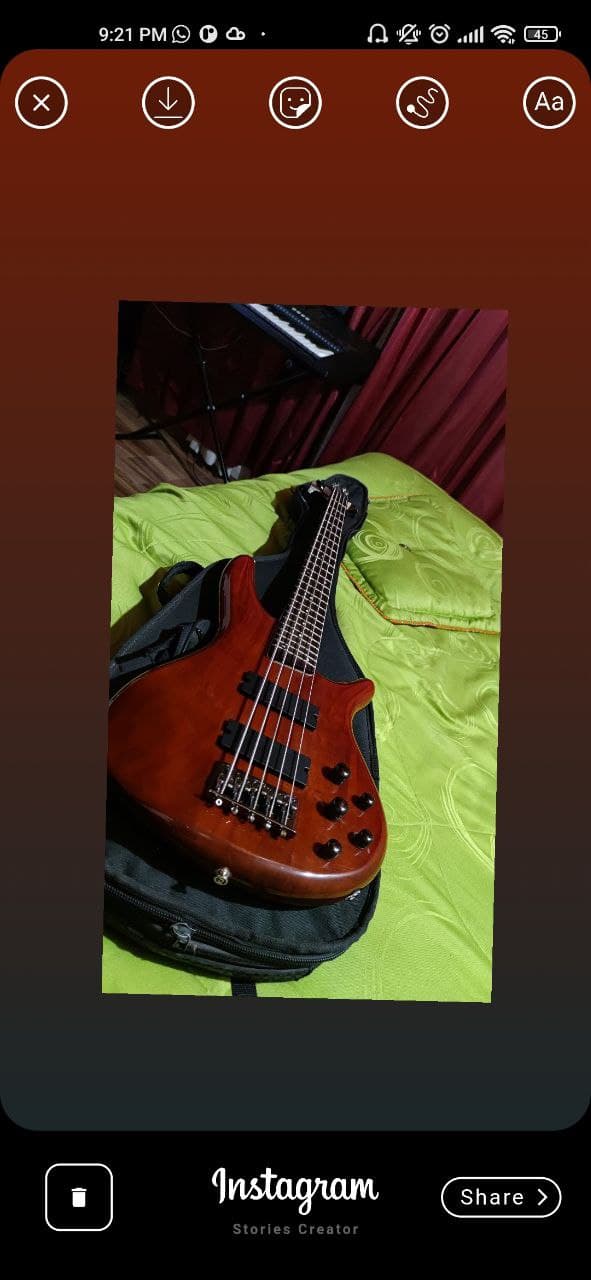
이 패키지는 인스타그램 스토리 생성기의 스타일로 만들어졌으며, 이미지, 텍스트, 손가락으로 그린 그림을 포함한 이미지를 만들 수 있습니다.

AndroidiOS
30일 다운로드
164
좋아요
46
Pub 점수
140

패키지 설치

flutter pub add vs_story_designer

패키지 개요

공개 정보를 바탕으로 생성한 선택 가이드입니다.

vs_story_designer는 이미지, 텍스트 오버레이 및 손그림 스케치와 같은 상호작용 요소를 포함한 인스타그램 스타일의 스토리를 만들 수 있도록 해주는 Flutter 패키지입니다. 안드로이드 및 iOS용으로 개발되어 앱 내에서 시각적으로 풍부한 콘텐츠를 간편한 인터페이스로 구성할 수 있습니다. 멀티미디어 출력을 편집하고 저장하며 압축할 수 있어 소셜 미디어 통합에 적합합니다. 사용의 용이성과 실시간 창의성에 중점을 둔 설계입니다.

사용 사례

  • 소셜 미디어 스토리 만들기
  • 사용자 정의 이미지 오버레이 설계
  • 손글씨 주석 추가
  • 앱에 스토리 생성 통합
  • 사용자 생성 콘텐츠 공유
  • 모바일 앱을 위한 창의적 도구 개발

주요 기능

  • 이미지와 텍스트 레이어링
  • 실시간 손가락 그림
  • 다중 플랫폼 지원 (Android 및 iOS)
  • 간편한 내보내기 및 압축
  • 간단한 통합용 API
  • 인터랙티브 스토리 구성

적합한 대상

  • 소셜 미디어 앱 개발자
  • 창의적인 도구 제작자
  • 모바일 앱 디자이너
  • 콘텐츠 창작자
  • 교육 앱 제작자
  • 사용자 친화적인 디자인 인터페이스

고려 사항

  • 이미지 접근 권한이 필요합니다
  • 기본 도면 도구에 제한됨
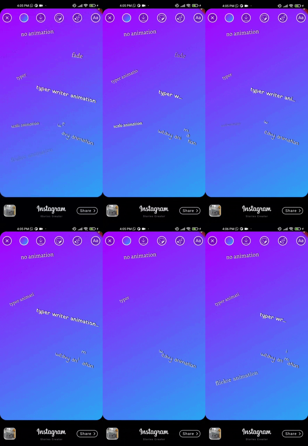
  • 고급 애니메이션 지원 없음
  • 외부 종속성에 의존
  • 복잡한 레이아웃에 맞춰 맞춤 설정이 필요할 수 있습니다
  • 간단한부터 중간 정도로 복잡한 디자인에 가장 적합

원본 README

연결된 소스 저장소의 README 원문 스냅샷입니다. 최신 내용은 저장소에서 확인하세요.

vs_story_designer 2.2.1

flutter story designer

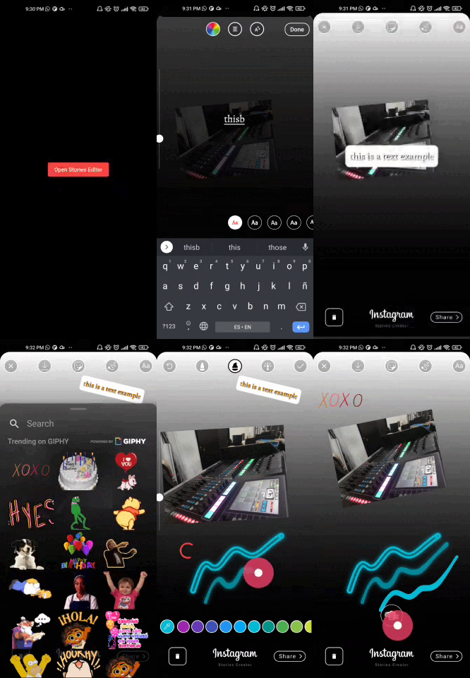
This is a package created in the style of the instagram story creator, with which you can create images with images, texts, finger drawing. They can be exported as an image to the gallery or shared directly to social networks.

Features

[✔️] Draggable image

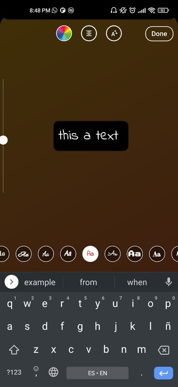
[✔️] Draggable text

[✔️] Gradient container background

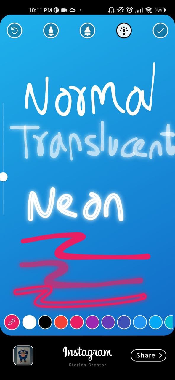
[✔️] Finger painting (normal/translucent/neon)

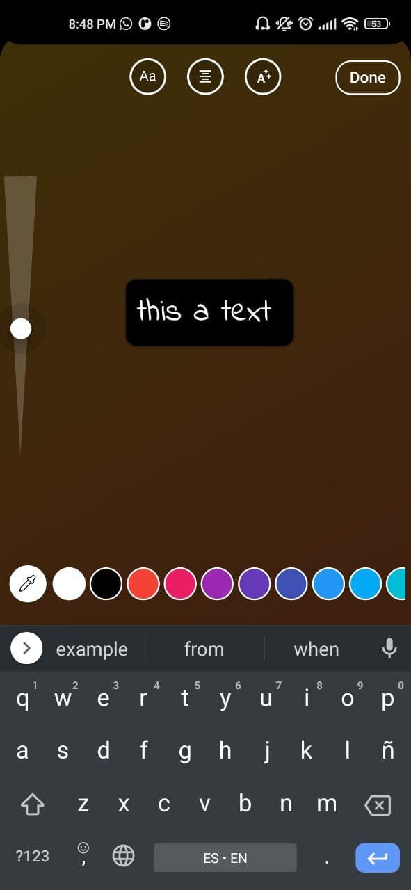
[✔️] Custom colors, gradients and Google font families

[✔️] Media Picker (vs_media_picker)

[✔️] Save draft as image

[✔️] Get draft local path uri

Demo

If you don't see the images go to the github repository and by the way give me a star :D

showcase gif showcase gif

Installation

This package has been tested in Android and ios, some features works on flutter web

Add vs_story_designer: 2.2.1 to your pubspec.yaml dependencies and then import it.

import 'package:vs_story_designer/vs_story_designer.dart';

How to use

  1. Android

    add uses-permission AndroidManifest.xml file

     <uses-permission android:name="android.permission.READ_EXTERNAL_STORAGE" />
     <uses-permission android:name="android.permission.WRITE_EXTERNAL_STORAGE"
         android:maxSdkVersion="31" />
     <uses-permission android:name="android.permission.INTERNET" />
     <uses-permission android:name="android.permission.VIBRATE"/>
     <!-- Permission is required if you are targeting android 33 and above -->
     <uses-permission android:name="android.permission.READ_MEDIA_IMAGES"/>
     <uses-permission android:name="android.permission.READ_MEDIA_VIDEO"/>
     <uses-permission android:name="android.permission.READ_MEDIA_AUDIO"/>
    
    ios

    add this config to your config.plist

    <key>NSPhotoLibraryUsageDescription</key>
    <string>Privacy - Photo Library Usage Description</string>
    <key>NSMotionUsageDescription</key>
    <string>Motion usage description</string>
    <key>NSPhotoLibraryAddUsageDescription</key>
    <string>NSPhotoLibraryAddUsageDescription</string>
    
  2. Create a VSStoryDesigner() widget with the follow params:

VSStoryDesigner(
    giphyKey: '[YOUR GIPHY API KEY]', /// (String), //disabled feature for now
    onDone: (String uri){
      /// uri is the local path of final render Uint8List
      /// here your code
    },
    mediaPath: mediaPath // OPTIONAL, pass path of media, image to use inside the package by default.
    themeType: ThemeType.dark, // OPTIONAL, DEFAULT ThemeType.dark
    centerText : "Start Designing" //mandatory param, this text will appear in center of story designer
    colorList: [] /// (List<Color>[]) optional param 
    gradientColors: [] /// (List<List<Color>>[]) optional param 
    middleBottomWidget: Container() /// (Widget) optional param, you can add your own logo or text in the bottom tool
    fontFamilyList: [] /// (List<FontType>) optional param
    isCustomFontList: '' /// (bool) if you use a own font list set value to "true"
    onDoneButtonStyle: Container() /// (Widget) optional param, you can create your own button style
    onBackPress: /// (Future<bool>) optional param, here you can add yor own style dialog
    editorBackgroundColor: /// (Color) optional param, you can define your own background editor color
    galleryThumbnailQuality: /// (int = 200) optional param, you can set the gallery thumbnail quality (higher is better but reduce the performance)
);

Example

import 'package:flutter/material.dart';
import 'package:provider/provider.dart';
import 'package:share_plus/share_plus.dart';
import 'package:vs_story_designer/vs_story_designer.dart';

void main() {
  runApp(const MyApp());
}

class MyApp extends StatelessWidget {
  const MyApp({Key? key}) : super(key: key);
  
  @override
  Widget build(BuildContext context) {
    return MaterialApp(
      title: 'Flutter Story Designer Demo',
      theme: ThemeData(
        primarySwatch: Colors.blue,
      ),
      home: const Example(),
    );
  }
}

class Example extends StatefulWidget {
  const Example({Key? key}) : super(key: key);


  @override
  State<Example> createState() => _ExampleState();
}

class _ExampleState extends State<Example> {

  @override
  Widget build(BuildContext context) {
    return Scaffold(
        backgroundColor: Colors.black,
        resizeToAvoidBottomInset: false,
        body: Center(
          child: ElevatedButton(
            onPressed: (){
              Navigator.push(context, MaterialPageRoute(builder: (context) => VSStoryDesigner(
                centerText: "Start Your Design",
                // fontFamilyList: const [
                //   FontType.abrilFatface,
                //   FontType.alegreya,
                //   FontType.typewriter
                // ],
                onDone: (uri){
                  debugPrint(uri);
                  Share.shareFiles([uri]);
                },
              ))
              );
            },
            child: const Text('Open Story Designer'),
          ),
        )
    );
  }
}

ScreenShots

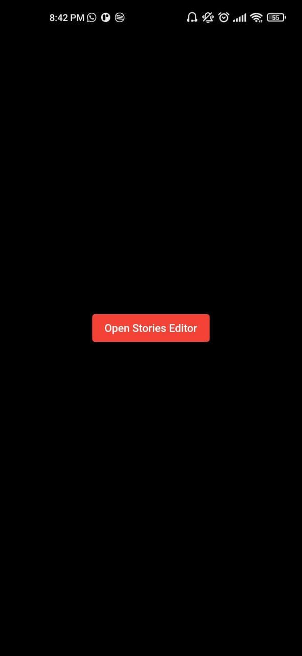
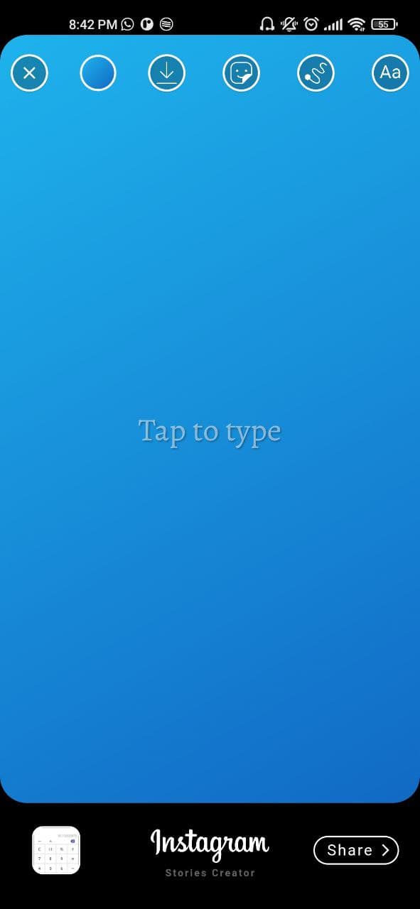
initial view

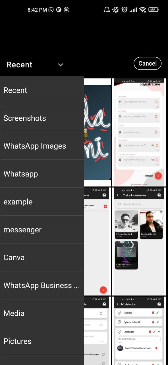
Custom image picker made with Photo_manager package

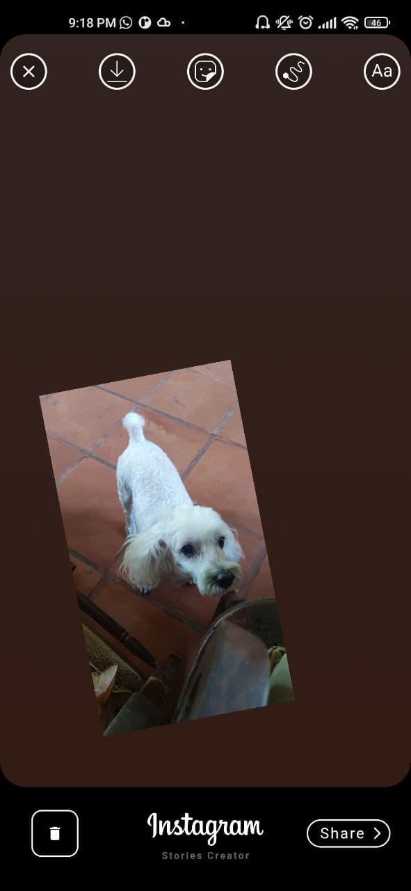
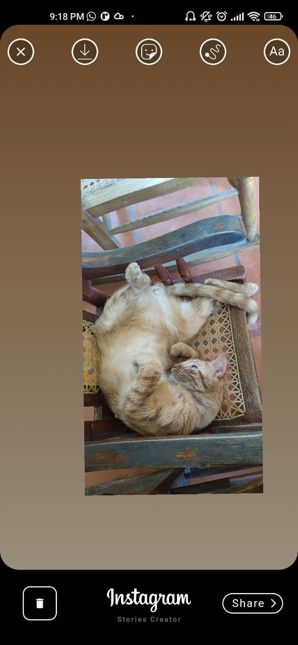
Gradient background taking image color pixel

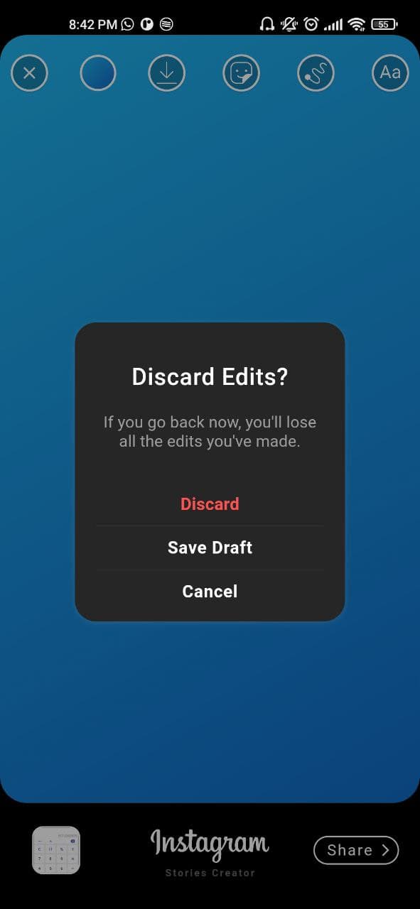
Exit Dialog

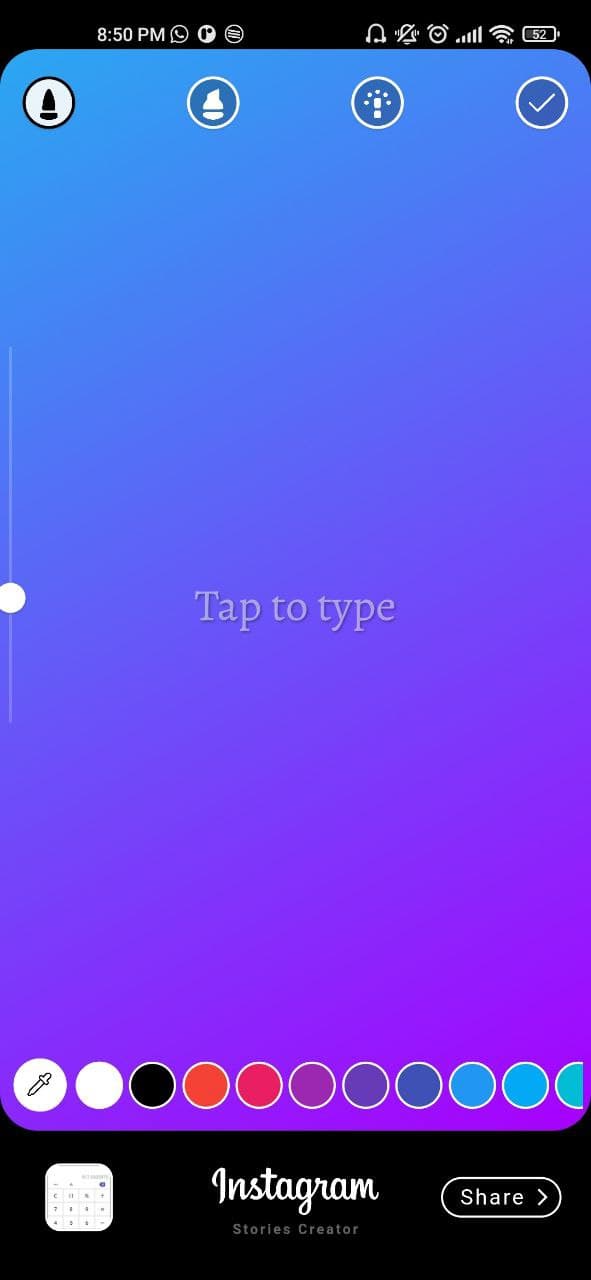
Custom finger Drawing made with perfect_freehand package

Text Editor

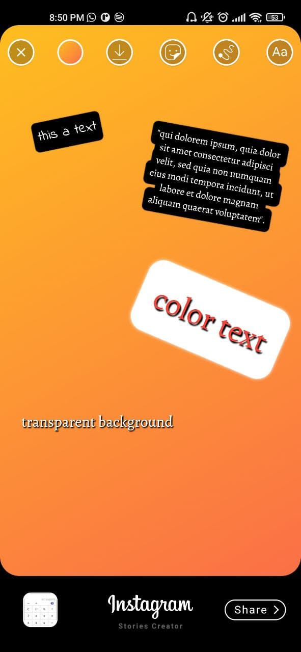
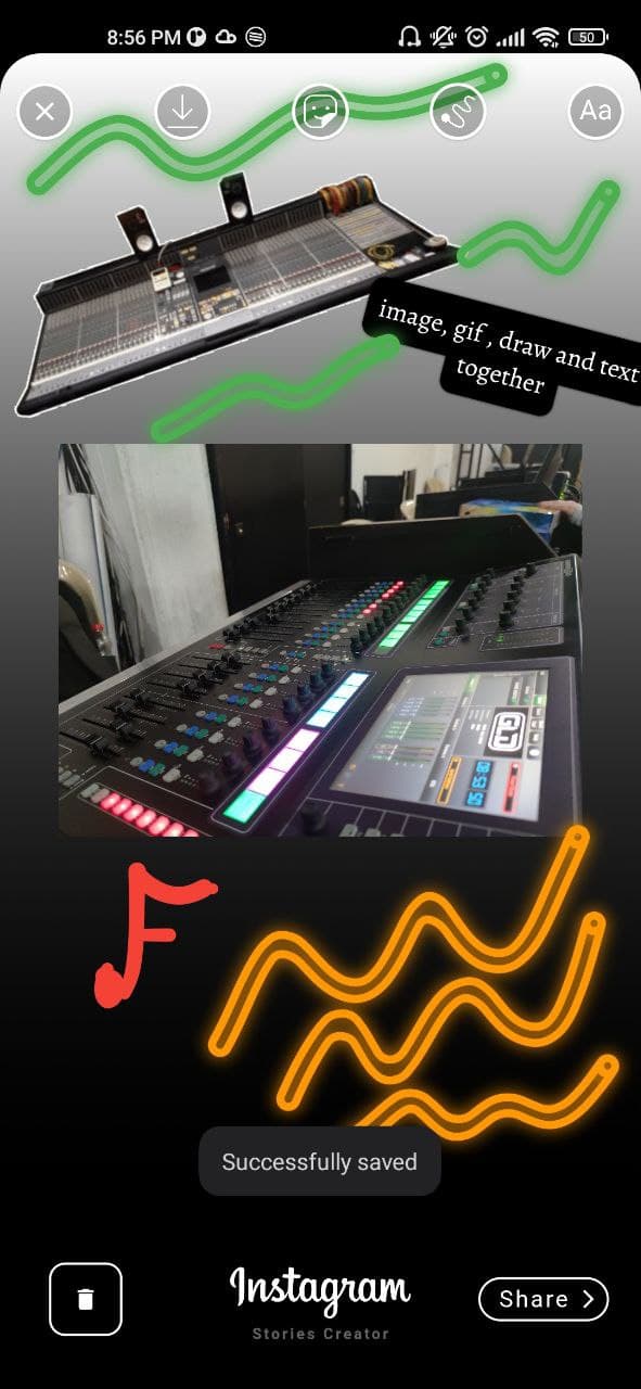
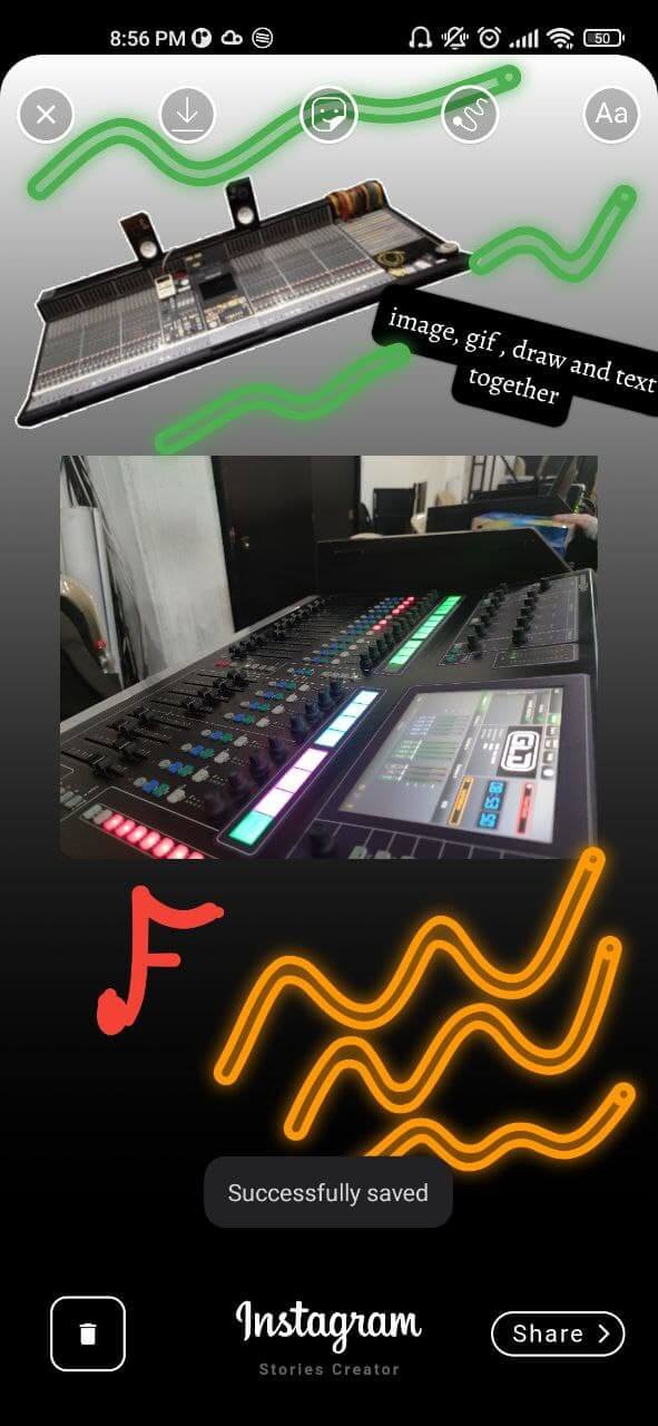
All features together

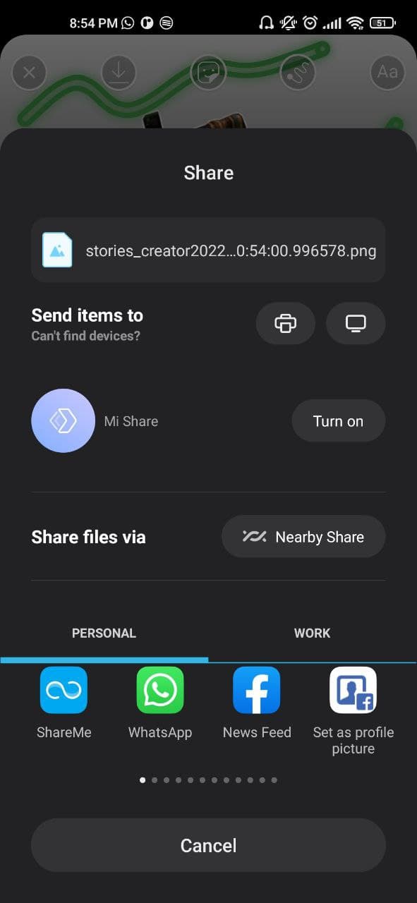
Share to social networks made with share_plus package

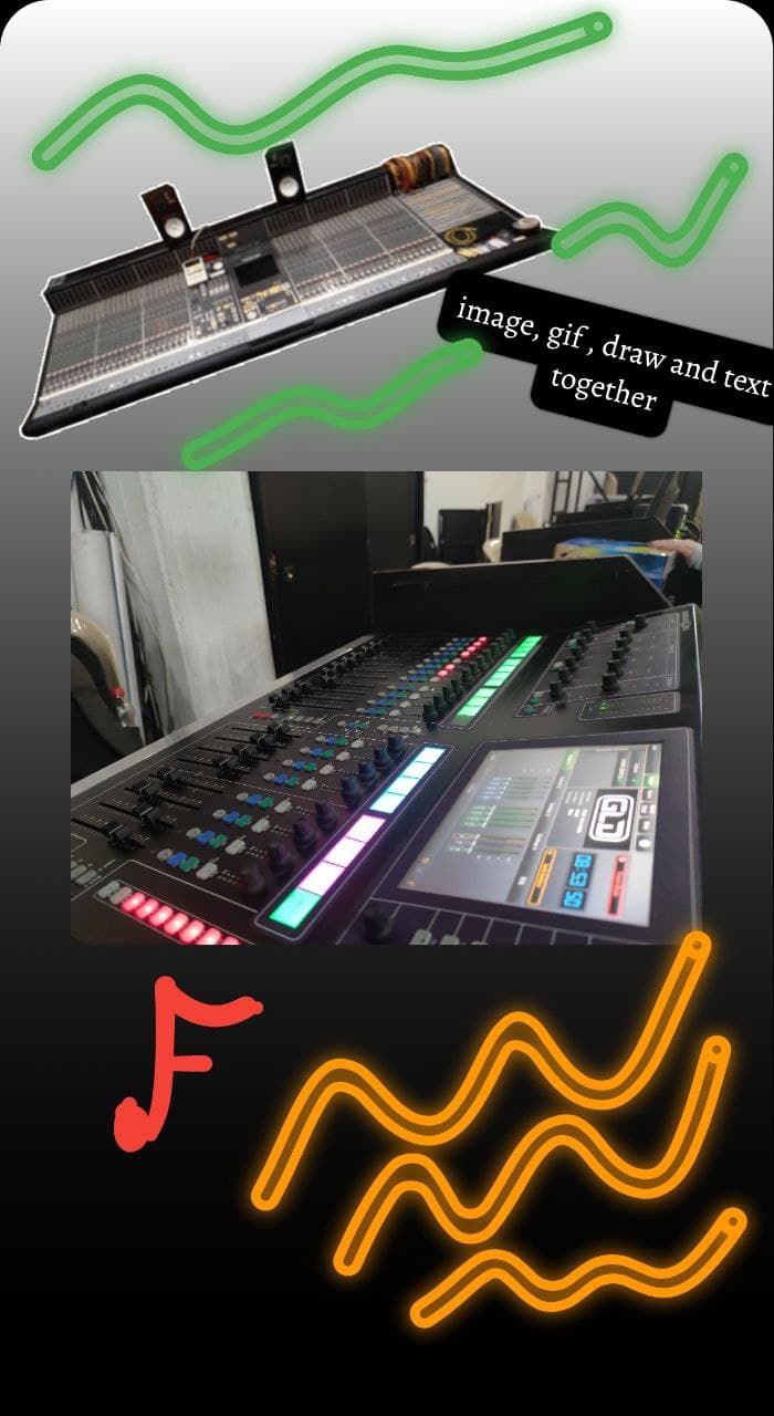
Saved image

카테고리

의존성

의존성 목록 12 개

소스 저장소

이 패키지를 사용하는 프로젝트

아직 데이터가 없습니다.