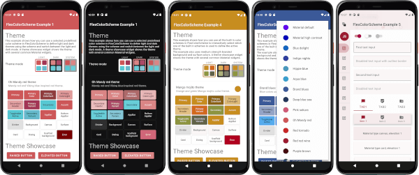
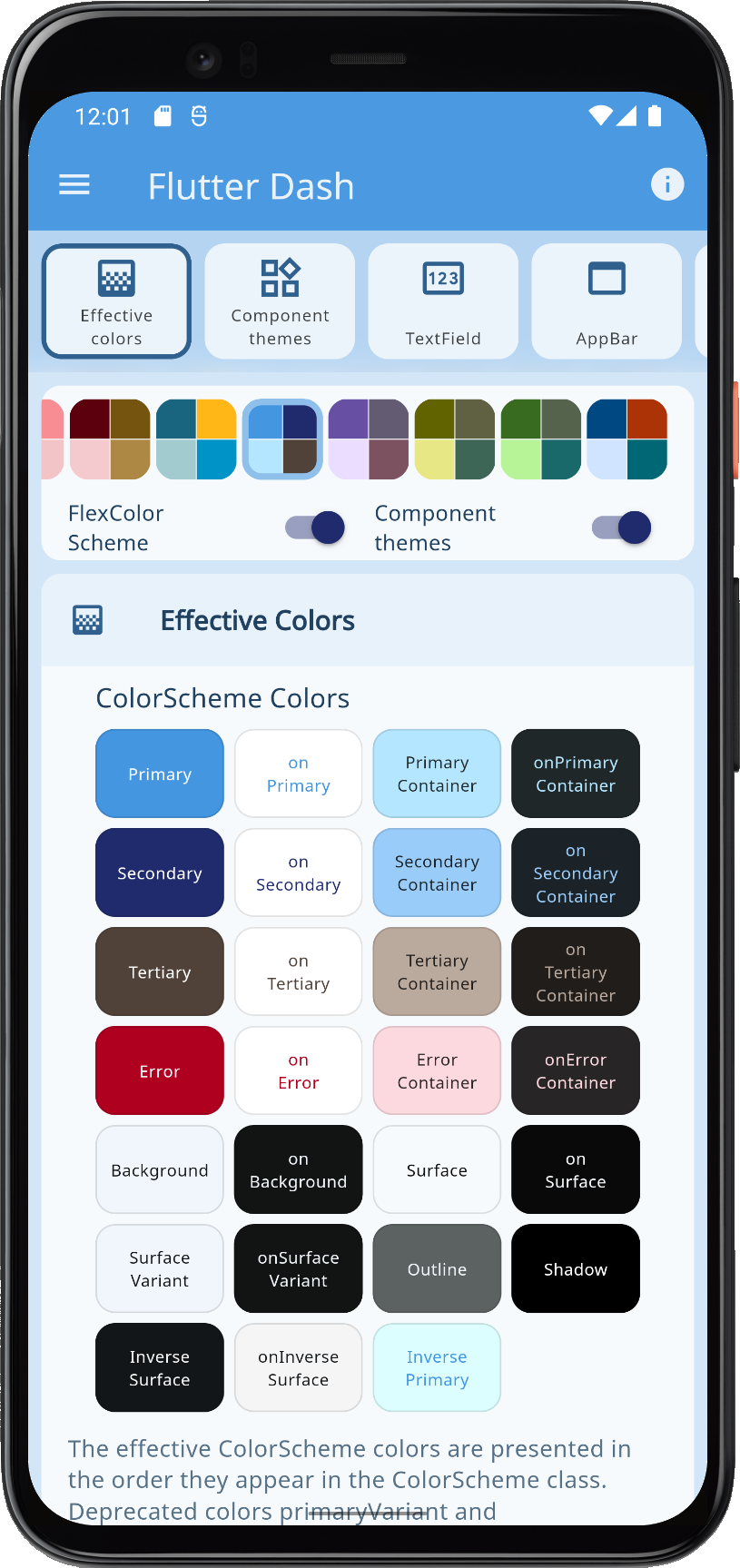
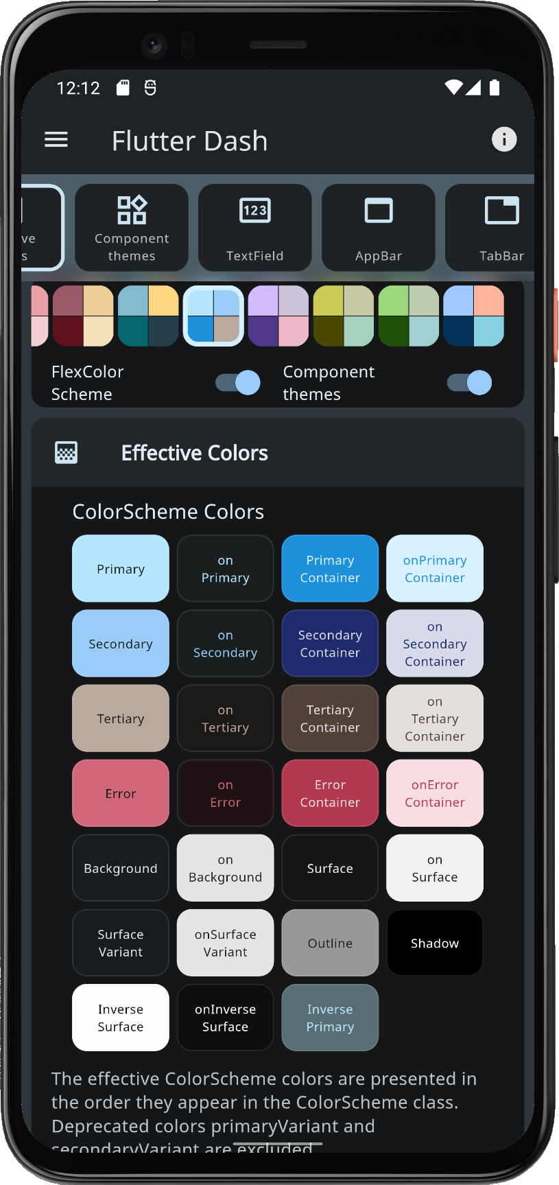
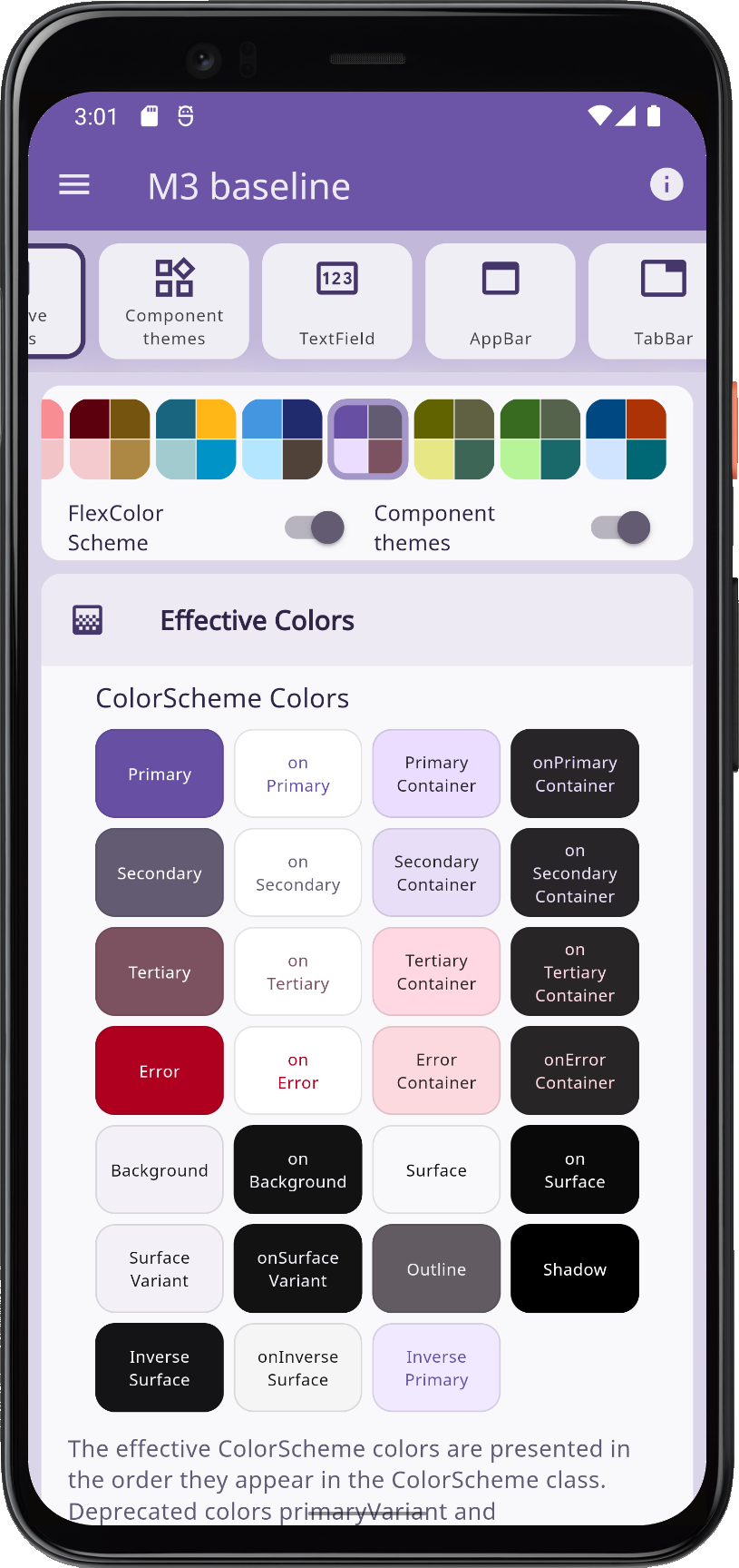
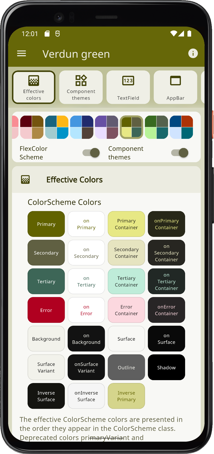
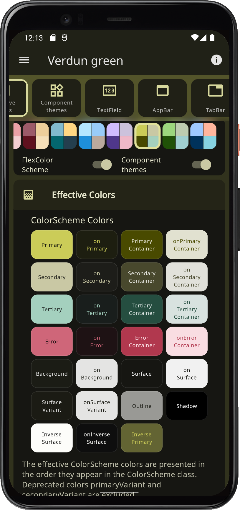
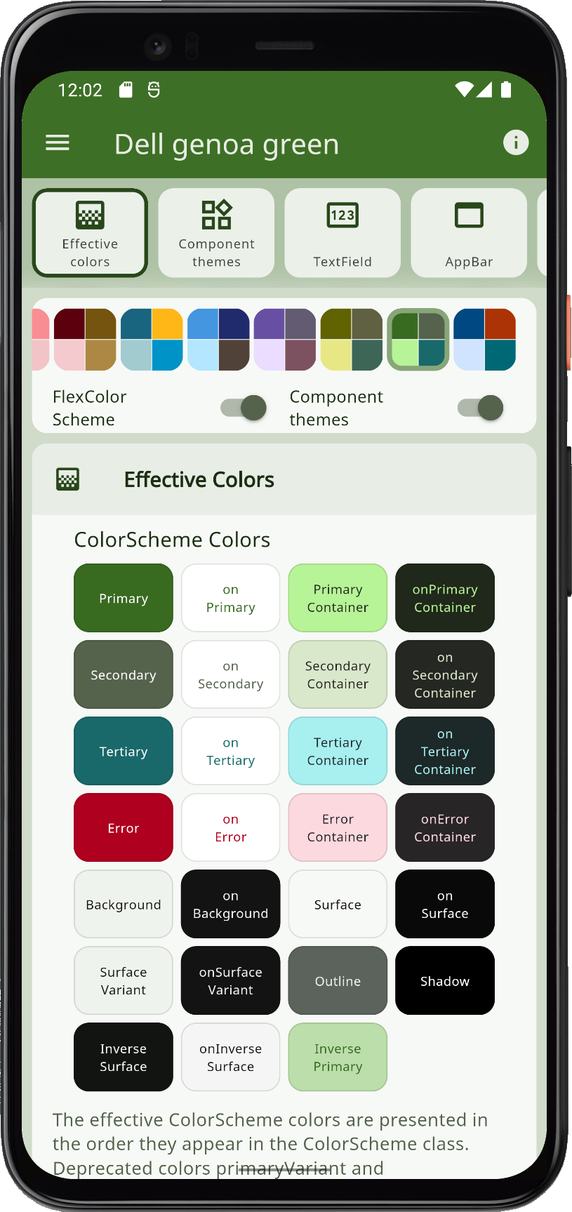
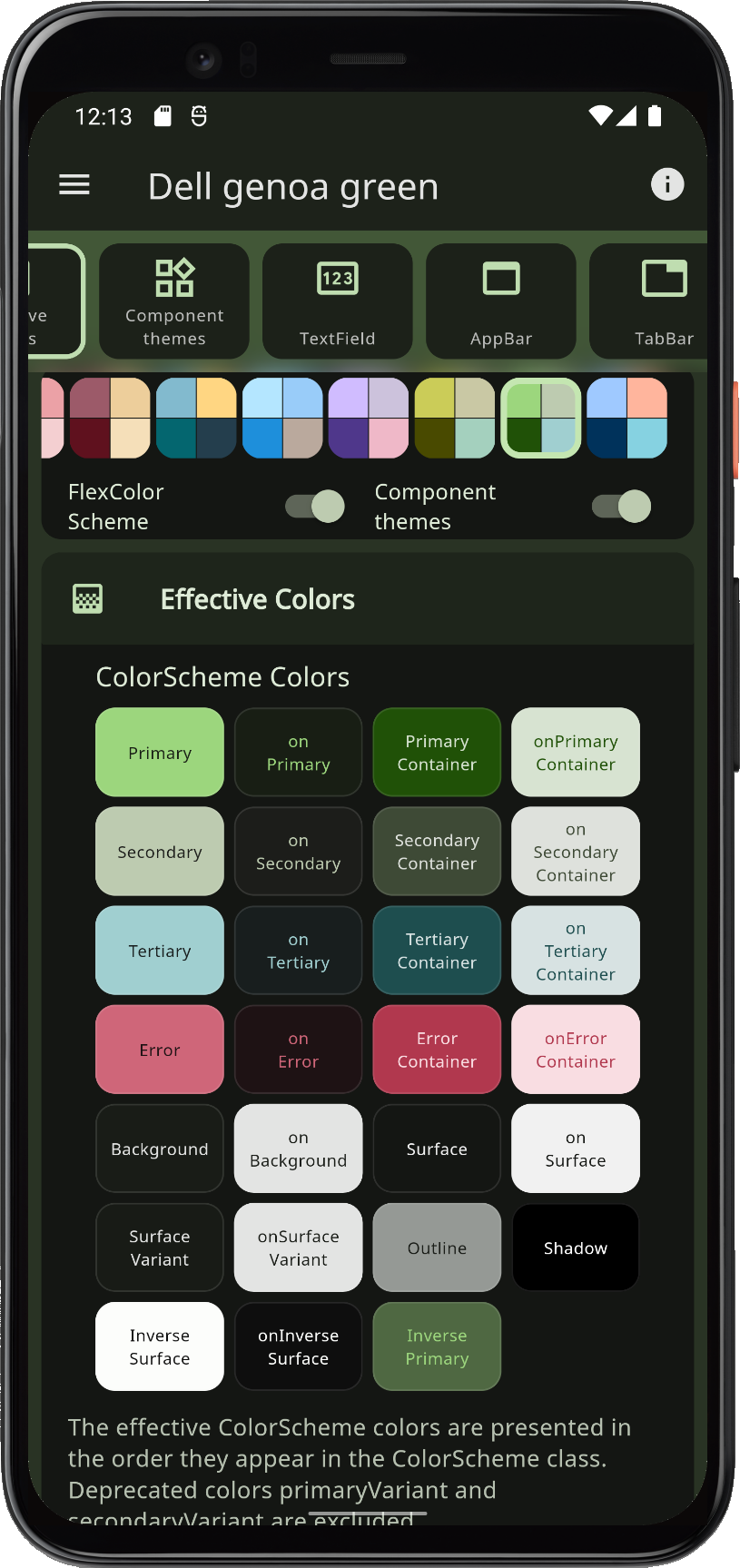
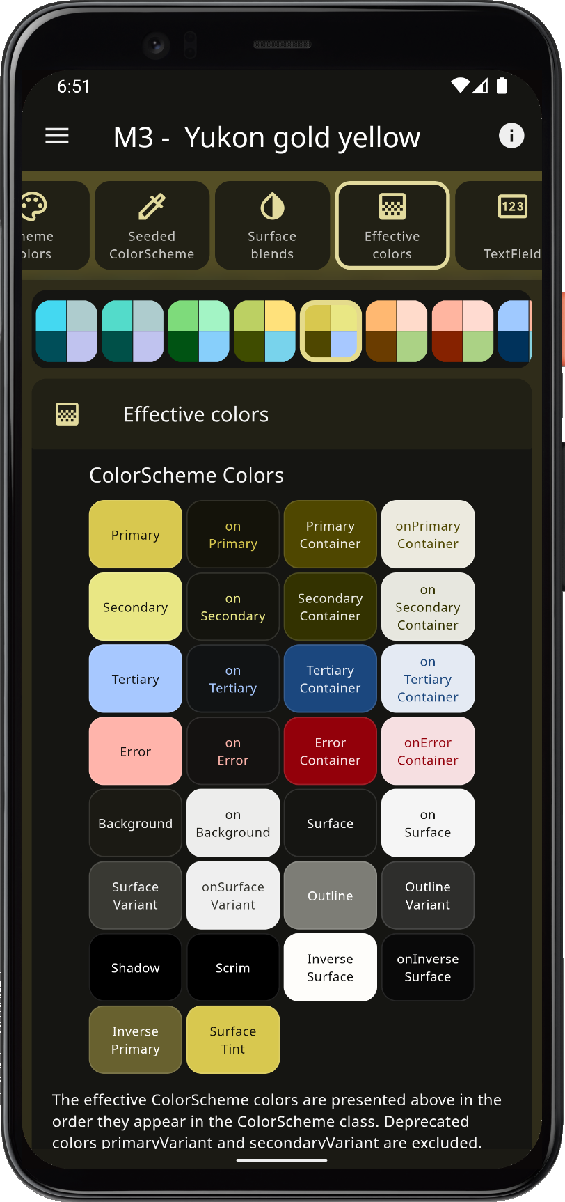
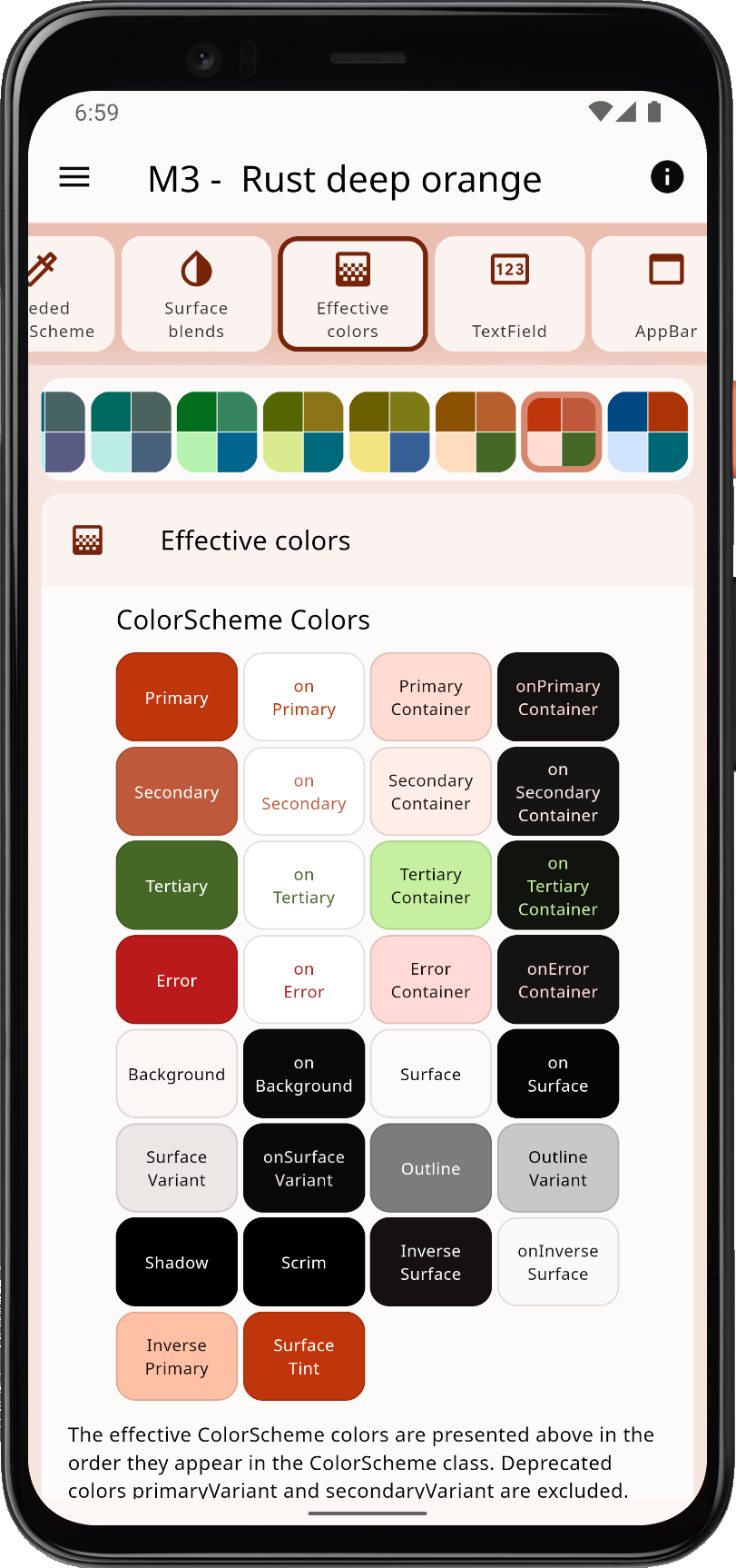
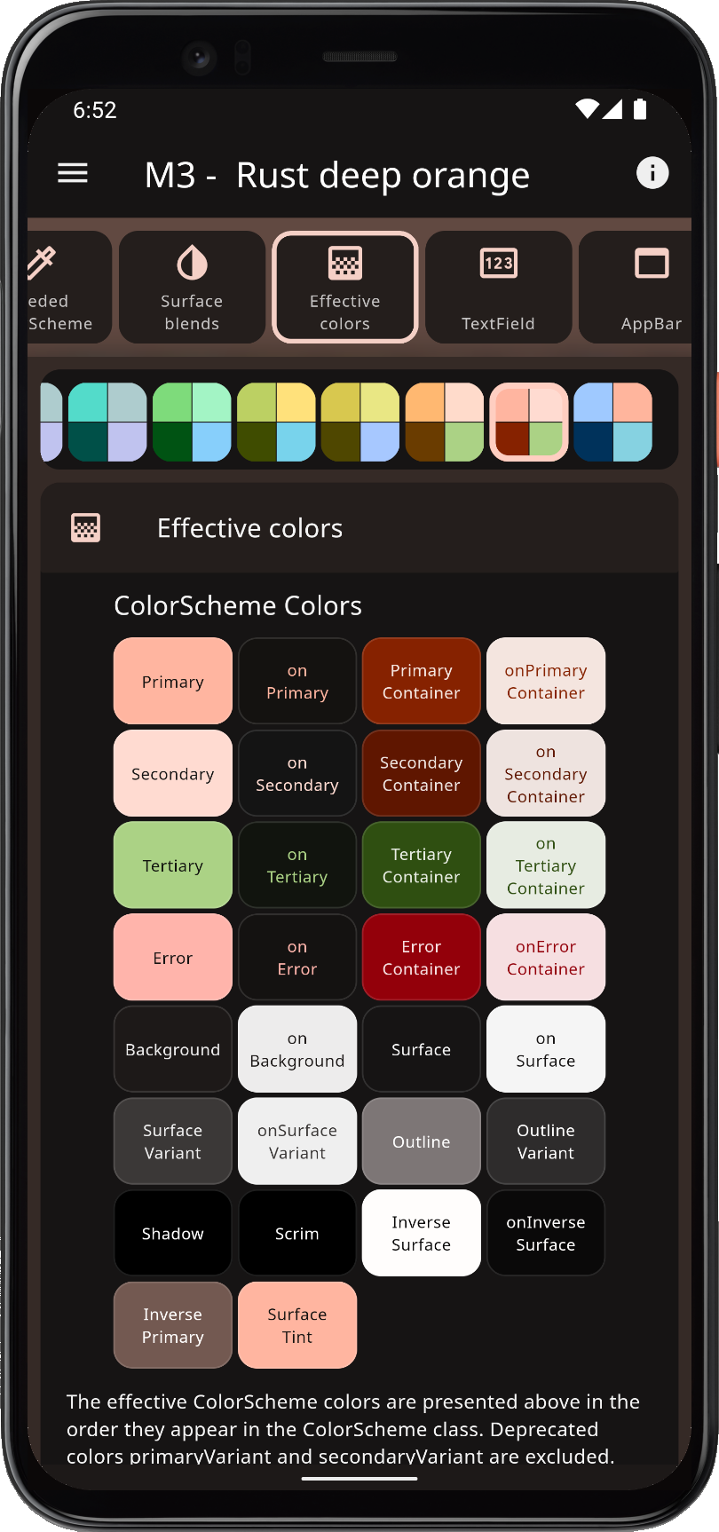
Flex Color Scheme는 아름다운 Material Design 기반 테마의 생성과 적용을 간소화하기 위해 설계된 Flutter 패키지입니다. 라이트 모드와 다크 모드를 모두 지원하는 유연한 색상 스키마 관리 기능을 제공하여 개발자가 주요, 보조 및 강조 색상과 같은 시각적 요소를 쉽게 사용자 정의할 수 있도록 합니다. 사전 정의된 테마 템플릿을 제공하며, 플랫폼 간 디자인 일관성을 유지하면서도 깊이 있는 사용자 정의가 가능합니다. 동적 테마 및 현대적인 미학을 필요로 하는 앱에 적합합니다.
사용 사례
라이트 모드와 다크 모드를 사용하여 반응형 UI 만들기
Material Design 테마 사용자 지정
일관된 색상 계획으로 앱 만들기
Flutter 앱에서 동적 테마 구현하기
시각적으로 매력적인 인터페이스 설계
다양한 플랫폼 디자인 지원
주요 기능
내장된 라이트 모드 및 다크 모드 지원
풍부한 색상 구성의 사용자 정의
사전 정의된 테마 템플릿
다중 플랫폼 테마 일관성
MaterialApp과의 간편한 통합
유연한 테마 조합
적합한 대상
현대적인 UI를 원하는 플러터 개발자
테마 전환을 필요로 하는 앱
Material Design를 사용하여 작업하는 디자이너
일관된 브랜딩이 필요한 프로젝트
사용자 경험에 중점을 둔 팀
빠른 테마 구현을 원하는 개발자
고려 사항
마테리얼 디자인 원칙을 이해해야 합니다
앱 크기가 약간 증가할 수 있습니다
Flutter 3.0 이상과 함께 사용하는 것이 가장 좋습니다
Material Design 컴포넌트에 제한됨
복잡한 주제를 위해서는 신중한 계획이 필요합니다
최적의 결과를 얻기 위해 올바른 구성에 달려 있습니다
원본 README
연결된 소스 저장소의 README 원문 스냅샷입니다. 최신 내용은 저장소에서 확인하세요.
FlexColorScheme
FlexColorScheme 9.x builds matched light and dark ThemeData for Flutter 3.47+, with full support for the SDK-decoupled material_ui and cupertino_ui packages.
Version 9.0 is a major release because Flutter's UI libraries left the SDK. Theming features are otherwise an easy step from 8.4. Breaking API and seed-tone details are in the changelog and at docs.flexcolorscheme.com.
Use it to make Material Design themes with optional surface blends, seed-generated ColorSchemes, and quick component settings. The result is standard ThemeData, with more complete ColorScheme wiring than Flutter's ThemeData.from / colorSchemeSeed factories.
Configure visually in the Themes Playground and copy the API setup into your app.
FlexColorScheme themes all Flutter SDK UI components from your ColorScheme and custom colors, including legacy ThemeData color properties, in Material 2 or Material 3 mode. Opt in on component themes to adjust shared styles, for example border radius on many widgets with one property.
Material 3
Material 3 is the default since FlexColorScheme v8, matching Flutter's ThemeData. Component theme defaults follow Material 3, including per-widget radii from the Material 3 Guide. Keep those defaults, set a shared global radius, or override radius per widget.
Surface alpha blends and seed-generated ColorSchemes go beyond Flutter's seed factory: multiple seed colors, custom minimum chroma, and custom tone mapping.
Component themes use simple flat properties. You can skip verbose SDK ShapeBorder and WidgetState theme objects for common cases.
Getting Started
Requires Flutter 3.47 or later. FlexColorScheme depends on material_ui and cupertino_ui; your app still needs a direct material_ui import for MaterialApp and widgets.
Version 9.0 allows any material_ui / cupertino_ui1.x (^1.0.0). It does not use APIs added after 1.0.0 of those packages. Later FlexColorScheme releases will raise that floor when they adopt new features from them.
Start with a built-in FlexScheme palette, or define your own colors. The package default example is a heavily commented guide. See Examples and the Tutorial.
FlexColorScheme Counter App
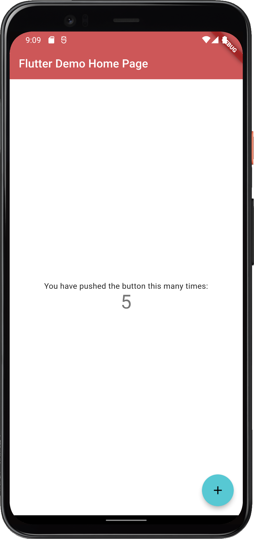
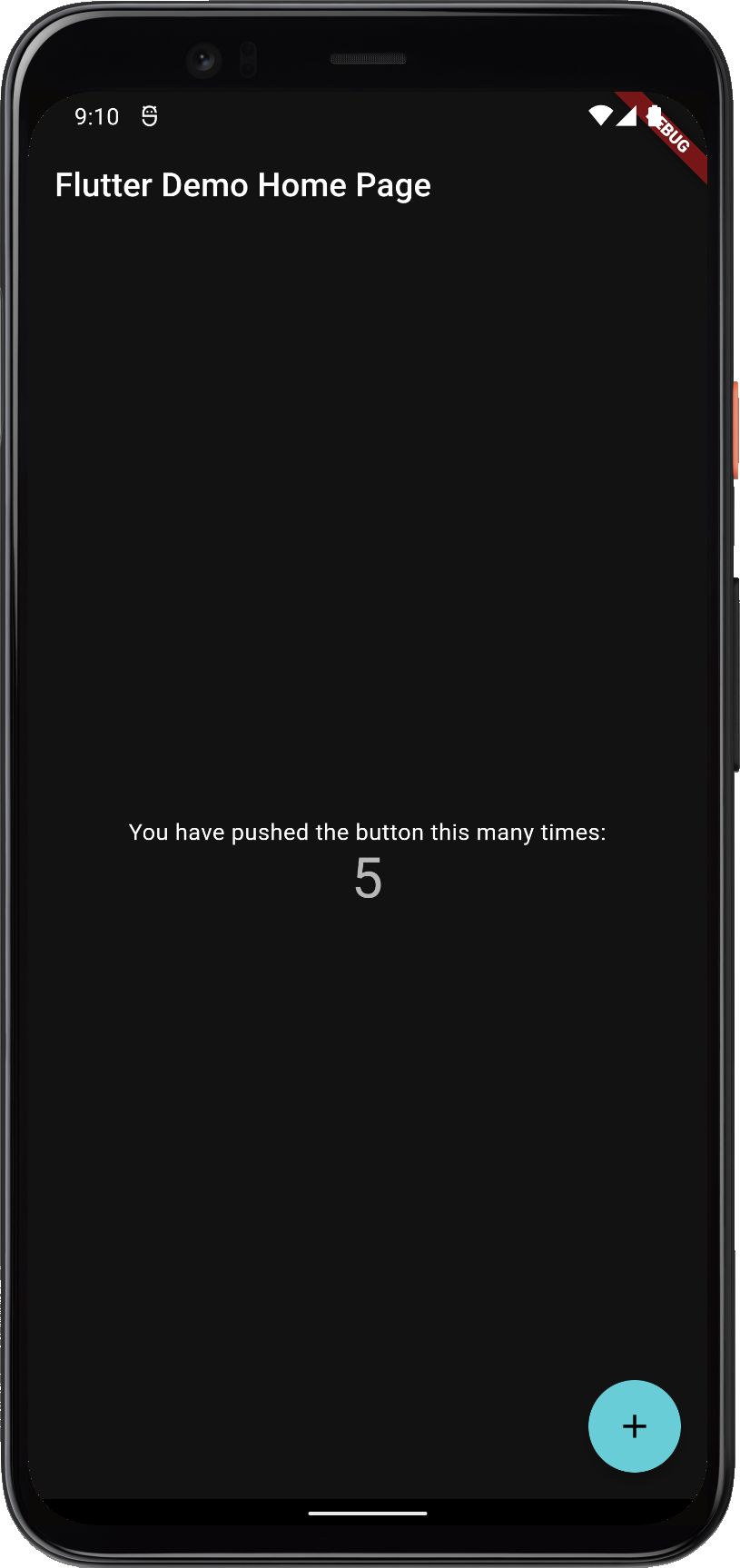
Create a new Flutter project and theme the default counter app with Oh Mandy red (FlexScheme.mandyRed). ThemeMode.system follows the device light/dark setting.
import'package:flex_color_scheme/flex_color_scheme.dart';
import'package:material_ui/material_ui.dart';
classMyAppextendsStatelessWidget{
constMyApp({super.key});
@overrideWidgetbuild(BuildContext context) {
returnMaterialApp(
title: 'Flutter Demo',
// The Mandy red, light theme.
theme: FlexThemeData.light(scheme: FlexScheme.mandyRed),
// The Mandy red, dark theme.
darkTheme: FlexThemeData.dark(scheme: FlexScheme.mandyRed),
// Use dark or light theme based on system setting.
themeMode: ThemeMode.system,
home: constMyHomePage(title: 'Flutter Demo Home Page'),
);
}
}
This gives a counter application that looks like this:
FlexColorScheme applied to the standard Flutter counter template
The counter app uses few widgets, so it does not show the theme well. The package examples use placeholder UI only to present results; that demo UI is not part of using FlexColorScheme.
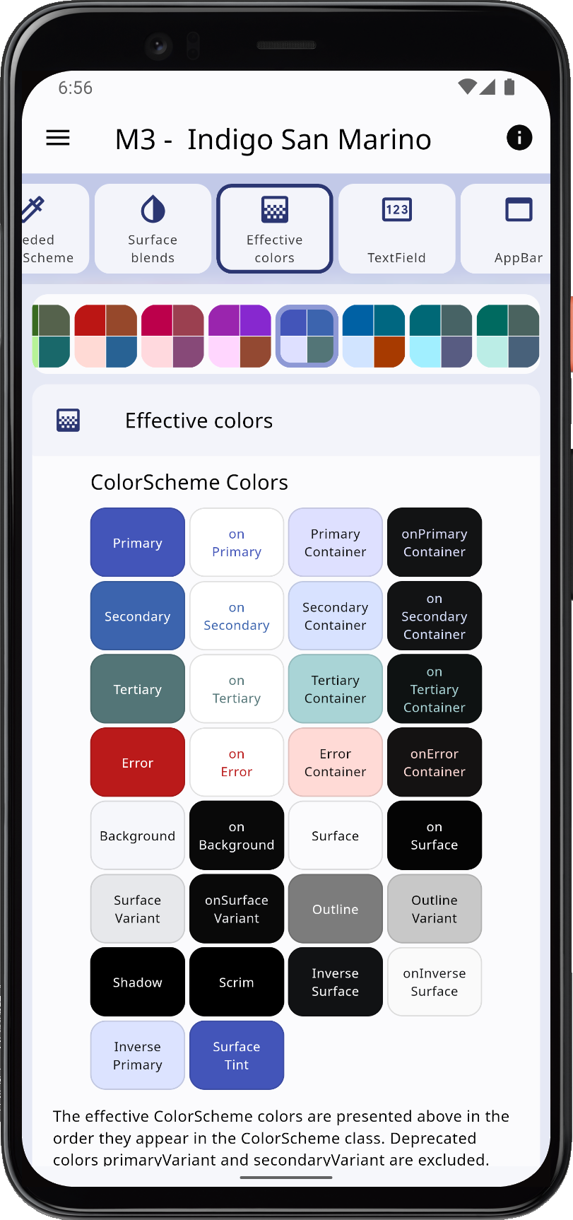
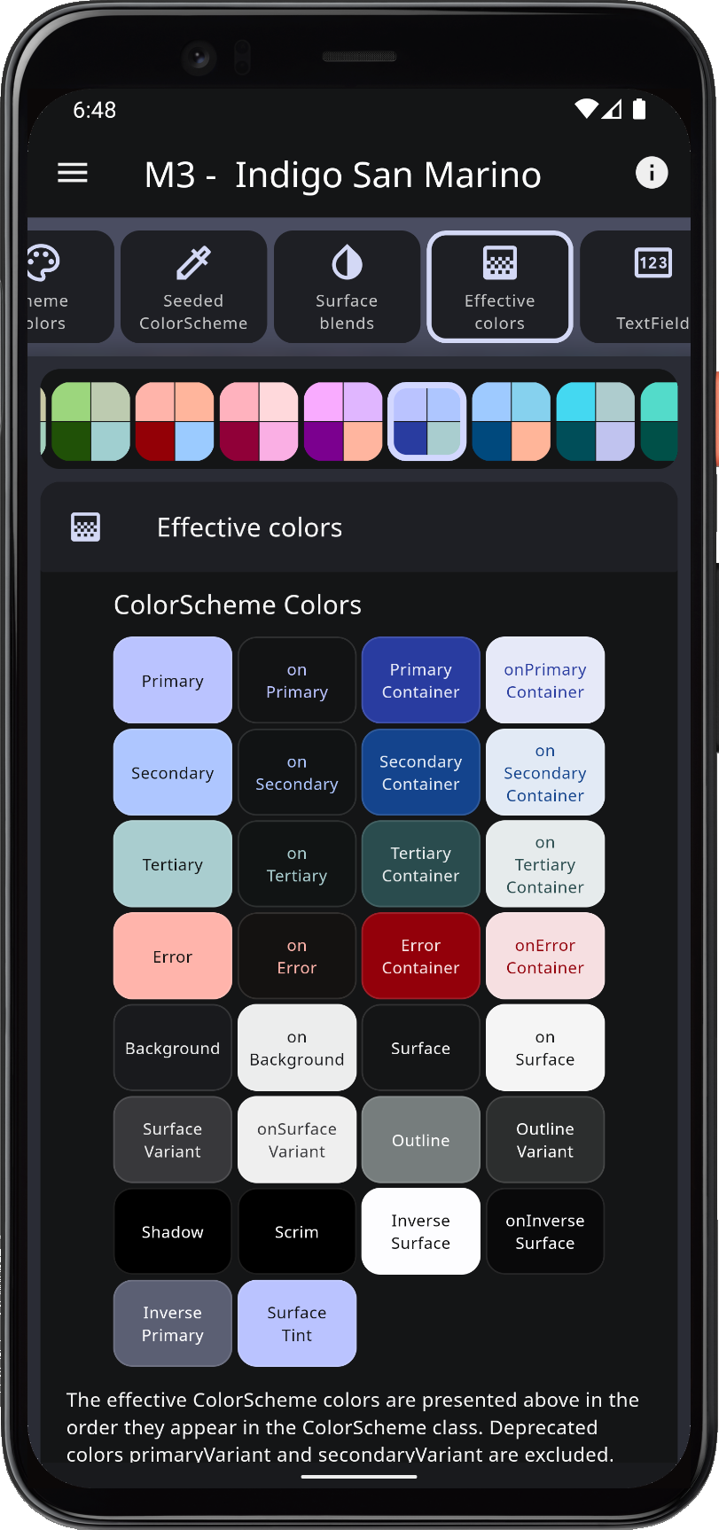
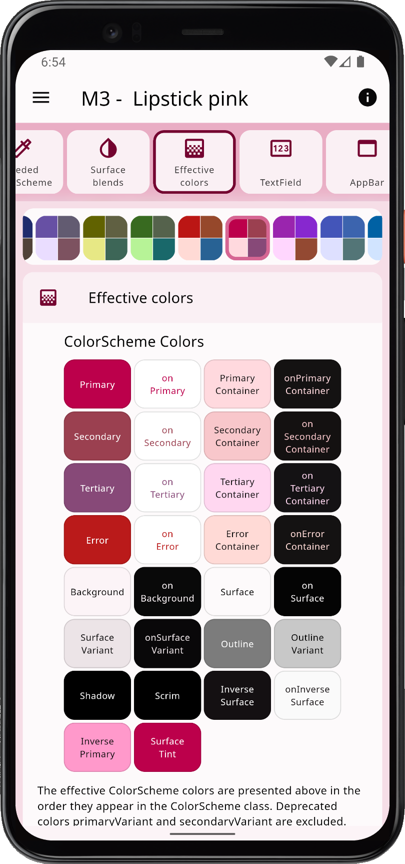
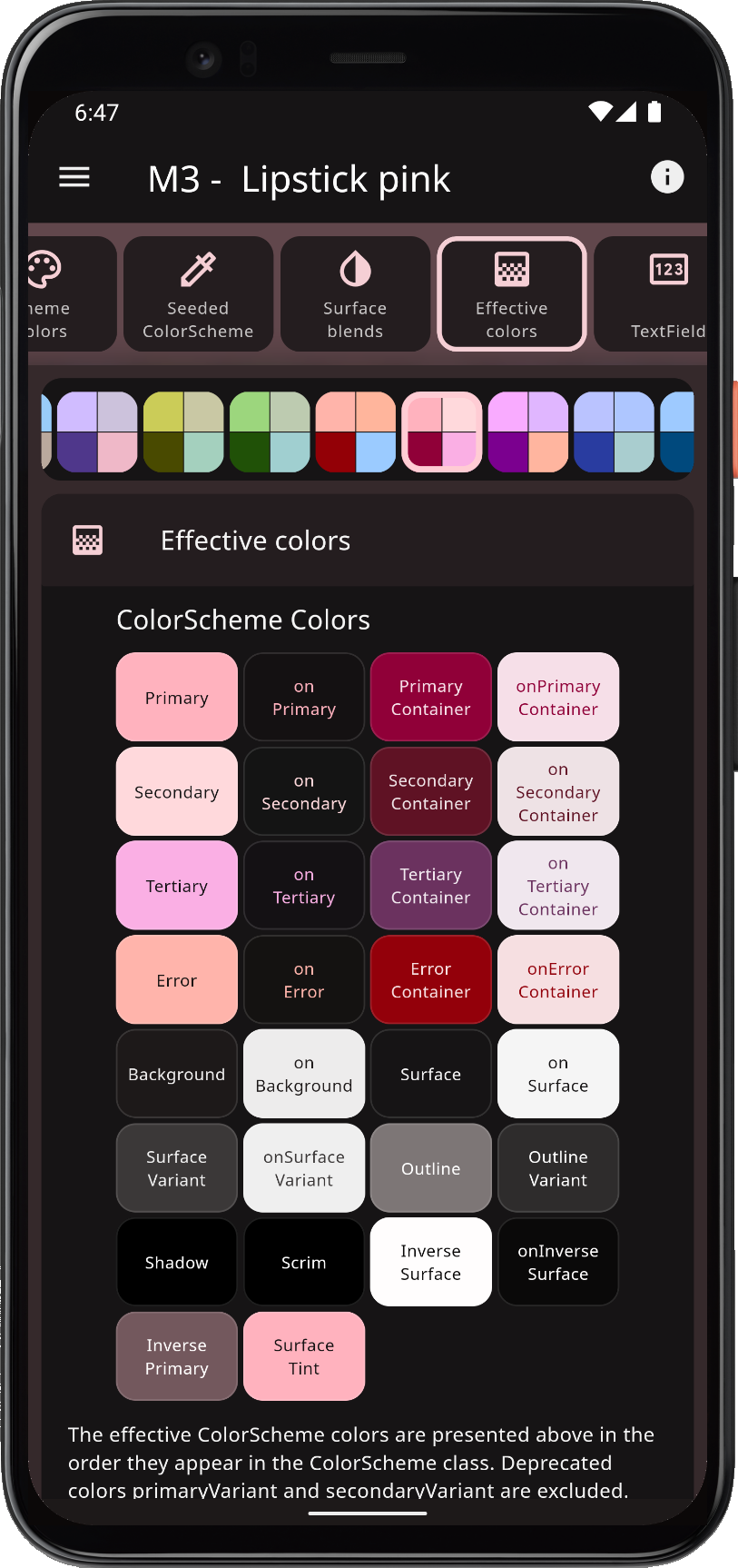
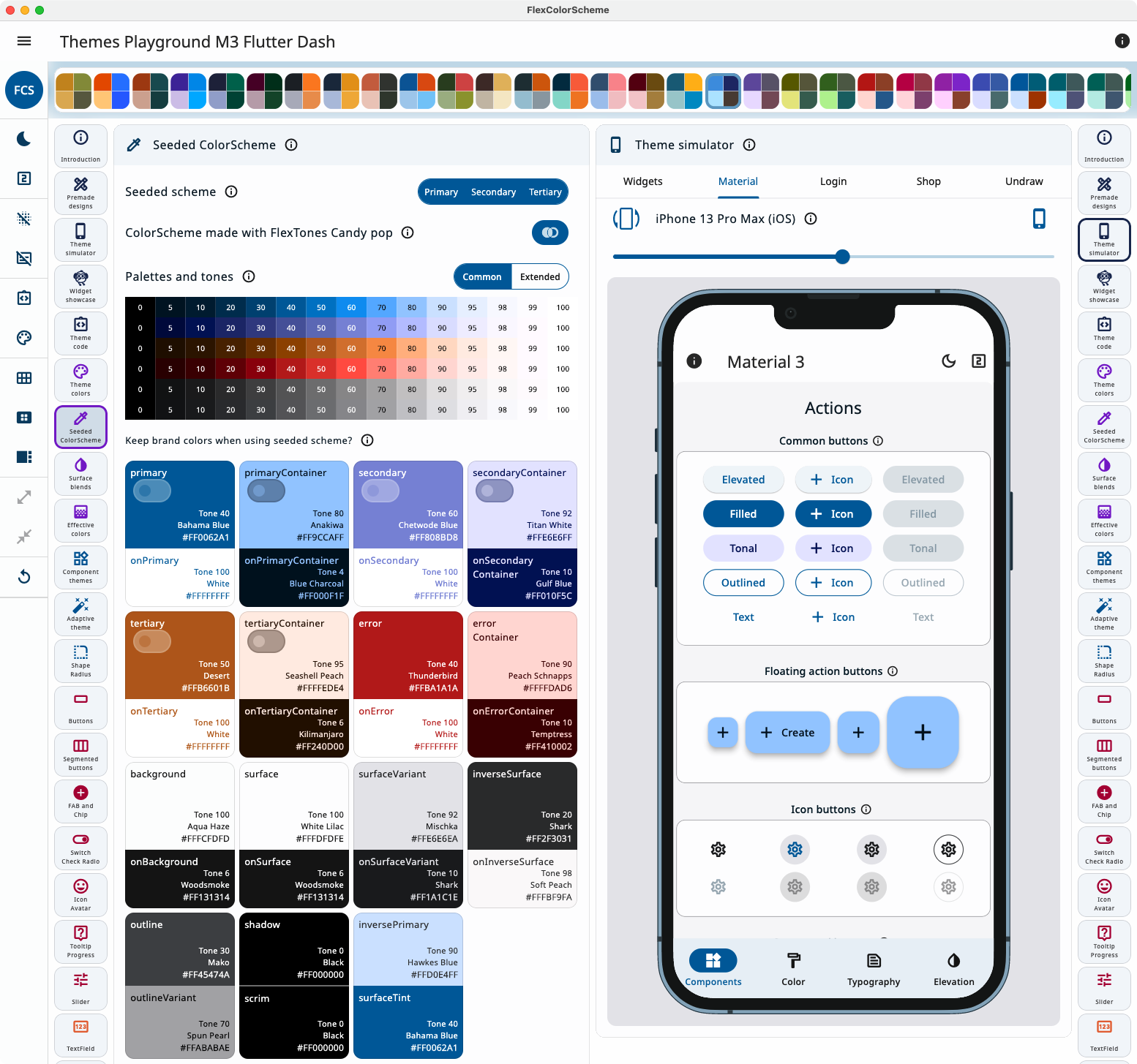
The Themes Playground is a web companion that generates FlexColorScheme setup code for the active theme. The app itself, and the demos in its theme simulator, show the result of that code. Settings persist; reset them if you get lost. It is bundled as example 5, the last tutorial step.
In Themes Playground you can visually configure your theme and copy its setup code.
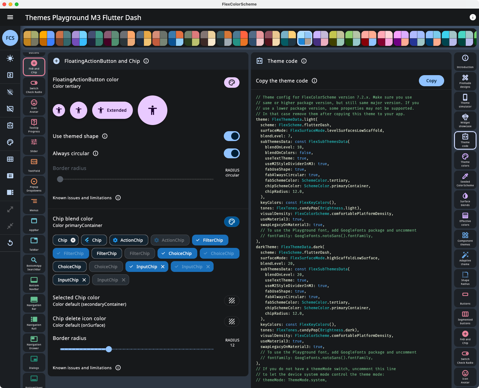
Open the code view beside the controls to watch the API update as you change settings.
Viewing API configuration and its updates as you change settings in Themes Playground.
Latest live build (WASM GC, with JS fallback): playground.flexcolorscheme.com. Usage notes: Playground chapter. Use the same major version of Themes Playground as your flex_color_scheme package, and for versions 7, 8, and 9 prefer matching the minor version too. GitHub Pages JS builds are in the table below.
NOTE! Older and newer web builds on this domain share browser storage. Loading a newer Playground, then an older one, can fail until you clear site data (Settings → Delete browsing data → Cookies and other site data). You lose saved config. Version 8.0.0 and later uses a different storage name, so it does not conflict with V7 and older.
Themes Playground as a Desktop App
A Windows, macOS, or Linux build of Example 5 is smoother than the web app. For an older package version, download a ZIP from the GitHub releases.