搜索插件、代码仓与 APP 分类

adaptive_scrollbar 封面
插件详情v2.1.2

adaptive_scrollbar

自适应的桌面风格滚动条,可放置在屏幕的任一侧。

AndroidiOSWebmacOSWindowsLinux
近 30 天下载
2660
喜欢数
40
Pub 分数
130

安装插件

flutter pub add adaptive_scrollbar

插件介绍

基于插件公开信息、社区数据与项目使用情况整理的选型参考。

自适应滚动条是一个Flutter包,提供了一种桌面风格的滚动条,可根据平台和上下文自动调整其位置和外观。它可以放置在可滚动控件的左侧或右侧,为不同设备提供一致的用户体验。专为现代UI设计,它在触摸和非触摸界面中均能提升可用性。该滚动条可适应不同的屏幕尺寸和输入方式,非常适合面向移动、Web和桌面等多种平台的应用程序。

适合场景

  • 跨平台应用中的可滚动内容
  • 移动设备上的桌面类体验
  • 增强长列表的可访问性
  • 可自定义的滚动指示器
  • Web 和桌面端的响应式 UI

主要特点

  • 自动定位在左侧或右侧
  • 平台感知设计
  • 支持触摸和非触摸设备
  • 可配置的外观
  • 与 ScrollViews 的平滑集成

适合对象

  • 面向多平台应用的开发者
  • 寻求桌面风格用户界面的设计人员
  • 需要可访问滚动的App
  • 包含长篇内容的项目
  • 面向网络和桌面的Flutter应用

使用建议

  • 可能需要额外的样式设置以支持自定义主题
  • 对超大列表的性能影响
  • 超出基本定位之外的自定义功能有限
  • 不适合极简设计
  • 在复杂布局中需要谨慎放置

原始 README

以下为关联源码仓库的 README 原文快照,最新内容请访问源码仓库。

adaptive_scrollbar

platform pub package GitHub stars GitHub forks GitHub license GitHub issues

Language: English

Adaptive Scrollbar is a library that allows you to create one or more desktop-style scrollbars on a single screen, each of which is bound only to its own object and placed in its own place on the screen.

How to use it

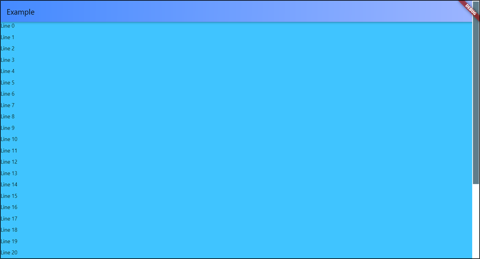
Just wrap with AdaptiveScrollbar your widget that contains your ScrollView object and specify the controller that is attached to this ScrollView object.

AdaptiveScrollbar(
  controller: controller,
  child: Center(
    child: ListView.builder(
      controller: controller,
      itemBuilder: (context, index) { 
        return Text(
            "Line " + index.toString());
      },
      itemCount: 50,
    ))),

pic

Multiple scrollbars

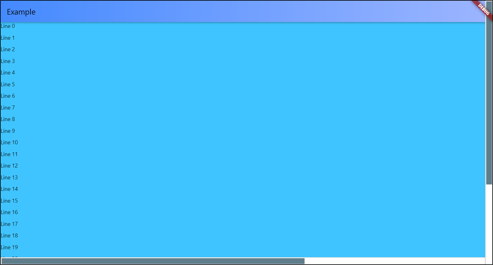
You can add multiple scrollbars to the screen at once. The controller is a required parameter in order to track changes to only one object if there are several ScrollView objects in your widget.

return AdaptiveScrollbar(
  controller: verticalScroll,
  width: verticalWidth,
  child: AdaptiveScrollbar(
    controller: horizontalScroll,
    width: horizontalWidth,
    position: ScrollbarPosition.bottom,
    underSpacing: EdgeInsets.only(bottom: verticalWidth),
    child: SingleChildScrollView(
      controller: horizontalScroll,
      scrollDirection: Axis.horizontal,
      child: Container(
        width: 2000,
        child: Container(
          color: Colors.lightBlueAccent,
          child: ListView.builder(
            controller: verticalScroll,
            itemCount: 30,
            itemBuilder: (context, index) {
              return Container(
                height: 30,
                child: Text("Line " + index.toString()));
            }))),
    )));

pic

Customization

You can position your scrollbar on any of the 4 sides of the screen. There is only one thing - if you choose ScrollbarPosition.top or ScrollbarPosition.bottom, your scrollbar will actually be rotated 90 degrees, and the top will be on the left. Do not forget about this if you specify the spacings for slider and under the slider part. I'll think about how to simplify this.

AdaptiveScrollbar(
  controller: verticalScroll,
  width: verticalWidth,
  child: AdaptiveScrollbar(
    controller: horizontalScroll,
    position: ScrollbarPosition.bottom,
    
    //the horizontal scrollbar will have a padding
    // on the RIGHT by the width of the vertical scrollbar
    underSpacing: EdgeInsets.only(bottom: verticalWidth),
    
    width: horizontalWidth,
    child: ...
),

pic

To set slider width, you can set the horizontal sliderSpacing. The vertical sliderSpacing will determine the padding of the slider from the start and the end of the bottom. The height of the slider is determined automatically based on the size of the ScrollView object. If ScrollView object has nowhere to scroll, the scrollbar will not be displayed on the screen.

You can set colors for slider and under the slider part, or completely set the decorations for them.

Slider scroll-to-click speed

You can set your own speed parameters for moving the slider in the direction of the click. scrollToClickDelta is the distance that the slider will move in one move. scrollToClickFirstDelay is the duration of the first delay between the slider moves in the direction of the click, in milliseconds. scrollToClickOtherDelay is the duration of the remaining delays between scrolls in the click direction, in milliseconds.

AdaptiveScrollbar(
  ...
  scrollToClickDelta: 75,
  scrollToClickFirstDelay: 200,
  scrollToClickOtherDelay: 50,
  ...
),

Parameters

Parameter Description Type Default value
child Widget that contains your ScrollView. Widget required
controller Controller that attached to ScrollView object. ScrollController required
position Position of scrollbar on the screen. ScrollbarPosition (enum) ScrollbarPosition.right
width Width of all scrollBar. double 16.0
sliderHeight Height of slider. If you set this value, there will be this height. If not set, the height will be calculated based on the content, as usual. double Calculated based on content
sliderChild Child widget for slider. Widget? -
underColor Under the slider part of the scrollbar color. Color Colors.white
sliderDefaultColor Default slider color. Color Colors.blueGrey
sliderActiveColor Active slider color. Color sliderDefaultColor.withRed(10)
underDecoration Under the slider part of the scrollbar decoration. BoxDecoration BoxDecoration(shape: BoxShape.rectangle, color: underColor)
sliderDecoration Slider decoration. BoxDecoration BoxDecoration(shape: BoxShape.rectangle, color: sliderDefaultColor)
sliderActiveDecoration Slider decoration during pressing. BoxDecoration BoxDecoration(shape: BoxShape.rectangle, color: sliderActiveColor)
scrollToClickDelta Offset of the slider in the direction of the click. double 100.0
scrollToClickFirstDelay Duration of the first delay between scrolls in the click direction, in milliseconds. int 400
scrollToClickOtherDelay Duration of the others delays between scrolls in the click direction, in milliseconds. int 100

underSpacing Under the slider part of the scrollbar spacing. Don't forget about rotation that depends on position. EdgeInsetsGeometry const EdgeInsets.all(0.0)
sliderSpacing Slider spacing from bottom. Don't forget about rotation that depends on position. EdgeInsetsGeometry const EdgeInsets.all(2.0)

所属分类

依赖

依赖清单 2 项

源码仓库

使用此插件的项目

暂无相关数据。