Animated Cross Fade Plus
A powerful Flutter package that enhances the traditional AnimatedCrossFade widget with support for multiple children, auto-play capabilities, and smooth transitions.
Demo
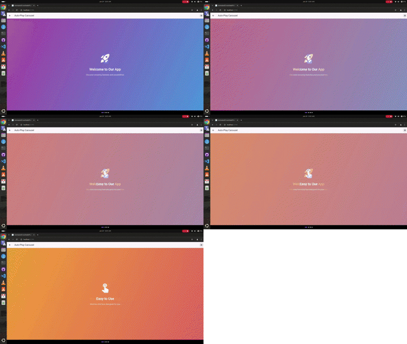
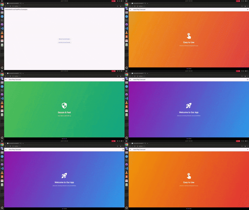
Auto-Play Carousel
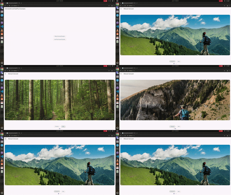
Manual Navigation
Youtube Video
🎥 Check out the tutorial video on my YouTube channel to see it in action! Youtube video
Features 🚀
✨ Support for unlimited children (not just two like AnimatedCrossFade)
🎮 Manual navigation controls
🎯 Auto-play functionality
🎨 Multiple transition types (fade, slide, scale, slideAndFade)
📱 Separate enter and exit animations
🎭 Customizable transition configurations
🔄 Built-in play/pause controls
📍 Progress indicators
Installation 💻
Add this to your package's pubspec.yaml file:
dependencies:
  animated_cross_fade_plus: ^0.0.4
Usage 🎯
Basic Auto-Play Carousel
class AutoPlayExample extends StatefulWidget @override
_AutoPlayExampleState createState () => _AutoPlayExampleState ();
}
class _AutoPlayExampleState extends State <AutoPlayExample > final List <SlideContent > _slides = [
SlideContent (
title: 'Welcome' ,
gradient: [Colors .purple, Colors .blue],
icon: Icons .rocket_launch,
),
SlideContent (
title: 'Easy to Use' ,
gradient: [Colors .orange, Colors .red],
icon: Icons .touch_app,
),
];
@override
Widget build (BuildContext context) {
return AnimatedCrossFadePlus (
children: _slides.map ((slide) => _buildSlide (slide)).toList (),
transitionType: CrossFadeTransitionType .scale,
enterConfig: const TransitionConfig (
curve: Curves .easeInOutCubic,
duration: Duration (milliseconds: 1000 ),
),
exitConfig: const TransitionConfig (
curve: Curves .easeInOutCubic,
duration: Duration (milliseconds: 1000 ),
),
autoPlay: true ,
autoPlayDuration: const Duration (seconds: 3 ),
);
}
}
Manual Navigation Carousel
class ManualExample extends StatefulWidget @override
_ManualExampleState createState () => _ManualExampleState ();
}
class _ManualExampleState extends State <ManualExample > final GlobalKey <AnimatedCrossFadePlusState > _key = GlobalKey ();
int _currentIndex = 0 ;
@override
Widget build (BuildContext context) {
return Column (
children: [
AnimatedCrossFadePlus (
key: _key,
children: _items.map ((item) => _buildItem (item)).toList (),
transitionType: CrossFadeTransitionType .slideAndFade,
enterConfig: const TransitionConfig (
curve: Curves .easeInOutCubic,
duration: Duration (milliseconds: 800 ),
direction: AxisDirection .left,
),
exitConfig: const TransitionConfig (
curve: Curves .easeInOutCubic,
duration: Duration (milliseconds: 800 ),
direction: AxisDirection .right,
),
onIndexChanged: (index) => setState (() => _currentIndex = index),
),
Row (
children: [
ElevatedButton (
onPressed: () => _key.currentState?.animateToIndex ((_currentIndex - 1 ) % _items.length),
child: Text ('Previous' ),
),
ElevatedButton (
onPressed: () => _key.currentState?.animateToIndex ((_currentIndex + 1 ) % _items.length),
child: Text ('Next' ),
),
],
),
],
);
}
}
Parameters ⚙️
Parameter
Type
Description
children
List
List of widgets to animate between
transitionType
CrossFadeTransitionType
Type of transition animation
enterConfig
TransitionConfig
Configuration for entering widget animation
exitConfig
TransitionConfig
Configuration for exiting widget animation
initialIndex
int
Starting index
autoPlay
bool
Enable/disable auto-play
autoPlayDuration
Duration?
Time between auto-play transitions
alignment
AlignmentGeometry
Alignment of children
constraints
BoxConstraints?
Optional size constraints
clipChildren
bool
Whether to clip children during animation
onIndexChanged
Function(int)?
Callback when index changes
Transition Types 🎭
enum CrossFadeTransitionType {
fade,
slide,
scale,
slideAndFade,
}
TransitionConfig Properties 🛠️
class TransitionConfig final Curve curve;
final Duration duration;
final AxisDirection direction;
const TransitionConfig ({
this .curve = Curves .linear,
this .duration = const Duration (milliseconds: 300 ),
this .direction = AxisDirection .right,
});
}
Controller Methods 🎮
final GlobalKey <AnimatedCrossFadePlusState > _key = GlobalKey ();
_key.currentState?.animateToIndex (2 );
Complete Examples 📱
Check out the example folder for complete implementation examples:
Auto-play carousel with scale transitions
Manual navigation with slide and fade transitions
Progress indicators
Play/pause controls
Contributing 🤝
Contributions are welcome! Please feel free to submit issues and pull requests.
Fork it
Create your feature branch (git checkout -b feature/amazing)
Commit changes (git commit -am 'Add amazing feature')
Push to branch (git push origin feature/amazing)
Open a Pull Request
License 📄
This project is licensed under the MIT License - see the LICENSE file for details.
Maintainers 👥