搜索插件、代码仓与 APP 分类

插件详情v1.0.5

animated_cursor

用于增强用户界面交互的动画光标

AndroidiOSWebmacOSWindowsLinux
近 30 天下载
75
喜欢数
33
Pub 分数
160

安装插件

flutter pub add animated_cursor

插件介绍

基于插件公开信息、社区数据与项目使用情况整理的选型参考。

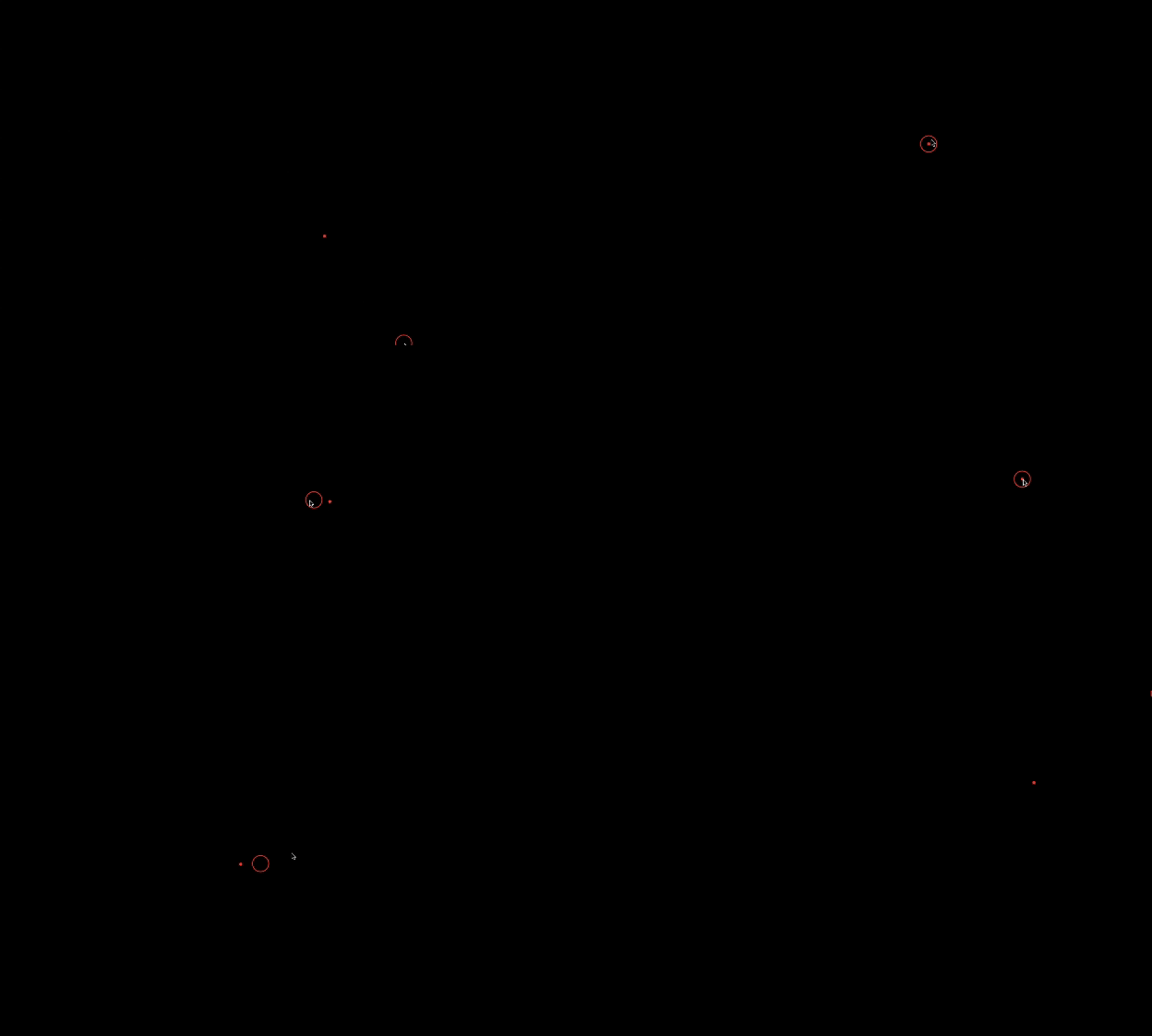
Animated Cursor 是一个 Flutter 包,通过在多个平台上提供可自定义的动画光标来增强用户界面交互。它允许开发者创建动态光标效果,例如轨迹、形状或动画,从而提升视觉反馈和用户参与度。该包支持桌面(Windows、Linux、macOS)和移动设备(Android、iOS)平台,非常适合沉浸式 UI 体验。通过 pub add 简单集成,即可实现流畅且性能优异的光标动画,无需复杂设置。适用于游戏、创意应用或交互式仪表板。

适合场景

  • 交互式 UI
  • 游戏开发
  • 创意应用
  • 仪表板界面
  • 视觉反馈系统

主要特点

  • 可自定义的光标动画
  • 跨平台支持
  • 流畅的性能
  • 轻松集成
  • 轨迹效果
  • 响应式设计

适合对象

  • UI/UX 设计师
  • 游戏开发者
  • 交互式应用创建者
  • 桌面应用程序构建器
  • 创意编程项目

使用建议

  • 在低端设备上的性能
  • 网页上的自定义功能有限
  • 需要平台特定的测试
  • 可能不适用于所有无障碍需求
  • 极简设计中的潜在过度使用

原始 README

以下为关联源码仓库的 README 原文快照,最新内容请访问源码仓库。

Alt Text

View on GitHub View on GitHub View on Linkedin View on Github

Preview

Alt Text

Animated Cursor Package

Welcome to the Animated Cursor package for Flutter! This package provides a customizable animated cursor widget that you can easily integrate into your Flutter projects.

Installing

Add dependency to pubspec.yaml To use the latest version of animated_cursor, add the following line to your pubspec.yamlfile:

dependencies:
  animated_cursor: ^1.0.5

Install it You can install packages from the command line: with Flutter:

$ flutter pub get

Import the package

import 'package:animated_cursor/animated_cursor.dart';

Usage

AnimatedCursor
(
circleColor: Colors.red,
dotColor: Colors.red,
backgroundColor: Colors.black,
borderWidth: 2,
child: Container(color: Colors.black)
);

Properties of Animated Cursor:

Name Type Default Behaviour Description
child Widget The child widget beneath the animated cursor.
cursor MouseCursor? SystemMouseCursors.basic The cursor to be displayed when the mouse is over the child widget
circleColor Color? Color(0xFF4CAF50) Color of the animated circle.
dotColor Color? Color(0xFF4CAF50) Color of the animated dot.
backgroundColor Color? Colors.transparent Background color of the cursor.
circleDuration Duration? 100 Duration of the animated circle's appearance.
dotDuration Duration? 350 Duration of the animated dot's appearance.
borderWidth double? 1 Width of the cursor's border.
shape CursorShape? BoxShape.circle Shape of the cursor (Circle or Rectangle).
borderRadius BorderRadius? 100 Border radius for the cursor (applicable when shape is set to Rectangle).

Example

import 'package:animated_cursor/animated_cursor.dart';

void main() {
  runApp(MyApp());
}

class MyApp extends StatelessWidget {
  const MyApp({super.key});

  @override
  Widget build(BuildContext context) {
    return MaterialApp(
      title: 'Animated Cursor',
      debugShowCheckedModeBanner: false,
      theme: ThemeData(
        primarySwatch: Colors.red,
      ),
      home: AnimatedCursor(
        // cursor: SystemMouseCursors.alias,
        circleColor: Colors.red,
        dotColor: Colors.red,
        backgroundColor: Colors.black,
        borderWidth: 1,
        child: Container(color: Colors.black),
      ),
    );
  }
}

Additional Information

👍 If you appreciate our solution's value and positive impact on your project,✨ show your support with a thumbs up! 🌟 Your feedback fuels our commitment to excellence.💫 Thank you for choosing us!

-Darshak Desai

所属分类

依赖

依赖清单 1 项

源码仓库

使用此插件的项目

暂无相关数据。