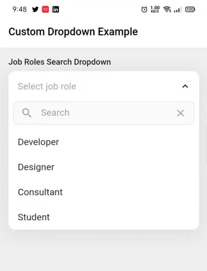
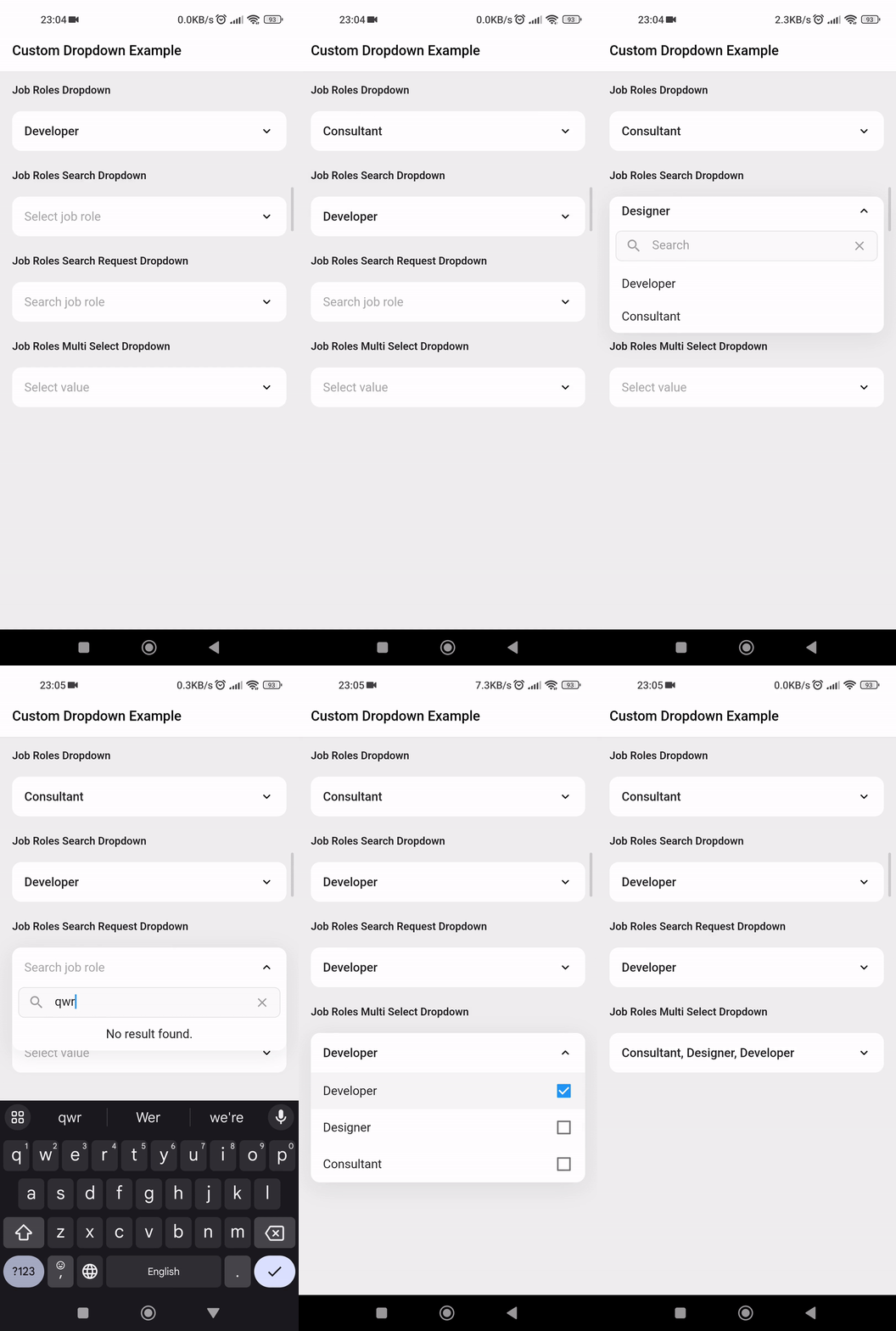
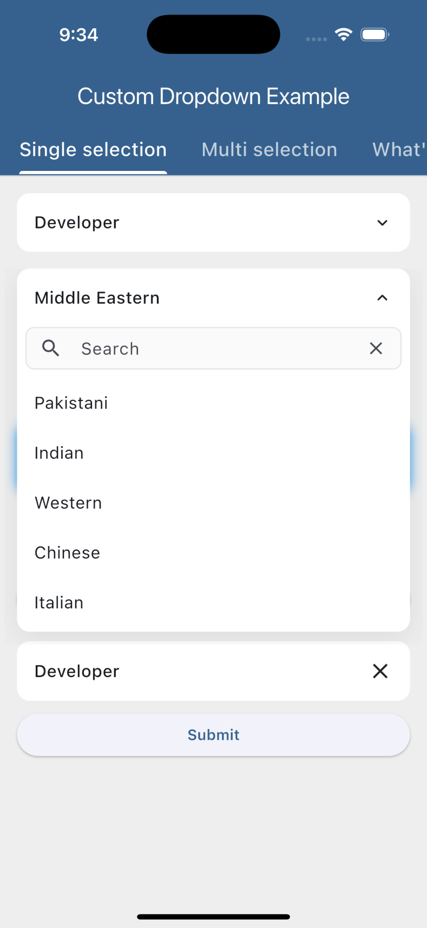
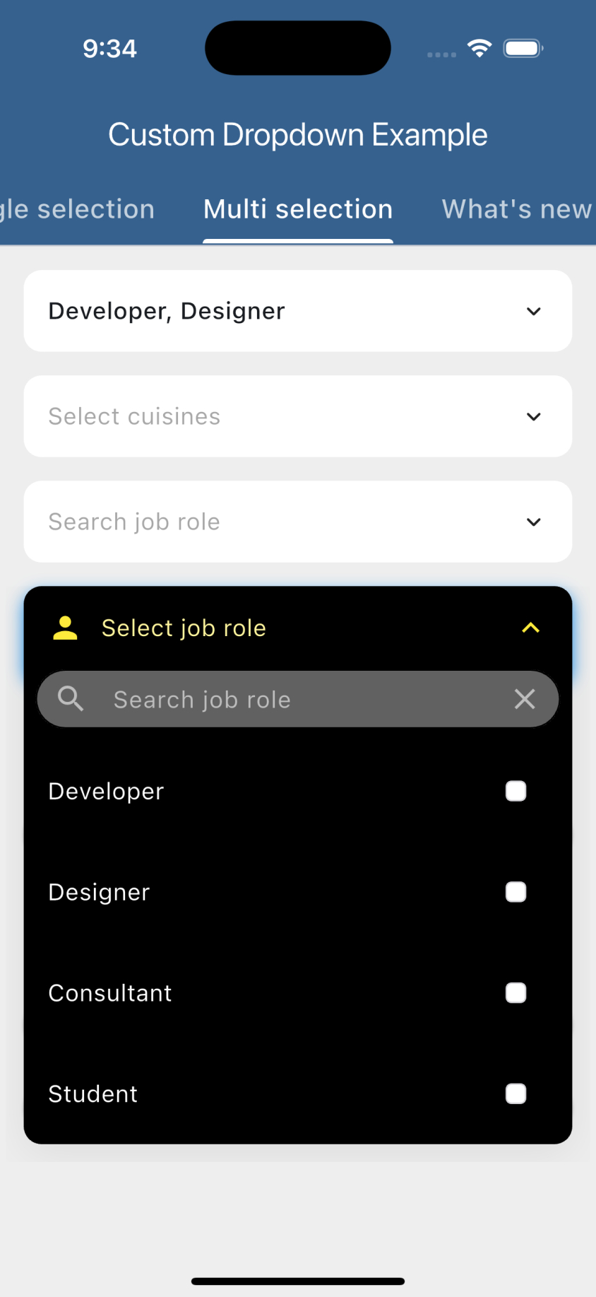
Animated Custom Dropdown 是一个高度可定制的 Flutter 小部件,使开发者能够创建功能丰富的下拉菜单,支持搜索列表、基于网络的搜索和多选功能。它支持 Android、iOS、Web、macOS、Windows 和 Linux 多个平台。该包通过流畅的动画和灵活的设计与行为自定义选项,提升了用户体验。非常适合需要高级下拉功能的表单和数据选择界面。
适合场景
具有动态选项的表单输入
多选下拉菜单
网络驱动的自动补全
自定义选择菜单界面
大型数据集的动态筛选
主要特点
可搜索的下拉列表
网络搜索集成
多选支持
流畅的动画
高度可定制的外观
跨平台兼容性
适合对象
开发复杂表单的开发者
需要动态数据选择的应用程序
需要自定义下拉菜单设计的项目
希望拥有可重用 UI 组件的团队
具有大型或远程数据源的应用程序
使用建议
需要谨慎的状态管理来处理网络搜索
可能需要额外的样式以保持外观一致
使用超大数据集时的性能影响
除了基本用法外,文档有限
未针对极高频率的更新进行优化
原始 README
以下为关联源码仓库的 README 原文快照,最新内容请访问源码仓库。
Custom Dropdown
A highly customizable, animated dropdown widget for Flutter — with search, network search + infinite scroll, multi-selection, a floating label, configurable open/close animations, and form validation.
If you like this package, please leave a like on pub.dev and star on GitHub.
Features
Lots of properties to use and customize dropdown widget as per your need. Also usable under Form widget for required validation.
Custom dropdown using constructor CustomDropdown().
Custom dropdown with search field using named constructor CustomDropdown.search().
Custom dropdown with search request field using named constructor CustomDropdown.searchRequest().
Multi select custom dropdown using named constructor CustomDropdown.multiSelect().
Multi select custom dropdown with search field using named constructor CustomDropdown.multiSelectSearch().
Multi select custom dropdown with search request field using named constructor CustomDropdown.multiSelectSearchRequest().
Configurable open/close overlay animations (animation) with built-in transitions, a custom-transition builder, and an optional staggered list-item entrance.
Infinite scroll / pagination for async search (paginatedRequest).
Material-style floating label (labelText), clear button (canClearSelection), text alignment (textAlign) and forced overlay direction (overlayDirection).
Keyboard-aware overlay positioning, initiallyOpen, autofocusOnSearch, and searchRequestMinChars.
Preview
Getting started
Add the latest version of package to your pubspec.yaml (and run flutter pub get):
dependencies:
  animated_custom_dropdown: 4.0.0
Import the package and use it in your Flutter App.
Whenever you are going to work with custom type model T, your model must override the default toString() method and return the property inside that you want to display as list item otherwise the dropdown list item would show Instance of [model name].
By default the search matches against each item's toString() value, so custom model classes are searchable out of the box as long as toString() returns the text you want to match. If the filter on the object is more complex (e.g. matching multiple fields), add the CustomDropdownListFilter mixin to it, which gives you access to the filter(query) method, and by this the items of the list will be filtered.
For the search constructors (CustomDropdown.search(), CustomDropdown.searchRequest() and their multi-select variants), the open overlay automatically stays clear of the on-screen keyboard: it flips above the field when the keyboard would cover it and repositions whenever the keyboard shows or hides. If the field lives inside a scrollable (e.g. a ListView), it is also scrolled back into view so the overlay never disappears.
For this to work the field must be able to move above the keyboard. This is handled automatically when you keep the Scaffold default resizeToAvoidBottomInset: true and either:
place the dropdown inside a scrollable (ListView / SingleChildScrollView), or
use a layout that can reflow (e.g. a Column with a Spacer / MainAxisAlignment.end).
If you set resizeToAvoidBottomInset: false or use a non-reflowable layout, a field pinned to the bottom can't be moved out of the keyboard's area, so part of the overlay may remain covered.
Customization
For a complete customization of the package, go to the example.
Contributors
Issues & Feedback
Please file an issue to send feedback or report a bug. PRs are always welcome. Thank you!