Animated Shimmer



Supports Null Safety
A simple & lightweight widget to display an animated shimmer effect.
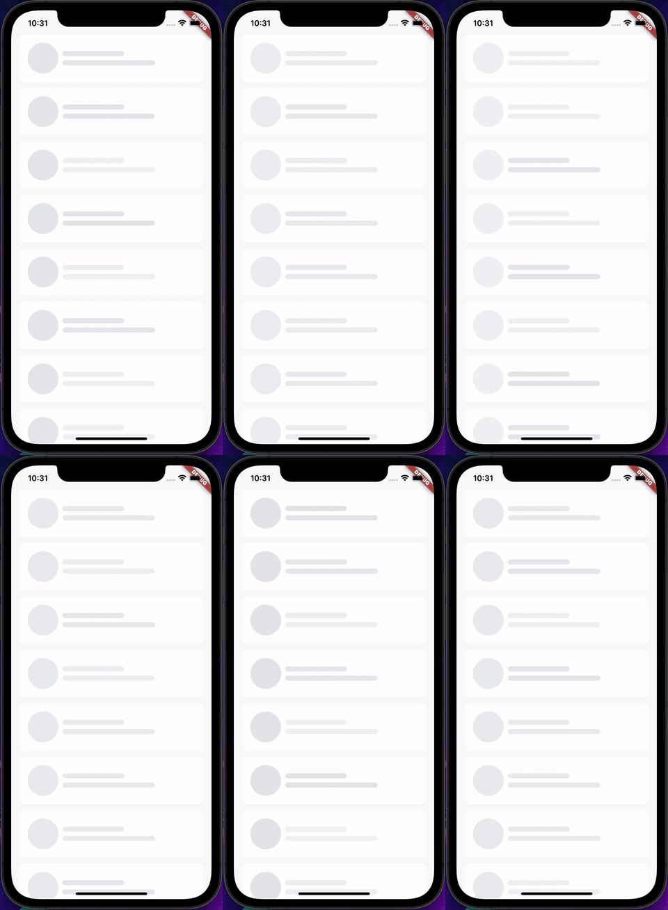
Making a skeleton of a widget with shimmer effect while loading data from server or any other source is a common task that can be easily done with AnimatedShimmer widget.
AnimatedShimmer is a simple yet very useful Widget that developers can use it to create an awesome animated shimmer effect for any widget skeleton loading.
Examples
An example can be found in the example directory of this repository.
More examples will be added soon!
Loading List
How to use
Add animated_shimmer to pubspec.yaml of your project:
dependencies:
  animated_shimmer: ^1.0.0
Import it in your Dart code:
import 'package:animated_shimmer/animated_shimmer.dart';
Declare AnimatedShimmer widget with required height and width:
  AnimatedShimmer(
    height: 10,
    width: 120,
  ),
A number of parameters can be passed to customise the look and feel of this animation:
  AnimatedShimmer(
    height: 10,
    width: 120,
    borderRadius: const BorderRadius.all(Radius.circular(16)),
    delayInMilliSeconds: Duration(milliseconds: index * 500),
  ),
To create round AnimaiedShimmer :
  AnimatedShimmer.round(
    size: 50,
  ),
Parameters:
- @required height : accepts a double to set height of the shimmer effect
- @required width : accepts a double to set width of the shimmer effect
- startColor : accepts a Color and sets the start color of the shimmer effect from which animation will start
- endColor : accepts a Color and sets the end color of the shimmer effect to which animation will end
- borderRadius : accepts a borderRadius and sets the border radius of the animated shimmer widget
- delayInMilliSeconds : accepts a Duration that would be the delay in starting the animation. Default value is Duration(milliseconds: 0)
A detailed API Reference can be found on pub.dev
License
MIT License

Copyright (c) 2022 Shubham Soni

Permission is hereby granted, free of charge, to any person obtaining a copy
of this software and associated documentation files (the "Software"), to deal
in the Software without restriction, including without limitation the rights
to use, copy, modify, merge, publish, distribute, sublicense, and/or sell
copies of the Software, and to permit persons to whom the Software is
furnished to do so, subject to the following conditions:

The above copyright notice and this permission notice shall be included in all
copies or substantial portions of the Software.

THE SOFTWARE IS PROVIDED "AS IS", WITHOUT WARRANTY OF ANY KIND, EXPRESS OR
IMPLIED, INCLUDING BUT NOT LIMITED TO THE WARRANTIES OF MERCHANTABILITY,
FITNESS FOR A PARTICULAR PURPOSE AND NONINFRINGEMENT. IN NO EVENT SHALL THE
AUTHORS OR COPYRIGHT HOLDERS BE LIABLE FOR ANY CLAIM, DAMAGES OR OTHER
LIABILITY, WHETHER IN AN ACTION OF CONTRACT, TORT OR OTHERWISE, ARISING FROM,
OUT OF OR IN CONNECTION WITH THE SOFTWARE OR THE USE OR OTHER DEALINGS IN THE
SOFTWARE.

