Animated Sidebar


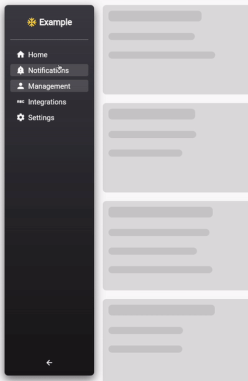
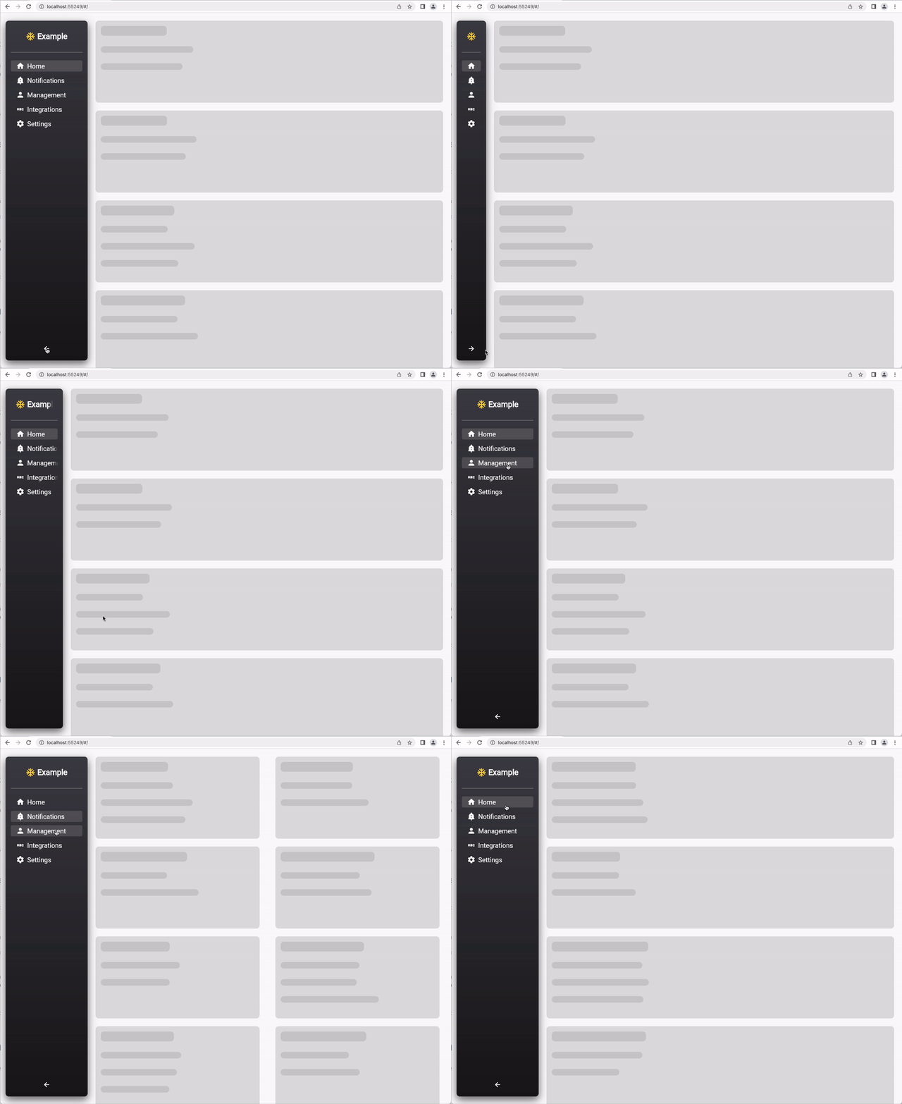
A highly customizable and styleable collapsable sidebar plugin for Flutter, optimized for web and desktop applications.
Example
Installation
Add the following to your pubspec.yaml file:
dependencies:
 animated_sidebar: ^1.0.0
or use the following command:
flutter pub add animated_sidebar
Add the following import to your dart file:
import 'package:animated_sidebar/animated_sidebar.dart';
Usage
Sidebar Items
define a list of SidebarItem objects:
import 'package:animated_sidebar/animated_sidebar.dart';

final List<SidebarItem> items = [
  SidebarItem(icon: Icons.home, text: 'Home'),
  SidebarItem(icon: Icons.notifications, text: 'Notifications'),
  SidebarItem(icon: Icons.person, text: 'Management'),
];
Child Items
it is also possible to define multiple SidebarChildItem for every SidebarItem.
import 'package:animated_sidebar/animated_sidebar.dart';

final List<SidebarItem> items = [
  SidebarItem(icon: Icons.home, text: 'Home'),
  SidebarItem(
    icon: Icons.person,
    text: 'Management',
    children: [
	  SidebarChildItem(icon: Icons.person, text: 'Users'),
	  SidebarChildItem(icon: Icons.verified_user, text: 'Roles'),
    ],
  ),
];
The Item Containing the Children is Collapsed and expand only on tap. If the Current selected item is a SidebarChildItem the overlying Item keeps expanded
Default usage of AnimatedSidebar
import 'package:animated_sidebar/animated_sidebar.dart';

@override
Widget build(BuildContext context) {
  return Scaffold(
    backgroundColor: Theme.of(context).scaffoldBackgroundColor,
    body: Row(
      children: [
        AnimatedSidebar(
          expanded: MediaQuery.of(context).size.width > 600,
          items: items,
          selectedIndex: 0,
          onItemSelected: (index) => print(index),
          headerIcon: Icons.ac_unit_sharp,
          headerIconColor: Colors.amberAccent,
          headerText: 'Example',
        ),
        Center(
          child: Text(
            'Page: $activeTab',
            style: Theme.of(context).textTheme.headline3,
          ),
        ),
      ],
    ),
  );
}
Use the AnimatedSidebar widget and handle state external :
import 'package:animated_sidebar/animated_sidebar.dart';
int activeTab = 0;
@override
Widget build(BuildContext context) {
return Scaffold(
backgroundColor: Theme.of(context).scaffoldBackgroundColor,
body: Row(
children: [
AnimatedSidebar(
expanded: MediaQuery.of(context).size.width > 600,
items: items,
selectedIndex: activeTab,
autoSelectedIndex: false,
onItemSelected: (index) =>
setState(() => activeTab = index),
headerIcon: Icons.ac_unit_sharp,
headerIconColor: Colors.amberAccent,
headerText: 'Example',
),
Center(
child: Text(
'Page: $activeTab',
style: Theme.of(context).textTheme.headline3,
),
),
],
),
);
}