搜索分类、插件与代码仓

awesome_dropdown 封面
插件详情v0.0.4

awesome_dropdown

一个简单的下拉库,支持自定义样式并控制所有触摸事件。

近 30 天下载
661
喜欢数
116
Pub 分数
70

安装插件

flutter pub add awesome_dropdown

插件介绍

基于插件公开信息、社区数据与项目使用情况整理的选型参考。

Awesome Dropdown 是一个 Flutter 包,提供可自定义的下拉菜单组件,完全控制触摸事件和样式。它让开发者能够轻松创建美观且交互性强的下拉菜单,支持自定义主题、动画和响应式行为。该库设计简洁灵活,非常适合表单、筛选器和选择界面。无平台限制,可在移动、Web 和桌面端无缝运行。其轻量级特性确保了快速性能,同时不牺牲功能。

适合场景

  • 表单输入
  • 筛选选择
  • 可自定义的 UI 组件
  • 用户偏好选择器
  • 动态数据选择
  • 移动和网页界面

主要特点

  • 完全可自定义的样式
  • 触摸事件控制
  • 轻量且高效
  • 跨平台兼容性
  • 轻松集成
  • 支持动画

适合对象

  • 寻求简单下拉菜单的开发者
  • 想要自定义控件的UI设计师
  • 需要触摸事件处理的项目
  • 表单密集型工作流程的应用程序
  • 优先考虑快速实施的团队

使用建议

  • 无内置验证
  • 仅限基本下拉功能
  • 需要手动处理状态
  • 无国际化支持
  • 依赖外部样式知识
  • 无高级筛选选项

原始 README

以下为关联源码仓库的 README 原文快照,最新内容请访问源码仓库。

Awesome DropDown

A customizable drop-down library that handles all the touch and clicks events, including iOS and mobile back-pressed callbacks.

Installation

Add following dependency in pubspec.yaml file. And add this import to your file.

awesome_dropdown:^0.0.4

import 'package:awesome_dropdown/awesome_dropdown.dart';

Quick Start

Add AwesomeDropdown to the widget tree

AwesomeDropDown(
                  isPanDown: _isPanDown,
                  dropDownList: _list,
                  dropDownIcon: Icon(Icons.arrow_drop_down, color: Colors.grey, size: 23,),
                  selectedItem: _selectedItem,
                  onDropDownItemClick: (selectedItem) {
                    _selectedItem = selectedItem;
                  },
                  dropStateChanged: (isOpened) {
                    _isDropDownOpened = isOpened;
                    if (!isOpened) {
                      _isBackPressedOrTouchedOutSide = false;                    }
                  },
                ),                ​

Custom Body


AwesomeDropDown(
                   ​isPanDown: _isPanDown,
                   ​isBackPressedOrTouchedOutSide:
                   ​_isBackPressedOrTouchedOutSide,
                   ​dropDownBGColor: Colors.white,
                    dropDownOverlayBGColor: Colors.transparent,
                   ​padding: 8,
                   ​dropDownIcon: Icon(Icons.arrow_drop_down, color: Colors.grey, size: 23,),
                   ​elevation: 5,
                   ​dropDownBorderRadius: 10,
                   ​dropDownTopBorderRadius: 50,
                   ​dropDownBottomBorderRadius: 50,
                   ​dropDownIconBGColor: Colors.transparent,
                   ​dropDownList: _list,
                   ​selectedItem: _selectedItem,
                   ​numOfListItemToShow: 4,
                   ​selectedItemTextStyle: TextStyle(
                       ​color: Colors.black,
                       ​fontSize: 16,
                       ​fontWeight: FontWeight.normal),
                   ​dropDownListTextStyle: TextStyle(
                       ​color: Colors.grey,
                       ​fontSize: 15,
                       ​backgroundColor: Colors.transparent),
                   ​onDropDownItemClick: (selectedItem) {
                     ​_selectedItem = selectedItem;
                   ​},
                   ​dropStateChanged: (isOpened) {
                     ​_isDropDownOpened = isOpened;
                     ​if (!isOpened) {
                       ​_isBackPressedOrTouchedOutSide = false;
                     ​}
                   ​},
                 ​),

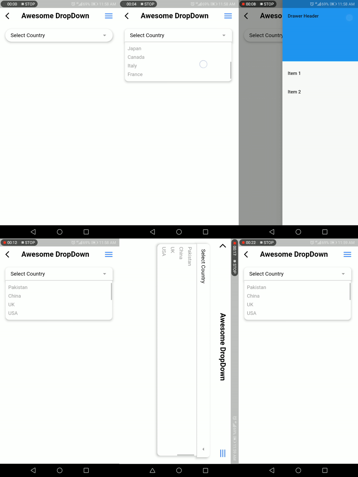
Screenshot

Developer Team

Faiza Farooqui & my team members (Hina Hussain, Kamran Khan, Abdul Sattar)

License

MIT

所属分类

源码仓库

使用此插件的项目

暂无相关数据。