搜索插件、代码仓与 APP 分类

card_slider 封面
插件详情v1.0.6

card_slider

一个可拖动的 Flutter 图片轮播滑块,滑动或拖动以切换幻灯片!

AndroidiOSWebmacOSWindowsLinux
近 30 天下载
243
喜欢数
37
Pub 分数
140

安装插件

flutter pub add card_slider

插件介绍

基于插件公开信息、社区数据与项目使用情况整理的选型参考。

Card Slider 是一个 Flutter 包,提供可拖动的图像轮播,允许用户通过滑动或拖动浏览卡片。它非常适合以视觉吸引人的方式展示图片、产品或内容。该滑块支持平滑的过渡效果和跨多个平台的直观手势操作。专为性能和易用性而设计,可无缝集成到需要交互式基于卡片的导航的应用程序中。适用于画廊、产品展示或引导页面。

适合场景

  • 图像画廊
  • 产品展示
  • 入门屏幕
  • 交互式滑块
  • 内容轮播

主要特点

  • 可拖动手势支持
  • 平滑的滑动过渡
  • 跨平台兼容性
  • 可自定义的卡片外观
  • 内置滑动动画

适合对象

  • 移动应用开发者
  • UI/UX 设计师
  • 电子商务应用
  • 作品集网站
  • 交互式原型

使用建议

  • 需要设置手势处理
  • 可能需要针对大型数据集进行优化
  • 内置样式选项有限
  • 不适用于非图像内容
  • 性能取决于卡牌数量

原始 README

以下为关联源码仓库的 README 原文快照,最新内容请访问源码仓库。

card_slider

A draggable Flutter image carousel slider on swipe or drag! Card slider for carousel images and widgets. This widget works on both Android & iOS.

Example Example App Closed Example App Open Example App Open


Installing

Add the following to your pubspec.yaml file:

dependencies:
  card_slider: ^1.0.5

Maintaining card_slider

Thank you everyone for the support surrounding this project! card_slider has grown far larger than I could have ever imagined, so parsing through all the feature requests and new issues has taken me more time than I'd like. If you're interested in helping maintain this project, please send me an email at asylzatwww@gmail.com. As a sidenote, I'll always try to make sure that this project is compatible with the latest version of Flutter.


Simple Usage

There are two ways which the CardSlider can easily be added to your project.

  1. Using the CardSlider slides as widgets.
  2. Using the CardSlider slides as images
  3. Using the CardSlider slides as widgets inside scrollable Column.

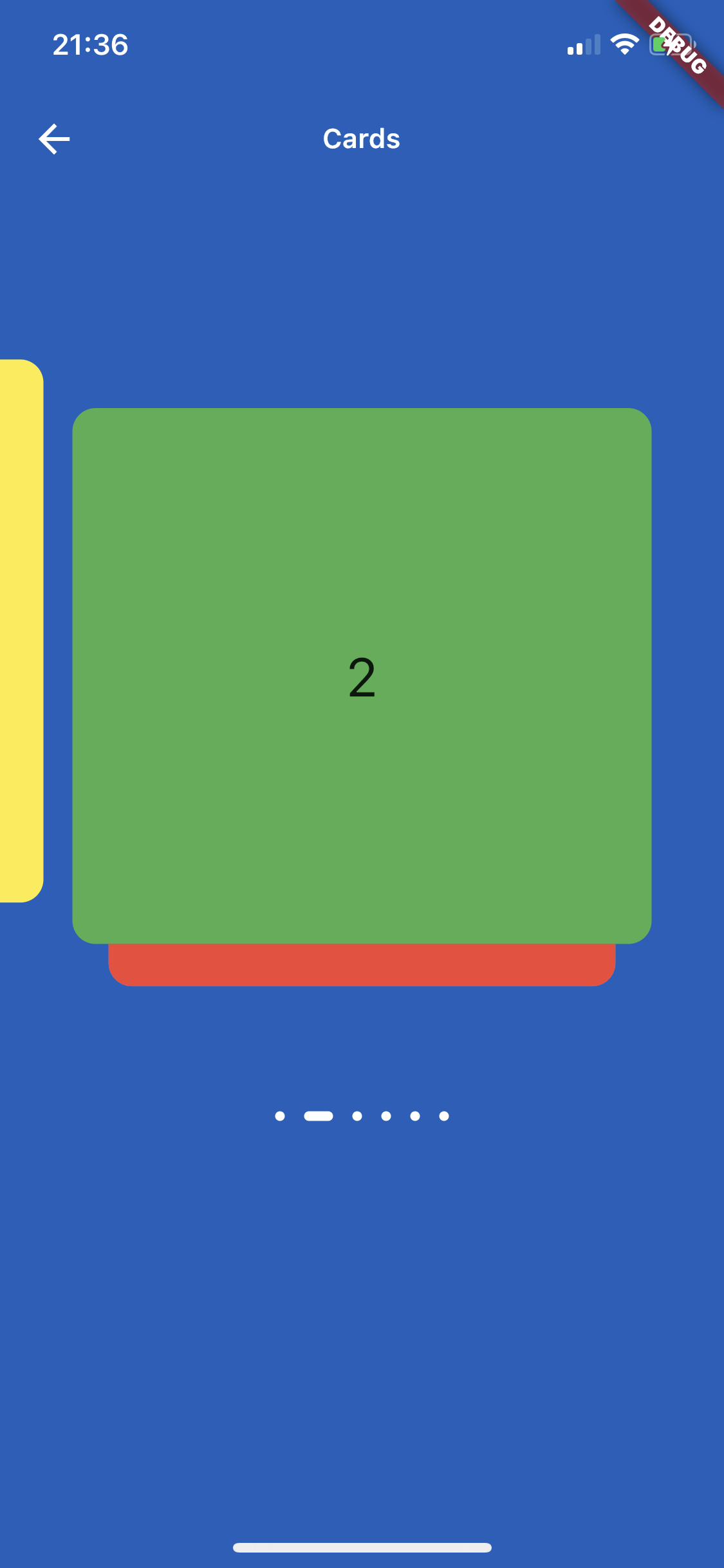
CardSlider slides as widgets

This method uses widgets as a slide cards. For example:

@override
Widget build(BuildContext context) {
  List<Color> valuesDataColors = [
    Colors.purple,
    Colors.yellow,
    Colors.green,
    Colors.red,
    Colors.grey,
    Colors.blue,
  ];

  List<Widget> valuesWidget = [];
  for (int i = 0; i < valuesDataColors.length; i++) {
    valuesWidget.add(Container(
        decoration: BoxDecoration(
          borderRadius: BorderRadius.circular(12.0),
          color: valuesDataColors[i],
        ),
        child: Align(
          alignment: Alignment.center,
          child: Text(
            i.toString(),
            style: const TextStyle(
              fontSize: 28,
            ),
          ),
        )));
  }

  return Scaffold(
      backgroundColor: const Color(0xFF1560BD),
      appBar: AppBar(
        backgroundColor: Colors.transparent,
        elevation: 0,
        title: const Text(
          "Cards",
          style: TextStyle(
              fontSize: 14, fontWeight: FontWeight.w600, color: Colors.white),
        ),
        centerTitle: true,
        leading: IconButton(
          icon: const Icon(
            Icons.arrow_back,
            color: Colors.white,
          ),
          tooltip: 'Back',
          onPressed: () => Navigator.of(context).pop(),
        ),
      ),
      body: CardSlider(
        cards: valuesWidget,
        bottomOffset: .0005,
        cardHeight: 0.75,
        itemDotOffset: 0.25,
      ));
}

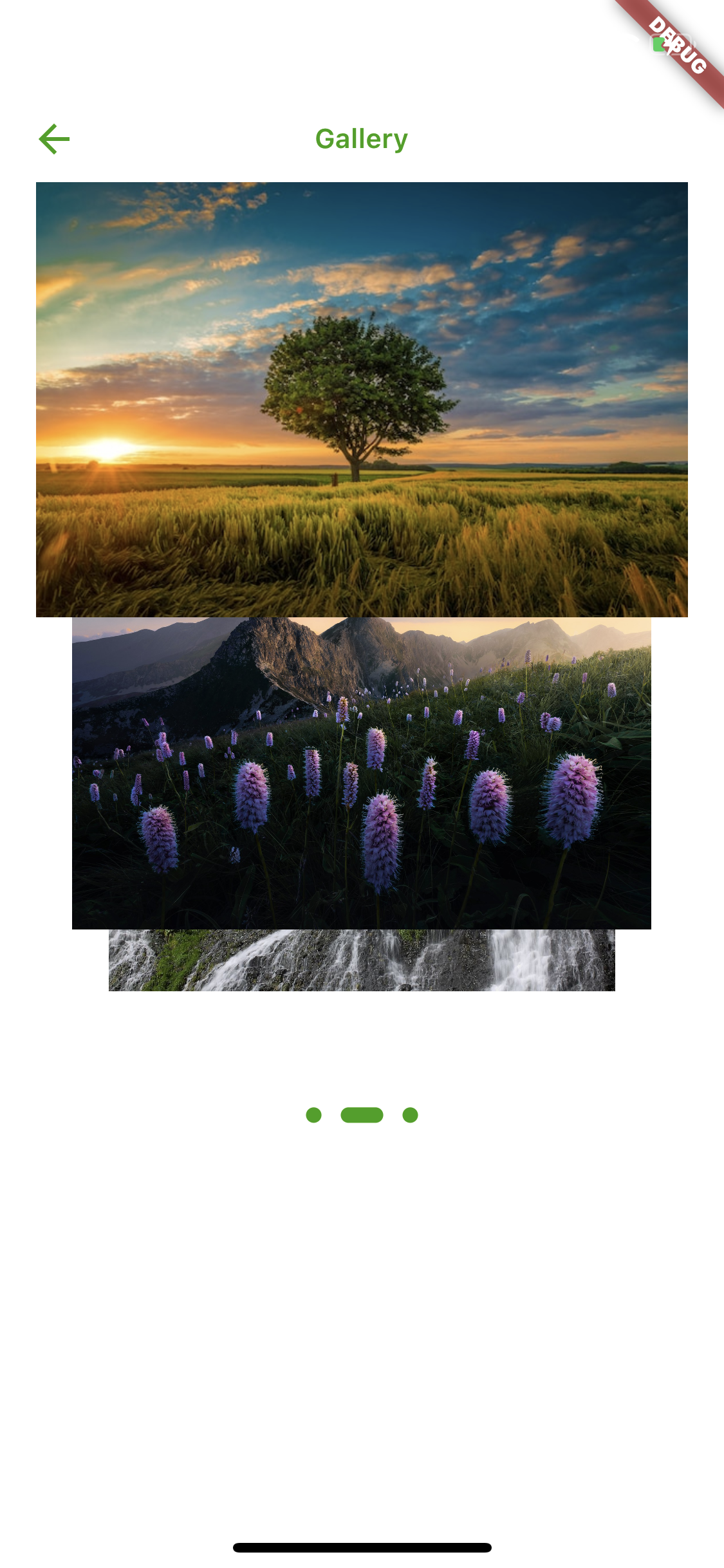
CardSlider slides as images

This method uses images as a slide cards. For example:

  @override
Widget build(BuildContext context) {
  List<Widget> valuesWidget = [];

  List<String> valuesUrl = [
    'https://upload.wikimedia.org/wikipedia/commons/thumb/4/42/Shaqi_jrvej.jpg/1200px-Shaqi_jrvej.jpg',
    'https://img.freepik.com/free-photo/wide-angle-shot-single-tree-growing-clouded-sky-during-sunset-surrounded-by-grass_181624-22807.jpg',
    'https://www.eea.europa.eu/themes/biodiversity/state-of-nature-in-the-eu/state-of-nature-2020-subtopic/image_print'
  ];

  for (int i = 0; i < valuesUrl.length; i++) {
    valuesWidget.add(
      Image.network(valuesUrl[i]),
    );
  }

  return Scaffold(
    backgroundColor: Colors.white,
    appBar: AppBar(
      backgroundColor: Colors.transparent,
      elevation: 0,
      title: const Text(
        "Gallery",
        style: TextStyle(
            fontSize: 14,
            fontWeight: FontWeight.w600,
            color: Color(0xFF33a000)),
      ),
      centerTitle: true,
      leading: IconButton(
        icon: const Icon(
          Icons.arrow_back,
          color: Color(0xFF33a000),
        ),
        tooltip: 'Back',
        onPressed: () => Navigator.of(context).pop(),
      ),
    ),
    body: CardSlider(
      cards: valuesWidget,
      bottomOffset: .0008,
      itemDotWidth: 14,
      itemDotOffset: 0.15,
      itemDot: (itemDotWidth) {
        return Container(
            margin: const EdgeInsets.all(5),
            width: 8 + itemDotWidth,
            height: 8,
            decoration: BoxDecoration(
              borderRadius: BorderRadius.circular(10),
              color: const Color(0xFF33a000),
            ));
      },
    ),
  );
}

CardSlider slides as widgets inside scrollable Column widget

This method uses widget as a slide cards inside scrollable column, instead of using SingleChildScrollView use the code below which uses ListView, otherwise GestureDetector won't work. For example:

  bool _dragOverMap = false;
final GlobalKey _pointerKey = GlobalKey();

_checkDrag(Offset position, bool up) {
  if (!up) {
    // find your widget
    RenderBox box = _pointerKey.currentContext!.findRenderObject() as RenderBox;

    //get offset
    Offset boxOffset = box.localToGlobal(Offset.zero);

    // check if your pointerdown event is inside the widget (you could do the same for the width, in this case I just used the height)
    if (position.dy > boxOffset.dy &&
        position.dy < boxOffset.dy + box.size.height) {
      setState(() {
        _dragOverMap = true;
      });
    }
  } else {
    setState(() {
      _dragOverMap = false;
    });
  }
}

@override
Widget build(BuildContext context) {

  List<Color> valuesDataColors = [
    Colors.purple,
    Colors.yellow,
    Colors.green,
    Colors.red,
    Colors.grey,
    Colors.blue,
  ];

  List<Widget> valuesWidget = [];
  for (int i = 0; i < valuesDataColors.length; i++) {
    valuesWidget.add(Container(
        decoration: BoxDecoration(
          borderRadius: BorderRadius.circular(12.0),
          color: valuesDataColors[i],
        ),
        child: Align(
          alignment: Alignment.center,
          child: Text(
            i.toString(),
            style: const TextStyle(
              fontSize: 28,
            ),
          ),
        )));
  }

  return Scaffold(
    appBar: AppBar(
      title: const Text("Slide inside column widget"),
    ),
    body: Listener(
      onPointerUp: (ev) {
        _checkDrag(ev.position, true);
      },
      onPointerDown: (ev) {
        _checkDrag(ev.position, false);
      },
      child: ListView(
        // if dragging over your widget, disable scroll, otherwise allow scrolling
        physics:
        _dragOverMap ? const NeverScrollableScrollPhysics() : const ScrollPhysics(),
        children: [
          Column(
            children: [
              for (int i = 0; i < 3; i++)
                const ListTile(title: Text("Tile to scroll")),
              const Divider(),
            ],
          ),
          // Your widget that you want to prevent to scroll the Listview
          Container(
            color: Colors.amberAccent,
            key: _pointerKey, // key for finding the widget
            height: 350,
            width: double.infinity,
            child:
            CardSlider(
              cards: valuesWidget,
              bottomOffset: .0008,
              cardHeight: 0.75,
              containerHeight: MediaQuery.of(context).size.height - 100,
              itemDotOffset: 0.55,
            )
            ,
          ),
          Column(
            children: [
              for (int i = 0; i < 3; i++)
                const ListTile(title: Text("Tile to scroll")),
              const Divider(),
            ],
          ),
        ],
      ),
    ),
  );
}

Screenshots

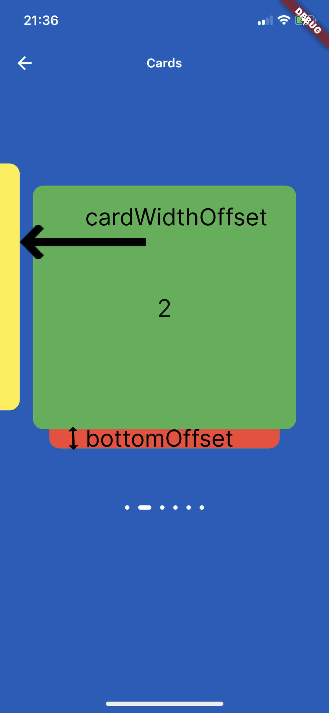
On the image below is shown how to use parameters cardWidthOffset, cardHeightOffset, bottomOffset :

Panel Closed


Custom Usage

There are several options that allow for more control:

Properties Description
cards The List of Widgets for slider
slideChanged Optional Event fired when ever slide is changed, (sliderIndex){ } sliderIndex has a value of a current slide.
blurValue Optional blurValue used for blurring the slider
blurOnClick Optional blurOnClick is method which listens if users clicks over blurred slider to be able to remove blurry
sliderBackGroundWidget Optional widget which placed on the background of slider, can be placed logo or any other image or widget .
itemDotWidth Optional is a width of dots under slider showing current location.
bottomOffset Optional is a double value, the height of a bottom of previous slide
cardWidth Optional is a width of a slides
cardHeight Optional is a height of a slides
cardWidthOffset Optional is a width which is used for how far slide must go on in horizontal distance when swiping or dragging
cardHeightOffset Optional is a height which is used for how far slide must go on in vertical distance when swiping or dragging
itemDot Optional is a widget by which can be changed the dots of th slider position
containerWidth Optional is a width of main Container
containerHeight Optional is a height of main Container
containerColor Optional is a color of main Container
itemDotOffset Optional is a distance to position itemDot under slides


🔢 Get Current Slide Index

You can listen to slide changes and get the current slide index using the slideChanged callback.

This is useful when you need to:

Track user interactions

Sync the slider with external state

Show slide numbers (e.g. 2 / 5)

Trigger analytics or business logic

Example: Listening to Slide Changes
CardSlider(
  cards: valuesWidget,
  slideChanged: (index) {
    print("Current index of slide is");
    print(index.toString());
  },
  bottomOffset: .0003,
  cardHeight: 0.75,
  containerHeight: MediaQuery.of(context).size.height - 100,
  itemDotOffset: -0.05,
),
Callback Details

Parameter Type Description index int Zero-based index of the currently visible slide

ℹ️ The callback fires every time the active slide changes, whether by swipe or drag.

所属分类

源码仓库

使用此插件的项目

暂无相关数据。