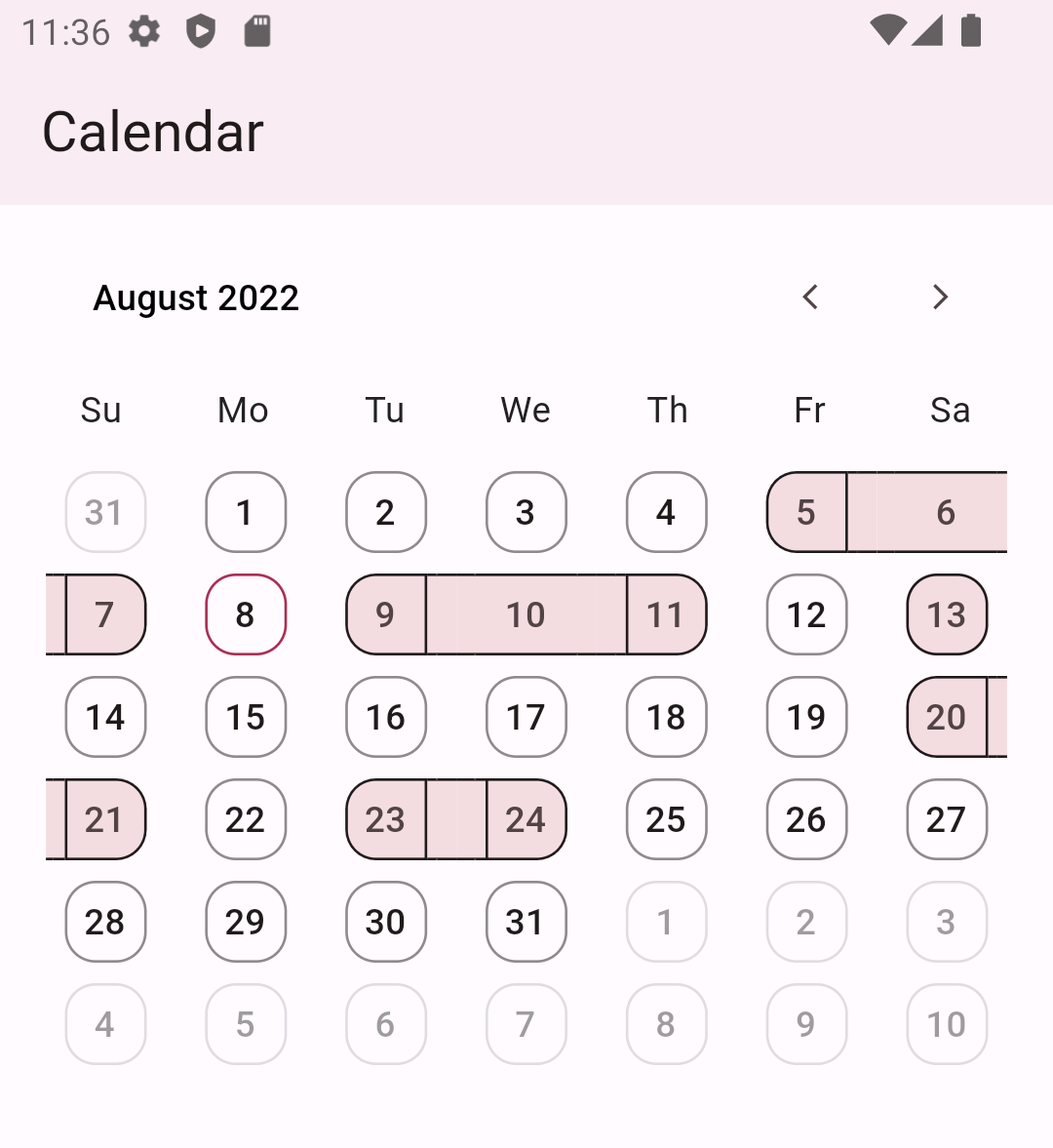
Clean Calendar 是一个现代且可自定义的 Flutter 包,旨在轻松创建优雅简洁的日历。它提供了一个清晰的 API,可在 Android、iOS、Web、macOS、Windows 和 Linux 等多个平台上构建交互式日历视图。支持日期、样式和事件集成的自定义功能,非常适合需要直观日期选择或调度功能的应用程序。该包强调简单性和性能,同时为开发者提供了高度灵活性。
适合场景
表单中的日期选择
事件调度接口
每日计划应用程序
基于日历的数据筛选
用户生日或预约跟踪
主要特点
高度可定制的用户界面
跨平台兼容性
简单的日期处理
支持事件标记
轻量级且快速渲染
适合对象
开发日历功能的开发者
需要日期选择器的应用
专注于干净的UI设计
Flutter 初学者探索组件
可自定义的日期接口
使用建议
有限的内置事件管理
需要手动实现复杂交互
无原生重复事件支持
基本用法之外的最小文档
依赖外部状态管理来处理动态数据
原始 README
以下为关联源码仓库的 README 原文快照,最新内容请访问源码仓库。
Word from creator
Hello👋, Clean Calendar is in the early stages of development and can have many breaking changes. If you have any questions or suggestions, contact me via GitHub issues, email, discord, or any of the ways listed on my GitHub profile.
Yes, giving the package a 👍(Pub) or ⭐(Github) will encourage me to work on it more.
Package description
Get ready to enhance your Flutter app with this fantastic calendar package! With its simple yet elegant design, you can create a fully customized calendar that suits your needs. It provides a customizable month view and the ability to highlight dates with streaks. It is just the beginning, and we will add more features.
Customise date boundary behaviour and tap behaviour
CleanCalendar(
)
CleanCalendar(
  // To allow date boundary to shrink.
  enableDenseViewForDates: true,

  // To allow date tap splash to shrink.
  enableDenseSplashForDates: true,
)
Note: This dense mode could lead to overflow if the available width to calendar is smaller than 280px so it is advised to disable them in smaller space than 280px.
// Enabling selecting single or multiple dates. Defaults to disable selection. dateSelectionMode: DatePickerSelectionMode.singleOrMultiple,
// Listening to selected dates. onSelectedDates: (List<DateTime> value) { // If selected date picked again then removing it from selected dates. if (selectedDates.contains(value.first)) { selectedDates.remove(value.first); } else { // If unselected date picked then adding it to selected dates. selectedDates.add(value.first); } // setState to update the calendar with new selected dates. setState(() {}); },
// Providing calendar the dates to select in ui. selectedDates: selectedDates,
Note:weekdaysSymbol defaults to Mo, Tu, We, Th, Fr, Sa, Su from monday to sunday and monthsSymbol defaults to January, February, March, April, May, June, July, August, September, October, November, December.
Accessing selected dates
To access selected dates use the onSelectedDates callback but keep in mind that this callback always provides a list of dates as shown below:
CleanCalendar(
...
onSelectedDates: (List<DateTime> selectedDates) {
// Called every time dates are selected or deselected.print(selectedDates);
},
)
Note: Even for single selection mode it provides a list with just one date and for multiple selection it provides a list with multiple dates.
Providing pre-selected dates
You can provide pre-selected dates by providing a list of dates to selectedDates as shown below:
Note: Even with selection mode set to single or disable it will still show the provided pre-selected dates as selected. And I think is the correct behavious as sometimes we might want to show selected dates while also preventing users from interacting with them.
Providing start and end dates
You can provide start and end dates for calendar view as shown below:
CleanCalendar(
  ...
  // Setting start date of calendar.
  startDateOfCalendar: DateTime(2022,6,5),

  // Setting end date of calendar.
  endDateOfCalendar: DateTime(2022,10,15),
)
Note:startDateOfCalendar defaults to DateTime.utc(0000, 1, 1) and endDateOfCalendar defaults to DateTime.utc(9999, 1, 1).
Providing initial month view for calendar
You can provide initial month view for calendar by providing date of that month as shown below:
Note:initialViewMonthDateTime defaults to current date and if current is not between startDateOfCalendar and endDateOfCalendar then defaults to start date..
Providing current date for calendar
You can provide current date for calendar as shown below:
CleanCalendar(
  ...
  // Setting current date of calendar.
  currentDateOfCalendar: DateTime(2022,9,5),
)
Note:currentDateOfCalendar defaults to DateTime.now().
Listening for calendar view week or month change
You can listen and get the current calendar view date on calendar view change. Useful in case you want to change your ui acording to the dates visible to user.
CleanCalendar(
...
onCalendarViewDate: (DateTime calendarViewDate) {
// Called every time view is changed like scrolled etc.print(calendarViewDate);
},
)
Note: For now onCalendarViewDate will only provide the view starting date. Later I may can add an option to get all dates of current view depending on users request. Also, onCalendarViewDate is called only on change of view like scroll, etc and will not be called on the creation of calendar as at thst time we already know the date.
Additional information
Support is surely planned for these:
Complete documentation.
Option to disable user interactions on whole view, past dates, and dates after-before end-start date. (🐇)
More customization and premade templates for calendar. (🐢)
More calendar view types. (🐢)
Date selection options such as range, and multiple range selections. (🐢)
A calendar option for choosing a view by year, month, or day. (🐢)
Support for dates to be displayed in events style. (🐢)
Dry mode, which optimizes performance for low-end devices by removing or substituting heavy animations and widgets. (🐢)
And, if I'm forgetting something crucial/important/necessary then please let me know.