搜索插件、代码仓与 APP 分类

color_picker_field 封面
插件详情v2.1.0

color_picker_field

适用于 Material 和 Cupertino 的颜色选择器字段,包括基于色相的圆形颜色选择器

AndroidiOSWebmacOSWindowsLinux
近 30 天下载
199
喜欢数
16
Pub 分数
150

安装插件

flutter pub add color_picker_field

插件介绍

基于插件公开信息、社区数据与项目使用情况整理的选型参考。

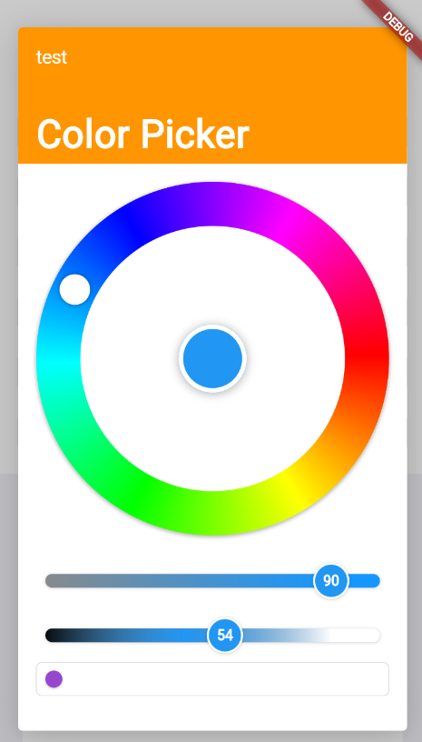
一个 Flutter 包,为 Material 和 Cupertino 设计提供可自定义的颜色选择器字段,具有基于色调的圆形颜色选择器,便于直观地选择颜色。它支持 Android、iOS、Web、macOS、Windows 和 Linux 等多个平台。该控件可无缝集成到表单中,并允许用户通过圆形色调轮和饱和度/明度滑块精确选择颜色。非常适合需要在 UI 自定义或设计工具中动态输入颜色的应用程序。

适合场景

  • 表单输入项需要颜色选择
  • UI 主题自定义
  • 设计工具界面
  • 配色方案创建
  • 移动和网页应用样式
  • 仪表板中的交互式颜色选择器

主要特点

  • 径向色调色彩选择器
  • 材料和Cupertino兼容性
  • 跨平台支持
  • 可自定义的 UI 组件
  • 与表单字段的集成
  • 实时颜色预览

适合对象

  • 应用开发者构建设计工具
  • UI/UX 设计师实现颜色选择器
  • 需要动态主题选项的应用程序
  • 表单密集型应用中的颜色输入
  • 跨平台移动和网页应用

使用建议

  • 可能需要为复杂主题添加额外的样式
  • 大量实例带来的性能影响
  • 仅限基本颜色选择(不支持高级颜色模型)
  • 不适合高精度色彩工作流程
  • 依赖外部依赖管理

原始 README

以下为关联源码仓库的 README 原文快照,最新内容请访问源码仓库。

Color Picker Field

Pub

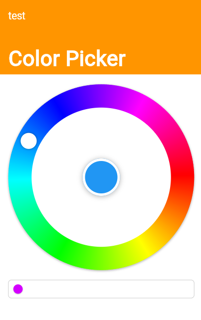
Color Picker field for Material and Cupertino, including a Radial Color picker(Hue based)

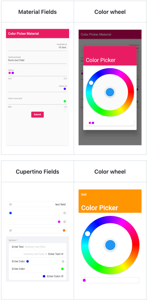
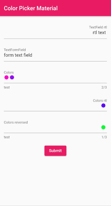
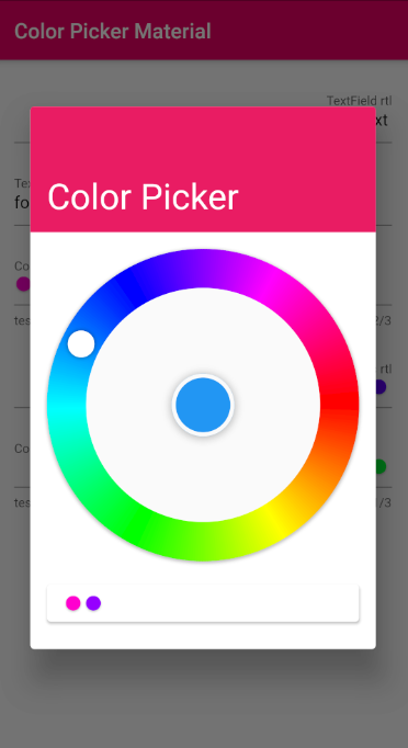
Material

Material Fields Color wheel Remove colors Saturation and Lightness

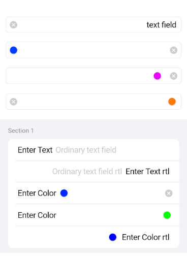
Cupertino

Cupertino Fields Color wheel Remove colors Saturation and Lightness

Usage

Just the ColorPickerField without a Form with a controller set
final ColorPickerFieldController controller = ColorPickerFieldController();
ColorPickerField(
  colors: [],
  defaultColor: Colors.blue,
  onChanged: (Color value) {},
  controller: controller,
  decoration: InputDecoration(
    labelText: 'Colors',
  ),
),
ColorPickerFieldFor with a validator, decoration and an onChange callback
ColorPickerFormField(
  initialValue: [],
  defaultColor: Colors.blue,
  autovalidateMode: AutovalidateMode.onUserInteraction,
  maxColors: 3,
  decoration: InputDecoration(
    labelText: 'Colors',
    helperText: 'test',
  ),
  validator: (List<Color>? value) {
    if (value!.isEmpty) {
      return 'a minimum of 1 color is required';
    }
    return null;
  },
  onChanged: (Color value) {},
),
Just a CupertinoColorPickerField without a Form
CupertinoColorPickerField(
  placeholder: 'CupertinoColorPickerField',
  colors: [],
  defaultColor: Colors.blue,
  onChanged: (Color value) {},
  clearButtonMode: ClearButtonVisibilityMode.always,
),
A CupertinoColorPickerField inside a CupertinoFormSection using CupertinoColorPickerFormFieldRow
CupertinoFormSection.insetGrouped(
  header: const Text('Section 1'),
  children: [
    // A field with an always showing clear button
    CupertinoColorPickerFormFieldRow(
      prefix: const Text('Enter Color'),
      defaultColor: defaultColor,
      clearButtonMode: ClearButtonVisibilityMode.always,
      placeholder: 'Enter Color',
      onChanged: _onChanged,
      validator: (List<Color>? value) {
        if (value == null || value.isEmpty) {
          return 'Please enter at least one color';
        }
        return null;
      },
    ),
    
    // A field with a reversed position and order of the chosen colors list
    CupertinoColorPickerFormFieldRow(
      prefix: const Text('Enter Color'),
      defaultColor: defaultColor,
      placeholder: 'Enter Color',
      onChanged: (Color value) {},
      colorListReversed: true,
      validator: (List<Color>? value) {
        if (value == null || value.isEmpty) {
          return 'Please enter at least one color';
        }
        return null;
      },
    ),

    // Forcing Text Direction using Directionality widget, 
    // by default the TextDirection will be read from the Localization
    Directionality(
      textDirection: TextDirection.rtl,
      child: CupertinoColorPickerFormFieldRow(
        prefix: const Text('Enter Color rtl'),
        defaultColor: defaultColor,
        placeholder: 'Enter Color rtl',
        onChanged: (Color value) {},
        validator: (List<Color>? value) {
          if (value == null || value.isEmpty) {
            return 'Please enter at least one color';
          }
          return null;
        },
      ),
    ),
  ],
),

API reference

所属分类

依赖

依赖清单 2 项

源码仓库

使用此插件的项目

暂无相关数据。