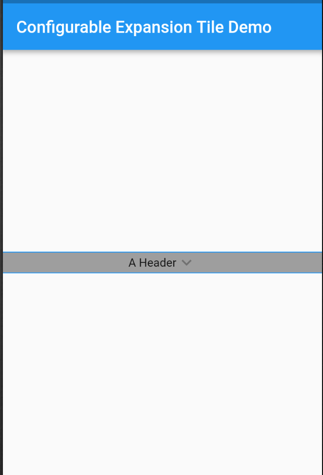
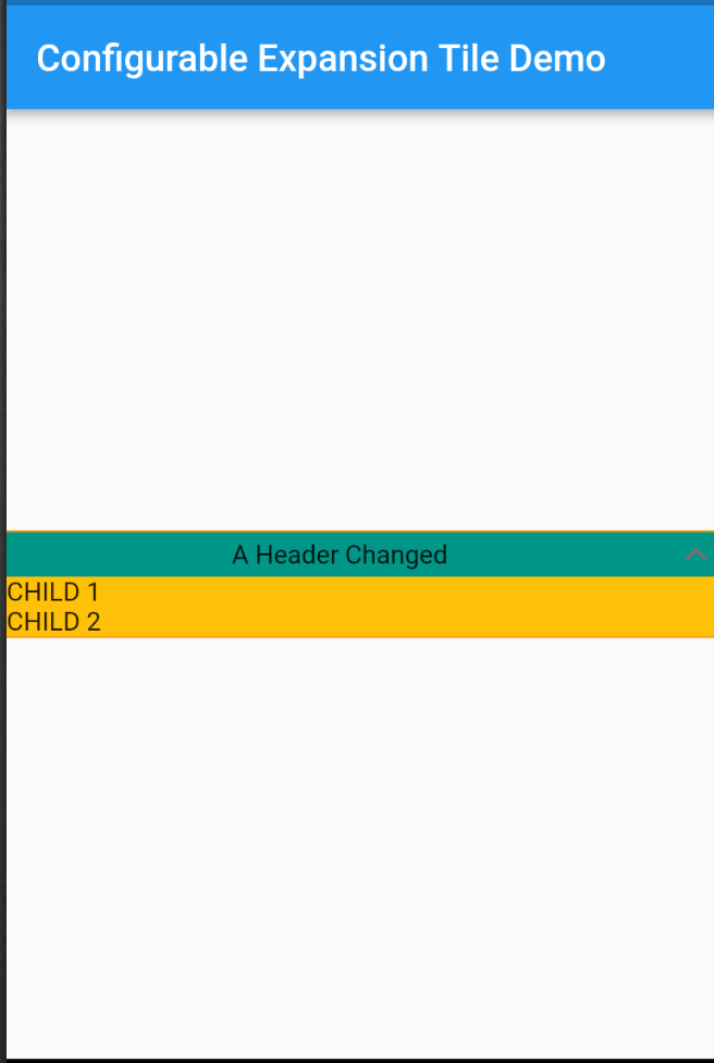
一个可自定义的 Flutter ExpansionTile 版本,源自 Material 实现,提供对外观和行为的增强控制。它允许开发者定制图块的视觉元素,如图标、颜色和动画,同时保持可展开内容部分的核心功能。非常适合创建具有可折叠内容的动态、用户友好的界面。
适合场景
可自定义的折叠面板
动态表单部分
交互式常见问题解答显示
嵌套可展开列表
带可折叠选项的设置面板
主要特点
完全可自定义的标题
可调节的动画持续时间
支持自定义尾部图标
可扩展的主题集成
可配置的展开状态
适合对象
需要灵活扩展瓷砖的开发人员
UI 设计师想要独特的瓷砖样式
具有复杂可折叠布局的应用程序
需要在图块之间保持一致主题的项目
使用建议
需要手动处理状态管理
有限的平台特定优化
可能会略微增加打包大小
不适合简单的静态扩展
依赖上游 Material 设计规范
原始 README
以下为关联源码仓库的 README 原文快照,最新内容请访问源码仓库。
configurable_expansion_tile
A Configurable Expansion Tile edited from the flutter material implementation
that allows for customization of the internal components. Includes providing colours,
replacement widgets on expansion, and custom animations.
Tile animations still takes place (which are also configurable), and a widget can be set to precede and/or follow the provided header, which will rotate on expand/collapse of the tile.
Configure any or all parameters or leave default behaviour - header works out of the box.
Installation
In the dependencies: section of your pubspec.yaml, add the following line: