搜索插件、代码仓与 APP 分类

create_date_picker 封面
插件详情v1.0.2

create_date_picker

99% 可自定义的日期选择器

AndroidiOSWebmacOSWindowsLinux
近 30 天下载
193
喜欢数
7
Pub 分数
150

安装插件

flutter pub add create_date_picker

插件介绍

基于插件公开信息、社区数据与项目使用情况整理的选型参考。

适用于Flutter应用的高度可定制日期选择器,提供广泛的样式和配置选项。专为需要在多个平台上完全控制日期选择界面外观和行为的开发者打造。该包支持Android、iOS、Web、macOS、Windows和Linux,确保无论设备如何都能提供一致的用户体验。专注于灵活性和易于集成,使开发者能够精确调整选择器的外观和感觉,以匹配应用设计。

适合场景

  • 表单中的自定义日期选择
  • 为移动和网络应用量身定制的用户界面
  • 跨平台日期选择器
  • 通过独特设计提升用户体验
  • 集成到复杂的输入工作流中

主要特点

  • 99% 可自定义设计
  • 支持所有主要平台
  • 丰富的样式选项
  • 与 Flutter 的轻松集成
  • 可配置的日期范围和格式
  • 响应式布局适配

适合对象

  • 需要完全UI控制的开发者
  • 需要独特日期选择器样式的应用
  • 跨平台 Flutter 项目
  • 注重设计的应用程序
  • 注重跨设备一致性的团队

使用建议

  • 需要手动样式设置以进行高级自定义
  • 对初学者来说可能有学习曲线
  • 与标准选择器相比,内置主题有限
  • 重度自定义带来的性能影响
  • 依赖外部 GitHub 仓库以获取更新

原始 README

以下为关联源码仓库的 README 原文快照,最新内容请访问源码仓库。

CreateDatePicker Package

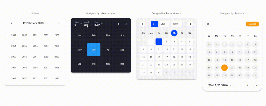
The CreateDatePicker package enables you to create a fully customizable date picker. You can create your own component without worrying about the functionality and place it anywhere to match your design

The example app running in Browser

Table of Contents

Integration Steps

To integrate the package into your Flutter application is very easy, you just need to add the Widget and customize every component and place it anywhere with the builder property:

    CreateDatePicker(
            width: 450,
            initialViewState: ViewState.date,
            initialDate: DateTime(2027, 6, 2),
            minDateTime: DateTime(2024, 5, 1),
            maxDateTime: DateTime(2029, 5, 1),
            restrictedDates: restrictedDates,
            weekLabels: weekLabels,
            monthLabels: monthLabels,
            leftArrowBuilder: _leftArrowBuilder,
            rightArrowBuilder: _rightArrowBuilder,
            dateViewButtonBuilder: _dateViewButtonBuilder,
            monthViewButtonBuilder: _monthViewButtonBuilder,
            yearViewButtonBuilder: _yearViewButtonBuilder,
            weekdayCellBuilder: _weekdayCellBuilder,
            dateCellBuilder: _dateCellBuilder,
            monthCellBuilder: _monthCellBuilder,
            yearCellBuilder: _yearCellBuilder,
            onViewStateChanged: _changeViewState,
            onSelectedDateChanged: _onSelectedDateChanged,
            builder: _createDatePickerBuilder,
        ),

NOTE: To place all the component together and anywhere, use builder property.

Available Parameters in CreateDatePicker
  • initialViewState: The initial view state of the picker (date, month, or year).

  • initialDate: The initially selected date.

  • minDateTime: The minimum selectable date.

  • maxDateTime: The maximum selectable date.

  • restrictedDates: A list of dates that cannot be selected.

  • weekLabels: Labels for the days of the week (e.g., Sunday, Monday). Must contain exactly 7 items.

  • monthLabels: Labels for the months of the year (e.g., January, February). Must contain exactly 12 items.

  • width: The width of the picker.

  • elevation: Sets the default elevation of the date picker.

  • popupMenuOffset: Offset for the popup menu.

  • popupMenuPosition: Position of the popup menu (above or below the trigger).

  • builder: Custom builder for the entire picker. Allows placing and customizing components using individual builders.

  • leftArrowBuilder: Custom builder for the left navigation arrow.

  • rightArrowBuilder: Custom builder for the right navigation arrow.

  • popupSelectedDateBuilder: Custom builder for the popup displaying the selected date.

  • dateViewButtonBuilder: Custom builder for the button to switch to the date view.

  • monthViewButtonBuilder: Custom builder for the button to switch to the month view.

  • yearViewButtonBuilder: Custom builder for the button to switch to the year view.

  • weekdayCellBuilder: Custom builder for the weekday cells.

  • dateCellBuilder: Custom builder for the date cells.

  • monthCellBuilder: Custom builder for the month cells.

  • yearCellBuilder: Custom builder for the year cells.

  • onViewStateChanged: Callback triggered when the view state changes.

  • onSelectedDateChanged: Callback triggered when the selected date changes.

Upcoming Updates

Currently, the package is only for a single datetime picker. Support for multiple pickers will be coming soon.

Contributing

Contributions are welcome! Please open an issue or submit a pull request if you have any improvements or bug fixes.

License

This project is licensed under the MIT License. See the LICENSE file for details.

Support Me

If you find this package helpful and want to support its development, consider making a donation. Thank you for your support!

Support via PayPal

所属分类

源码仓库

使用此插件的项目

暂无相关数据。