搜索插件、代码仓与 APP 分类

cupertino_tabbar 封面
插件详情v2.0.0

cupertino_tabbar

一个高度可自定义且简单的小部件,用于实现 iOS 13 风格的标签栏。

AndroidiOSWebmacOSWindowsLinux
近 30 天下载
2470
喜欢数
72
Pub 分数
140

安装插件

flutter pub add cupertino_tabbar

插件介绍

基于插件公开信息、社区数据与项目使用情况整理的选型参考。

一个可自定义且简单的 Flutter 小部件,可复制 iOS 13 风格的标签栏,提供跨平台的原生体验。它支持平滑动画、自定义图标、标签和样式选项,以符合现代 iOS 设计原则。该小部件轻量且易于集成,非常适合希望在 Android 和其他平台上保持一致 iOS 外观的应用程序。对于需要简洁、极简标签界面的导航密集型应用尤其有用。

适合场景

  • iOS 风格的导航在跨平台应用中
  • 带有动画过渡的自定义标签栏
  • 简单而优雅的底部导航
  • 针对 iOS 用户体验一致性的应用
  • 用增强视觉效果的标签栏替换默认标签栏

主要特点

  • iOS 13 设计模仿
  • 高度可定制的外观
  • 流畅的动画支持
  • 支持图标和标签
  • 跨平台兼容性
  • 与现有 Flutter 项目的轻松集成

适合对象

  • 寻求原生 iOS 用户界面组件的开发者
  • 需要极简标签导航的项目
  • 跨平台应用,以iOS设计为重点
  • 注重视觉一致性的团队
  • Flutter 初学者探索标签栏自定义

使用建议

  • 仅限iOS 13美学风格
  • 可能需要为非iOS平台添加额外的样式
  • 不适用于复杂的标签页布局
  • 最好与 CupertinoTheme 配合使用
  • 使用多个标签页时可能存在性能影响

原始 README

以下为关联源码仓库的 README 原文快照,最新内容请访问源码仓库。

cupertino_tabbar

Cosmos Software

Pub License

A highly customisable and simple widget for having iOS 13 style tab bars.

It is highly recommended to read the documentation and run the example project on a real device to fully understand and inspect the full range of capabilities.

Media | Description | Installation | How-to-Use

Recent

  • [useShadow] is added. If set to true, a shadow will be displayed under the indicator that is much more similar to the actual iOS version. See Media for examples.

  • [allowScrollable], [fittedWhenScrollable], [animateWhenScrollable], [animateUntilScrolled], [outerHorizontalPadding] and [outerVerticalPadding] are added. These all work towards making an easy-to-use scrollable tab bar. Please refer to the documentation and the examples for instructions and see Media for examples.


Warning

  • Variables previously named as [horizontalPadding], [verticalPadding] and [expand] are now named [innerHorizontalPadding], [innerVerticalPadding] and [allowExpand].

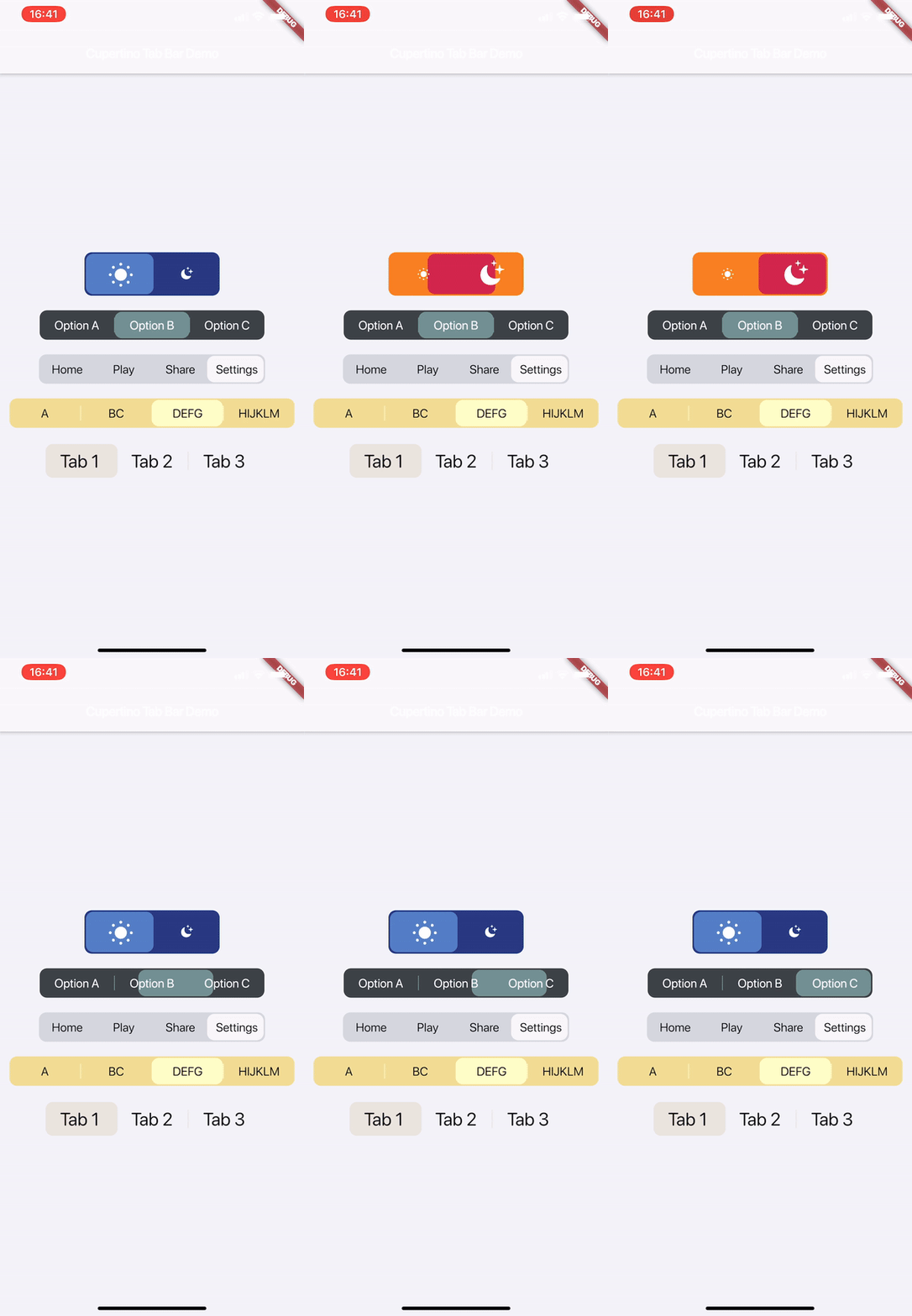
Media

Watch on Youtube:

v1.1.0

v1.0.0


Description

This is a highly customisable and simple widget for having iOS 13 style tab bars.

How-to-Use

Simply create a CupertinoTabBar as shown in the example:

CupertinoTabBar(
  Colors.black                  //_backgroundColor
  Colors.white                  //_foregroundColor
  [...],                        //_widgets
  cupertinoTabBarValueGetter,   //_valueGetter
  (int index) {                 //_onTap
    setState(() {
      cupertinoTabBarValue = index;
    });
  },
  {Key key,
  useSeparators             : false,
  innerHorizontalPadding    : 10.0,
  innerVerticalPadding      : 10.0,
  borderRadius              : const BorderRadius.all(const Radius.circular(10.0)),
  curve                     : Curves.linearToEaseOut,
  duration                  : const Duration(milliseconds: 350),
  allowExpand               : false,
  allowScrollable           : false,
  fittedWhenScrollable      : false,
  animateWhenScrollable     : false,
  animateUntilScrolled      : false,
  outerHorizontalPadding    : 10.0,,
  outerVerticalPadding      : 0})
)

int cupertinoTabBarValue = 0;
int cupertinoTabBarValueGetter() => cupertinoTabBarValue;

Further Explanations:

For a complete set of descriptions for all parameters and methods, see the documentation.

  • Do not set both [allowExpand] and [allowScrollable] to true.

Notes

Any help, suggestion or criticism is appreciated!

Cheers.


所属分类

源码仓库

使用此插件的项目

暂无相关数据。
