搜索插件、代码仓与 APP 分类

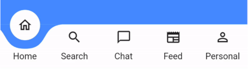
curved_labeled_navigation_bar 封面
插件详情v2.0.6

curved_labeled_navigation_bar

惊艳的动态弯曲形状导航栏。可调节颜色、背景色、动画曲线和动画持续时间。

AndroidiOSmacOSWindowsLinux
近 30 天下载
2330
喜欢数
145
Pub 分数
160

安装插件

flutter pub add curved_labeled_navigation_bar

插件介绍

基于插件公开信息、社区数据与项目使用情况整理的选型参考。

一个视觉上引人注目的、可动画化的曲线导航栏,适用于Flutter应用。它具有平滑的过渡效果,支持自定义颜色、背景色调、动画曲线和持续时间设置。非常适合注重美学吸引力和用户参与度的现代UI。该包支持Android、iOS、macOS、Windows和Linux等多个平台,确保在不同设备上设计的一致性。其动态动画提升了用户体验,同时保持了实现的简洁性。

适合场景

  • 现代应用程序界面
  • 移动和桌面应用程序
  • 交互式 UI 组件
  • 自定义底部导航栏
  • 增强的用户体验

主要特点

  • 可动画的曲线形状
  • 可自定义颜色
  • 可调节动画曲线
  • 可配置的动画持续时间
  • 跨平台支持
  • 标记的导航项

适合对象

  • 注重设计的开发者
  • 需要视觉魅力的应用程序
  • UI/UX 设计师
  • Flutter 初学者寻找高级小部件
  • 具有自定义导航需求的项目

使用建议

  • 可能会影响低端设备的性能
  • 需要仔细考虑颜色对比度以确保可访问性
  • 动画设置需要在不同设备上进行测试
  • 仅限底部导航使用场景
  • 不适合极简设计

原始 README

以下为关联源码仓库的 README 原文快照,最新内容请访问源码仓库。

curved_labeled_navigation_bar

pub package

A Flutter package for easy implementation of curved navigation bar. This package is a fork of the original curved_navigation_bar from https://github.com/rafalbednarczuk/curved_navigation_bar with label for CurvedNavigationBarItem.

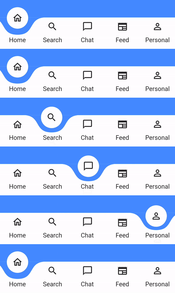
Label No Label
Gif Gif
Add dependency
dependencies:
  curved_labeled_navigation_bar: ^2.0.6 #latest version
Easy to use
Scaffold(
  bottomNavigationBar: CurvedNavigationBar(
    backgroundColor: Colors.blueAccent,
    items: [
      CurvedNavigationBarItem(
        child: Icon(Icons.home_outlined),
        label: 'Home',
      ),
      CurvedNavigationBarItem(
        child: Icon(Icons.search),
        label: 'Search',
      ),
      CurvedNavigationBarItem(
        child: Icon(Icons.chat_bubble_outline),
        label: 'Chat',
      ),
      CurvedNavigationBarItem(
        child: Icon(Icons.newspaper),
        label: 'Feed',
      ),
      CurvedNavigationBarItem(
        child: Icon(Icons.perm_identity),
        label: 'Personal',
      ),
    ],
    onTap: (index) {
      // Handle button tap
    },
  ),
  body: Container(color: Colors.blueAccent),
)
Attributes
CurvedNavigationBar
Attribute Description
items List of CurvedNavigationBarItem
index Index of NavigationBar, can be used to change current index or to set initial index
color Color of NavigationBar, default Colors.white
buttonBackgroundColor Background color of floating button, default same as color attribute
backgroundColor Color of NavigationBar's background, default Colors.blueAccent
onTap Function handling taps on items
letIndexChange Function which takes page index as argument and returns bool. If function returns false then page is not changed on button tap. It returns true by default
animationCurve Curves interpolating button change animation, default Curves.easeOut
animationDuration Duration of button change animation, default Duration(milliseconds: 600)
height Height of NavigationBar
maxWidth Allows to set the width of the navigation bar lower than the entire screen width by default
iconPadding Padding of icon in floating button
CurvedNavigationBarItem
Attribute Description
child Icon of CurvedNavigationBarItem
label Text of CurvedNavigationBarItem
labelStyle TextStyle for label
Change page programmatically
 // State class
  int _page = 0;
  GlobalKey<CurvedNavigationBarState> _bottomNavigationKey = GlobalKey();

  @override
  Widget build(BuildContext context) {
    return Scaffold(
        bottomNavigationBar: CurvedNavigationBar(
          key: _bottomNavigationKey,
          items: [
            CurvedNavigationBarItem(
              child: Icon(Icons.home_outlined),
              label: 'Home',
            ),
            CurvedNavigationBarItem(
              child: Icon(Icons.search),
              label: 'Search',
            ),
            CurvedNavigationBarItem(
              child: Icon(Icons.chat_bubble_outline),
              label: 'Chat',
            ),
            CurvedNavigationBarItem(
              child: Icon(Icons.newspaper),
              label: 'Feed',
            ),
            CurvedNavigationBarItem(
              child: Icon(Icons.perm_identity),
              label: 'Personal',
            ),
          ],
          onTap: (index) {
            setState(() {
              _page = index;
            });
          },
        ),
        body: Container(
          color: Colors.blueAccent,
          child: Center(
            child: Column(
              children: <Widget>[
                Text(_page.toString(), textScaler: TextScaler.linear(10.0)),
                ElevatedButton(
                  child: Text('Go To Page of index 1'),
                  onPressed: () {
                    // Page change using state does the same as clicking index 1 navigation button
                    final CurvedNavigationBarState? navBarState =
                        _bottomNavigationKey.currentState;
                    navBarState?.setPage(1);
                  },
                )
              ],
            ),
          ),
        ),
    );
  }

所属分类

依赖

依赖清单 2 项

源码仓库

使用此插件的项目

暂无相关数据。