custom_pointed_popup
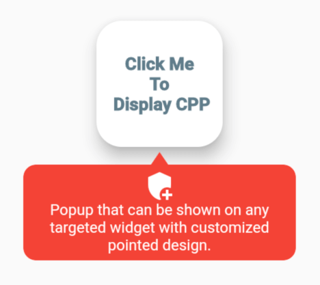
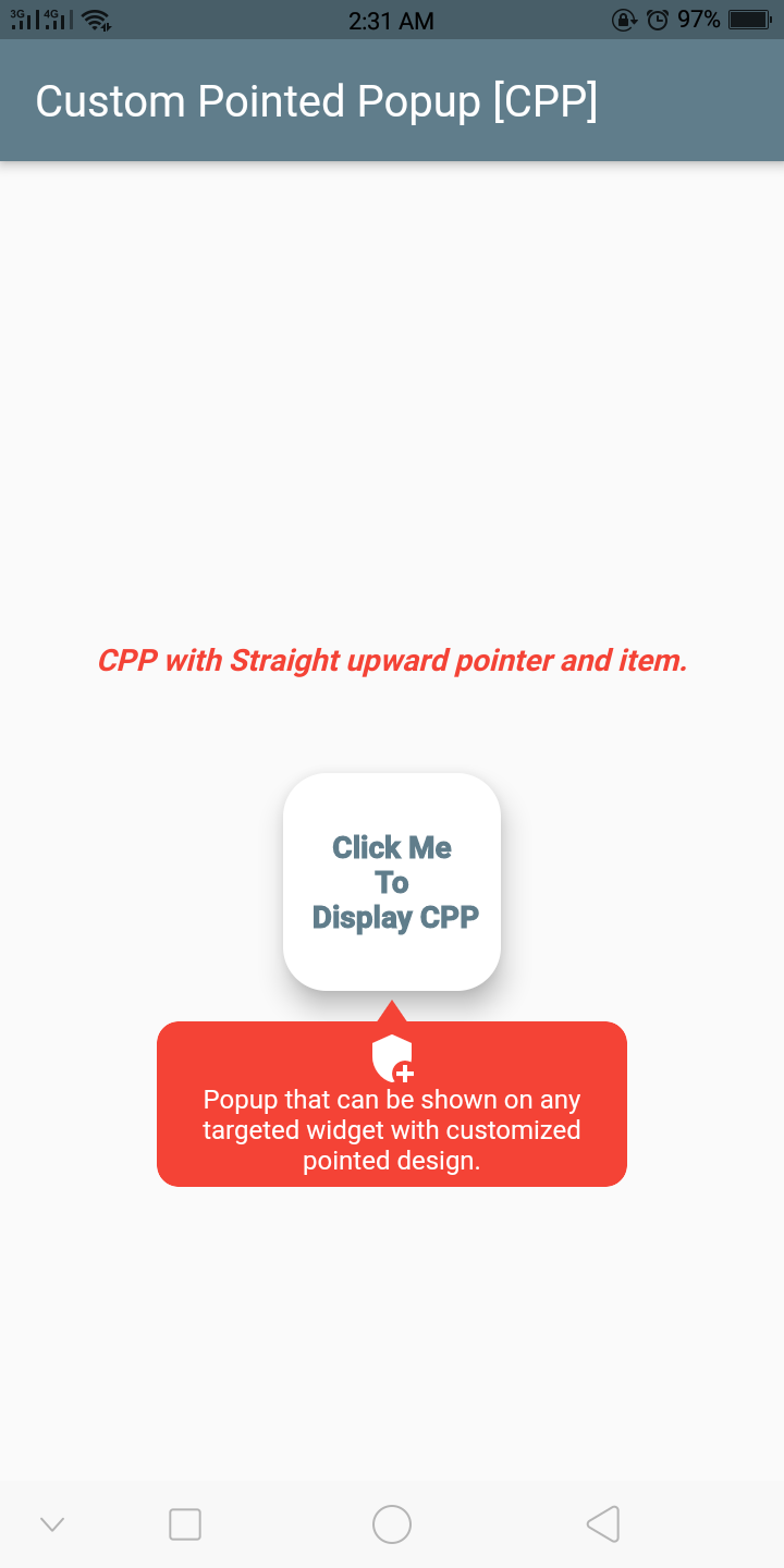
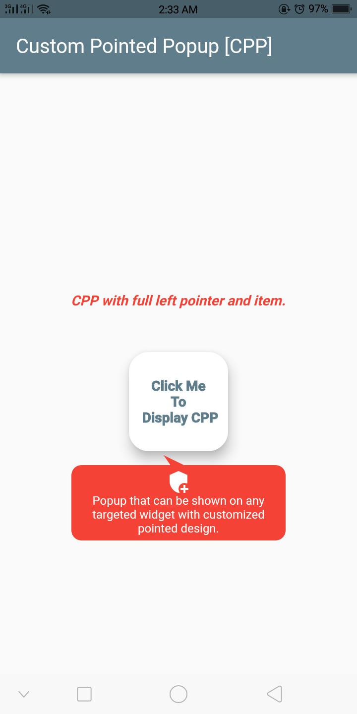
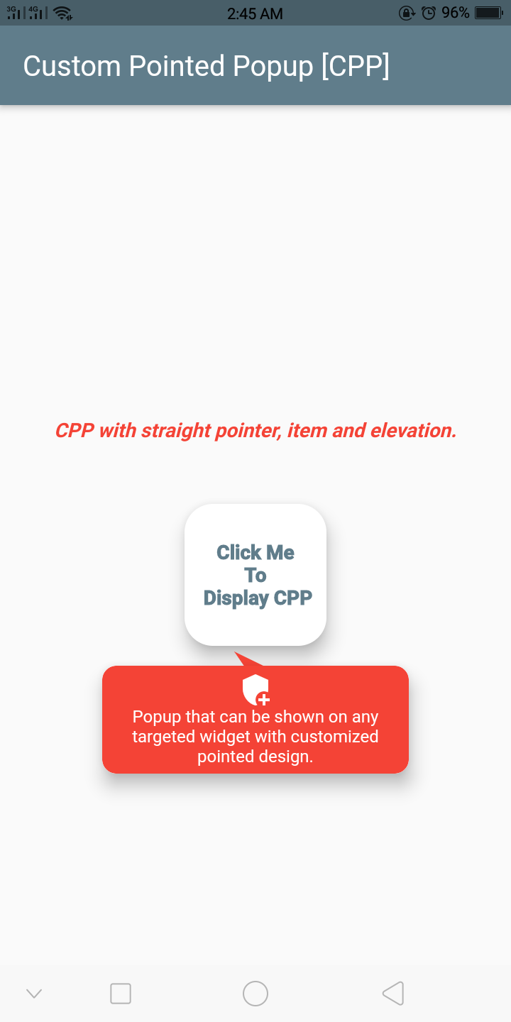
Popup that can be shown on any targeted widget with customized pointed design.
Screenshots

Getting Started
Example
final GlobalKey widgetKey = GlobalKey();
CustomPointedPopup getCustomPointedPopup(BuildContext context) {
return CustomPointedPopup(
backgroundColor: Colors.red,
context: context,
lineColor: Colors.tealAccent,
widthFractionWithRespectToDeviceWidth: 3,
displayBelowWidget: true,
triangleDirection: TriangleDirection.FullLeft,
popupElevation: 10,
item: CustomPointedPopupItem(
title: 'Popup that can be shown on any targeted widget with customized pointed design.',
textStyle: Theme.of(context).textTheme.caption!.copyWith(
color: Theme.of(context).cardColor,
),
iconWidget: Icon(
Icons.add_moderator,
color: Theme.of(context).cardColor,
),
),
onClickWidget: (onClickMenu) {
print('popup item clicked');
},
onDismiss: () {
print('on dismissed called');
},
);
}
@override
Widget build(BuildContext context) {
return Scaffold(
appBar: AppBar(
title: Text(
'Custom Pointed Popup [CPP]',
),
),
body: Container(
child: Center(
child: Column(
mainAxisAlignment: MainAxisAlignment.center,
children: [
Text(
'CPP with straight pointer & item.',
style: TextStyle(
color: Colors.red,
fontSize: 14.0,
fontStyle: FontStyle.italic,
fontWeight: FontWeight.bold,
),
),
SizedBox(
height: 40,
),
GestureDetector(
onTap: () {
getCustomPointedPopup(context)
..show(
widgetKey: widgetKey,
);
},
child: Card(
key: widgetKey,
elevation: 10,
shape: RoundedRectangleBorder(
borderRadius: BorderRadius.circular(20),
),
child: Container(
height: 100,
width: 100,
child: Center(
child: Text(
'Click Me \nTo\n Display CPP',
textAlign: TextAlign.center,
overflow: TextOverflow.clip,
style: TextStyle(
color: Colors.blueGrey,
fontWeight: FontWeight.w900,
fontSize: 14.0,
),
),
),
),
),
),
],
),
),
),
);
}
Important Class, Function And Enum
The important class to know. CustomPointedPopupItem - Model item to display inside the pointed popup:
| Attribute |
Type |
Default |
Required |
Description |
iconWidget |
Widget |
|
No |
This will create an icon inside the pointed popup. |
title |
String |
|
No |
Title or text for the pointed popup. |
textStyle |
TextStyle |
|
No |
Text style for the title. |
textAlign |
TextAlign |
|
No |
Alignment for the title. |
itemWidget |
Widget |
|
No |
Custom item widget or child for the pointed popup. No need to add iconWidget & title if you added this. |
The important function to know. show - Function to show the custom pointed popup:
| Attribute |
Type |
Default |
Required |
Description |
rect |
Rect |
|
No |
The rect bound that the popup should appear around it. |
widgetKey |
GlobalKey |
|
No |
The key to widget. |
item |
CustomPointedPopupItem [class] |
|
No |
If you want the dynamic item widget or child inside the popup per action, you can add the item here. |
The important enum to know. TriangleDirection - Enum to choose the direction of pointer or triangle shape:
| Value |
Description |
Straight |
This will create an pointer with straight upward. |
Right |
This will create an pointer with slightly bended towards right. |
FullRight |
This will create an pointer with fully bended towards right. |
Left |
This will create an pointer with slightly bended towards left. |
FullLeft |
This will create an pointer with fully bended towards left. |
In order to create a custom pointed popup on the widget, there are several attributes that are supported by custom_pointed_popup:
| Attribute |
Type |
Default |
Required |
Description |
item |
CustomPointedPopupItem [class] |
|
Yes |
To create the item widget or child in pointed popup. |
customHeight |
double |
|
Yes |
The custom height of the pointed popup. |
displayBelowWidget |
bool |
false |
No |
If true always display the popup below the widget else automatically calculate the space and display the popup either up or below the widget. |
triangleDirection |
TriangleDirection [enum] |
TraingleDirection.Straight |
No |
Determines the direction of pointer or triangle shape. |
popupBorderRadius |
BorderRadius |
BorderRadius.circular(10.0) |
No |
Defines the border of the custom pointed popup. |
popupElevation |
double |
0 |
No |
The elevation of the pointed popup. |
stateChanged |
Function(bool isShow) |
|
No |
This event function will fire immediately the the popup state changes. |
backgroundColor |
Color |
Colors.red |
No |
Background color for pointed popup. |
widthFractionWithRespectToDeviceWidth |
int |
3 |
No |
Width ratio with respect to the device width. |
onDismiss |
VoidCallBack |
|
No |
Callback function that fire when the custom pointed popup dismissed. |
onClickWidget |
Function(CustomPointedPopupItem item) |
|
No |
Callback function that fire when the child of popup is clicked. |
context |
BuildContext |
|
Yes |
Context where the popup to be shown. |
##If you have any queries, email me to dipak.shrestha@eemc.edu.np
CREDITS
Contributors

Made with contributors-img.