Empty Widget





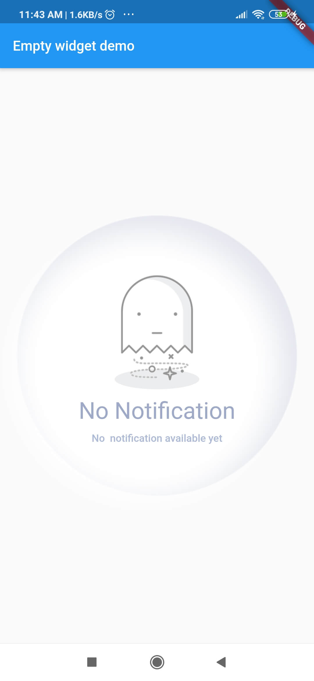
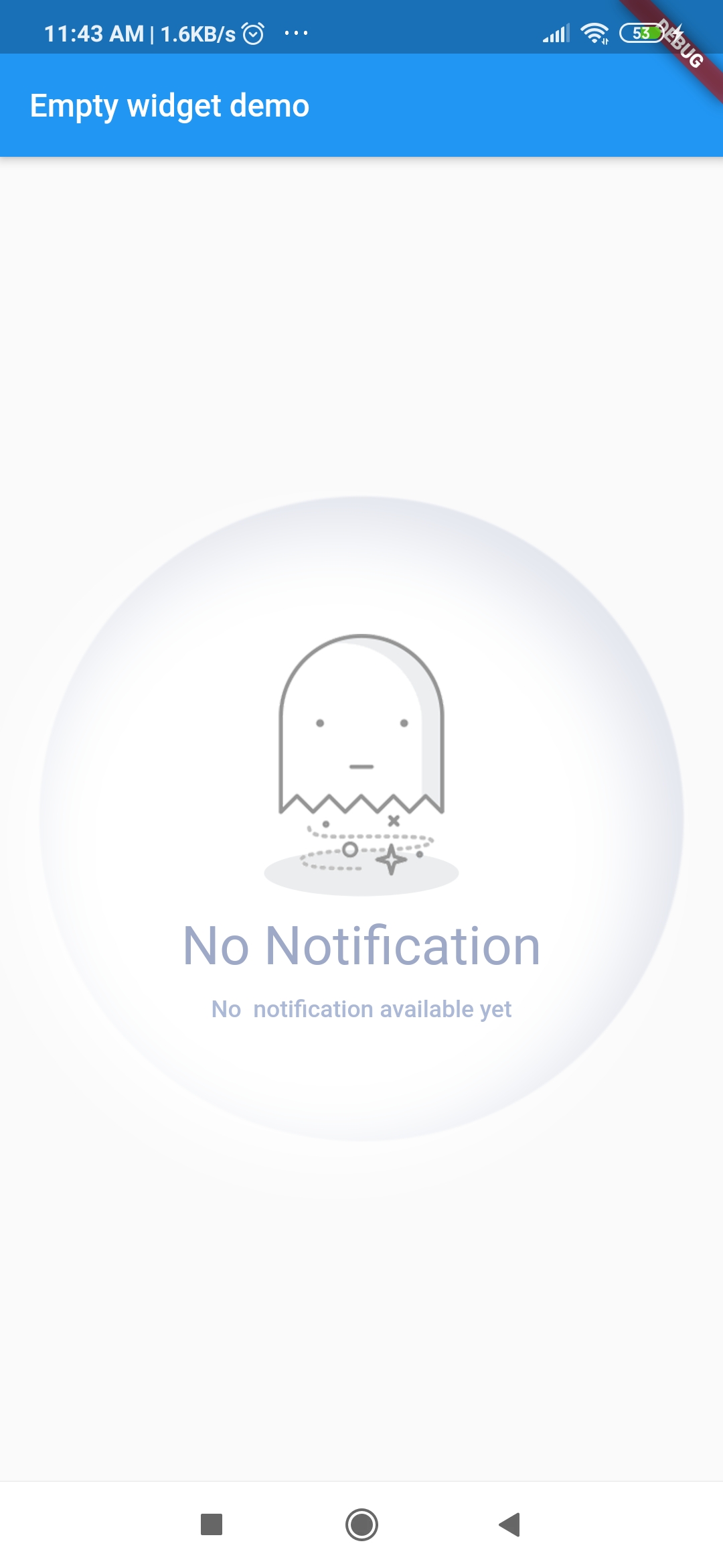
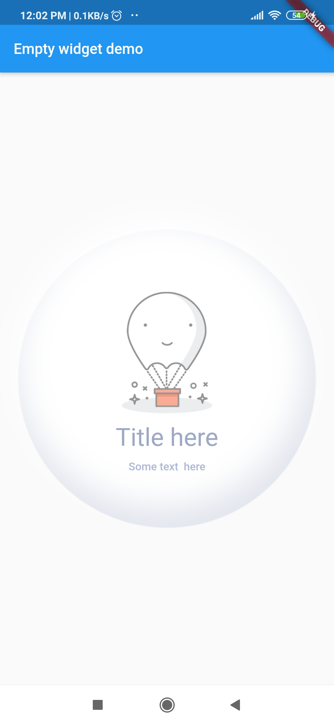
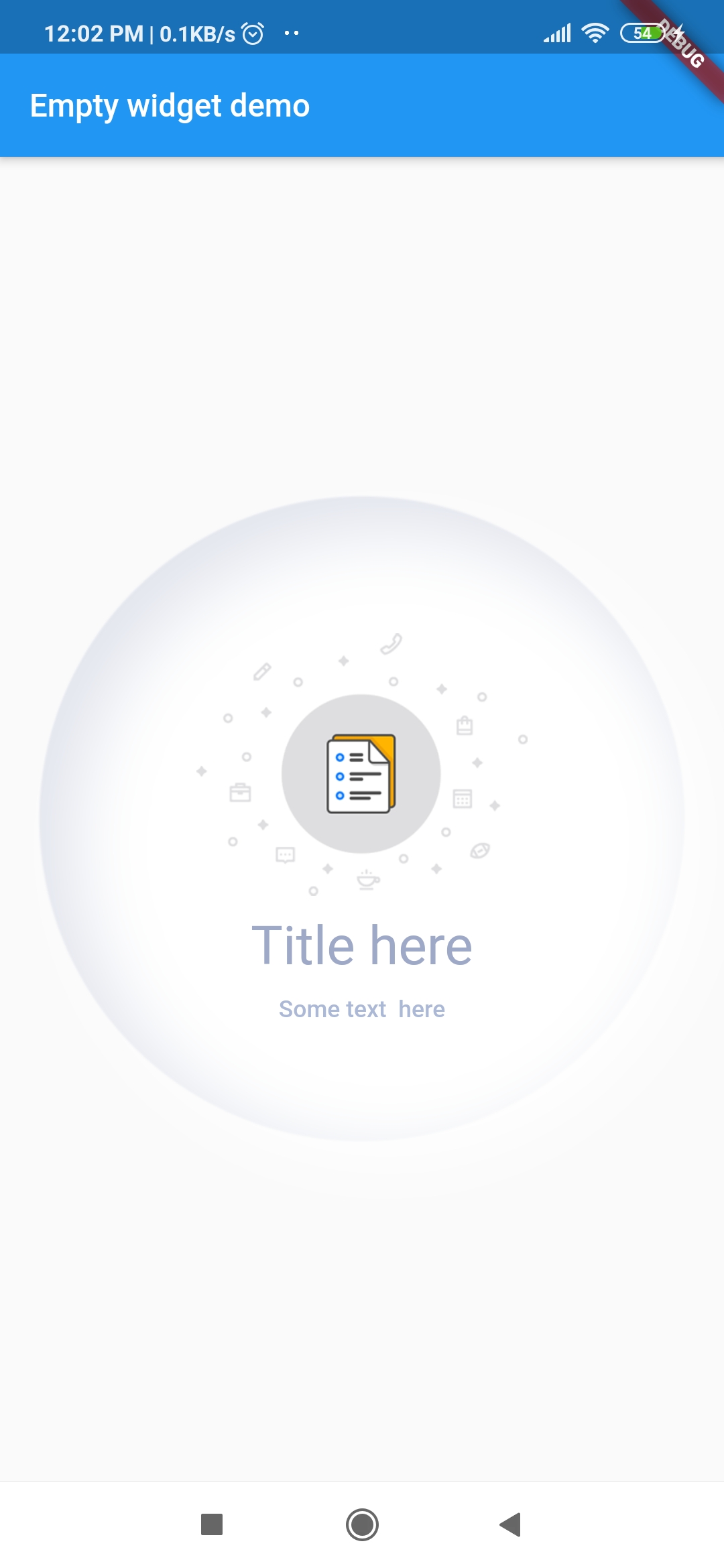
Custom_Empty widget is flutter custom widget which is designed to notify user about some event.
Screenshots
| Screenshots |
Screenshots |
Screenshots |
Screenshots |
 |
 |
 |
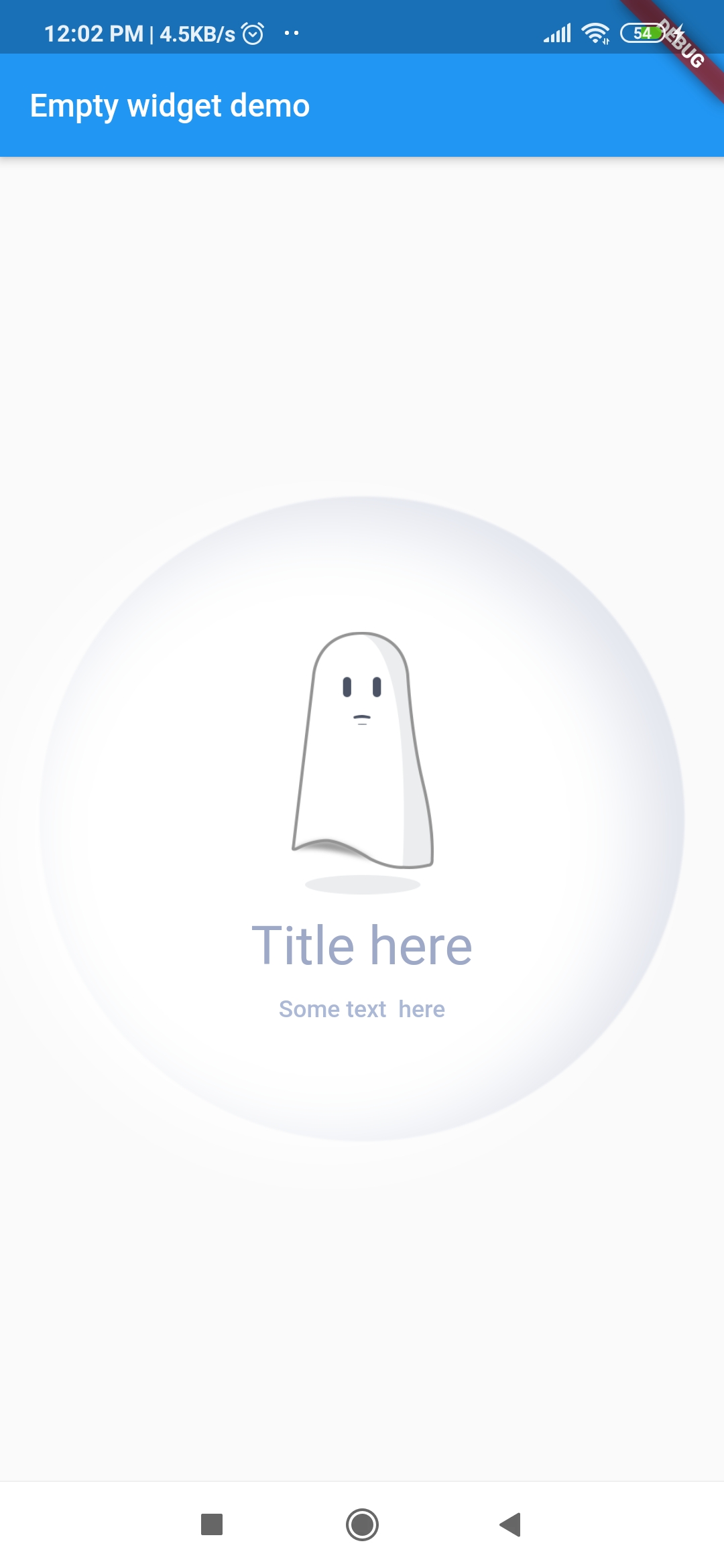 |
Getting Started
1. Add library to your pubspec.yaml
dependencies:
  empty_widget: ^0.0.3
2. Import library in dart file
import 'package:empty_widget/empty_widget.dart';
3. Use of EmptyWidget
 EmptyWidget(
   image: null,
   packageImage: PackageImage.Image_1,
   title: 'No Notification',
   subTitle: 'No  notification available yet',
   titleTextStyle: TextStyle(
     fontSize: 22,
     color: Color(0xff9da9c7),
     fontWeight: FontWeight.w500,
   ),
   subtitleTextStyle: TextStyle(
     fontSize: 14,
     color: Color(0xffabb8d6),
   ),
 );
Example
import 'package:empty_widget/empty_widget.dart';
import 'package:flutter/material.dart';

void main() => runApp(MyApp());

class MyApp extends StatelessWidget {
  @override
  Widget build(BuildContext context) {
    return MaterialApp(
      title: 'Flutter Demo',
      theme: ThemeData(
         primarySwatch: Colors.blue,
      ),
      home: MyHomePage(title: 'Empty widget demo'),
    );
  }
}

class MyHomePage extends StatefulWidget {
  MyHomePage({Key key, this.title}) : super(key: key);
 final String title;

  @override
  _MyHomePageState createState() => _MyHomePageState();
}

class _MyHomePageState extends State<MyHomePage> {
  @override
  Widget build(BuildContext context) {
    return Scaffold(
      appBar: AppBar(
        title: Text(widget.title),
      ),
      body: Container(
        alignment: Alignment.center,
        child: EmptyWidget(
          image: null,
          packageImage: PackageImage.Image_1,
          title: 'No Notification',
          subTitle: 'No  notification available yet',
          titleTextStyle: TextStyle(
            fontSize: 22,
            color: Color(0xff9da9c7),
            fontWeight: FontWeight.w500,
          ),
          subtitleTextStyle: TextStyle(
            fontSize: 14,
            color: Color(0xffabb8d6),
          ),
        ),
      ),
    );
  }
}
Parameters and Value
| Parameter |
Type |
Description |
| title |
string |
Set text for title |
| subTitle |
string |
Set text for subtitle |
| image |
string |
Display images from project assets |
| packageImage |
PackageImage |
Display image from package assets |
| titleTextStyle |
TextStyle |
Set text style for title |
| subtitleTextStyle |
TextStyle |
Set text style for subtitle |
| hideBackgroundAnimation |
bool |
Hides the background circular ball animation |
Download Example App

Pull Requests
I welcome and encourage all pull requests. It usually will take me within 24-48 hours to respond to any issue or request.
Created & Maintained By
Sonu Sharma (Twitter) (Youtube)
(Insta) 
If you found this project helpful or you learned something from the source code and want to thank me, consider buying me a cup of :coffee:
Visitors Count