搜索插件、代码仓与 APP 分类

extended_text_field 封面
插件详情v17.0.0

extended_text_field

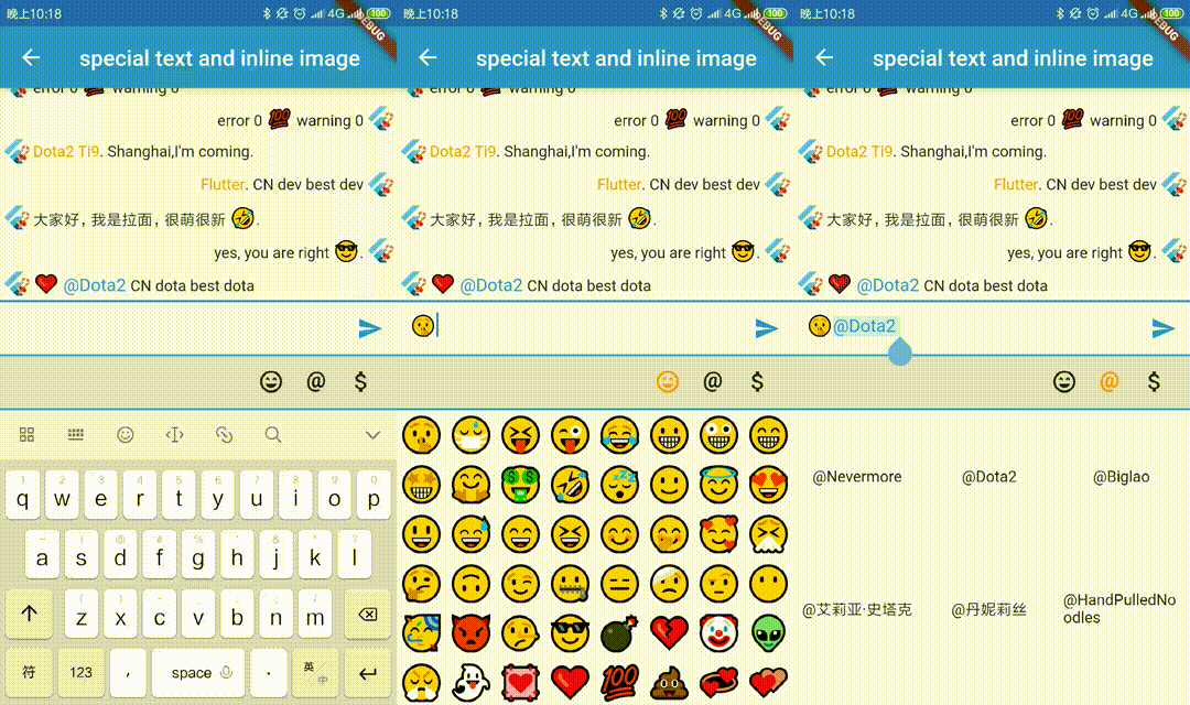
扩展的官方文本字段,可快速构建包含内联图像、@某人、自定义背景等特殊文本。它还支持构建自定义选择工具栏和处理程序。

AndroidiOSWebmacOSWindowsLinux
近 30 天下载
3.5万
喜欢数
308
Pub 分数
150

安装插件

flutter pub add extended_text_field

插件介绍

基于插件公开信息、社区数据与项目使用情况整理的选型参考。

ExtendedTextField 是一个强大的 Flutter 包,通过支持内联图片、提及(@someone)和自定义背景等富文本功能,增强了标准文本字段。它支持构建自定义选择工具栏和触摸手柄,提供对用户交互的更大控制。专为寻求高级文本编辑功能的开发者设计,它简化了在多个平台上创建交互式且视觉丰富的文本输入的过程。

适合场景

  • 创建带有提及功能的聊天界面
  • 将图像嵌入文本中
  • 构建功能丰富的笔记应用
  • 实现自定义文本选择菜单
  • 开发社交媒体文本字段
  • 添加动态文本格式

主要特点

  • 支持内联图像
  • 处理 @提及 和 标签
  • 可自定义的选择工具栏
  • 可扩展的文本跨度类型
  • 跨平台兼容性
  • 可配置的触摸控件

适合对象

  • 开发富文本编辑器的开发者
  • 需要交互式文本输入的应用程序
  • 聊天或消息应用
  • 内容创作工具
  • 以UI为主的文本组件

使用建议

  • 需要理解 TextSpan 和 RichText
  • 可能增加应用复杂性
  • 需要仔细处理文本选择逻辑
  • 与核心组件相比,文档有限
  • 大量跨度可能带来的性能影响

原始 README

以下为关联源码仓库的 README 原文快照,最新内容请访问源码仓库。

extended_text_field

pub package GitHub stars GitHub forks GitHub license GitHub issues FlutterCandies QQ 群

Language: English | 中文简体

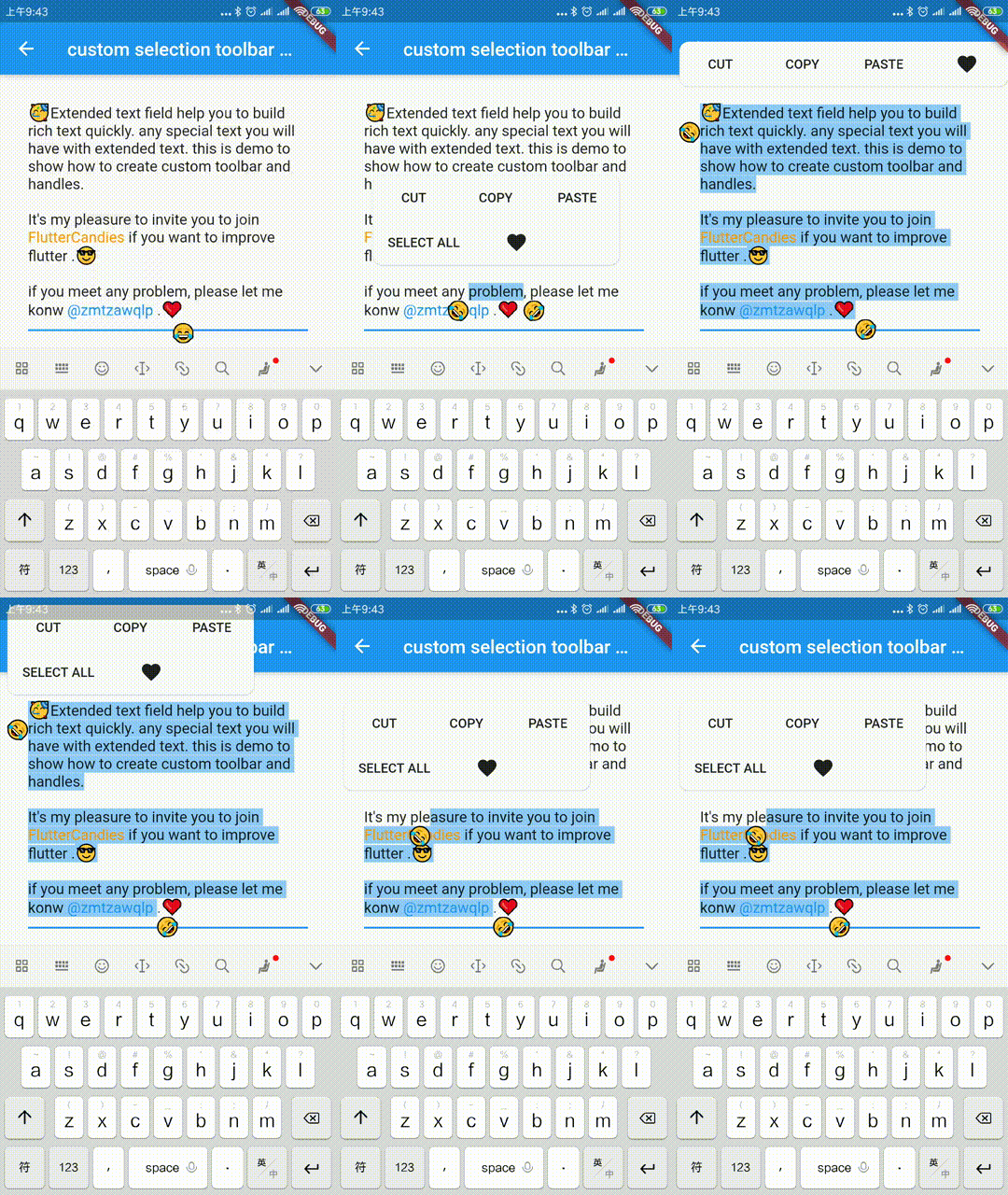
Extended official text field to build special text like inline image, @somebody, custom background etc quickly.It also support to build custom seleciton toolbar and handles.

Web demo for ExtendedTextField

ExtendedTextField is a third-party extension library for Flutter's official TextField component. The main extended features are as follows:

Feature ExtendedTextField TextField
Inline images and text mixture Supported, allows displaying inline images and mixed text Only supports displaying text, but have issues with text selection
Copying the actual value Supported, enables copying the actual value of the text Not supported
Quick construction of rich text Supported, enables quick construction of rich text based on text format Not supported

HarmonyOS is supported. Please use the latest version which contains ohos tag. You can check it in Versions tab.

dependencies:
  extended_text_field: 11.0.1-ohos

Please note that the translation provided above is based on the information you provided in the original text.

Limitation

  • Not support: it won't handle special text when TextDirection.rtl.

    Image position calculated by TextPainter is strange.

  • Not support:it won't handle special text when obscureText is true.

Special Text

Create Special Text

extended text helps to convert your text to special textSpan quickly.

for example, follwing code show how to create @xxxx special textSpan.

class AtText extends SpecialText {
  static const String flag = "@";
  final int start;

  /// whether show background for @somebody
  final bool showAtBackground;

  AtText(TextStyle textStyle, SpecialTextGestureTapCallback onTap,
      {this.showAtBackground: false, this.start})
      : super(
          flag,
          " ",
          textStyle,
        );

  @override
  InlineSpan finishText() {
    TextStyle textStyle =
        this.textStyle?.copyWith(color: Colors.blue, fontSize: 16.0);

    final String atText = toString();

    return showAtBackground
        ? BackgroundTextSpan(
            background: Paint()..color = Colors.blue.withOpacity(0.15),
            text: atText,
            actualText: atText,
            start: start,

            ///caret can move into special text
            deleteAll: true,
            style: textStyle,
            recognizer: (TapGestureRecognizer()
              ..onTap = () {
                if (onTap != null) onTap(atText);
              }))
        : SpecialTextSpan(
            text: atText,
            actualText: atText,
            start: start,
            style: textStyle,
            recognizer: (TapGestureRecognizer()
              ..onTap = () {
                if (onTap != null) onTap(atText);
              }));
  }
}

SpecialTextSpanBuilder

create your SpecialTextSpanBuilder

class MySpecialTextSpanBuilder extends SpecialTextSpanBuilder {
  /// whether show background for @somebody
  final bool showAtBackground;
  final BuilderType type;
  MySpecialTextSpanBuilder(
      {this.showAtBackground: false, this.type: BuilderType.extendedText});

  @override
  TextSpan build(String data, {TextStyle textStyle, onTap}) {
    var textSpan = super.build(data, textStyle: textStyle, onTap: onTap);
    return textSpan;
  }

  @override
  SpecialText createSpecialText(String flag,
      {TextStyle textStyle, SpecialTextGestureTapCallback onTap, int index}) {
    if (flag == null || flag == "") return null;

    ///index is end index of start flag, so text start index should be index-(flag.length-1)
    if (isStart(flag, AtText.flag)) {
      return AtText(textStyle, onTap,
          start: index - (AtText.flag.length - 1),
          showAtBackground: showAtBackground,
          type: type);
    } else if (isStart(flag, EmojiText.flag)) {
      return EmojiText(textStyle, start: index - (EmojiText.flag.length - 1));
    } else if (isStart(flag, DollarText.flag)) {
      return DollarText(textStyle, onTap,
          start: index - (DollarText.flag.length - 1), type: type);
    }
    return null;
  }
}

Image

ImageSpan

show inline image by using ImageSpan.

ImageSpan(
    ImageProvider image, {
    Key key,
    @required double imageWidth,
    @required double imageHeight,
    EdgeInsets margin,
    int start: 0,
    ui.PlaceholderAlignment alignment = ui.PlaceholderAlignment.bottom,
    String actualText,
    TextBaseline baseline,
    TextStyle style,
    BoxFit fit: BoxFit.scaleDown,
    ImageLoadingBuilder loadingBuilder,
    ImageFrameBuilder frameBuilder,
    String semanticLabel,
    bool excludeFromSemantics = false,
    Color color,
    BlendMode colorBlendMode,
    AlignmentGeometry imageAlignment = Alignment.center,
    ImageRepeat repeat = ImageRepeat.noRepeat,
    Rect centerSlice,
    bool matchTextDirection = false,
    bool gaplessPlayback = false,
    FilterQuality filterQuality = FilterQuality.low,
  })

ImageSpan(AssetImage("xxx.jpg"),
        imageWidth: size,
        imageHeight: size,
        margin: EdgeInsets.only(left: 2.0, bottom: 0.0, right: 2.0));
  }
parameter description default
image The image to display(ImageProvider). -
imageWidth The width of image(not include margin) required
imageHeight The height of image(not include margin) required
margin The margin of image -
actualText Actual text, take care of it when enable selection,something likes "[love]" '\uFFFC'
start Start index of text,take care of it when enable selection. 0
Cache Image

if you want cache the network image, you can use ExtendedNetworkImageProvider and clear them with clearDiskCachedImages

import extended_image_library

dependencies:
  extended_image_library: ^0.1.4
ExtendedNetworkImageProvider(
  this.url, {
  this.scale = 1.0,
  this.headers,
  this.cache: false,
  this.retries = 3,
  this.timeLimit,
  this.timeRetry = const Duration(milliseconds: 100),
  CancellationToken cancelToken,
})  : assert(url != null),
      assert(scale != null),
      cancelToken = cancelToken ?? CancellationToken();
parameter description default
url The URL from which the image will be fetched. required
scale The scale to place in the [ImageInfo] object of the image. 1.0
headers The HTTP headers that will be used with [HttpClient.get] to fetch image from network. -
cache whether cache image to local false
retries the time to retry to request 3
timeLimit time limit to request image -
timeRetry the time duration to retry to request milliseconds: 100
cancelToken token to cancel network request CancellationToken()
/// Clear the disk cache directory then return if it succeed.
///  <param name="duration">timespan to compute whether file has expired or not</param>
Future<bool> clearDiskCachedImages({Duration duration}) async

TextSelectionControls

override [ExtendedTextField.extendedContextMenuBuilder] and [TextSelectionControls] to custom your toolbar widget or handle widget

const double _kHandleSize = 22.0;

/// Android Material styled text selection controls.
class MyTextSelectionControls extends TextSelectionControls
    with TextSelectionHandleControls {
  static Widget defaultContextMenuBuilder(
      BuildContext context, ExtendedEditableTextState editableTextState) {
    return AdaptiveTextSelectionToolbar.buttonItems(
      buttonItems: <ContextMenuButtonItem>[
        ...editableTextState.contextMenuButtonItems,
        ContextMenuButtonItem(
          onPressed: () {
            launchUrl(
              Uri.parse(
                'mailto:xxx@live.com?subject=extended_text_share&body=${editableTextState.textEditingValue.text}',
              ),
            );
            editableTextState.hideToolbar(true);
            editableTextState.textEditingValue
                .copyWith(selection: const TextSelection.collapsed(offset: 0));
          },
          type: ContextMenuButtonType.custom,
          label: 'like',
        ),
      ],
      anchors: editableTextState.contextMenuAnchors,
    );
    // return AdaptiveTextSelectionToolbar.editableText(
    //   editableTextState: editableTextState,
    // );
  }

  /// Returns the size of the Material handle.
  @override
  Size getHandleSize(double textLineHeight) =>
      const Size(_kHandleSize, _kHandleSize);

  /// Builder for material-style text selection handles.
  @override
  Widget buildHandle(
      BuildContext context, TextSelectionHandleType type, double textLineHeight,
      [VoidCallback? onTap, double? startGlyphHeight, double? endGlyphHeight]) {
    final Widget handle = SizedBox(
      width: _kHandleSize,
      height: _kHandleSize,
      child: Image.asset(
        'assets/40.png',
      ),
    );

    // [handle] is a circle, with a rectangle in the top left quadrant of that
    // circle (an onion pointing to 10:30). We rotate [handle] to point
    // straight up or up-right depending on the handle type.
    switch (type) {
      case TextSelectionHandleType.left: // points up-right
        return Transform.rotate(
          angle: math.pi / 4.0,
          child: handle,
        );
      case TextSelectionHandleType.right: // points up-left
        return Transform.rotate(
          angle: -math.pi / 4.0,
          child: handle,
        );
      case TextSelectionHandleType.collapsed: // points up
        return handle;
    }
  }

  /// Gets anchor for material-style text selection handles.
  ///
  /// See [TextSelectionControls.getHandleAnchor].
  @override
  Offset getHandleAnchor(TextSelectionHandleType type, double textLineHeight,
      [double? startGlyphHeight, double? endGlyphHeight]) {
    switch (type) {
      case TextSelectionHandleType.left:
        return const Offset(_kHandleSize, 0);
      case TextSelectionHandleType.right:
        return Offset.zero;
      default:
        return const Offset(_kHandleSize / 2, -4);
    }
  }

  @override
  bool canSelectAll(TextSelectionDelegate delegate) {
    // Android allows SelectAll when selection is not collapsed, unless
    // everything has already been selected.
    final TextEditingValue value = delegate.textEditingValue;
    return delegate.selectAllEnabled &&
        value.text.isNotEmpty &&
        !(value.selection.start == 0 &&
            value.selection.end == value.text.length);
  }
}

WidgetSpan

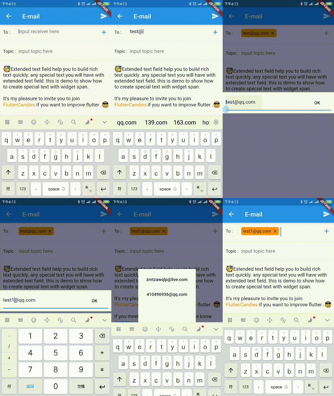
support to select and hitTest ExtendedWidgetSpan, you can create any widget in ExtendedTextField.

class EmailText extends SpecialText {
  final TextEditingController controller;
  final int start;
  final BuildContext context;
  EmailText(TextStyle textStyle, SpecialTextGestureTapCallback onTap,
      {this.start, this.controller, this.context, String startFlag})
      : super(startFlag, " ", textStyle, onTap: onTap);

  @override
  bool isEnd(String value) {
    var index = value.indexOf("@");
    var index1 = value.indexOf(".");

    return index >= 0 &&
        index1 >= 0 &&
        index1 > index + 1 &&
        super.isEnd(value);
  }

  @override
  InlineSpan finishText() {
    final String text = toString();

    return ExtendedWidgetSpan(
      actualText: text,
      start: start,
      alignment: ui.PlaceholderAlignment.middle,
      child: GestureDetector(
        child: Padding(
          padding: EdgeInsets.only(right: 5.0, top: 2.0, bottom: 2.0),
          child: ClipRRect(
              borderRadius: BorderRadius.all(Radius.circular(5.0)),
              child: Container(
                padding: EdgeInsets.all(5.0),
                color: Colors.orange,
                child: Row(
                  mainAxisAlignment: MainAxisAlignment.start,
                  mainAxisSize: MainAxisSize.min,
                  children: <Widget>[
                    Text(
                      text.trim(),
                      //style: textStyle?.copyWith(color: Colors.orange),
                    ),
                    SizedBox(
                      width: 5.0,
                    ),
                    InkWell(
                      child: Icon(
                        Icons.close,
                        size: 15.0,
                      ),
                      onTap: () {
                        controller.value = controller.value.copyWith(
                            text: controller.text
                                .replaceRange(start, start + text.length, ""),
                            selection: TextSelection.fromPosition(
                                TextPosition(offset: start)));
                      },
                    )
                  ],
                ),
              )),
        ),
        onTap: () {
          showDialog(
              context: context,
              barrierDismissible: true,
              builder: (c) {
                TextEditingController textEditingController =
                    TextEditingController()..text = text.trim();
                return Column(
                  children: <Widget>[
                    Expanded(
                      child: Container(),
                    ),
                    Material(
                        child: Padding(
                      padding: EdgeInsets.all(10.0),
                      child: TextField(
                        controller: textEditingController,
                        decoration: InputDecoration(
                            suffixIcon: FlatButton(
                          child: Text("OK"),
                          onPressed: () {
                            controller.value = controller.value.copyWith(
                                text: controller.text.replaceRange(
                                    start,
                                    start + text.length,
                                    textEditingController.text + " "),
                                selection: TextSelection.fromPosition(
                                    TextPosition(
                                        offset: start +
                                            (textEditingController.text + " ")
                                                .length)));

                            Navigator.pop(context);
                          },
                        )),
                      ),
                    )),
                    Expanded(
                      child: Container(),
                    )
                  ],
                );
              });
        },
      ),
      deleteAll: true,
    );
  }
}

NoSystemKeyboard

support to prevent system keyboard show without any code intrusion for [ExtendedTextField] or [TextField].

TextInputBindingMixin

we prevent system keyboard show by stop Flutter Framework send TextInput.show message to Flutter Engine.

you can use [TextInputBinding] directly.

void main() {
  TextInputBinding();
  runApp(const MyApp());
}

or if you have other binding you can do as following.

 class YourBinding extends WidgetsFlutterBinding with TextInputBindingMixin,YourBindingMixin {
 }

 void main() {
   YourBinding();
   runApp(const MyApp());
 }

or you need to override ignoreTextInputShow, you can do as following.

 class YourBinding extends TextInputBinding {
   @override
   // ignore: unnecessary_overrides
   bool ignoreTextInputShow() {
     // you can override it base on your case
     // if NoKeyboardFocusNode is not enough
     return super.ignoreTextInputShow();
   }
 }

 void main() {
   YourBinding();
   runApp(const MyApp());
 }
TextInputFocusNode

you should pass the [TextInputFocusNode] into [ExtendedTextField] or [TextField].

final TextInputFocusNode _focusNode = TextInputFocusNode();

  @override
  Widget build(BuildContext context) {
    return ExtendedTextField(
      // request keyboard if need
      focusNode: _focusNode..debugLabel = 'ExtendedTextField',
    );
  }

  @override
  Widget build(BuildContext context) {
    return TextField(
      // request keyboard if need
      focusNode: _focusNode..debugLabel = 'CustomTextField',
    );
  }

we prevent system keyboard show base on current focus is [TextInputFocusNode] and ignoreSystemKeyboardShow is true。

  final FocusNode? focus = FocusManager.instance.primaryFocus;
  if (focus != null &&
      focus is TextInputFocusNode &&
      focus.ignoreSystemKeyboardShow) {
    return true;
  }

### CustomKeyboard

show/hide your custom keyboard on [TextInputFocusNode] focus is changed.

if your custom keyboard can be close without unFocus, you need also handle 
show custom keyboard when [ExtendedTextField] or [TextField] `onTap`.

``` dart
  @override
  void initState() {
    super.initState();
    _focusNode.addListener(_handleFocusChanged);
  }

  void _onTextFiledTap() {
    if (_bottomSheetController == null) {
      _handleFocusChanged();
    }
  }

  void _handleFocusChanged() {
    if (_focusNode.hasFocus) {
      // just demo, you can define your custom keyboard as you want
      _bottomSheetController = showBottomSheet<void>(
          context: FocusManager.instance.primaryFocus!.context!,
          // set false, if don't want to drag to close custom keyboard
          enableDrag: true,
          builder: (BuildContext b) {
            // your custom keyboard
            return Container();
          });
      // maybe drag close
      _bottomSheetController?.closed.whenComplete(() {
        _bottomSheetController = null;
      });
    } else {
      _bottomSheetController?.close();
      _bottomSheetController = null;
    }
  }

  @override
  void dispose() {
    _focusNode.removeListener(_handleFocusChanged);
    super.dispose();
  }

see Full Demo

所属分类

依赖

依赖清单 1 项

源码仓库

使用此插件的项目