搜索插件、代码仓与 APP 分类

floating_menu_panel 封面
插件详情v0.0.2

floating_menu_panel

浮动菜单面板

AndroidiOSWebmacOSWindowsLinux
近 30 天下载
42
喜欢数
29
Pub 分数
130

安装插件

flutter pub add floating_menu_panel

插件介绍

基于插件公开信息、社区数据与项目使用情况整理的选型参考。

一个 Flutter 包,提供浮动菜单面板,具有交互式且可自定义的浮动操作界面。它允许用户通过一个紧凑、动画化的面板访问多个操作,该面板可展开或收起。非常适合需要快速访问常用功能而又不使 UI 杂乱的应用程序。该面板支持多种配置,包括定位、动画和自定义子部件。兼容所有主要平台,可增强移动和桌面应用程序的可用性。

适合场景

  • 快速访问应用操作
  • 增强用户导航
  • 减少用户界面杂乱
  • 可自定义的操作面板
  • 移动和桌面应用程序集成

主要特点

  • 动画展开和折叠
  • 可自定义的位置和大小
  • 支持多个子控件
  • 跨平台兼容性
  • 可配置的动画
  • 与现有 UI 的轻松集成

适合对象

  • 移动和桌面应用程序
  • 需要手势菜单的应用程序
  • 寻求交互元素的UI设计师
  • 想要轻量级解决方案的开发者
  • 空间受限界面的项目

使用建议

  • 可能需要仔细放置以避免重叠
  • 低端设备上的动画性能
  • 与完整自定义小部件相比,自定义选项有限
  • 不适合复杂的嵌套菜单
  • 需要关注无障碍标准

原始 README

以下为关联源码仓库的 README 原文快照,最新内容请访问源码仓库。

floating_menu_panel

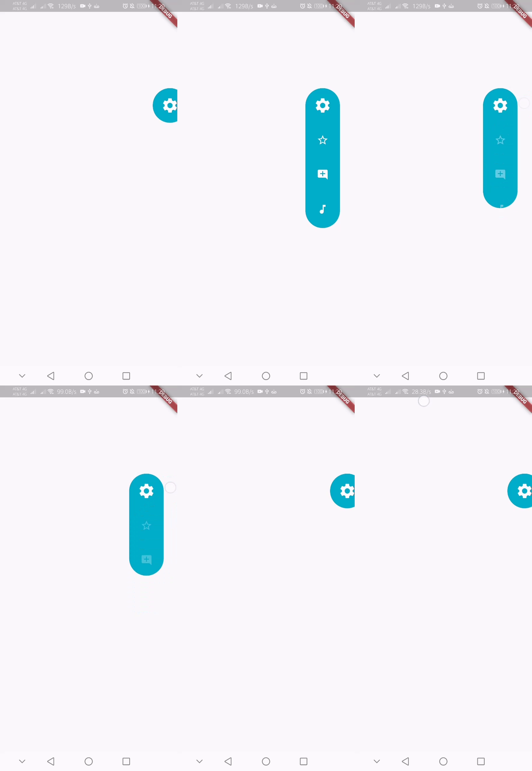
Floating menu panel

Basic:

This is what you needs to get the widget working. Import Widget -> Add 'FloatingMenuPanel' at the bottom of your stack widget. Add icons inside the "buttons" list.

import 'package:floating_menu_panel/floating_menu_panel.dart'; // Import Floating Menu Panel

return MaterialApp(
      home: Scaffold(
        body: Stack(
          children: [
            FloatingMenuPanel(
              onPressed: (index) {
                print('SELECT__: $index');
              },
              buttons: [
                Icons.star_border_outlined,
                Icons.add_comment,
                Icons.music_note
              ],
            ),
          ],
        ),
      ),
    );

alt Floating Menu Panel

All Properties:

These are all the properties you can customize of the floating panel.

    import 'package:floating_menu_panel/floating_menu_panel.dart'; // Import Floating Menu Panel
    
    Stack(
        children: [
            ...
    
            // Add Float Box Panel at the bottom of the 'stack' widget.
            FloatingMenuPanel(
                positionTop: 0.0, // Initial Top Position
                positionLeft: 0.0, // Initial Left Position
                backgroundColor: Color(0xFFEDEDED), // Color of the panel
                contentColor: Colors.black, // Color of the icons
                panelShape: PanelShape.rectangle, // 'PanelShape.rectangle' or 'PanelShape.rounded', border radius property doesn't work in the rounded shape
                borderRadius: BorderRadius.circular(8.0), // Border radius of the panel
                dockType: DockType.inside, // 'DockType.inside' or 'DockType.outside', weather to dock the panel outside or inside the edge of the screen
                dockOffset: 5.0, // Offset the dock from the edge depending on the 'dockType' property
                panelAnimDuration: 300, // Duration for panel open and close animation
                panelAnimCurve: Curves.easeOut, // Curve for panel open and close animation
                dockAnimDuration: 300, // Auto dock to the edge of screen - animation duration
                dockAnimCurve: Curves.easeOut, // Auto dock animation curve
                panelOpenOffset: 20.0, // Offset from the edge of screen when panel is open
                panelIcon: Icons.menu, // Panel open/close icon
                size: 70.0, // Size of single button in the panel
                iconSize: 24.0, // Size of icons
                borderWidth: 1.0, // Width of panel border
                borderColor: Colors.black, // Color of panel border
                onPressed: (index) {
                    print("Clicked on item: $index");
                }
                buttons: [
                    // Add Icons to the buttons list.
                    Icons.message,
                    Icons.photo_camera,
                    Icons.video_library
                ]
            );
        ]
    );

所属分类

源码仓库

使用此插件的项目

暂无相关数据。