
flutter_custom_carousel_slider
A carousel slider Flutter widget, supports custom decoration suitable for news and blog.
Table of contents
Demo
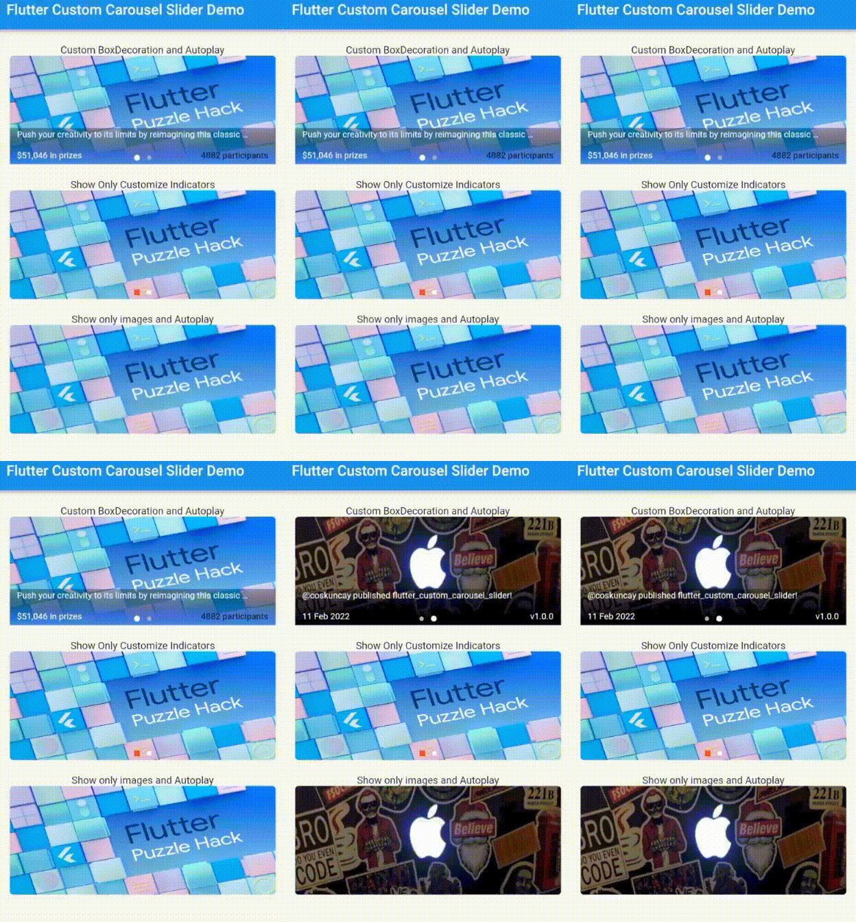
Supported Platforms
- Flutter Android
- Flutter iOS
- Flutter web
- Flutter desktop
Installation
dependencies:
  flutter_custom_carousel_slider: ^1.0.0
Using
import 'package:flutter/material.dart';
import 'package:flutter_custom_carousel_slider/flutter_custom_carousel_slider.dart';

void main() {
  runApp(const MyApp());
}

class MyApp extends StatelessWidget {
  const MyApp({Key? key}) : super(key: key);

  @override
  Widget build(BuildContext context) {
    return MaterialApp(
      title: 'Flutter Demo',
      theme: ThemeData(
        primarySwatch: Colors.blue,
      ),
      home: const MyHomePage(title: 'Flutter Custom Carousel Slider Demo'),
      debugShowCheckedModeBanner: false,
    );
  }
}

class MyHomePage extends StatefulWidget {
  const MyHomePage({Key? key, required this.title}) : super(key: key);
  final String title;

  @override
  State<MyHomePage> createState() => _MyHomePageState();
}

class _MyHomePageState extends State<MyHomePage> {
  List<CarouselItem> itemList = [
    CarouselItem(
      image: const NetworkImage(
        'https://miro.medium.com/max/1400/1*RpaR1pTpRa0PUdNdfv4njA.png',
      ),
      boxDecoration: BoxDecoration(
        gradient: LinearGradient(
          begin: FractionalOffset.bottomCenter,
          end: FractionalOffset.topCenter,
          colors: [
            Colors.blueAccent.withOpacity(1),
            Colors.black.withOpacity(.3),
          ],
          stops: const [0.0, 1.0],
        ),
      ),
      title:
          'Push your creativity to its limits by reimagining this classic puzzle!',
      titleTextStyle: const TextStyle(
        fontSize: 12,
        color: Colors.white,
      ),
      leftSubtitle: '\$51,046 in prizes',
      rightSubtitle: '4882 participants',
      rightSubtitleTextStyle: const TextStyle(
        fontSize: 12,
        color: Colors.black,
      ),
      onImageTap: (i) {},
    ),
    CarouselItem(
      image: const NetworkImage(
        'https://pbs.twimg.com/profile_banners/1444928438331224069/1633448972/600x200',
      ),
      title: '@coskuncay published flutter_custom_carousel_slider!',
      titleTextStyle: const TextStyle(
        fontSize: 12,
        color: Colors.white,
      ),
      leftSubtitle: '11 Feb 2022',
      rightSubtitle: 'v1.0.0',
      onImageTap: (i) {},
    ),
  ];
  @override
  Widget build(BuildContext context) {
    return Scaffold(
      appBar: AppBar(
        title: Text(widget.title),
      ),
      body: SingleChildScrollView(
        child: Center(
          child: Column(
            children: [
              const SizedBox(height: 20),
              Column(
                children: [
                  const Text('Custom BoxDecoration and Autoplay'),
                  CustomCarouselSlider(
                    items: itemList,
                    height: 150,
                    subHeight: 50,
                    width: MediaQuery.of(context).size.width * .9,
                    autoplay: true,
                  ),
                ],
              ),
              const SizedBox(height: 20),
              Column(
                children: [
                  const Text('Show Only Customize Indicators'),
                  CustomCarouselSlider(
                    items: itemList,
                    height: 150,
                    subHeight: 50,
                    width: MediaQuery.of(context).size.width * .9,
                    autoplay: false,
                    showText: false,
                    showSubBackground: false,
                    indicatorShape: BoxShape.rectangle,
                    selectedDotColor: Colors.red,
                    unselectedDotColor: Colors.white,
                  ),
                ],
              ),
              const SizedBox(height: 20),
              Column(
                children: [
                  const Text('Show only images and Autoplay'),
                  CustomCarouselSlider(
                    items: itemList,
                    height: 150,
                    subHeight: 50,
                    width: MediaQuery.of(context).size.width * .9,
                    autoplay: true,
                    showSubBackground: false,
                    showIndicator: false,
                    showText: false,
                  ),
                ],
              ),
            ],
          ),
        ),
      ),
    );
  }
}
CustomCarouselSlider
| Name |
Type |
Default |
| items |
List |
*required |
| height |
double |
200.0 |
| subHeight |
double |
height*.4 |
| width |
double |
200.0 |
| showIndicator |
bool |
true |
| showSubBackground |
bool |
true |
| showText |
bool |
true |
| autoplay |
bool |
true |
| animationCurve |
Curve |
Curves.ease |
| animationDuration |
Duration |
300ms |
| autoplayDuration |
Duration |
3s |
| indicatorShape |
BoxShape |
BoxShape.circle |
| dotSpacing |
double |
5.0 |
| selectedDotColor |
Color |
Colors.white |
| selectedDotHeight |
double |
8.0 |
| selectedDotWidth |
double |
8.0 |
| unselectedDotColor |
Color |
Color(0XFFACAEBA) |
| unselectedDotHeight |
double |
6.0 |
| unselectedDotWidth |
double |
6.0 |
| boxPaddingHorizontal |
double |
10.0 |
| boxPaddingVertical |
double |
2.0 |
CarouselItem
| Name |
Type |
| image |
NetworkImage |
| title |
String |
| titleTextStyle |
TextStyle |
| leftSubtitle |
String |
| leftSubtitleTextStyle |
TextStyle |
| rightSubtitle |
String |
| rightSubtitleTextStyle |
TextStyle |
| onImageTap |
Function(int) |
| boxDecoration |
BoxDecoration |
License
MIT Copyright (c) 2022, Emre Coşkunçay

