搜索插件、代码仓与 APP 分类

flutter_responsive 封面
插件详情v1.1.0

flutter_responsive

适用于 Flutter 的响应式布局小部件。此插件受 Bootstrap 网页项目启发。

AndroidiOSWebmacOSWindowsLinux
近 30 天下载
2060
喜欢数
30
Pub 分数
140

安装插件

flutter pub add flutter_responsive

插件介绍

基于插件公开信息、社区数据与项目使用情况整理的选型参考。

Flutter Responsive 提供了一组布局小部件,旨在为 Flutter 创建响应式用户界面,其设计灵感来自 Bootstrap 的自适应设计方法。它使开发者能够构建自动适应不同屏幕尺寸和方向的布局,适用于多种平台。该包简化了灵活网格、断点和响应式组件的实现,无需复杂的自定义逻辑。非常适合需要在移动设备、平板电脑、网页和桌面设备上保持一致 UI 的应用。

适合场景

  • 构建跨平台响应式仪表板
  • 为移动设备和网页创建自适应布局
  • 为平板电脑和桌面设备设计可扩展的用户界面
  • 实现基于网格的响应式设计
  • 确保在不同设备类型上保持一致的用户体验

主要特点

  • 基于断点的布局调整
  • 灵活的网格系统
  • 跨平台兼容性
  • 受Bootstrap启发的设计模式
  • 与现有 Flutter 项目的轻松集成

适合对象

  • 针对多个平台的开发者
  • 构建响应式管理面板的团队
  • 需要自适应UI的项目
  • 面向前端的 Flutter 应用
  • 具有不同屏幕尺寸需求的应用程序

使用建议

  • 可能需要学习新的小部件约定
  • 与手动布局编码相比,自定义选项有限
  • 依赖于平台特定的渲染行为
  • 最适合常规网格布局
  • 不太适合高度动态或非网格的UI

原始 README

以下为关联源码仓库的 README 原文快照,最新内容请访问源码仓库。

About flutter_responsive plugin

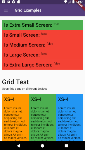
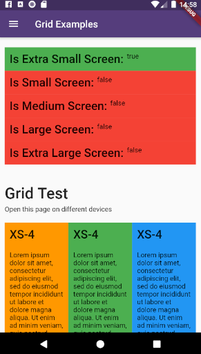
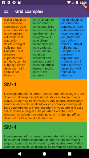
example_6 example_7

This plugin provides a easy and productive way to work with responsive layouts for Flutter Applications in mobile, desktop and web, allowing your layout to adapt and wrap widgets ( Container, Rows, Columns and RichText ) referent to the size of his parent element.

Made by Rafael Setragni to all Flutter's Community.

Licensing

This project follows the GNU General Public License V3, wich means you can change the entire project the way as you want to, but you need to share your improvements back to the community.

To share your improvements, please first do a Fork of this project, change what you need to and finally do a pull request. And don´t let to share your ideas and needs on "Issues" page, even before to start your changes.

IMPORTANT NOTES:

  • This plugin was based on Bootstrap Web Project, but do not implement all its features (not yet).
  • The column's layer responsiveness is based on the size of the global screen, such as Bootstrap does.
  • All the widgets contains margin, padding, width, height (maximum and minimum edges), such as div Html element.
  • Fell free to improve and change this project.

How to Use

Add the dependency bellow into your pubspec.yaml file.

dependencies:
  flutter_responsive: ^0.0.6 #Please, ensure to use the most updated version

Add the reference into your .dart files

import 'package:flutter_responsive/flutter_responsive.dart';

Use the Widgets ResponsiveContainer, ResponsiveRow, ResponsiveCol and JSX as the way you want to.

Screen Sizes

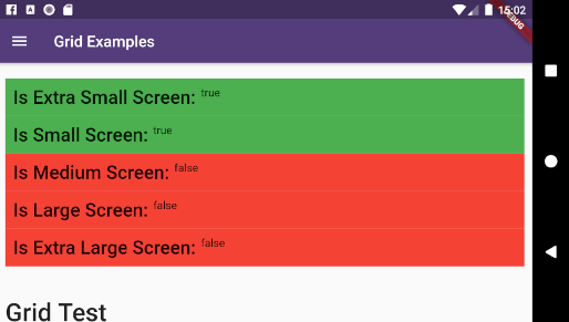
This plugin was based on Bootstrap web project and split the screen in 12 columns, considering 7 screen sizes:

  • US - Ultra Small Screens - 0px to 309px
  • XS - Extra Small Screens - 310px to 575px
  • SM - Small Screens - 576px to 767px
  • MD - Medium Screens - 768px to 991px
  • LG - Large Small Screens - 992px to 1199px
  • XL - Extra Large Screens - 1200px to 1999px
  • UL - Ultra Large Screens - 2000px and beyond

example_1 example_2 example_3 example_4

Personalizing limits (Optional)

All the limits could be personalized as you need, changing the limit Hashmap into ResponsiveScreen class.

/* Map<String, double> */
ResponsiveScreen.limits = {
    ScreenSize.us: 0.00,
    // Smart watches
    ScreenSize.xs: 310.00,
    // Small phones (5c)
    ScreenSize.sm: 576.00,
    // Medium phones
    ScreenSize.md: 768.00,
    // Large phones (iPhone X)
    ScreenSize.lg: 992.00,
    // Tablets
    ScreenSize.xl: 1200.00,
    // Laptops
    ScreenSize.ul: 2000.00,
    // Desktops and TVs 4K
  };

Grid Usage

This plugin have 3 major grid elements:

  • ResponsiveContainer: Container to all page elements, such as Rows and Columns, centralizing the content and beeing limited to a maximum width size
ResponsiveContainer(

  // Determines the container's limit size
  widthLimit: ResponsiveScreen.limits[ScreenSize.lg],
  margin: EdgeInsets.symmetric(horizontal: 10),
  
  children: <Widget>[
  
    ResponsiveRow(),
    ResponsiveRow(),
    ResponsiveRow(),
    
  ]
)
  • ResponsiveRow: Container wich contains many columns or even other widget. OBS: Its not necessary to wrap inner widgets into a ResponsiveCol object.
ResponsiveRow(

  margin: EdgeInsets.only(top: 20, bottom: 5),
  
  children: <Widget>[
  
    ResponsiveCol(),
    ResponsiveCol(),
    ResponsiveCol(),
    
    Text('It´s fine to use another widget directly inside a ResponsiveRow')
  ]
),
  • ResponsiveCol:
ResponsiveCol(
  margin: EdgeInsets.all(10),
  padding: EdgeInsets.all(10),
  backgroundColor: Colors.blue,
  gridSizes: {
      ScreenSize.xs : 4,
      ScreenSize.sm : 3,
      ScreenSize.lg : 2,
      ScreenSize.xl : 1,
  },
  children: [
      Text('Lorem ipsum dolor sit amet, consectetur adipiscing elit')
  ]
)

Full Example

import 'package:flutter/material.dart';
import 'package:flutter_responsive/flutter_responsive.dart';

class HomePage extends StatefulWidget {
  @override
  _HomePage createState() => _HomePage();
}

class _HomePage extends State<HomePage> {

  @override
  void initState() {
    super.initState();
  }

  @override
  Widget build(BuildContext context) {

    /*create 12 columns*/
    List<Widget> responsiveGridExample =

      /*repeat 12 times*/
      List<int>.generate(12, (index) => index).map((colIndex) =>
          ResponsiveCol(
              padding: EdgeInsets.all(10),
              backgroundColor: Colors.blue,
              gridSizes: {
                ScreenSize.xs : 4,
                ScreenSize.sm : 3,
                ScreenSize.lg : 2,
                ScreenSize.xl : 1,
              },
              children: [
                Text('Lorem ipsum dolor sit amet, consectetur adipiscing elit')
              ]
          )
      ).toList();

    MediaQueryData mediaQuery = MediaQuery.of(context);

    return Scaffold(
        appBar: AppBar(
          title: const Text('Home', overflow: TextOverflow.ellipsis),
        ),
        body: Container(
          color: Color(0xFFCCCCCC),
          child: ListView(
            children: <Widget>[
              ResponsiveContainer(
                margin: EdgeInsets.symmetric(vertical: 10),
                padding: EdgeInsets.symmetric(horizontal: 10),
                backgroundColor: Colors.white,
                widthLimit: mediaQuery.size.width * 0.95,
                children: <Widget>[
                  ResponsiveRow(
                    margin: EdgeInsets.symmetric(vertical: 10),
                    children: <Widget>[

                      ResponsiveCol(
                          padding: EdgeInsets.all(10),
                          margin: EdgeInsets.only(bottom: 20),
                          backgroundColor: Colors.blueGrey,
                          children: [
                            Text('Flutter Responsive Layout', style: JSXTypography.h4.merge(TextStyle(color: Colors.white)))
                          ]
                      ),
                    ]
                  ),
                  ResponsiveRow(
                    margin: EdgeInsets.symmetric(vertical: 10),
                    children: <Widget>[

                      // By default, the column occupies the entire row, always
                      ResponsiveCol(
                        children: [
                          JSX(
                            shrinkToFit: true,
                            padding: EdgeInsets.only(bottom: 20),
                            stylesheet: {
                              'h3': JSXStylesheet(
                                  textStyle: TextStyle(color: Theme.of(context).primaryColor),
                                  displayLine: DisplayLine.block
                              ),
                              'h6': JSXStylesheet(
                                  textStyle: TextStyle(color: Theme.of(context).primaryColor),
                                  displayLine: DisplayLine.block
                              )
                            },
                            margin: EdgeInsets.symmetric(horizontal: 10, vertical: 20),
                            text:
                            '<div>'
                                '<h3>Responsive Layouts</h3><h6>for <i>Flutter</i></h6>'
                                '<br><br>'
                                '<p>This <b>RichText</b> was easily produced and personalized using pure HTML</p>'
                                '<p>Bellow there is an example of 12 columns, wich changes the amount of each line depending of his father´s widget size.</p>'
                            '</div>',
                          )
                        ]
                      )

                    ]..addAll(
                        responsiveGridExample
                    )
                  )
                ],
              )
            ],
          ),
        )
    );
  }
}
Final result:

example_9

How to run the plugin example

This project is a starting point for a Flutter plug-in package, a specialized package that includes platform-specific implementation code for Android and/or iOS.

For help getting started with Flutter, view our online documentation, which offers tutorials, samples, guidance on mobile development, and a full API reference.

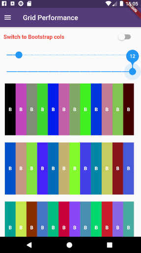
To run the full example App, wich contains performance and case tests, do the steps bellow:

  • Clone this project into your local machine using Github Desktop or any other git program of your preference.
  • Download Android Studio and the last Flutter SDK into your local machine. Configure they to works properly such as this article here
  • Run flutter pub get to update all the dependencies
  • Debug the file example/lib/main.dart or any of the unity case tests located on test folder on emulator or real device.
  • To run properly the performance tests, please run the app using flutter run --release

所属分类

源码仓库

使用此插件的项目

暂无相关数据。