搜索插件、代码仓与 APP 分类

flutter_tabbar_lite 封面
插件详情v0.0.6

flutter_tabbar_lite

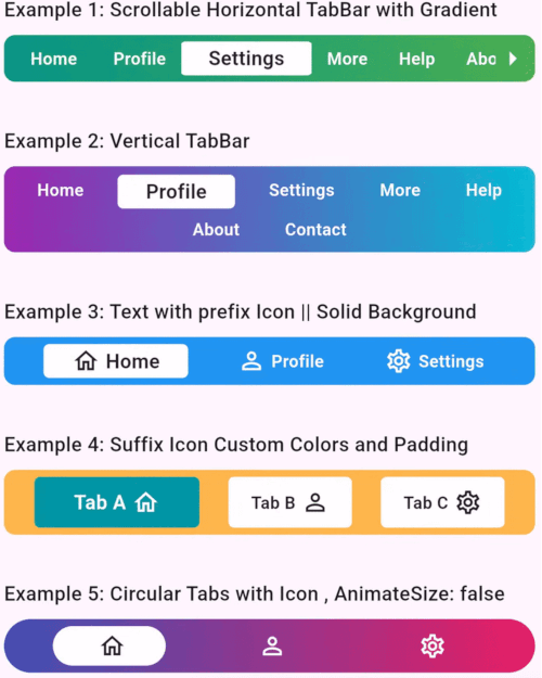
FlutterTabBarLite 是一个带有动画、水平和垂直功能的自定义标签栏小部件。

AndroidiOSWebmacOSWindowsLinux
近 30 天下载
65
喜欢数
9
Pub 分数
145

安装插件

flutter pub add flutter_tabbar_lite

插件介绍

基于插件公开信息、社区数据与项目使用情况整理的选型参考。

FlutterTabBarLite 是一个轻量级、可自定义的标签栏小部件,适用于 Flutter,支持水平和垂直布局,并具有平滑的动画效果。设计简洁且性能出色,为开发者提供了一种在 Android、iOS、Web、macOS、Windows 和 Linux 等多个平台上实现动画标签切换的便捷方式。该包通过导航时流畅的视觉反馈提升了用户体验。非常适合需要直观标签式导航、设置简单且高度灵活的应用程序。

适合场景

  • 移动应用中的简单标签导航
  • 紧凑用户界面的垂直制表符布局
  • 网页应用中的动画标签切换
  • 仪表板的可自定义标签样式
  • 多平台 Flutter 应用中的导航

主要特点

  • 水平和垂直制表符支持
  • 平滑的动画过渡
  • 轻量且高效
  • 跨平台兼容性
  • 与现有 Flutter 项目的轻松集成
  • 可自定义的外观和行为

适合对象

  • 寻求简单标签栏解决方案的开发者
  • 需要动画标签交互的应用
  • 跨平台 Flutter 应用
  • UI 设计师想要灵活的标签布局
  • 项目优先考虑最小依赖

使用建议

  • 仅限基本标签功能(无高级滑动手势)
  • 可能需要自定义样式才能实现复杂设计
  • 动画在不同平台上的表现可能略有差异
  • 不适合高度动态的标签内容管理
  • 最适合静态或半静态标签结构

原始 README

以下为关联源码仓库的 README 原文快照,最新内容请访问源码仓库。

FlutterTabBarLite

A fully customizable and animated tab bar widget for Flutter applications. Designed to make navigation intuitive and visually appealing, this package is perfect for creating modern and dynamic tab interfaces.

FlutterTabBarLite

Features

  • Customizable Titles: Unique titles to each tab.
  • Icon Support: Include prefix and suffix icons for enhanced aesthetics.
  • Scrollable & Fixed Layouts: Choose between scrollable and fixed tab bar layouts.
  • Gradient Backgrounds: Apply gradients for a modern look.
  • Responsive Design: Fully responsive for various screen sizes.
  • Tab Change Callback: Get notified when the user switches tabs.
  • Tab Axis Horizontal & Vertical: Horizontal and Vertical Tabs.

Installation

Add the following to your pubspec.yaml file:

dependencies:
  flutter_tabbar_lite: ^0.0.6

Run the command to fetch the package:

flutter pub get

Usage

FlutterTabBarLite Horizontal Example
import 'package:flutter/material.dart';
import 'package:flutter_tab_bar/flutter_tabbar_lite.dart';

void main() => runApp(const MyApp());

class MyApp extends StatelessWidget {
  const MyApp({super.key});

  @override
  Widget build(BuildContext context) {
    return MaterialApp(
      home: Scaffold(
        appBar: AppBar(title: const Text("FlutterTabBarLite Horizontal Example")),
        body: Column(
          children: [
            FlutterTabBarLite.horizontal(
              scrollable: true,
              titles: const [
                "Home",
                "Profile",
                "Settings",
                "More",
                "Help",
                "About",
                "Contact"
              ],
              gradient: const LinearGradient(
                colors: [Colors.teal, Colors.green],
                begin: Alignment.centerLeft,
                end: Alignment.centerRight,
              ),
              onTabChange: (index) {
                print("Scrollable TabBar - Selected Tab: $index");
              },
            ),
          ],
        ),
      ),
    );
  }
}
Flutter TabBarLite Vertical Example
import 'package:flutter/material.dart';
import 'package:flutter_tab_bar/flutter_tabbar_lite.dart';

void main() => runApp(const MyApp());

class MyApp extends StatelessWidget {
  const MyApp({super.key});

  @override
  Widget build(BuildContext context) {
    return MaterialApp(
      home: Scaffold(
        appBar: AppBar(title: const Text("FlutterTabBarLite Vertical Example")),
        body: Column(
          children: [
            FlutterTabBarLite.vertical(
              itemMargin: const EdgeInsets.symmetric(horizontal: 8, vertical: 2),
              titles: const [
                "Home",
                "Profile",
                "Settings",
                "More",
                "Help",
                "About",
                "Contact"
              ],
              gradient: const LinearGradient(
                colors: [Colors.purple, Colors.cyan],
                begin: Alignment.centerLeft,
                end: Alignment.centerRight,
              ),
              onTabChange: (index) {
                print("Selected Tab: $index");
              },
            ),
          ],
        ),
      ),
    );
  }
}

Properties

Property Type Default Value Description
scrollable bool false Enables horizontal scrolling for tabs.
titles List<String> ["Tab 1", "Tab 2"] Titles for each tab.
prefixIcons List<IconData>? null Icons before titles.
suffixIcons List<IconData>? null Icons after titles.
backgroundColor Color? Colors.blue Tab bar background color.
selectedTextColor Color Colors.black87 Color for the selected tab's text.
unselectedItemTextColor Color Colors.white Color for unselected tab's text.
gradient LinearGradient? null Gradient applied to the tab bar.
borderRadius double? 8.0 Border radius for TabBar
itemBorderRadius double? 4.0 Border radius for TabBar Item
itemMargin EdgeInsets? null Margin for TabBar Item
onTabChange Function(int)? null Callback function invoked on tab change.
horizontal constructor null Constructor to use horizontal tab bar
vertical constructor null Constructor to use vertical TabBar

Contributions

Contributions are welcome! Please fork the repository, make changes, and submit a pull request. Refer to the CONTRIBUTING.md for more details.


License

This project is licensed under the MIT License. See the LICENSE file for details.


Author

Developed with ❤️ by Khandakar Amir Hamza
GitHub Profile | Portfolio:amirhamza.com


Example App

Check the example directory for a fully functional implementation. Run it locally using:

cd example
flutter run

Feedback

If you encounter any issues or have suggestions, please create an issue in the GitHub repository.

所属分类

源码仓库

使用此插件的项目

暂无相关数据。