🚀 Flutter Widget Catalogue
A collection of visual, structural, platform-adaptive, and interactive widgets to help you build beautiful and functional Flutter apps faster.
✨ Available Components
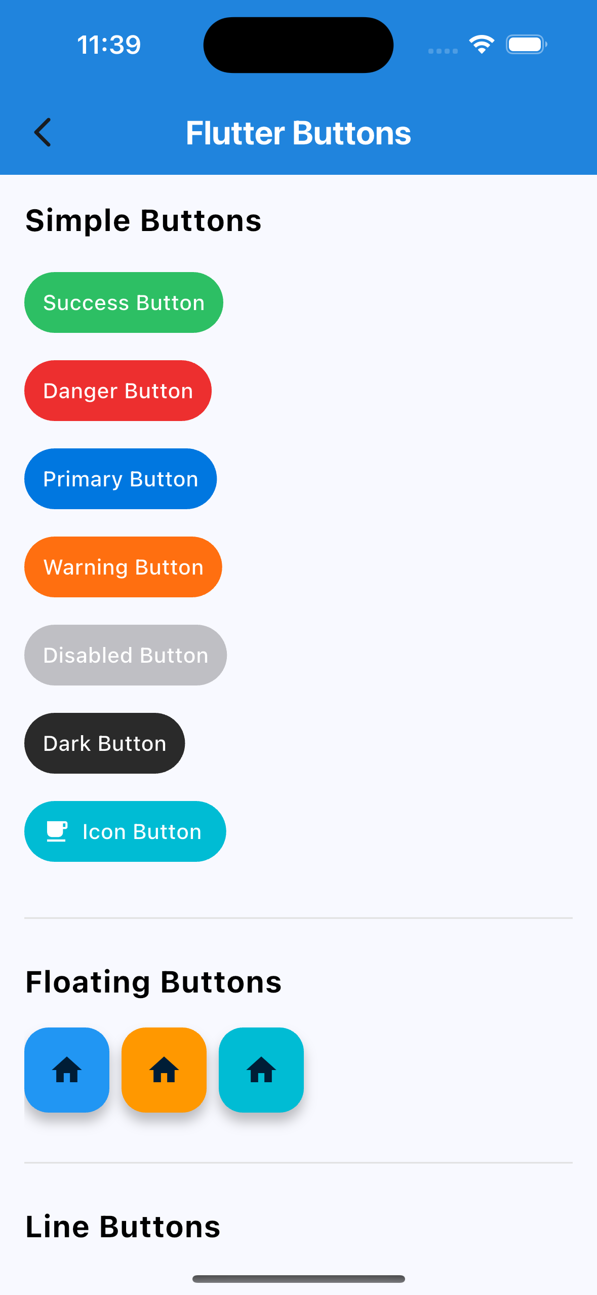
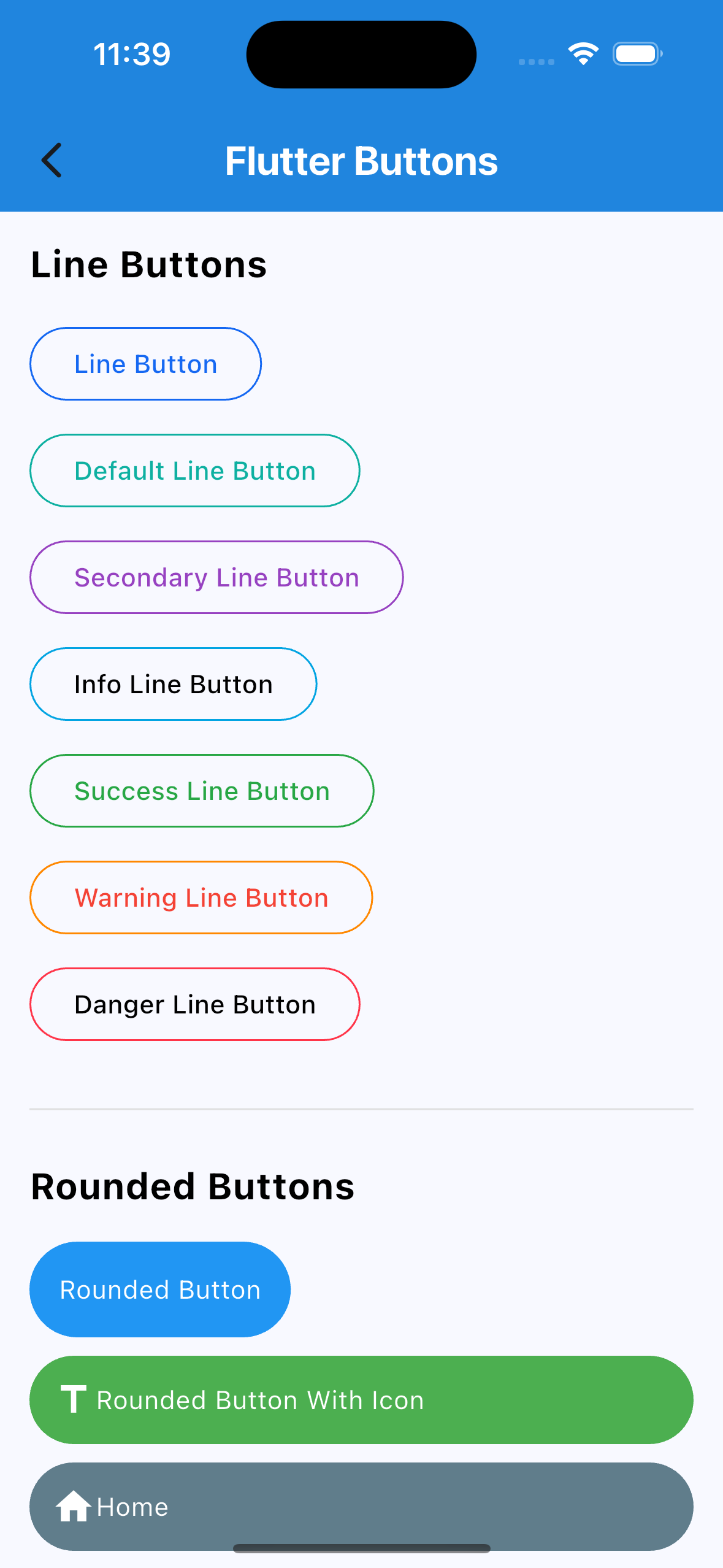
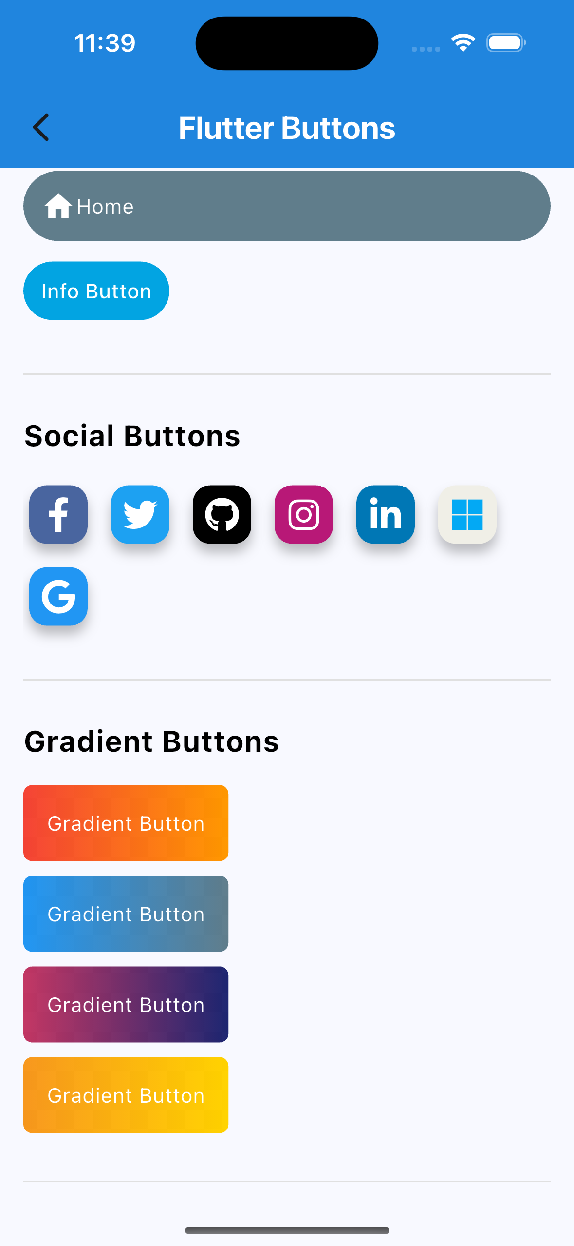
🔘 Buttons
Social Auth Buttons (Google, Facebook, Apple, etc.)
Rounded Buttons
Icon Buttons
Line Buttons
Gradient Buttons
Many more…
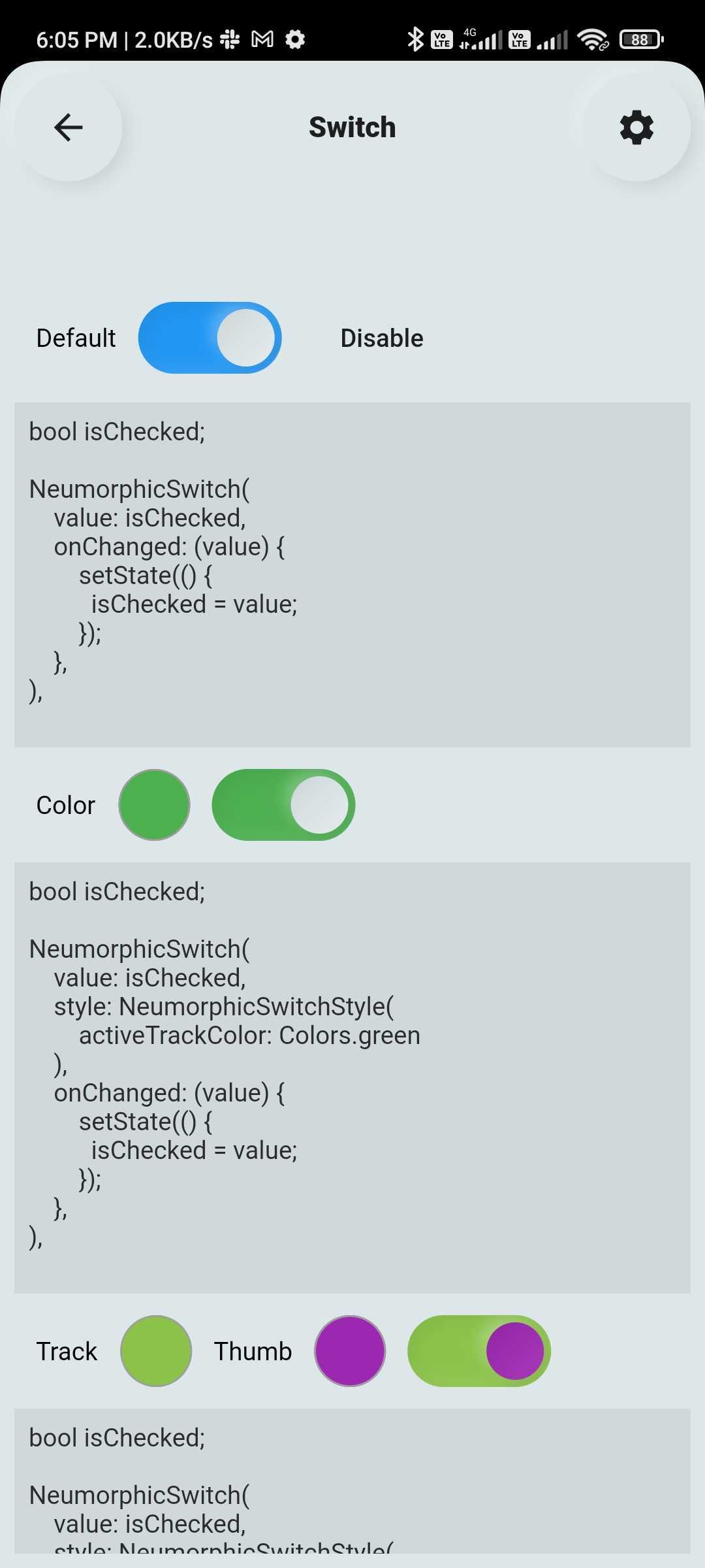
🔄 Custom Switch
Highly customizable Flutter switch widget:
Adjustable height, width, toggle size
Borders, colors, radius, icons, labels
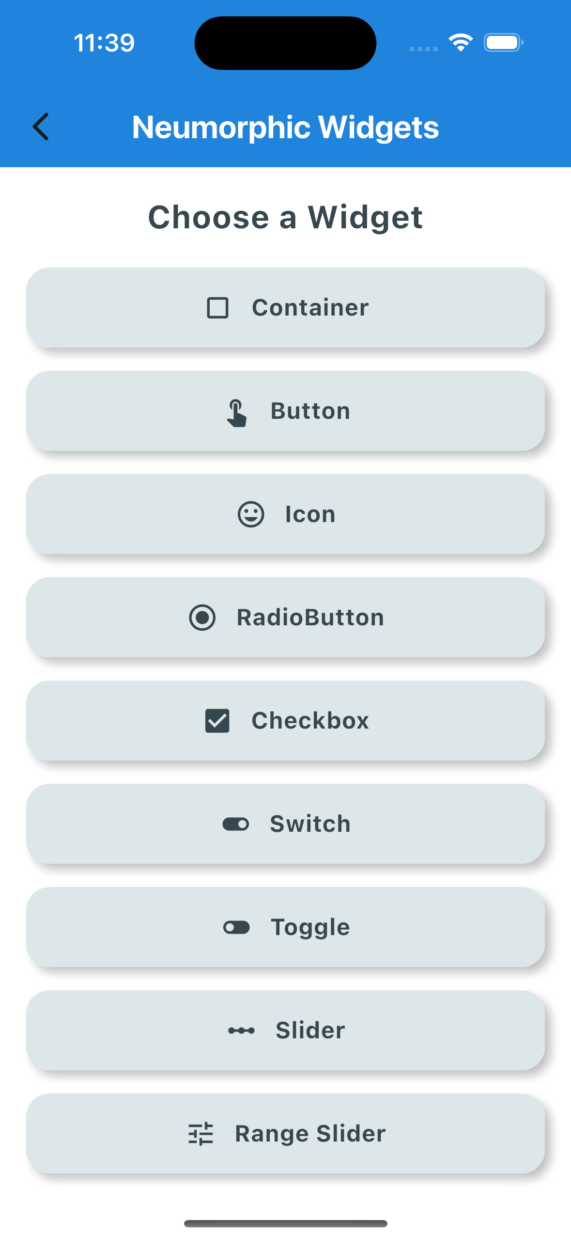
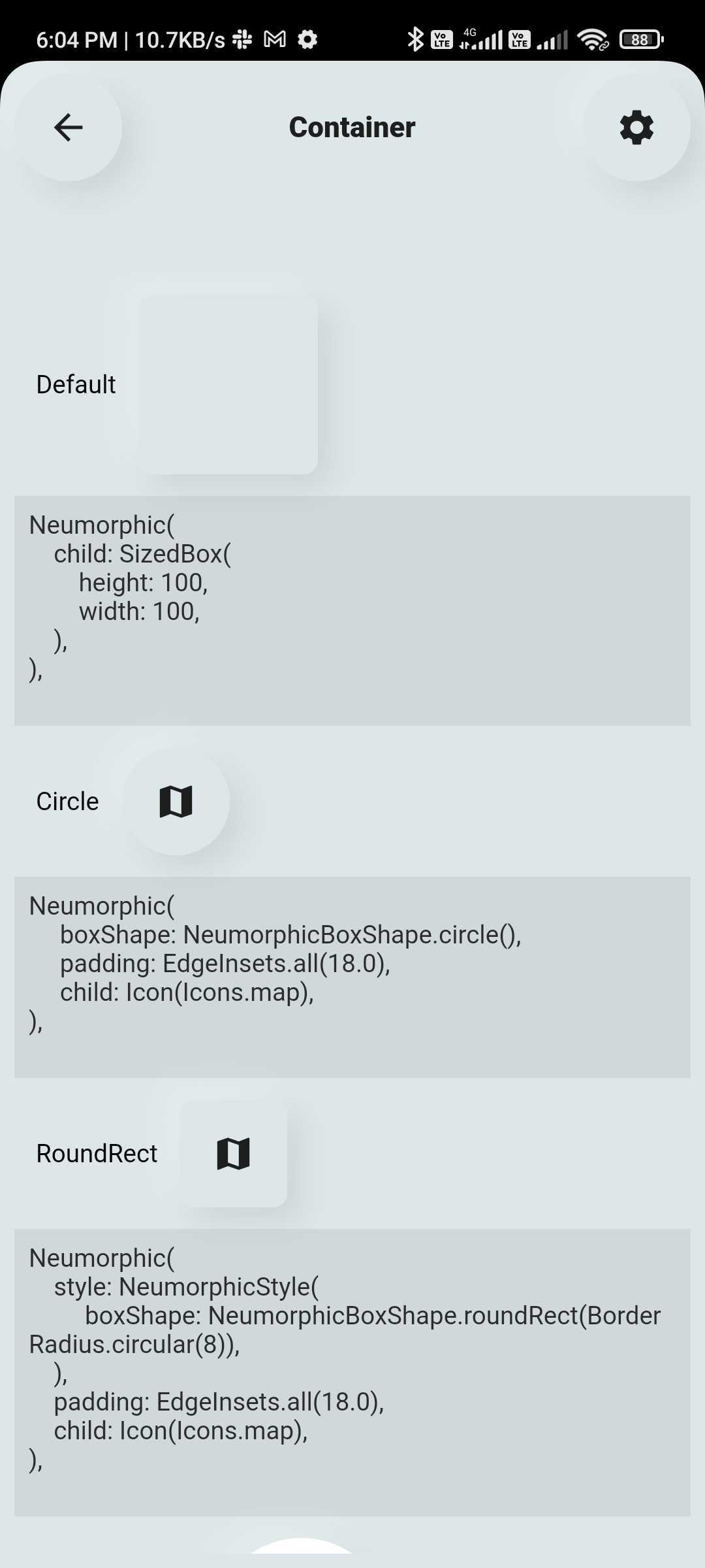
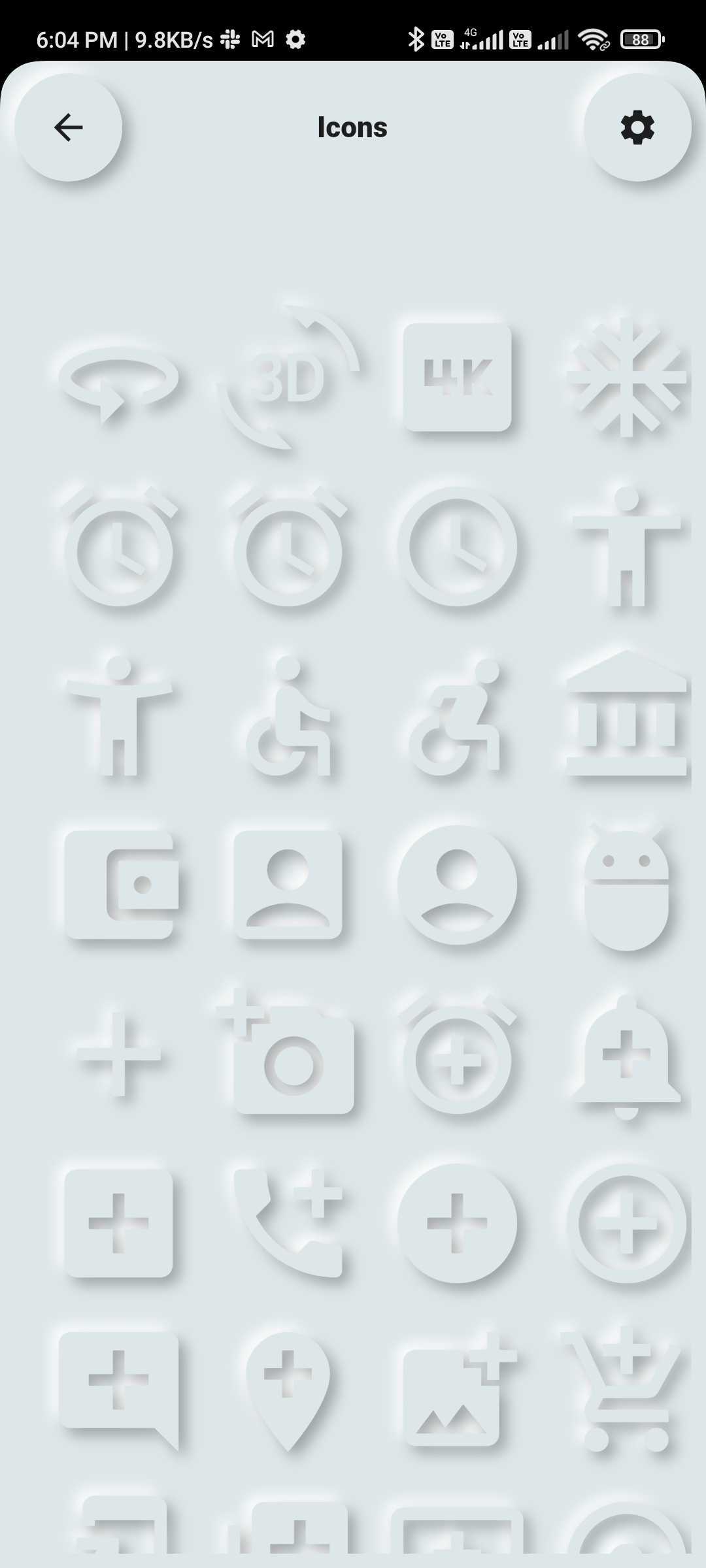
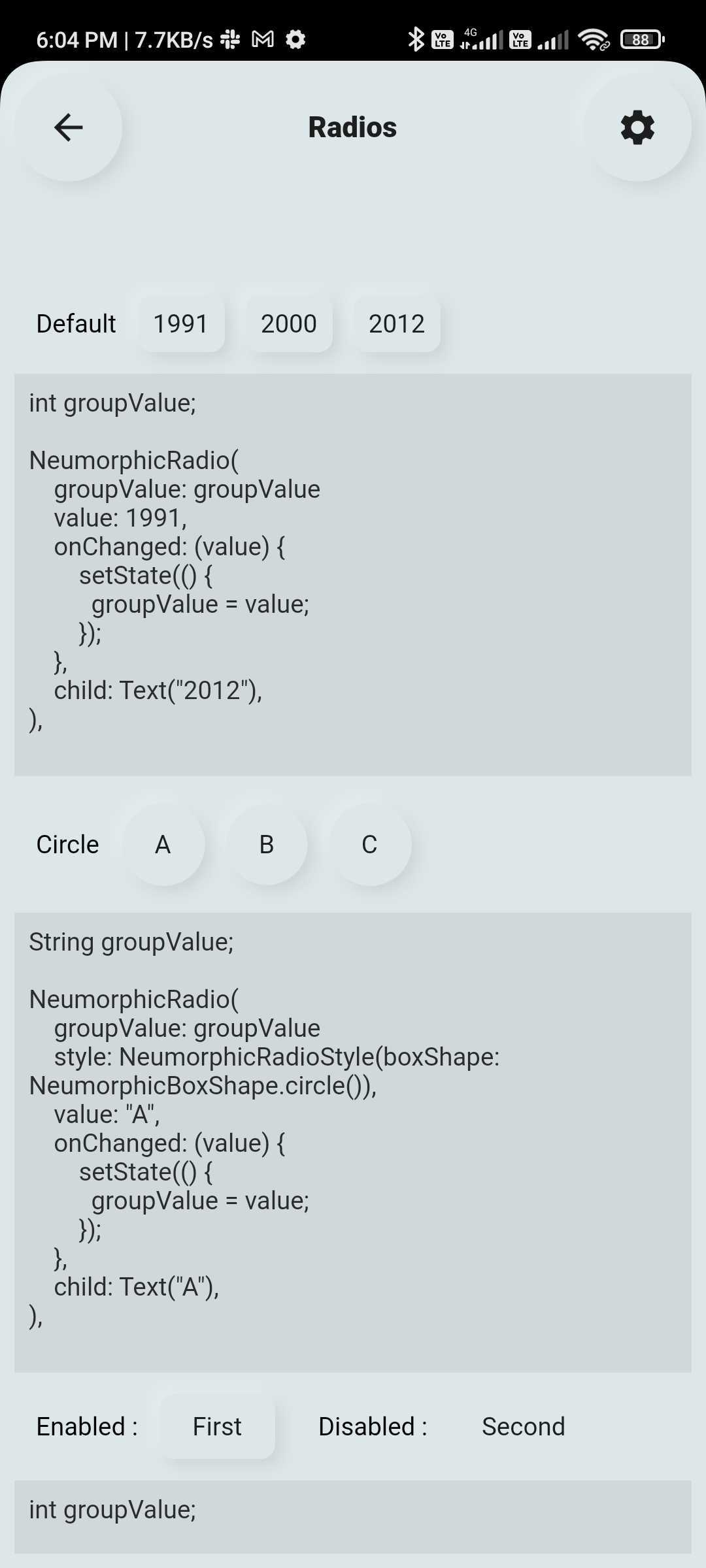
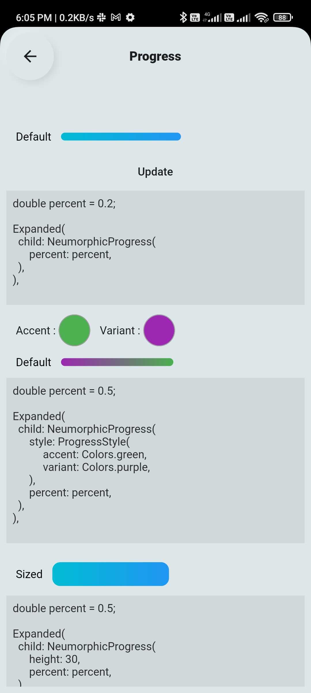
💠 Neumorphic UI Kit
Ready-to-use Neumorphic-styled widgets with glass mode:
Buttons, Switches, Containers, Sliders, Texts, Icons
Checkboxes, Toggles, Indicators, Range Sliders, AnimatedList and more
🔤 Text Fields
Fully customizable and themeable text input fields:
Outline, filled, underlined, or borderless styles
Support for icons, hint text, labels
Password visibility toggle, character counter, input formatter support
Focus, validation, and keyboard behavior control
🆕 New Features (Latest Update 🚀)
📊 Customizable & Animated Layouts
Animated ListView
Animated GridView
Masonry Layout support
Quilted Layout support
Smooth UI transitions & effects
💎 Glass Effect in Neumorphic UI
Added Glassmorphism (blur + transparency) support view
Works with existing Neumorphic components
🔽 Advanced Custom Dropdowns
Multi-select dropdown with chips
Scrollable chip-based selection
Hierarchical dropdown (tree structure)
Autocomplete dropdown (e.g., locations)
Custom item UI (user profile, icons, etc.)
Custom header & builder support
📦 Installation
Add the dependency to your pubspec.yaml:
dependencies:
  flutter_widget_catalogue: <latest-version>
Then import it:
import 'package:flutter_widget_catalogue/flutter_widget_catalogue.dart' ;
🖼️ Screenshots
Neumorphic Widgets
Buttons
DropDown
Components
Switch
TextField
List & Grid
🧪 Usage
Buttons Example
SuccessButton (title: "Success Button" , onPressed: () {});
ButtonWithIcon (
icon: Icons .local_cafe,
title: "Icon Button" ,
color: Colors .white,
buttonColor: Colors .cyan,
onPressed: () {},
);
GradientButton (
onPressed: () {},
splashColor: Colors .orange,
colors: [Colors .red, Colors .orange],
title: "Gradient Button" ,
);
Switch Example
FlutterSwitch (
width: 90.0 ,
height: 45.0 ,
toggleSize: 38.0 ,
value: status,
borderRadius: 24.0 ,
padding: 2.0 ,
toggleColor: Colors .white,
switchBorder: Border .all (color: Colors .blueAccent, width: 3.0 ),
activeColor: Colors .cyan,
inactiveColor: Colors .grey.shade400,
onToggle: (val) {
setState (() {
status = val;
});
},
);
TextField Example
FlutterTextField (
borderRadius: 50 ,
hintText: "Fill Color" ,
hintStyling: TextStyle (color: Colors .black),
readOnly: false ,
fillColor: Colors .pink,
borderColor: Colors .transparent,
cursorColor: Colors .black,
);
FlutterTextField (
iconBackgroundColor: Colors .black,
borderRadius: 20 ,
customTextFieldIcon: Icon (
Icons .lock,
color: Colors .black,),
hintText: "Enter your password" ,
isPasswordField: true ,
isIconShow: true ,
readOnly: false ,
fillColor: Colors .white,
borderColor: Colors .black,
cursorColor: Colors .black,
leadingIconColor: Colors .black,
labelName: "Password" ,
);
FlutterTextField (
isIconShow: false ,
iconBackgroundColor: Colors .white10,
borderRadius: 30 ,
isNumber: true ,
hintText: "Enter your number" ,
readOnly: false ,
borderColor: Colors .yellow,
labelName: "Phone number" ,
labelNameTextStyle: const TextStyle (color: Colors .black, fontSize: 20 , fontWeight: FontWeight .w600),
);
Dropdown Example
HierarchySearchableDropdown (
items: _kSampleData,
hint: 'Select Multiple Items' ,
isMultiline: true ,
isMultiSelect: true ,
onChanged: (label) => setState (() => selectedLabel = label),
validator: (value) {
if (value == null || value.isEmpty) {
return 'Please select at least one item' ;
}
return null ;
},
itemSpacing: 2 ,
listPadding: const EdgeInsets .symmetric (vertical: 16 ),
itemTextStyle: const TextStyle (
color: Colors .black,
fontSize: 15 ,
),
);
HierarchySearchableDropdown (
items: _kFilterData,
hint: 'Select Filters' ,
isMultiSelect: true ,
showChips: true ,
isMultiline: false ,
onChanged: (label) => setState (() => selectedFilters = label),
),
✅ Platform Support
Platform
Supported
Android
✅
iOS
✅
Web
✅
📌 Changelog
Please see the CHANGELOG.md for a list of recent changes.
👨💻 Contributors
📃 License
This project is licensed under the MIT License .