搜索插件、代码仓与 APP 分类

m_calendar 封面
插件详情v1.5.1

m_calendar

一个可自定义且轻量级的 Flutter 日历小部件包,支持基于天和列表的选择,并支持用户定义的装饰。

AndroidiOSWebmacOSWindowsLinux
近 30 天下载
226
喜欢数
12
Pub 分数
160

安装插件

flutter pub add m_calendar

插件介绍

基于插件公开信息、社区数据与项目使用情况整理的选型参考。

m_calendar 是一个轻量级且高度可定制的 Flutter 包,用于构建日历小部件。它支持基于天数和基于列表的选择模式,允许用户选择日期或以结构化列表的形式查看事件。开发者可以为日期应用自定义装饰,例如颜色、图标或徽章,以突出显示特定日期。该包旨在跨所有主要平台(包括 Android、iOS、Web、macOS、Windows 和 Linux)实现简单性和高性能。非常适合需要直观日期选择和视觉自定义的应用程序。

适合场景

  • 日历选择器在日程安排应用中
  • 带有高亮日期的活动策划
  • 用户生日或纪念日追踪
  • 生产力工具中的日历视图
  • 自定义日期选择界面

主要特点

  • 支持天数和列表选择模式
  • 可扩展的日期装饰系统
  • 轻量且高效
  • 跨平台兼容性
  • 与 Flutter UI 的轻松集成
  • 可自定义的外观和行为

适合对象

  • 开发日历功能的开发者
  • 需要日期选择并带有视觉反馈的应用程序
  • 依赖项最少的项目
  • 跨平台日历实现
  • 希望灵活日期样式的UI设计师

使用建议

  • 有限的内置事件管理
  • 无原生重复事件支持
  • 需要手动处理日期逻辑
  • 最适合简单到中等复杂度的日历
  • 不适合功能完整的日历应用以及高级调度需求

原始 README

以下为关联源码仓库的 README 原文快照,最新内容请访问源码仓库。

📆 m_calendar

A customizable, lightweight Flutter calendar package with monthly, weekly, and horizontal layouts, single/range date selection, marked dates, and a built-in month/year picker.

pub.dev license


🖼️ Previews

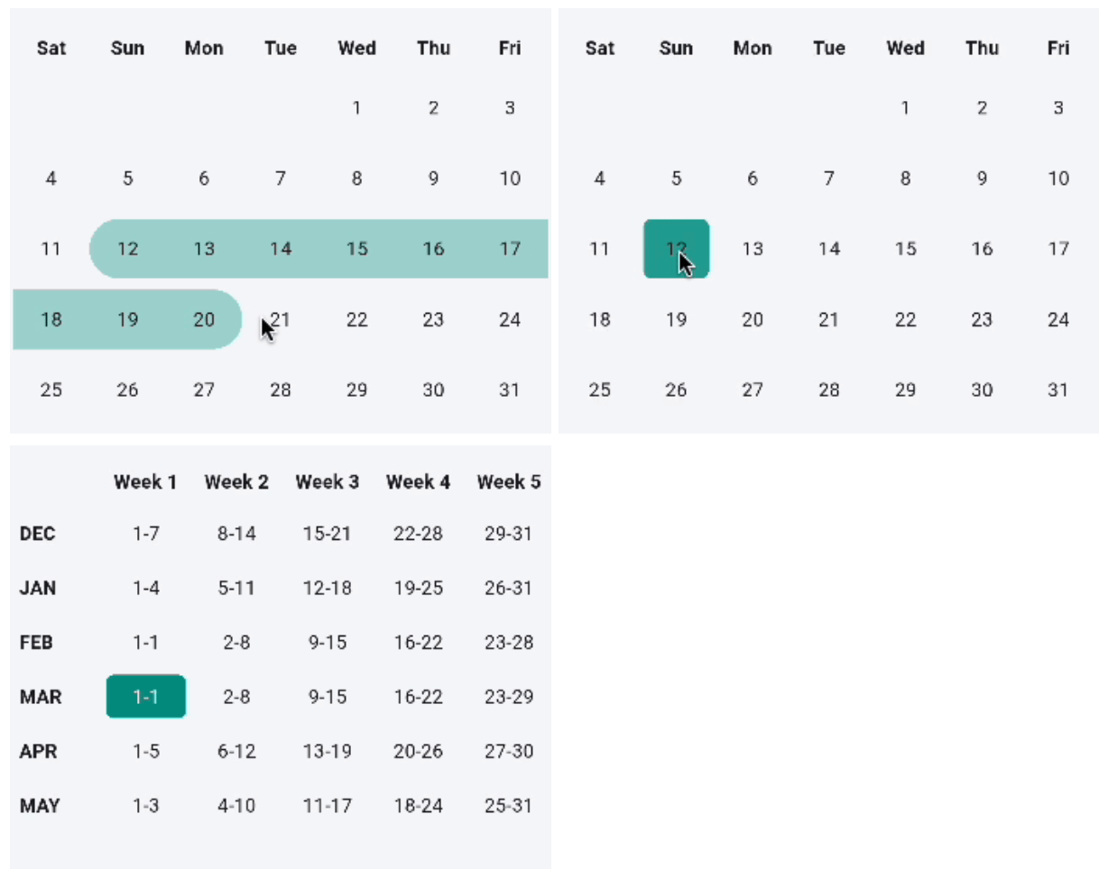
Monthly range selection Monthly single selection Weekly calendar

Horizontal calendar

✨ Features

Feature Monthly Weekly Horizontal
Single-date selection ✅ ✅ ✅
Range selection ✅ — —
Marked dates ✅ — ✅
Month/year picker ✅ — ✅
Custom cell decoration ✅ ✅ ✅
Custom cell widget ✅ ✅ ✅
Auto-scroll to date — — ✅

📝 Behavioral notes

  • Monthly and weekly views start the week on Saturday by default. Pass startDay (e.g. Day.monday) to change it.
  • The weekly view reports a single picked date per tap (the first day of the selected week). The isRangeSelection flag is accepted for API symmetry, but weekly range selection is not implemented yet.
  • The horizontal view is always single-select, and selectedDay is initialized to today before any interaction — so controller.selectedDates returns [today] until the user (or controller) picks another date.
  • A cross-month range set via controller.selectRange(start, end) is truncated to the end of the start month.
  • Attach one MCalendarController per MCalendar widget. Attaching the same controller to multiple calendars is not supported.

🚀 Installation

Add to your pubspec.yaml:

dependencies:
  m_calendar: ^1.4.0

Then run:

flutter pub get

Import in your Dart file:

import 'package:m_calendar/m_calendar.dart';

📖 Usage

Monthly calendar (default)
MCalendar(
  selectedMonth: DateTime.now(),
  onUserPicked: (List<DateTime> dates) {
    // Single selection → list contains one date.
    print(dates);
  },
)
Monthly calendar with range selection
MCalendar(
  selectedMonth: DateTime.now(),
  isRangeSelection: true,
  onUserPicked: (List<DateTime> dates) {
    // Range → list contains every date in the selected range.
    // The callback fires only once both range endpoints are picked.
    print('From ${dates.first} to ${dates.last}');
  },
)
Monthly calendar with marked dates
MCalendar(
  selectedMonth: DateTime.now(),
  markedDaysList: [
    MarkedDaysModel(
      selectedDateList: [
        DateTime(2025, 6, 10),
        DateTime(2025, 6, 15),
      ],
      decoration: BoxDecoration(
        color: Colors.blue.withOpacity(0.3),
        shape: BoxShape.circle,
      ),
    ),
  ],
  onUserPicked: (dates) => print(dates),
)
Monthly calendar with month/year picker
MCalendar(
  selectedMonth: DateTime.now(),
  showMonthYearPicker: true, // tap the header to open the picker
  onUserPicked: (dates) => print(dates),
)

Note: MCalendar.monthly(...) defaults showMonthYearPicker to true.
The MCalendar(...) shorthand defaults it to false. Explicitly set it to your preference.

Programmatic control with MCalendarController

Control navigation and programmatic selections from outside the calendar:

final controller = MCalendarController();

MCalendar(
  controller: controller,
  selectedMonth: DateTime(2026, 3),
  onUserPicked: (dates) => print(dates),
)

// Imperative controls:
controller.nextMonth();
controller.previousMonth();
controller.setMonth(DateTime(2026, 6));
controller.selectDate(DateTime(2026, 6, 15));
controller.selectRange(DateTime(2026, 6, 10), DateTime(2026, 6, 18));
controller.clearSelection();

// Query selection:
print(controller.selectedDates);
Custom day cell builder (dayBuilder)

Render custom widgets with event dots, badges, or icons inside day cells:

MCalendar(
  selectedMonth: DateTime.now(),
  dayBuilder: (context, date, state) {
    if (state.isDisabled) {
      return Center(child: Text('${date.day}', style: const TextStyle(color: Colors.grey)));
    }
    if (state.isToday) {
      return Column(
        mainAxisAlignment: MainAxisAlignment.center,
        children: [
          Text('${date.day}', style: const TextStyle(fontWeight: FontWeight.bold)),
          const Icon(Icons.circle, size: 4, color: Colors.blue),
        ],
      );
    }
    return null; // return null to fall back to default rendering
  },
  onUserPicked: (dates) => print(dates),
)
Disabling dates (minDate, maxDate, isDateDisabled)

Prevent selection of past dates, weekends, or specific days:

MCalendar(
  selectedMonth: DateTime.now(),
  minDate: DateTime.now(), // past dates disabled
  maxDate: DateTime.now().add(const Duration(days: 60)), // max 60 days ahead
  isDateDisabled: (date) => date.weekday == DateTime.sunday, // disable Sundays
  disabledDecoration: BoxDecoration(
    color: Colors.grey.shade200,
    borderRadius: BorderRadius.circular(6),
  ),
  onUserPicked: (dates) => print(dates),
)
Animations (opt-in)

Animations are off by default to keep existing behavior unchanged. Pass a [CalendarAnimations] configuration to any calendar to enable them:

MCalendar(
  selectedMonth: DateTime.now(),
  animations: const CalendarAnimations(), // opt in
  onUserPicked: (dates) => print(dates),
)

This animates:

  • selection / range highlight changes on monthly, weekly, and horizontal cells, plus the month-picker tiles,
  • a fade + directional slide when the displayed month changes,
  • a smooth grid resize between months with different row counts.

Tune the timings and curves, or disable specific parts:

const CalendarAnimations(
  selectionDuration: Duration(milliseconds: 150),
  monthTransitionDuration: Duration(milliseconds: 250),
  sizeDuration: Duration.zero, // keep the height change instant
)

MCalendar(
  selectedMonth: DateTime.now(),
  animations: CalendarAnimations.none, // explicitly disable
  onUserPicked: (dates) => print(dates),
)

Animations automatically become instant when the platform requests reduced motion (MediaQueryData.disableAnimations).


Weekly calendar
MCalendar.weekly(
  selectedMonth: DateTime.now(),
  startDay: Day.sunday, // first day of the week; defaults to Day.saturday
  onUserPicked: (List<DateTime> dates) {
    // Returns [firstDayOfSelectedWeek].
    print(dates);
  },
)

The weekly view shows a scrollable table with one row per month (last 6 months) and up to 6 week columns. Months that span 6 calendar weeks (e.g. September 2023 with a Saturday week start) are displayed correctly without data loss.


Horizontal calendar
// Wrap in a SizedBox or Expanded to give the view a bounded height.
SizedBox(
  width: double.infinity,
  height: 120,
  child: MCalendar.horizontal(
    selectedMonth: DateTime.now(),
    onUserPicked: (DateTime date) {
      // Always a single date.
      print(date);
    },
  ),
)

The horizontal view callback is void Function(DateTime) — not a List — because the horizontal view only supports single-date selection.

Horizontal calendar with date range and auto-scroll
SizedBox(
  width: double.infinity,
  height: 120,
  child: MCalendar.horizontal(
    selectedMonth: DateTime.now(),
    initialDate: DateTime.now(),                       // scroll-to target
    endDate: DateTime.now().add(const Duration(days: 30)), // last selectable day
    autoScroll: true,                                  // default: true
    onUserPicked: (date) => print(date),
  ),
)

initialDate is also the first selectable date. Dates before initialDate and after endDate are shown greyed-out and cannot be tapped.

Assertion: passing initialDate after endDate throws an assertion error in debug mode with a clear message.


🎨 Styling

Cell decoration & child
MCalendar(
  selectedMonth: DateTime.now(),
  // Default (unselected) cell decoration
  decoration: BoxDecoration(
    color: Colors.grey.shade100,
    borderRadius: BorderRadius.circular(8),
  ),
  // Selected cell decoration
  userPickedDecoration: BoxDecoration(
    color: Colors.teal,
    borderRadius: BorderRadius.circular(8),
  ),
  // Custom widget inside the selected cell (overrides the default day number)
  userPickedChild: const Icon(Icons.check, color: Colors.white),
  // Cell padding
  cellPadding: const EdgeInsets.all(8),
  onUserPicked: (dates) => print(dates),
)
Header & week-label styling
MCalendar(
  selectedMonth: DateTime.now(),
  showMonthYearPicker: true,
  // Header text (month + year label)
  weekNameHeaderStyle: const TextStyle(
    fontWeight: FontWeight.bold,
    color: Colors.indigo,
  ),
  onUserPicked: (dates) => print(dates),
)
Month/year picker customization (horizontal view example)
MCalendar.horizontal(
  selectedMonth: DateTime.now(),
  showMonthYearPicker: true,
  monthYearPickerSelectedMonthColor: Colors.teal,
  monthYearPickerUnselectedMonthColor: Colors.grey.shade200,
  monthYearPickerCrossAxisCount: 4,
  monthYearPickerChildAspectRatio: 2.0,
  onUserPicked: (date) => print(date),
)

📦 Public API

MCalendar (monthly, default)
Parameter Type Default Description
selectedMonth DateTime required Month to display. Day/time components are ignored.
onUserPicked void Function(List<DateTime>) required Fires with selected dates.
isRangeSelection bool false Enables range selection.
showMonthYearPicker bool false Shows the month/year picker header.
markedDaysList List<MarkedDaysModel>? null Dates to visually mark.
decoration BoxDecoration? null Default cell decoration.
userPickedDecoration BoxDecoration? null Selected-cell decoration.
userPickedChild Widget? null Widget inside the selected cell.
defaultChild Widget? null Widget inside unselected cells.
cellPadding EdgeInsets? null Padding inside each cell.
controller MCalendarController? null Controller for programmatic navigation and selection.
dayBuilder CalendarDayBuilder? null Custom widget builder for day cells.
minDate DateTime? null Earliest selectable date.
maxDate DateTime? null Latest selectable date.
isDateDisabled bool Function(DateTime)? null Predicate to disable specific dates.
disabledDecoration BoxDecoration? null Decoration for disabled day cells.
disabledTextStyle TextStyle? null Text style for disabled day cell numbers.
startDay Day Day.saturday First day of the week; changes cell alignment and header labels.
animations CalendarAnimations? null Opt-in animation config; null = instant updates.
MCalendar.weekly

Same as above plus:

Parameter Type Default Description
startDay Day Day.saturday First day of the week.
MCalendar.horizontal
Parameter Type Default Description
selectedMonth DateTime required Month to display.
onUserPicked void Function(DateTime) required Fires with selected date.
initialDate DateTime? null First selectable date; auto-scroll target.
endDate DateTime? null Last selectable date.
autoScroll bool true Scroll to initialDate on first build.
showMonthYearPicker bool false Shows the month/year picker header.
showWeekDays bool true Show weekday labels under dates.
markedDaysList List<MarkedDaysModel>? null Dates to visually mark.
decoration BoxDecoration? null Default cell decoration.
userPickedDecoration BoxDecoration? null Selected-cell decoration.
headerHeight double? 320 Height of the picker bottom sheet.
headerIconColor Color? null Color for header arrow icons.
headerTextStyle TextStyle? null Style for header month/year text.
dateTextStyle TextStyle? null Style for the day number.
weekDaysTextStyle TextStyle? null Style for the weekday label.
selectedDateTextStyle TextStyle? null Day number style when selected.
selectedWeekDaysTextStyle TextStyle? null Weekday label style when selected.
animations CalendarAnimations? null Opt-in animation config; null = instant updates.
MarkedDaysModel
MarkedDaysModel(
  selectedDateList: [DateTime(2025, 6, 10)],
  decoration: BoxDecoration(color: Colors.amber, shape: BoxShape.circle),
  child: const Icon(Icons.star, size: 12), // optional overlay widget
)
Day enum

Used for MCalendar.weekly(startDay: ...):

Day.monday  Day.tuesday  Day.wednesday  Day.thursday
Day.friday  Day.saturday  Day.sunday
CalendarAnimations
Field Default Description
selectionDuration 180ms Duration of selection/range highlight transitions.
selectionCurve Curves.easeOut Curve for selection transitions.
monthTransitionDuration 250ms Duration of the month-change fade + slide.
monthTransitionCurve Curves.easeOutCubic Curve for the month-change transition.
sizeDuration 200ms Duration of grid resizes between row counts.

CalendarAnimations.none disables all of them. Any duration is forced to Duration.zero when the platform requests reduced motion.


⚠️ Migration Guide

1.3.x → 1.4.0

No breaking changes. All existing code continues to work.

Typo fix — provider class names (non-breaking, additive)

The internal providers were misspelled. The corrected names are now exported:

Old name (deprecated) New name
MonthlyCalenderTableProvider MonthlyCalendarTableProvider
WeeklyCalenderTableProvider WeeklyCalendarTableProvider

The old names still compile (they are @Deprecated typedef aliases) but will be removed in a future major release. Migrate by renaming:

// Before
MonthlyCalenderTableProvider()

// After
MonthlyCalendarTableProvider()
Barrel exports (non-breaking, additive)

MarkedDaysModel and Day are now re-exported from m_calendar.dart. You can remove separate imports if you had them:

// Before
import 'package:m_calendar/m_calendar.dart';
import 'package:m_calendar/model/marked_date_model.dart';
import 'package:m_calendar/provider/weekly_calendar_table_provider.dart';

// After
import 'package:m_calendar/m_calendar.dart'; // MarkedDaysModel and Day included

🔍 Frequently Asked Questions

Q: Why does the range callback fire only when both endpoints are selected?
A: The callback fires once the range is complete (two taps). During the first tap, rangeStart is set internally; the callback fires on the second tap with the full sorted date list.

Q: What happens if I tap the same date twice in range mode?
A: A single-date range is returned: [date].

Q: What happens if I tap a third date after completing a range?
A: The old range is cleared and a new range starts from the third tap.

Q: Can I use DateTime values with time components for markedDaysList?
A: Yes. Date matching always ignores the time component — only year, month, and day are compared.

Q: Can I show more than one decoration model on the same date?
A: The first matching MarkedDaysModel wins. Ensure no two models share the same date if you want distinct decorations.

Q: Why does MCalendar.weekly show up to 6 week columns?
A: Depending on startDay, some months span 6 calendar weeks (e.g. September 2023 with a Saturday start). Previous versions silently dropped the 6th week; 1.4.0 renders it correctly.


📄 License

MIT © Muntasir Asif

所属分类

依赖

依赖清单 2 项

源码仓库

使用此插件的项目

暂无相关数据。