Modals
Flutter overlays simplified !
Motivation
Working with Flutter overlays is quite cumbersome. Adding a simple context menu next to your button should not be hard.
Say hello 👋 to Modals , a package to simplify all your overlay needs!
Features
Show modals easily
Position modals using absolute position
Position modals using alignment
Position modals based on another widget position
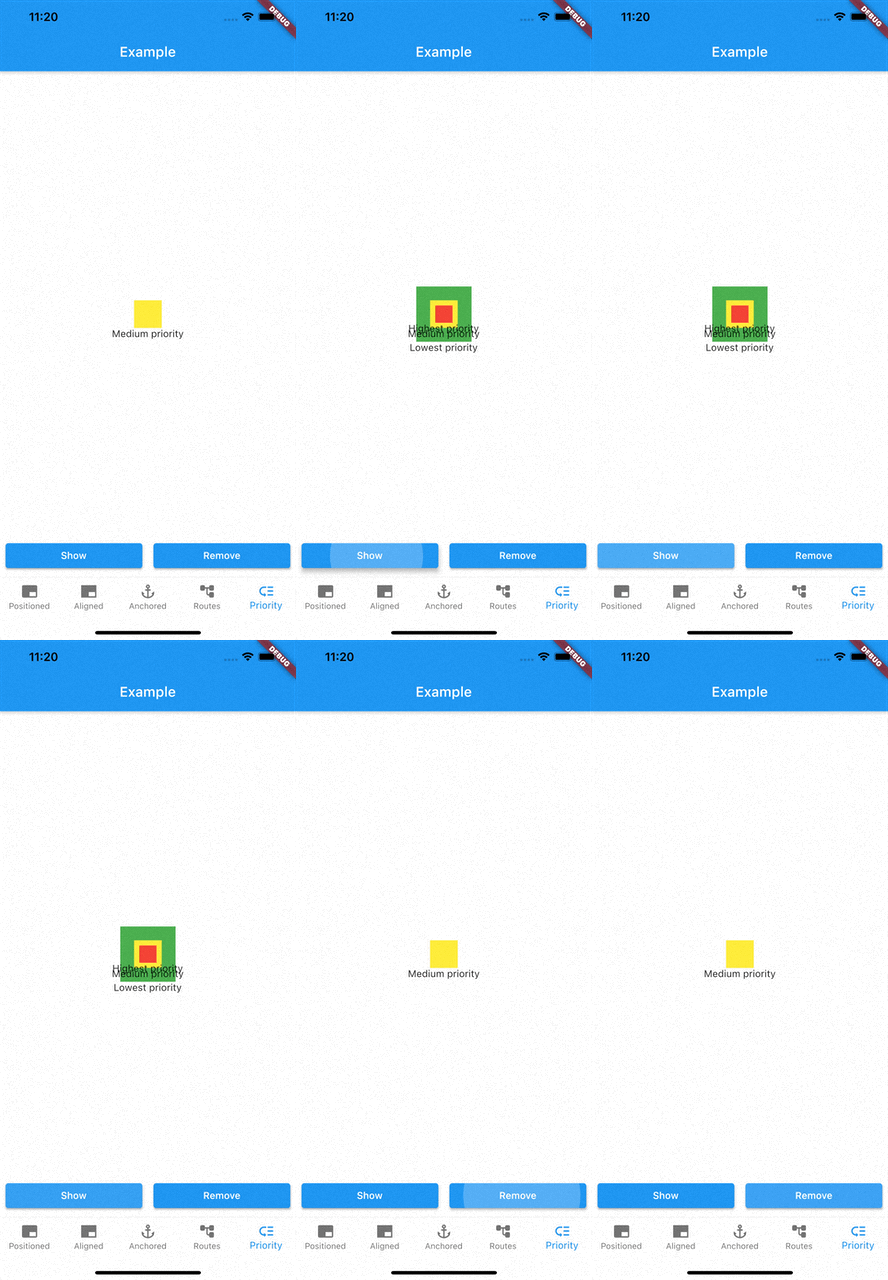
Prioritise modal visibility
Remove modals easily
Remove modal by id
Remove all modals at once
Remove modal by tapping modal barrier
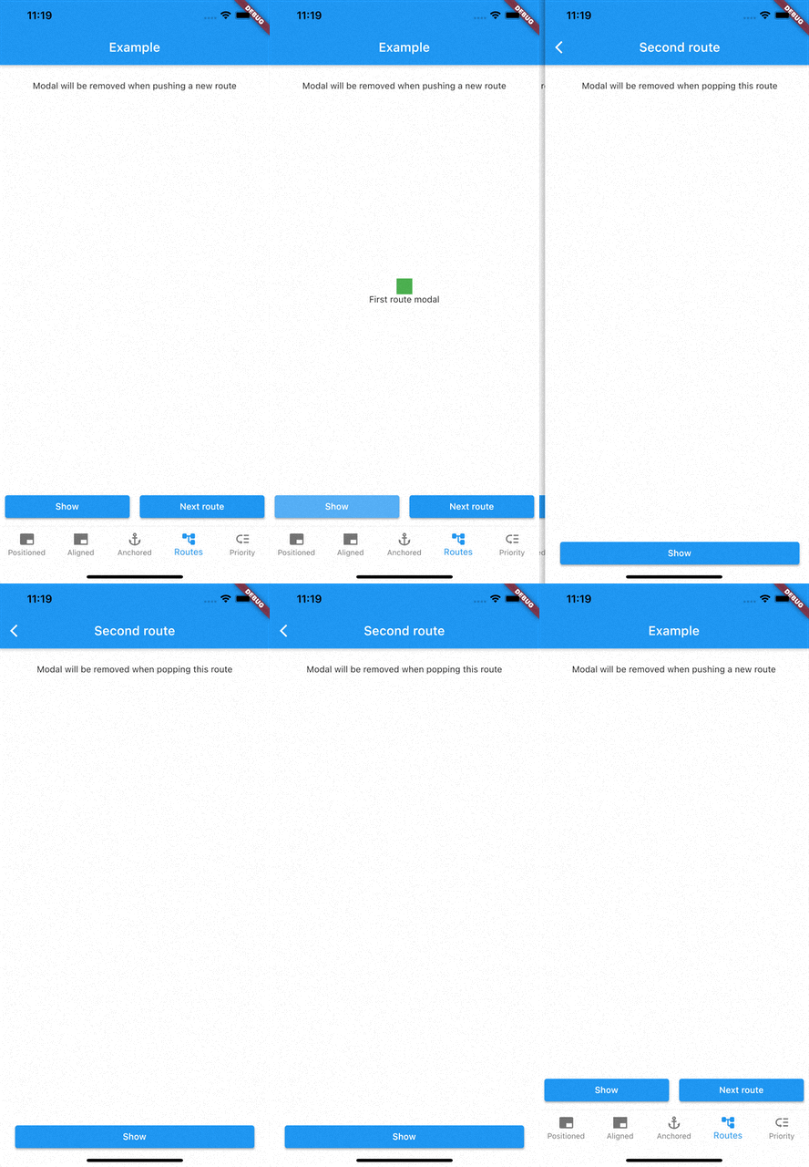
Remove modals on route changes
How to use
Showing modals
showModal is used to show modals. Function accepts a ModalEntry as parameter.
ModalEntry has 3 options ModalEntry.positioned, ModalEntry.aligned and ModalEntry.anchored
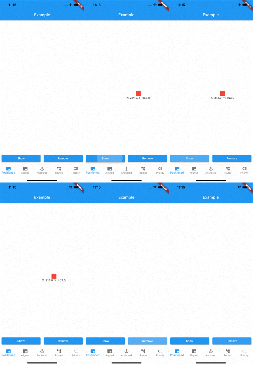
Positioned
class PositionedModalExample extends StatelessWidget const PositionedModalExample ({Key ? key}) : super (key: key);
@override
Widget build (BuildContext context) {
return Center (
child: ElevatedButton (
onPressed: () {
showModal (ModalEntry .positioned (context,
tag: 'containerModal' ,
left: 200 ,
top: 200 ,
child: Container (
color: Colors .red,
width: 50 ,
height: 50 ,
)));
},
child: const Text ('Show Modal' ),
),
);
}
}
Above example positions your widget to absolute position of left: 200 and top 200.
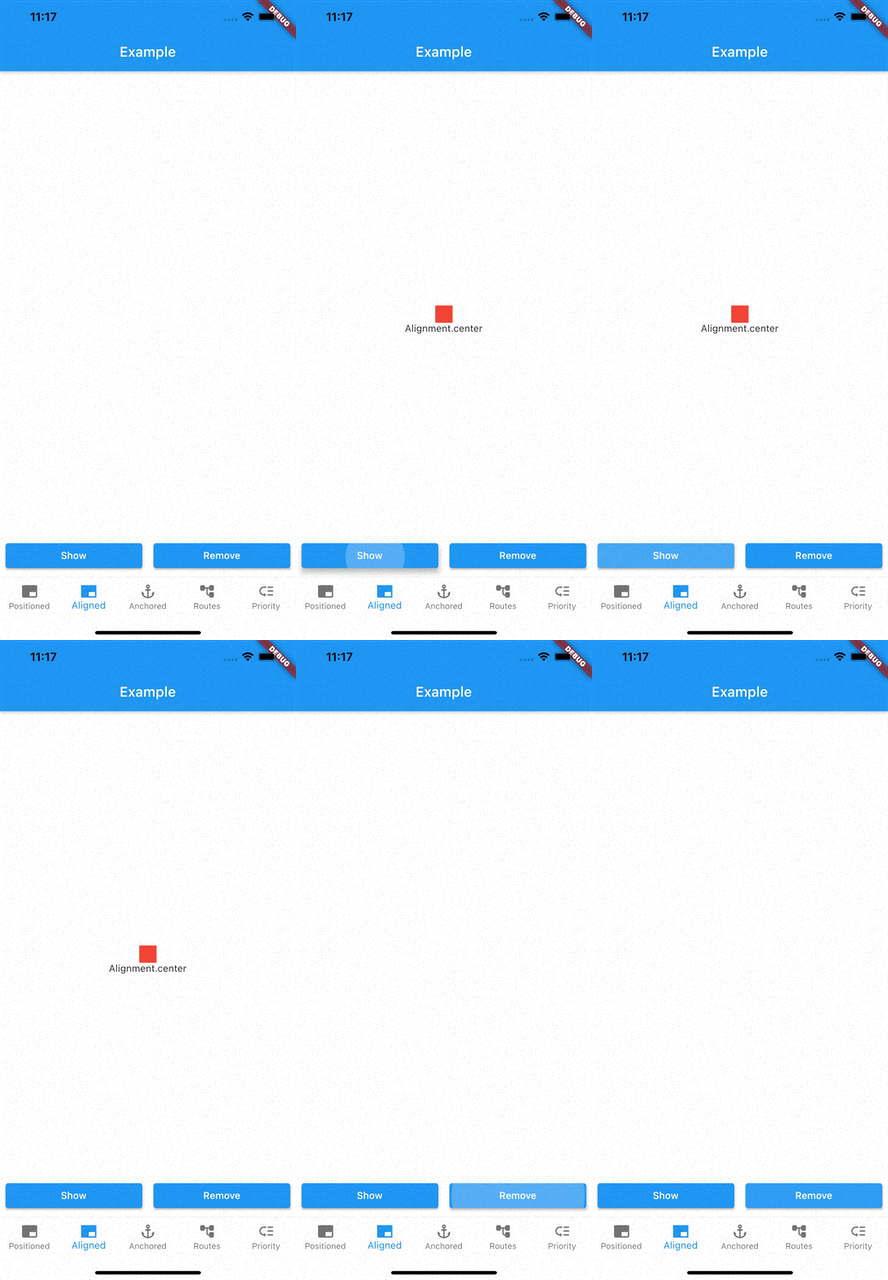
Aligned
class AlignmentModalExample extends StatelessWidget const AlignmentModalExample ({Key ? key}) : super (key: key);
@override
Widget build (BuildContext context) {
return Center (
child: ElevatedButton (
onPressed: () {
showModal (ModalEntry .aligned (context,
tag: 'containerModal' ,
alignment: Alignment .center,
child: Container (
color: Colors .red,
width: 50 ,
height: 50 ,
)));
},
child: const Text ('Show Modal' ),
),
);
}
}
Above example aligns your widget to center of the screen.
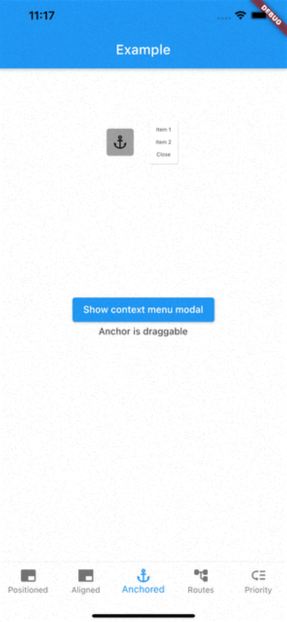
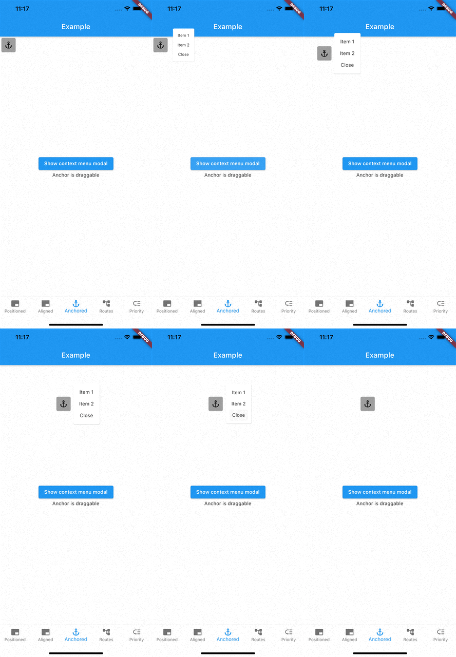
Anchored
class AnchoredModalExample extends StatelessWidget const AnchoredModalExample ({Key ? key}) : super (key: key);
@override
Widget build (BuildContext context) {
return Center (
child: Column (
children: [
const ModalAnchor (
tag: 'anchor' ,
child: Card (
color: Colors .grey,
child: Padding (
padding: EdgeInsets .all (8.0 ),
child: Icon (Icons .anchor),
),
)),
Column (
mainAxisSize: MainAxisSize .min,
children: [
ElevatedButton (
onPressed: () {
showModal (ModalEntry .anchored (context,
tag: 'anchoredModal' ,
anchorTag: 'anchor' ,
modalAlignment: Alignment .centerLeft,
anchorAlignment: Alignment .centerRight,
child: Container (
color: Colors .red,
width: 50 ,
height: 50 ,
)));
},
child: const Text ('Show Modal' ),
),
],
),
],
),
);
}
}
Above example positions widget at next to ModalAnchor widget.
To make widget act as an anchor, wrap widget with ModalAnchor widget.
Prioritising modals
To prioritise modals, use aboveTag and belowTag parameters.
aboveTag
Modal will be positioned just above given aboveTag
belowTag
Modal will be positioned just above given belowTag
Removing modals
You have 4 options to remove modals
removeModal(String id) removes modal by the given id
removeAllModals() removes all modals
Below parameters are configured in ModalEntry.
Tapping modal barrier
barrierDismissible when true (defaults to false) removes modal when tapping the barrierbarrierColor change barrier color (defaults to Colors.transparent)
Observing route changes
removeOnPop
The modal is removed when route is popped where the modal exists
removeOnPushNext
The modal is removed when new route is pushed on top of the route where the modal exists
To enable observing route changes, add navigator observer to root widget.
class MyApp extends StatelessWidget const MyApp ({Key ? key}) : super (key: key);
@override
Widget build (BuildContext context) {
return MaterialApp (
title: 'AppModals' ,
navigatorObservers: [modalsRouteObserver],
theme: ThemeData (
primarySwatch: Colors .blue,
),
home: const _Home (),
);
}
}
Gallery
See the Examples for more information