搜索插件、代码仓与 APP 分类

mongol 封面
插件详情v11.2.0

mongol

用于显示和编辑垂直蒙古文的 Flutter 小部件包。

AndroidiOSWebmacOSWindowsLinux
近 30 天下载
2450
喜欢数
61
Pub 分数
155

安装插件

flutter pub add mongol

插件介绍

基于插件公开信息、社区数据与项目使用情况整理的选型参考。

mongol 包是一个 Flutter 小部件库,专为渲染和编辑垂直蒙古文而设计。它支持传统蒙古文字中特有的从左到右、从上到下的书写系统,能够准确显示并交互式处理自上而下流动的文字。非常适合面向蒙古语用户或需要特定文化排版的应用程序,可无缝集成到所有主要平台的 Flutter 项目中。该包处理针对蒙古文字规范量身定制的布局、对齐和输入逻辑。

适合场景

  • 显示传统蒙古文
  • 编辑垂直蒙古文
  • 支持蒙古语的多语言应用程序
  • 文化或教育应用
  • 蒙古文数字出版

主要特点

  • 蒙古文的垂直文本渲染
  • 交互式文本编辑
  • 跨平台兼容性
  • 对蒙古文 Unicode 字符的支持
  • 可自定义的文本布局

适合对象

  • 面向蒙古语受众的开发者
  • 需要传统蒙古文排版的应用程序
  • 教育或语言软件
  • 涉及东亚或中亚文字的项目

使用建议

  • 需要了解蒙古文书写系统结构
  • 限于特定语言使用场景
  • 可能需要额外的本地化工作
  • 不适合标准横向文本布局

原始 README

以下为关联源码仓库的 README 原文快照,最新内容请访问源码仓库。

mongol

This library is a collection of Flutter widgets for displaying traditional Mongolian vertical text.

The primary widgets include:

  • MongolText: vertical version of Text
  • MongolTextField: vertical version of TextField
  • MongolListTile: vertical version of ListTile, for use in horizontal list views and menus
  • MongolPopupMenuButton: vertical version of PopupMenuButton, for displaying menus
  • MongolAlertDialog: vertical version of AlertDialog

Displaying vertical text

MongolText is a vertical text version of Flutter's Text widget. Left-to-right line wrapping is supported.

MongolText('ᠨᠢᠭᠡ ᠬᠣᠶᠠᠷ ᠭᠤᠷᠪᠠ ᠳᠦᠷᠪᠡ ᠲᠠᠪᠤ ᠵᠢᠷᠭᠤᠭ᠎ᠠ ᠳᠣᠯᠣᠭ᠎ᠠ ᠨᠠᠢᠮᠠ ᠶᠢᠰᠦ ᠠᠷᠪᠠ'),

The library supports mobile, web, and desktop.

Emoji and CJK characters

The library rotates emoji and CJK (Chinese, Japanese, and Korean) characters for proper orientation.

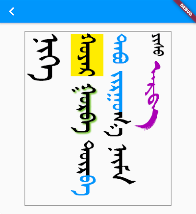
Text styling

You add styling using TextSpan and/or TextStyle, just as you would for a Text widget.

MongolText.rich(
  textSpan,
  textScaleFactor: 2.5,
),

where textSpan is defined like so:

const textSpan = TextSpan(
  style: TextStyle(fontSize: 30, color: Colors.black),
  children: [
    TextSpan(text: 'ᠨᠢᠭᠡ\n', style: TextStyle(fontSize: 40)),
    TextSpan(text: 'ᠬᠣᠶᠠᠷ', style: TextStyle(backgroundColor: Colors.yellow)),
    TextSpan(
      text: ' ᠭᠤᠷᠪᠠ ',
      style: TextStyle(shadows: [
        Shadow(
          blurRadius: 3.0,
          color: Colors.lightGreen,
          offset: Offset(3.0, -3.0),
        ),
      ]),
    ),
    TextSpan(text: 'ᠳᠦᠷ'),
    TextSpan(text: 'ᠪᠡ ᠲᠠᠪᠤ ᠵᠢᠷᠭᠤ', style: TextStyle(color: Colors.blue)),
    TextSpan(text: 'ᠭ᠎ᠠ ᠨᠠᠢᠮᠠ '),
    TextSpan(text: 'ᠶᠢᠰᠦ ', style: TextStyle(fontSize: 20)),
    TextSpan(
        text: 'ᠠᠷᠪᠠ',
        style:
            TextStyle(fontFamily: 'MenksoftAmuguleng', color: Colors.purple)),
  ],
);

This all assumes you've added one or more Mongolian fonts to your app assets.

Adding a Mongolian font

The library does not include a Mongolian font. This allows the library to be smaller and also gives developers the freedom to choose any Mongolian font they like.

Since it's likely that some of your users' devices won't have a Mongolian font installed, you should include at least one Mongolian font with your project. Here is what you need to do:

1. Get a font

You can find a font from the following sources:

2. Add the font to your project

You can get directions to do that here and here.

Basically you just need to create an assets/fonts folder for it and then declare the font in pubspec.yaml like this:

flutter:
  fonts:
    - family: MenksoftQagan
      fonts:
        - asset: assets/fonts/MQG8F02.ttf

You can call the family name whatever you want, but this string is what you will use in the next step.

3. Set the default Mongolian font for your app

In your main.dart file, set the fontFamily for the app theme.

MaterialApp(
  theme: ThemeData(fontFamily: 'MenksoftQagan'),
  // ...
);

Now you won't have to manually set the font for every Mongolian text widget. If you want to use a different font for some widgets, though, you can still set the fontFamily as you normally would inside TextStyle.

You may also consider using mongol_code with a Menksoft font if your users have devices that don't support OpenType Unicode font rendering. mongol_code converts Unicode to Menksoft code, which a Menksoft font can display without any special rendering requirements.

Editing vertical text

You can use MongolTextField to receive and edit text from the system keyboard. This widget includes most of the functionality of the standard Flutter TextField widget.

Here is it on iOS and Android interacting with a system keyboard:

If you want to use an outlined text field with a label, use MongolOutlineInputBorder:

Note: There is currently a bug in the MongolTextField for maxLines: null. PRs are welcome!

MongolTextField(
  decoration: InputDecoration(
    border: MongolOutlineInputBorder(),
    labelText: 'ᠨᠢᠭᠡ ᠬᠤᠶᠠᠷ ᠭᠤᠷᠪᠠ',
  ),
),

In order to correctly handle right/left and up/down keys on the web and desktop (or for physical keyboards connected to a mobile app), you need to return the MongolTextEditingShortcuts widget from the builder method of your MaterialApp (or CupertinoApp or WidgetsApp) at the top of your widget tree:

MaterialApp(
  builder: (context, child) => MongolTextEditingShortcuts(child: child),
  // ...
)

Horizontal lists

You can display horizontally scrolling lists with the standard ListView widget. All you need to do is set the scroll direction to horizontal.

ListView(
  scrollDirection: Axis.horizontal,
  children: [
    MongolText('ᠨᠢᠭᠡ'),
    MongolText('ᠬᠣᠶᠠᠷ'),
    MongolText('ᠭᠤᠷᠪᠠ'),
  ],
),

For something a little fancier, you can also use the MongolListTile widget just like you would use ListTile. Here is an example from the example project:

Card(
  child: MongolListTile(
    leading: FlutterLogo(size: 56.0),
    title: MongolText('ᠨᠢᠭᠡ ᠬᠣᠶᠠᠷ ᠭᠤᠷᠪᠠ'),
    subtitle: MongolText('ᠳᠦᠷᠪᠡ ᠲᠠᠪᠤ ᠵᠢᠷᠭᠤᠭ᠎ᠠ ᠳᠣᠯᠣᠭ᠎ᠠ ᠨᠠᠢᠮᠠ'),
    trailing: Icon(Icons.more_vert),
  ),
),

As visible in the image above, in addition to MongolListTile, there is also:

  • MongolCheckboxListTile
  • MongolRadioListTile
  • MongolSwitchListTile

Menus

To add a popup menu with horizontal items, you can use MongolPopupMenuButton. It is customizable in all the ways that the standard PopupMenuButton is.

Scaffold(
  appBar: AppBar(
    title: const Text('MongolPopupMenuButton'),
    actions: [
      MongolPopupMenuButton(
        itemBuilder: (context) => const [
          MongolPopupMenuItem(child: MongolText('ᠨᠢᠭᠡ'), value: 1),
          MongolPopupMenuItem(child: MongolText('ᠬᠣᠶᠠᠷ'), value: 2),
          MongolPopupMenuItem(child: MongolText('ᠭᠤᠷᠪᠠ'), value: 3),
        ],
        tooltip: 'vertical tooltip text',
        onSelected: (value) => print(value),
      ),
    ],
  ),
  body: Container(),
);

Buttons

There are Mongol equivalents to all of the Flutter buttons:

  • MongolTextButton
  • MongolOutlinedButton
  • MongolElevatedButton
  • MongolFilledButton
  • MongolFilledButton.tonal
  • MongolTextButton.icon
  • MongolOutlinedButton.icon
  • MongolElevatedButton.icon
  • MongolFilledButton.icon
  • MongolFilledButton.tonalIcon
  • MongolIconButton
  • MongolIconButton.filled
  • MongolIconButton.filledTonal
  • MongolIconButton.outlined

The reason for the Mongol icon button is to provide a vertical tooltip that will appear for a longpress on mobile and for a mouse hover on desktop and web.

Other widgets

MongolAlertDialog

This alert dialog works mostly the same as the Flutter AlertDialog.

TODO
  • Improve keyboard (this may be better as a separate package)
  • Various other text based widgets
  • Support WidgetSpan.
  • Add more tests
  • For MongolTextAlign.bottom don't count final space in line height
  • Add MongolSelectableText widget

所属分类

依赖

依赖清单 3 项

源码仓库

使用此插件的项目