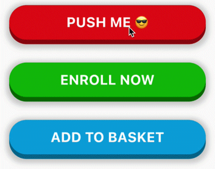
Pushable Button


A 3D pushable button built in Flutter. Ideal for important CTAs in the app.
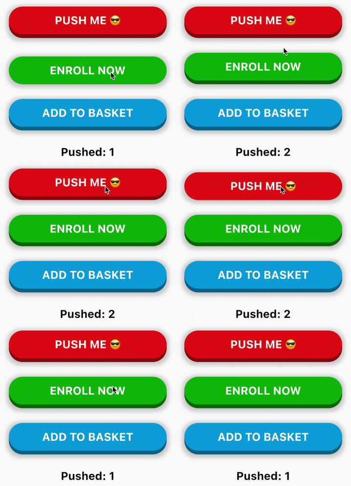
Usage
PushableButton(
  child: Text('ENROLL NOW', style: someTextStyle),
  height: 60,
  elevation: 8,
  hslColor: HSLColor.fromAHSL(1.0, 120, 1.0, 0.37),
  shadow: BoxShadow(
    color: Colors.grey.withOpacity(0.5),
    spreadRadius: 5,
    blurRadius: 7,
    offset: Offset(0, 2),
  ),
  onPressed: () => print('Button Pressed!'),
)
Configurable Properties
- child: child widget (normally a
Text or Icon)
- height: height of the top layer
- elevation: elevation or "gap" between the top and bottom layer
- hslColor: color of the top layer.
HSLColor is used instead of Color so that the bottom layer is automatically calculated by reducing the luminosity
- shadow: an optional shadow to make the button look better
- onPressed: button callback